
Update (March 2026): This article has been updated for Motion v12 (formerly Framer Motion). All code examples now use the motion/react import path. New sections on variants, whileInView, accessibility with useReducedMotion, and real-world use cases have been added.


Introduction
Modern web development relies heavily on animations to create a dynamic and interesting user experience. Creating animations in React applications can be done using traditional CSS or JavaScript, but it can become cumbersome quickly. Various libraries like GSAP, React Spring, and anime.js were created to simplify animation work, but one especially worth noting is Motion (formerly Framer Motion). Motion is a popular React animation library that makes constructing complicated animations easier by providing utility components and hooks. In this article, we will walk you through the core features and some of the more advanced capabilities of Motion.
What is Motion (Framer Motion)?
Motion is an open-source React animation and gesture library that offers a low-level API for integrating animation and gestures into elements in React applications while preserving HTML and SVG semantics.
Motion was originally created by Framer and released as "Framer Motion." In 2025 it became an independent project and was renamed to simply "Motion." The package name changed from framer-motion to motion, and the recommended import path is now motion/react. The old framer-motion package still works but is no longer actively developed.
Setting up Motion in React
To set up Motion in a React project, install the motion package:
npm install motion
Migration from framer-motion
If you are migrating from the old framer-motion package, swap your imports:
- import { motion, AnimatePresence } from "framer-motion";
+ import { motion, AnimatePresence } from "motion/react";
The API surface is the same, so no other code changes are needed.
Components in Motion
Motion includes a set of key components that serve as the basis for producing animations. They are:
Motion
The motion component encapsulates HTML elements in React components, allowing you to animate them using initial and animate props. Motion components are DOM primitives designed specifically for 60fps animation and gestures.
Props available in motion components
Theanimate:animateprop is responsible for animatingmotioncomponents because it holds the CSS properties to be animated. It is an object that accepts a key-value pair representing the CSS property (in camel case) and its value, respectively.
An example of the animate prop on a motion component is provided below:
<motion.div
  animate={{
    x: 0,
    backgroundColor: "#000",
    boxShadow: "10px 10px 0 rgba(0, 0, 0, 0.2)",
    position: "fixed",
  }}
/>
in the example above, the properties backgroundColor, boxShadow, position are animated to their respective specified values.
Examples of text and image animations using motion animate props
- animating texts using its opacity
Code:
<motion.p
  initial={{ opacity: 0 }}
  animate={{ opacity: 1 }}
  className="text-[40px] font-bold capitalize"
>
  Text animated using opacity
</motion.p>
From the code above, we can specify the initial animation property and value to be animated using the initial props and then animate that to another value using the animate props.
View:
 Text opacity animation example
- Animating texts using its transform scale:
Code:
<motion.p
  initial={{ scale: 0.5 }}
  animate={{ scale: 1 }}
  className="text-[40px] font-bold capitalize"
>
  Text animated using scale
</motion.p>
View:
 Text scale animation example
- Animating texts using their opacity and scale: you can also combine properties to get the desired animation.
Code:
<motion.p
  initial={{ opacity: 0, scale: 0.5 }}
  animate={{ opacity: 1, scale: 1 }}
  className="text-[40px] font-bold capitalize"
>
  Text animated using opacity and scale
</motion.p>
View:
 Text scale and opacity animation example
- Animating texts with translate transforms: We can create a translate animation by defining the x and y positions.
Code:
<motion.p
  initial={{ x: -100, y: -100 }}
  animate={{ x: 1, y: 1 }}
  className="text-[30px] font-bold capitalize"
>
  Text animated using transform translate
</motion.p>
View:
 Text translate animation example
Thelayoutlayoutprop is effective in animating layouts (like height, width, flex properties like justify-content, flex-start, etc). It does this performantly and doesn't trigger browser layout mechanisms with each animation frame by animating layout-related structures with transforms under the hood rather than the specified layout CSS property.
An example of the layout prop on a motion component is provided below:
<motion.div layout />
Examples of text and image animations using motion layouts
Here is an example that uses motion layout to animate its expanded parent element on click:
Code:
const [isOpen, setIsOpen] = useState(false);

<motion.div
  layout
  data-expanded={isOpen}
  initial={{ borderRadius: 50 }}
  className="flex h-[100px] w-[100px] items-center justify-center bg-black data-[expanded=true]:h-[200px] data-[expanded=true]:w-[400px]"
  onClick={() => setIsOpen(!isOpen)}
>
  <motion.div layout className="h-10 w-10 rounded-full bg-white" />
</motion.div>;
View:
 Layout animation example using Framer Motion
Gesturesmotioncomponents add a straightforward but effective collection of UI gesture handlers to React's core set of event listeners. It supports gesture detection for hover, tap, pan, and drag. You can add several event listeners to your motion component for each gesture.
An example of a gesture handler on a motion component is shown below:
Below is an example of a hover gesture handler:
<motion.button
  whileHover={{
    scale: 1.2,
    transition: { duration: 1 },
  }}
  whileTap={{ scale: 0.9 }}
/>
Examples of text and image animations using motion gestures
Below is an example of a scale animation displayed on hover:
Code:
<motion.div
  className="h-[80px] w-[200px] cursor-pointer rounded-[50px] bg-[#00ccff]"
  whileHover={{ scale: 1.1 }}
  transition={{ type: "spring", stiffness: 400, damping: 10 }}
/>
View:
 Hover gesture animation example
Transitionsmotioncomponents can accept atransitionprop, which specifies the type of animation used while animating CSS properties. In the transition props object, we can specify theduration,delay,easeproperties of the transition.
Examples of animations using motion transitions
An example of the transition prop with duration, ease, and delay on a motion component is shown below:
Code:
<motion.div
  className=" h-[200px] w-[200px] rounded-full bg-black"
  initial={{ opacity: 0, scale: 0.5 }}
  animate={{ opacity: 1, scale: 1 }}
  transition={{
    duration: 0.8,
    delay: 0.5,
    ease: [0, 0.71, 0.2, 1.01],
  }}
/>
View:
 Transition properties animation example
the transition props can also receive props that specify which sort of animation to utilize (Tween, Spring, or Inertia).
Code:
<motion.div
    className="flex items-center justify-center text-white w-[200px] h-[200px] rounded-full bg-black"
    animate={{ y: 100 }}
    transition={{ type: "spring", stiffness: 200 }}
    >
        Transition : Spring
</motion.div>

<motion.div
    className="flex items-center justify-center text-white w-[200px] h-[200px] rounded-full bg-black"
    animate={{ y: 100, pathLength: 1 }}
    transition={{ type: "tween", duration: 3, }}
    >
        Transition: Tween
</motion.div>

<motion.div
    className="flex items-center justify-center text-white w-[200px] h-[200px] rounded-full bg-black"
    animate={{ y: 100 }}
    transition={{ type: "inertia", velocity: 120 }}
    >
        Transition: Inertia
</motion.div>
View:
 Transition types animation example
AnimatePresence
Components removed from the React tree can be animated out using the AnimatePresence component.
This component solves many cases such as animating an element in React that was conditionally rendered, as React lacks a lifecycle method that supports the notification of components to be unmounted as well as allowing them to defer unmounting until after an action (like an animation) has been executed.
Examples of animations using AnimatePresence
An example below is an animation done on a conditionally rendered div box.
Code:
import { useState } from "react";
import { motion, AnimatePresence } from "motion/react";

const App = () => {
  const [show, setShow] = useState(true);

  return (
    <div className="mt-20 flex h-screen max-h-screen w-full flex-col items-center justify-start">
      <div className="flex flex-col items-center p-0 pb-[50px]">
        <motion.button
          className="rounded-[10px] bg-black p-4 text-white"
          whileTap={{ scale: 0.95 }}
          onClick={() => {
            setShow(!show);
          }}
        >
          {show ? "Hide" : "Show"}
        </motion.button>
      </div>

      <AnimatePresence>
        {show ? (
          <motion.div
            initial={{ opacity: 0 }}
            animate={{ opacity: 1 }}
            exit={{ opacity: 0 }}
            className="m-0 flex h-[150px] w-[150px] items-center justify-center rounded-[30px] bg-black text-white"
          />
        ) : null}
      </AnimatePresence>
    </div>
  );
};
View:
 AnimatePresence enter and exit animation example
Variants
Variants let you define named animation states in a single object and reference them by key across initial, animate, exit, and gesture props like whileHover. This keeps animation logic out of JSX and makes it reusable.
import { motion } from "motion/react";

const cardVariants = {
  hidden: { opacity: 0, y: 30 },
  visible: { opacity: 1, y: 0 },
};

function Card({ title }: { title: string }) {
  return (
    <motion.div
      variants={cardVariants}
      initial="hidden"
      animate="visible"
      transition={{ duration: 0.4 }}
      className="rounded-xl bg-white p-6 shadow-md"
    >
      <h3 className="text-lg font-semibold">{title}</h3>
    </motion.div>
  );
}
Where variants really shine is orchestrating children. A parent component can propagate variant labels down the tree, and each child resolves the label against its own variants object. Combined with staggerChildren in the parent's transition, you get staggered lists with minimal code:
const listVariants = {
  hidden: {},
  visible: {
    transition: { staggerChildren: 0.08 },
  },
};

const itemVariants = {
  hidden: { opacity: 0, x: -10 },
  visible: { opacity: 1, x: 0 },
};

function List({ items }: { items: string[] }) {
  return (
    <motion.ul variants={listVariants} initial="hidden" animate="visible">
      {items.map((item) => (
        <motion.li key={item} variants={itemVariants}>
          {item}
        </motion.li>
      ))}
    </motion.ul>
  );
}
whileInView
The whileInView prop triggers an animation when the element enters the viewport. Combined with the viewport option, you can control the threshold and whether the animation should only run once.
<motion.div
  initial={{ opacity: 0, y: 40 }}
  whileInView={{ opacity: 1, y: 0 }}
  viewport={{ once: true, amount: 0.3 }}
  transition={{ duration: 0.5 }}
  className="rounded-lg bg-gray-100 p-8"
>
  This fades in as you scroll down, and stays visible.
</motion.div>
Setting once: true means the animation fires only on the first intersection, which avoids the flickering that happens when an element repeatedly enters and leaves the viewport during scrolling. The amount property (0 to 1) controls how much of the element must be visible before the animation starts.
whileInView also works with variants, making it straightforward to stagger a group of cards or sections as the user scrolls through a page:
const sectionVariants = {
  hidden: { opacity: 0, y: 30 },
  visible: {
    opacity: 1,
    y: 0,
    transition: { staggerChildren: 0.1 },
  },
};

const itemVariants = {
  hidden: { opacity: 0, y: 20 },
  visible: { opacity: 1, y: 0 },
};

function FeatureGrid({ features }: { features: string[] }) {
  return (
    <motion.div
      variants={sectionVariants}
      initial="hidden"
      whileInView="visible"
      viewport={{ once: true }}
      className="grid grid-cols-3 gap-4"
    >
      {features.map((f) => (
        <motion.div
          key={f}
          variants={itemVariants}
          className="rounded bg-white p-4 shadow"
        >
          {f}
        </motion.div>
      ))}
    </motion.div>
  );
}
Hooks in Motion
useReducedMotion
The useReducedMotion hook returns true when the user has enabled the "Reduce motion" setting in their operating system. You can use it to tone down or disable animations entirely for users who prefer less movement on screen.
import { motion, useReducedMotion } from "motion/react";

function FadeIn({ children }: { children: React.ReactNode }) {
  const shouldReduce = useReducedMotion();

  return (
    <motion.div
      initial={{ opacity: 0, y: shouldReduce ? 0 : 20 }}
      animate={{ opacity: 1, y: 0 }}
    >
      {children}
    </motion.div>
  );
}
When shouldReduce is true, the component skips the vertical slide and only fades in, which avoids triggering motion-sickness for users who have opted out of animations at the OS level. Making this a habit in your components is a small effort that goes a long way for accessibility.
useSpring
A motion value can be animated in a spring fashion through the useSpring hook.
The useSpring hook generates a motion value that animates to its latest target value using a spring animation. The target can be set manually using .set methods, or automatically by handing in another motion value.
useSpring can be initialized with a number.
const spring = useSpring(0);
Or, with a motionValue provided by Motion
const x = useMotionValue(0);
const spring = useSpring(x);
UseSpring can be configured using the standard spring transition options.
useSpring(x, { stiffness: 1000, damping: 10 });
Use cases of the useSpring hook.
An example is to utilize the useSpring hook to animate the scale parameters of an element when the useEffect hook is triggered or when the element is hovered over.
Code:
import { useEffect } from "react";
import { motion, useSpring } from "motion/react";

const App = () => {
  const x = useSpring(0.5);
  const y = useSpring(0.5);

  useEffect(() => {
    x.set(1);
  }, []);

  return (
    <div>
      <motion.div
        className="flex h-10 w-full cursor-pointer items-center justify-center rounded-lg bg-black p-4 text-sm text-white"
        style={{ scale: x }}
      >
        Spring scale animation on useEffect (component mounts)
      </motion.div>

      <motion.div
        className="flex h-10 w-full cursor-pointer items-center justify-center rounded-lg bg-black p-4 text-sm text-white"
        onHoverStart={() => y.set(1)}
        style={{ scale: y }}
      >
        Spring scale animation on Hover
      </motion.div>
    </div>
  );
};
View:
 useSpring animation example
useScroll
The useScroll hook is used to watch scroll positions on an element or page. It is frequently used to create scroll-linked animations such as progress bars and parallax effects.
the useScroll hook returns four motion values:
- scrollX/scrollY: The absolute scroll position of the X and Y axis (in pixels).
- scrollXProgress/scrollYProgress: The scroll position (of the X and Y axis) between the specified offsets, expressed as a value between 0 and 1.
Use cases of the useScroll hook.
Let's look at an example of how we can use motion values to construct the classic scroll indicator. Simply send the scrollYProgress motion value to the scaleX style property of the progress bar element, as demonstrated in the code example below.
Code:
import { useScroll, useSpring, motion } from "motion/react";

function ScrollProgressBar() {
  const { scrollYProgress } = useScroll();
  const scaleX = useSpring(scrollYProgress, {
    stiffness: 100,
    damping: 30,
    restDelta: 0.001,
  });

  return (
    <>
      <motion.div
        className="progress-bar bg-red-500 fixed top-0 left-0 right-0 h-2.5 origin-left"
        style={{ scaleX }}
      />
      <h1>
        <code>useScroll</code> with spring smoothing
      </h1>

      <article>
        <p>
          Lorem ipsum dolor sit amet, consectetur adipiscing elit. Aliquam ac
          rhoncus quam.
        </p>
        <p>
          Fringilla quam urna. Cras turpis elit, euismod eget ligula quis,
          imperdiet sagittis justo. In viverra fermentum ex ac vestibulum.
          Aliquam eleifend nunc a luctus porta. Mauris laoreet augue ut felis
          blandit, at iaculis odio ultrices. Nulla facilisis. Vestibulum cursus
          ipsum tellus, eu tincidunt neque tincidunt a.
        </p>
        <h2>Sub-header</h2>
        <p>
          In eget sodales arcu, consectetur efficitur metus. Duis efficitur
          tincidunt odio, sit amet laoreet massa fringilla eu.
        </p>
        <p>
          Pellentesque id lacus pulvinar elit pulvinar pretium ac non urna.
          Mauris id mauris vel arcu commodo venenatis. Aliquam eu risus arcu.
          Proin sit amet lacus mollis, semper massa ut, rutrum mi.
        </p>
        <p>Sed sem nisi, luctus consequat ligula in, congue sodales nisl.</p>
        <p>
          Vestibulum bibendum at erat sit amet pulvinar. Pellentesque pharetra
          leo vitae tristique rutrum. Donec ut volutpat ante, ut suscipit leo.
        </p>
        <h2>Sub-header</h2>
        <p>
          Maecenas quis elementum nulla, in lacinia nisl. Ut rutrum fringilla
          aliquet. Pellentesque auctor vehicula malesuada. Aliquam id feugiat
          sem, sit amet tempor nulla. Quisque fermentum felis faucibus, vehicula
          metus ac, interdum nibh. Curabitur vitae convallis ligula. Integer ac
          enim vel felis pharetra laoreet. Interdum et malesuada fames ac ante
          ipsum primis in faucibus. Pellentesque hendrerit ac augue quis
          pretium.
        </p>
        <p>
          Morbi ut scelerisque nibh. Integer auctor, massa non dictum tristique,
          elit metus efficitur elit, ac pretium sapien nisl nec ante. In et ex
          ultricies, mollis mi in, euismod dolor.
        </p>
        <p>Quisque convallis ligula non magna efficitur tincidunt.</p>
        <p>
          Pellentesque id lacus pulvinar elit pulvinar pretium ac non urna.
          Mauris id mauris vel arcu commodo venenatis. Aliquam eu risus arcu.
          Proin sit amet lacus mollis, semper massa ut, rutrum mi.
        </p>
        <p>Sed sem nisi, luctus consequat ligula in, congue sodales nisl.</p>
        <p>
          Vestibulum bibendum at erat sit amet pulvinar. Pellentesque pharetra
          leo vitae tristique rutrum. Donec ut volutpat ante, ut suscipit leo.
        </p>
        <h2>Sub-header</h2>
        <p>
          Maecenas quis elementum nulla, in lacinia nisl. Ut rutrum fringilla
          aliquet. Pellentesque auctor vehicula malesuada. Aliquam id feugiat
          sem, sit amet tempor nulla. Quisque fermentum felis faucibus, vehicula
          metus ac, interdum nibh. Curabitur vitae convallis ligula. Integer ac
          enim vel felis pharetra laoreet. Interdum et malesuada fames ac ante
          ipsum primis in faucibus. Pellentesque hendrerit ac augue quis
          pretium.
        </p>
        <p>
          Morbi ut scelerisque nibh. Integer auctor, massa non dictum tristique,
          elit metus efficitur elit, ac pretium sapien nisl nec ante. In et ex
          ultricies, mollis mi in, euismod dolor.
        </p>
        <p>Quisque convallis ligula non magna efficitur tincidunt.</p>
      </article>
    </>
  );
}
View:
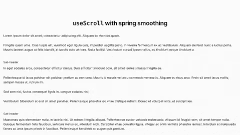 useScroll progress animation example
The useScroll motion values can be combined with other motion value hooks, such as useTransform and useSpring, to create sophisticated animations like the one shown below.
Code:
const data = [
  {
    id: 1,
    text: "Canyon",
    url: "https://images.pexels.com/photos/19561297/pexels-photo-19561297.jpeg?auto=compress&cs=tinysrgb&w=600&lazy=load",
  },
  {
    id: 2,
    text: "Kyoto",
    url: "https://images.pexels.com/photos/19488566/pexels-photo-19488566/free-photo-of-kyoto.jpeg?auto=compress&cs=tinysrgb&w=600&lazy=load",
  },
  {
    id: 3,
    text: "Forest",
    url: "https://images.pexels.com/photos/19237996/pexels-photo-19237996/free-photo-of-empty-road-in-forest.jpeg?auto=compress&cs=tinysrgb&w=600&lazy=load",
  },
  {
    id: 4,
    text: "Vietnam",
    url: "https://images.pexels.com/photos/18707547/pexels-photo-18707547/free-photo-of-a-curved-road-in-the-mountains-with-a-motorcycle.jpeg?auto=compress&cs=tinysrgb&w=600&lazy=load",
  },
];

function Images({ text, url }: { text: string; url: string }) {
  const ref = useRef(null);
  const { scrollYProgress } = useScroll({ target: ref });
  const scale = useSpring(useTransform(scrollYProgress, [0, 1], [1, 2]), {
    stiffness: 100,
    damping: 5,
  });
  return (
    <section className="relative h-screen border">
      <div className="absolute inset-0 rounded-[5px]" ref={ref}>
        <img className="absolute h-full w-full" src={url} alt={text} />
        <motion.h2
          className="absolute left-[45%] top-[50%] -translate-x-1/2 text-[20px] font-bold leading-[1.2] -tracking-[2px] text-red-500"
          style={{ scale }}
        >
          {text}
        </motion.h2>
      </div>
    </section>
  );
}

function App() {
  return (
    <div className="App">
      {data.map((img) => (
        <Images key={img.id} text={img.text} url={img.url} />
      ))}
    </div>
  );
}
View:
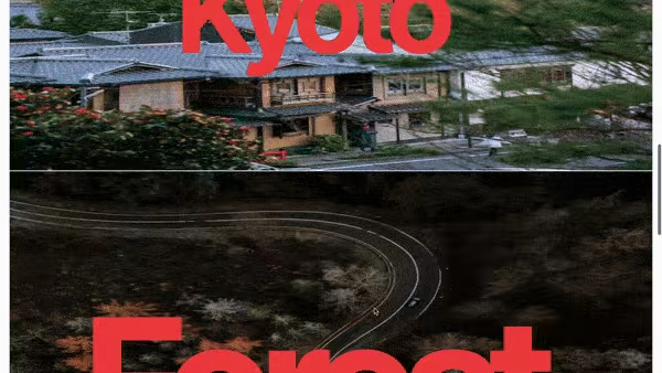 Image used in the useScroll parallax demo
useTransform
The useTransform hook generates a motionValue by modifying the output of one or more other motionValues.
const opacity = useTransform(
  x,
  // Map x from these values:
  [0, 100],
  // Into these values:
  [1, 0],
);
We may use the useTransform to define a new motion value called opacity. By specifying an input and output range, we can say, "When x is 0, opacity should be 1. When x is 100, opacity should be zero."
Use cases of the useTransform hook.
An example is to utilize the useTransform hook to animate the background parameters of an element on hover.
Code:
import { motion, useTransform, useMotionValue } from "motion/react";

const App = () => {
  const x = useMotionValue(0);
  const y = useMotionValue(0);

  const backgroundColor = useTransform(x, [0, 100], ["#fff", "#000"]);

  const color = useTransform(y, [0, 100], ["#000", "#fff"]);

  return (
    <div>
      <motion.div
        className="flex h-10 w-full cursor-pointer items-center justify-center rounded-lg bg-black p-4 text-sm text-white"
        style={{
          backgroundColor,
          color,
        }}
        onMouseEnter={() => {
          x.set(100);
          y.set(100);
        }}
        onMouseLeave={() => {
          x.set(0);
          y.set(0);
        }}
      >
        useTransform hook background color animation on hover
      </motion.div>
    </div>
  );
};
View:
 useTransform animation example
Another example is to combine the useTransform hook with the useSpring hook to get a spring animation on a transformed motion value on hover.
Code:
import { motion, useSpring, useTransform, useMotionValue } from "motion/react";

const App = () => {
  const springConfig = { stiffness: 100, damping: 5 };

  const scaleMV = useMotionValue(0.5);
  const transformMV = useMotionValue(50);

  const scale = useSpring(useTransform(scaleMV, [0, 1], [0, 1]), springConfig);

  const rotateX = useSpring(
    useTransform(transformMV, [0, 100], [0, 50]),
    springConfig,
  );

  return (
    <div>
      <motion.div
        className="flex h-10 w-full cursor-pointer items-center justify-center rounded-lg bg-black p-4 text-sm text-white"
        style={{
          scale,
          rotateX,
        }}
        onMouseEnter={() => {
          scaleMV.set(1);
          transformMV.set(50);
        }}
        onMouseLeave={() => {
          scaleMV.set(0.5);
          transformMV.set(0);
        }}
      >
        useTransform combination with useSpring
      </motion.div>
    </div>
  );
};
 useTransform with useSpring animation example
useVelocity
When a motion value is supplied, the useVelocity hook takes it and provides a new one that updates with the velocity of the motion value.
Code:
import { useMotionValue, useVelocity, useMotionValueEvent } from "motion/react";

function Component() {
  const x = useMotionValue(0);

  const xVelocity = useVelocity(x);

  useMotionValueEvent(xVelocity, "change", (latestVelocity) => {
    console.log("Velocity", latestVelocity);
  });

  return <motion.div style={{ x }} />;
}
View:
 useVelocity animation example
Use cases of the useVelocity hook.
In the example below, we create a velocity motion value (which updates when the element moves) from a spring animation and then translate it to a scale and background motion value, which we will utilize on our element.
const App = () => {
  const pink = (saturation: number) => `hsl(327, ${saturation}%, 50%)`;
  const x = useMotionValue(0);

  const xSmooth = useSpring(x, { damping: 50, stiffness: 400 });

  /**
   * Create a motion value from the smoothed output of x
   */
  const xVelocity = useVelocity(xSmooth);

  /**
   * Transform the velocity of x into a scale motion value
   */
  const scale = useTransform(xVelocity, [-3000, 0, 3000], [2, 1, 2], {
    clamp: false,
  });

  /**
   * Transform the velocity of x into a range of background color intensities
   */
  const backgroundColor = useTransform(
    xVelocity,
    [-2000, 0, 2000],
    [pink(100), pink(0), pink(100)],
  );

  return (
    <div>
      <motion.div
        className="h-20 w-20 rounded-[30px] bg-[#ff008c]"
        drag="x"
        dragElastic={1}
        dragConstraints={{ left: -200, right: 200 }}
        style={{ x, scale, backgroundColor }}
      />
    </div>
  );
};
View:
useTransform with useSpring animation exampleMotion + Tailwind CSS
If you are already using Tailwind CSS for styling, Motion is a natural pairing. Tailwind handles the visual design (colors, spacing, typography) while Motion handles the movement. You don't need CSS keyframes or timeline-based libraries, you just drop motion. prefixed elements into your existing Tailwind markup.
A practical pattern is a notification toast that slides in and slides out:
import { motion, AnimatePresence } from "motion/react";

function Toast({ message, visible }: { message: string; visible: boolean }) {
  return (
    <AnimatePresence>
      {visible && (
        <motion.div
          initial={{ opacity: 0, y: -20 }}
          animate={{ opacity: 1, y: 0 }}
          exit={{ opacity: 0, y: -20 }}
          transition={{ type: "spring", damping: 20, stiffness: 300 }}
          className="fixed right-4 top-4 z-50 rounded-lg bg-gray-900 px-4 py-3 text-sm text-white shadow-lg"
        >
          {message}
        </motion.div>
      )}
    </AnimatePresence>
  );
}
Tailwind gives you the positioning, color, and radius. Motion gives you the spring physics. Neither gets in the other's way, and the result is a component you can drop into any project without extra CSS files or global animation configuration.
Real-World Use Case: Refine + Motion
Refine is a React meta-framework for building internal tools, admin panels, and dashboards. Because Refine is headless, you are free to use any UI library or animation approach. Motion fits naturally into Refine projects for adding polish to data-heavy interfaces.
Here are a few patterns that work well together.
Drawer open/close with AnimatePresence
A detail drawer that slides in from the right when a user selects a record:
import { motion, AnimatePresence } from "motion/react";

function RecordDrawer({
  open,
  onClose,
  children,
}: {
  open: boolean;
  onClose: () => void;
  children: React.ReactNode;
}) {
  return (
    <AnimatePresence>
      {open && (
        <>
          <motion.div
            initial={{ opacity: 0 }}
            animate={{ opacity: 0.4 }}
            exit={{ opacity: 0 }}
            onClick={onClose}
            className="fixed inset-0 z-40 bg-black"
          />
          <motion.aside
            initial={{ x: "100%" }}
            animate={{ x: 0 }}
            exit={{ x: "100%" }}
            transition={{ type: "spring", damping: 25, stiffness: 200 }}
            className="fixed right-0 top-0 z-50 h-full w-[400px] overflow-y-auto bg-white p-6 shadow-xl"
          >
            {children}
          </motion.aside>
        </>
      )}
    </AnimatePresence>
  );
}
Staggered table rows
Rows that fade in one after another when data loads, using the variants pattern:
import { motion } from "motion/react";

const tableVariants = {
  hidden: {},
  visible: { transition: { staggerChildren: 0.04 } },
};

const rowVariants = {
  hidden: { opacity: 0, y: 8 },
  visible: { opacity: 1, y: 0 },
};

function AnimatedTable({ rows }: { rows: { id: number; name: string }[] }) {
  return (
    <motion.tbody variants={tableVariants} initial="hidden" animate="visible">
      {rows.map((row) => (
        <motion.tr key={row.id} variants={rowVariants}>
          <td className="px-4 py-2">{row.id}</td>
          <td className="px-4 py-2">{row.name}</td>
        </motion.tr>
      ))}
    </motion.tbody>
  );
}
Form validation shake
A quick horizontal shake that draws attention to a field with a validation error:
import { motion } from "motion/react";

function ShakeOnError({
  error,
  children,
}: {
  error: boolean;
  children: React.ReactNode;
}) {
  return (
    <motion.div
      animate={error ? { x: [0, -6, 6, -4, 4, 0] } : { x: 0 }}
      transition={{ duration: 0.4 }}
    >
      {children}
    </motion.div>
  );
}
These patterns are small and composable. You can mix and match them the same way you combine Refine's data hooks with any UI component.
When to use Motion
Complex Animations
If your project needs complex animations that involve multi-step sequences or multiple elements, Motion's robust API, especially variants and staggered children, makes orchestration straightforward.
Performance
Motion was built for performance and can handle hundreds of animated elements on the screen using hardware-accelerated transforms.
Interactive UI
For making interactive user interfaces, Motion provides gesture handlers for hover, tap, pan, and drag that let elements react to user input smoothly.
State-based Animations
If you want to animate components based on changing state, Motion integrates seamlessly with React's state and props.
Scroll-triggered Animations
With whileInView and the useScroll hook, Motion makes viewport-driven animations trivial, which is a common requirement for landing pages and dashboards.
Accessibility
The useReducedMotion hook gives you a one-line way to respect user preferences and reduce or disable motion for users who need it.
What's New in Motion v12
The library went through two major milestones since its early days as Framer Motion. In mid-2025 it became an independent project and was renamed to Motion, with the package changing from framer-motion to motion and the recommended import moving to motion/react. Then came v12, the current major release, which brought a long list of improvements:
- New color type support:
oklch,oklab,lab,lch, andcolor-mixvalues can now be animated directly. - Hardware-accelerated scroll animations:
useScrolland thescroll()function now leverage hardware acceleration for smoother performance. layoutAnchorprop: Configures a custom anchor point for resolving relative projection boxes in layout animations.- Axis-locked layout animations:
layout="x"andlayout="y"let you animate layout changes on a single axis. skipInitialAnimationinuseSpring: Skip the first animation if the value is set before the component mounts.- ViewTimeline support: CSS
ViewTimelinecan now drivescroll()-based animations. - React 19 compatibility: Full support for concurrent rendering and the latest React features.
If you are still on framer-motion, upgrading to motion@^12 is a straightforward swap of the package name and import paths, with no API-level breaking changes for most usage.
FAQ
Is Framer Motion the same as Motion?
Yes. Framer Motion was renamed to Motion in 2025 when it became an independent project. The API is the same, the package just moved from framer-motion to motion on npm, and the import path changed to motion/react.
Do I need to rewrite my code when migrating from framer-motion to motion?
No. The only required change is swapping the import path from "framer-motion" to "motion/react". The component and hook APIs are identical.
How do I respect users who prefer reduced motion?
Use the useReducedMotion hook. It returns true when the operating system's "Reduce motion" setting is enabled, letting you conditionally simplify or disable animations.
Can I use Motion with Tailwind CSS?
Absolutely. Tailwind handles visual styling and Motion handles animation. You apply Tailwind classes for layout and appearance, then use Motion props like initial, animate, and whileHover for movement. They don't conflict.
What is the difference between animate and whileInView?
animate runs immediately when the component mounts. whileInView waits until the element scrolls into the viewport. Use whileInView with viewport={{ once: true }} for scroll-triggered entrance animations.
Conclusion
Motion (formerly Framer Motion) has grown into one of the most capable animation libraries in the React ecosystem. Between motion components, variants, scroll-driven hooks, and gesture handlers, it covers everything from simple fade-ins to complex choreographed sequences.
For more, check the official Motion documentation. If you're building internal tools or admin panels with React, combining Motion with a framework like Refine gives you both productivity and polish.