Introduction
Quick Summary: What is Material UI Card?
Think of a Material UI Card as a digital container - like a paper card in real life, but for your website. It's a neat way to show related information in one place. You can put all sorts of things in it: text, pictures, buttons, and more.
Here's what makes Material UI Cards so useful:
- They keep information organized and tidy
- You can easily add images and other media
- They're interactive - users can click, expand, or interact with them
- They look great on both desktop and mobile screens
- You can style them however you want to match your website
The best part? They're super easy to use, even if you're just starting with React!
Material UI cards are an important part of modern web design. They make it simple for users to access and interact with important information, whether text, images, or a combination of the two. Developers can use Material UI to easily create powerful and interactive cards that integrate seamlessly into their website design. This article will go over the various features, benefits, and applications of Material UI cards to give web developers a thorough understanding of how the component can help them create beautiful and engaging user experiences.
What is Material UI?
Material UI is a React-based UI framework designed to aid in the creation of consistent user interfaces across web and mobile applications. It includes a large library of components and tools to help developers easily create modern user interfaces.
It provides a comprehensive library of components and tools to help developers create modern user interfaces with ease. Some of which include:
- Input components
- Surface components
- Data Display components
- Navigation components
- Feedback components
- Layout components
The Material UI Card is an example of the Material UI Surfaces.
Getting started with Material UI Card
Cards contain information and actions about a single topic. Material UI cards are an excellent way to add a visually appealing, well-organized layout to a website quickly. They are simple to use and can be customized with various options such as colors, sizes, and images. To make a card, simply choose the card component from the Material UI library and customize it to your specifications. You can also add content to the card quickly, such as text, images, and buttons. Material UI cards are an excellent way to quickly improve the visual appeal and organization of a website.
Here’a a demo of how to use Material UI Cards:
import * as React from "react";
import Box from "@mui/material/Box";
import Card from "@mui/material/Card";
import CardActions from "@mui/material/CardActions";
import CardContent from "@mui/material/CardContent";
import Button from "@mui/material/Button";
import Typography from "@mui/material/Typography";

const bull = (
  <Box
    component="span"
    sx={{ display: "inline-block", mx: "2px", transform: "scale(0.8)" }}
  >
    •
  </Box>
);

export default function CardDemo() {
  return (
    <div style={{ margin: "25%" }}>
      <Card sx={{ maxWidth: 600 }}>
        <CardContent>
          <Typography variant="h3" gutterBottom>
            A Simple Material UI Card
          </Typography>
          <Typography variant="h4" component="div">
            Heading
          </Typography>
          <Typography sx={{ mb: 1.5 }} color="text.secondary">
            describes the heading
          </Typography>
          <Typography variant="body1">
            Card content
            <br />
            {'"describes the content"'}
          </Typography>
        </CardContent>
        <CardActions>
          <Button size="small">Card Button</Button>
        </CardActions>
      </Card>
    </div>
  );
}
The code above represents a simple Material UI Card component that is used to convey a message or specific information to users while they are browsing your web app.
 Simple Material UI card example
Although cards can support multiple actions, UI controls, and an overflow menu, use caution and keep in mind that cards are gateways to more complex and detailed information. They should be simple to scan for relevant and actionable data. Text and images, for example, should be placed on them in a way that clearly indicates hierarchy.
Other Material UI Card Variants
Image Cards
The image card is a more interactive card type. This card allows developers to include an image or icon, as well as a title and description. This makes it easier to convey a message to the user in a timely and effective manner.
import * as React from "react";
import Card from "@mui/material/Card";
import CardActions from "@mui/material/CardActions";
import CardContent from "@mui/material/CardContent";
import CardMedia from "@mui/material/CardMedia";
import Button from "@mui/material/Button";
import Typography from "@mui/material/Typography";
import Chevrolet from "../Images/Chevrolet.jpg";

export default function MediaCard() {
  return (
    <div style={{ margin: "25%" }}>
      <Card sx={{ maxWidth: 345 }}>
        <CardMedia
          component="img"
          height="140"
          image={Chevrolet}
          alt="Chevrolet car photo"
        />
        <CardContent>
          <Typography gutterBottom variant="h5" component="div">
            Lizard
          </Typography>
          <Typography variant="body2" color="text.secondary">
            Chevrolet is an iconic American car brand known for its reliable,
            dependable, and affordable vehicles. Founded in 1911, Chevy has
            become one of the most recognizable car brands in the world.
          </Typography>
        </CardContent>
        <CardActions>
          <Button size="small">Share</Button>
          <Button size="small">Learn More</Button>
        </CardActions>
      </Card>
    </div>
  );
}
The demo code above showcases how to use a card with an image to help reinforce the content. Here’s the result:
 Material UI card with car image
Outlined Cards
This variant of the Material UI Card is meant to be used when there is a need to reduce the prominence of the card, such as when it is part of a list of other cards. It has a thin border that outlines the card and a slightly less prominent title. Set variant=outlined to render an outlined card like this:
import * as React from "react";
import Box from "@mui/material/Box";
import Card from "@mui/material/Card";
import CardActions from "@mui/material/CardActions";
import CardContent from "@mui/material/CardContent";
import Button from "@mui/material/Button";
import Typography from "@mui/material/Typography";

const bull = (
  <Box
    component="span"
    sx={{ display: "inline-block", mx: "2px", transform: "scale(0.8)" }}
  >
    •
  </Box>
);

export default function CardDemo() {
  return (
    <div style={{ margin: "25%" }}>
      <Card sx={{ maxWidth: 600 }} variant="outlined">
        <CardContent>
          <Typography variant="h3" gutterBottom>
            An Outlined Material UI Card
          </Typography>
          <Typography variant="h4" component="div">
            Heading
          </Typography>
          <Typography sx={{ mb: 1.5 }} color="text.secondary">
            describes the heading
          </Typography>
          <Typography variant="body1">
            Card content
            <br />
            {'"describes the content"'}
          </Typography>
        </CardContent>
        <CardActions>
          <Button size="small">Card Button</Button>
        </CardActions>
      </Card>
    </div>
  );
}
 Outlined Material UI card example
Material UI Card Component Classes
The Material UI Card Component is an excellent tool for organizing and displaying data. It includes classes for creating card containers, card titles, card contents, card images, and card actions, among other things. These classes can be used to create cards with a distinct look and feel, making them more visually appealing and understandable. Furthermore, the Material UI Card Component supports a wide range of customization options, such as custom designs, color palettes, and other UI components.
Some of these classes include:
<Card />- This is the main card class used to create the card container.<CardActionArea/>- This component wraps children in a single Button, creating a ripple effect when clicked.<CardActions/>- This is a flexbox component that adds 8px padding to the children and 8px horizontal padding between them. It is used to add action buttons, such as ‘Like’ or ‘Share’, to the card.<CardContent/>- This component places children inside a single<div>element and adds 16px padding to all sides. If the child is the last one in the group, it also adds an additional 24px of padding at the bottom.<CardHeader/>- This class is used to generate a header within the card, which is commonly used for titles, subtitles, or other headings.<CardMedia/>- This class is used to add a media element to the card, such as an image, video, or audio clip.
Material UI Card Interactions
Material UI Card Interactions are a Material Design feature that allows users to interact with data quickly and easily. Users can quickly scan the data and decide what action to take by using cards with a title, content, and action. This results in a more fluid, intuitive user experience, as the user can quickly access and interact with the data without having to scroll or search for it. This feature also displays a visual representation of the data to the user, making it easier to digest and comprehend the information.
Consider the code below:
import * as React from "react";
import { styled } from "@mui/material/styles";
import Card from "@mui/material/Card";
import CardHeader from "@mui/material/CardHeader";
import CardContent from "@mui/material/CardContent";
import CardActions from "@mui/material/CardActions";
import Collapse from "@mui/material/Collapse";
import Avatar from "@mui/material/Avatar";
import IconButton, { IconButtonProps } from "@mui/material/IconButton";
import Typography from "@mui/material/Typography";
import { red } from "@mui/material/colors";
import FavoriteIcon from "@mui/icons-material/Favorite";
import ShareIcon from "@mui/icons-material/Share";
import ExpandMoreIcon from "@mui/icons-material/ExpandMore";
import MoreVertIcon from "@mui/icons-material/MoreVert";
interface ExpandMoreProps extends IconButtonProps {
expand: boolean;
}
const ExpandMore = styled((props: ExpandMoreProps) => {
const { expand, ...other } = props;
return <IconButton {...other} />;
})(({ theme, expand }) => ({
transform: !expand ? "rotate(0deg)" : "rotate(180deg)",
marginLeft: "auto",
transition: theme.transitions.create("transform", {
duration: theme.transitions.duration.shortest,
}),
}));
export default function RecipeReviewCard() {
const [expanded, setExpanded] = React.useState(false);
const handleExpandClick = () => {
setExpanded(!expanded);
};
return (
<div style={{ margin: "25%" }}>
<Card sx={{ maxWidth: 345 }}>
<CardHeader
avatar={
<Avatar sx={{ bgcolor: red[500] }} aria-label="recipe">
D
</Avatar>
}
action={
<IconButton aria-label="settings">
<MoreVertIcon />
</IconButton>
}
title="Doro Onome Churchill"
subheader="nomzykush@gmail.com"
/>
<CardContent>
<Typography variant="body2" color="text.secondary">
Front-end developer and Technical writer with keen attention to
detail and a passion for delivering content as interactive as it is
educational.
</Typography>
</CardContent>
<CardActions disableSpacing>
<IconButton aria-label="add to favorites">
<FavoriteIcon />
</IconButton>
<IconButton aria-label="share">
<ShareIcon />
</IconButton>
<ExpandMore
expand={expanded}
onClick={handleExpandClick}
aria-expanded={expanded}
aria-label="show more"
>
<ExpandMoreIcon />
</ExpandMore>
</CardActions>
<Collapse in={expanded} timeout="auto" unmountOnExit>
<CardContent>
<Typography paragraph>Chevrolet Description</Typography>
<Typography paragraph>
Chevrolet is an iconic American automobile brand founded in 1911
by Louis Chevrolet and William C. Durant
</Typography>
<Typography paragraph>
It is currently the fourth-largest automotive brand in the United
States and is a division of General Motors. Chevrolet has become
one of America’s most iconic brands, producing reliable and
stylish cars, trucks, and SUVs for over a century. Its models
range from the economical Spark to the luxurious Corvette.
</Typography>
<Typography paragraph>
Chevrolet is also known for its commitment to safety, providing
advanced features like lane departure warning and front crash
prevention. (Discard any mussels that don't open.)
</Typography>
</CardContent>
</Collapse>
</Card>
</div>
);
}
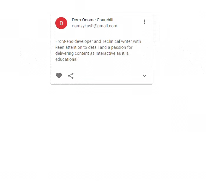
The code above describes an interactive Material UI Card component that allows users to click on one of its icons to reveal more information on a specific concept related to the content of the card.
Here’s the result:
 Material UI card hover animation example
Building a simple Blog Layout with React and Material UI Cards
Using React and Material UI Cards to create a simple blog layout is an excellent way to create an engaging blog page. React components are simple to use and customize, whereas Material UI Cards are an excellent way to present content visually. React components make it simple to add posts and other content to the page, while Material UI Cards style the content and make it more engaging.
Here’s a simple illustration:
import * as React from "react";
import { styled } from "@mui/material/styles";
import Card from "@mui/material/Card";
import CardHeader from "@mui/material/CardHeader";
import CardContent from "@mui/material/CardContent";
import CardActions from "@mui/material/CardActions";
import Collapse from "@mui/material/Collapse";
import Avatar from "@mui/material/Avatar";
import IconButton, { IconButtonProps } from "@mui/material/IconButton";
import Typography from "@mui/material/Typography";
import { blue } from "@mui/material/colors";
import FavoriteIcon from "@mui/icons-material/Favorite";
import ShareIcon from "@mui/icons-material/Share";
import ArrowForwardIcon from "@mui/icons-material/ArrowForward";
import MoreVertIcon from "@mui/icons-material/MoreVert";
interface ExpandMoreProps extends IconButtonProps {
expand: boolean;
}
const ExpandMore = styled((props: ExpandMoreProps) => {
const { expand, ...other } = props;
return <IconButton {...other} />;
})(({ theme, expand }) => ({
transform: !expand ? "rotate(0deg)" : "rotate(180deg)",
marginLeft: "auto",
transition: theme.transitions.create("transform", {
duration: theme.transitions.duration.shortest,
}),
}));
export default function RecipeReviewCard() {
const [expanded, setExpanded] = React.useState(false);
const handleExpandClick = () => {
setExpanded(!expanded);
};
return (
<>
<div style={{ margin: "5em", textAlign: "center" }}>
<h1>Blog Layout</h1>
<h3>Some Kind of Title</h3>
</div>
<div
style={{
margin: "0 25%",
display: "flex",
flexDirection: "row",
justifyContent: "center",
border: "1px solid #000",
padding: "2em",
}}
>
<hr />
<Card
sx={{ maxWidth: 345 }}
style={{ marginRight: "5em" }}
variant="outlined"
>
<CardHeader
avatar={
<Avatar sx={{ bgcolor: blue[500] }} aria-label="recipe">
B
</Avatar>
}
action={
<IconButton aria-label="settings">
<MoreVertIcon />
</IconButton>
}
title="Blog Title"
subheader="Blog Subtitle"
/>
<CardContent>
<Typography variant="body2" color="text.secondary">
Chevrolet is one of the most recognizable and popular car brands
in the world. Founded in 1911 by Louis Chevrolet and William C.
Durant, the brand has become a symbol of quality and reliability
</Typography>
</CardContent>
<CardActions disableSpacing>
<h4>Read More</h4>
<ExpandMore
expand={expanded}
onClick={handleExpandClick}
aria-expanded={expanded}
aria-label="show more"
>
<ArrowForwardIcon />
</ExpandMore>
</CardActions>
<Collapse in={expanded} timeout="auto" unmountOnExit>
<CardContent>
<Typography paragraph>Chevrolet Description</Typography>
<Typography paragraph>
Chevrolet is an iconic American automobile brand founded in 1911
by Louis Chevrolet and William C. Durant
</Typography>
<Typography paragraph>
It is currently the fourth-largest automotive brand in the
United States and is a division of General Motors. Chevrolet has
become one of America’s most iconic brands, producing reliable
and stylish cars, trucks, and SUVs for over a century. Its
models range from the economical Spark to the luxurious
Corvette.
</Typography>
<Typography paragraph>
Chevrolet is also known for its commitment to safety, providing
advanced features like lane departure warning and front crash
prevention. (Discard any mussels that don't open.)
</Typography>
</CardContent>
</Collapse>
</Card>
<Card sx={{ maxWidth: 345 }}>
<CardHeader
avatar={
<Avatar sx={{ bgcolor: blue[500] }} aria-label="recipe">
B
</Avatar>
}
action={
<IconButton aria-label="settings">
<MoreVertIcon />
</IconButton>
}
title="Blog Title"
subheader="Blog Subtitle"
/>
<CardContent>
<Typography variant="body2" color="text.secondary">
Chevrolet is one of the most recognizable and popular car brands
in the world. Founded in 1911 by Louis Chevrolet and William C.
Durant, the brand has become a symbol of quality and reliability
</Typography>
</CardContent>
<CardActions disableSpacing>
<h4>Read More</h4>
<ExpandMore
expand={expanded}
onClick={handleExpandClick}
aria-expanded={expanded}
aria-label="show more"
>
<ArrowForwardIcon />
</ExpandMore>
</CardActions>
<Collapse in={expanded} timeout="auto" unmountOnExit>
<CardContent>
<Typography paragraph>Chevrolet Description</Typography>
<Typography paragraph>
Chevrolet is an iconic American automobile brand founded in 1911
by Louis Chevrolet and William C. Durant
</Typography>
<Typography paragraph>
It is currently the fourth-largest automotive brand in the
United States and is a division of General Motors. Chevrolet has
become one of America’s most iconic brands, producing reliable
and stylish cars, trucks, and SUVs for over a century. Its
models range from the economical Spark to the luxurious
Corvette.
</Typography>
<Typography paragraph>
Chevrolet is also known for its commitment to safety, providing
advanced features like lane departure warning and front crash
prevention. (Discard any mussels that don't open.)
</Typography>
</CardContent>
</Collapse>
</Card>
</div>
</>
);
}
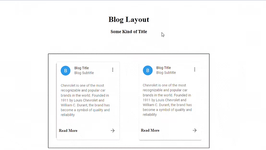
Here’s the result:
 Material UI card layout animation example
Frequently Asked Questions (FAQ)
Can I customize the look of Material UI Cards?
Absolutely! You can change pretty much everything about how a card looks. Colors, shadows, borders, spacing - it's all customizable using the sx prop or custom styles.
Do Material UI Cards work well on mobile devices?
Yes! Cards are responsive by default and will adjust their size based on the screen. Just make sure to set appropriate width values (like maxWidth) to control how they display.
What can I put inside a Material UI Card?
Almost anything! Common elements include:
- Text content
- Images and videos
- Buttons and links
- Icons
- Action areas
- Expandable sections
Are Material UI Cards accessible?
Yes, they're built with accessibility in mind. They work well with screen readers and can be navigated using a keyboard. Just remember to add proper ARIA labels when needed!
How do I handle card interactions like clicking or expanding?
It's pretty straightforward! You can add onClick handlers to the Card or CardActionArea components, and use the Collapse component for expandable content. Check out our examples above to see how it works.
Conclusion
This article demonstrated the significance of Material UI in web applications. We discovered that Material UI Cards are an effective way to present content in a visually appealing and user-friendly manner by describing its features, classes, and variants. They are simple to set up, offer numerous customization options, and can be used to provide a consistent user experience. We also investigated a possible application for Material UI Cards in a simple Blog Page Layout.
I hope you find this article valuable Happy Coding!


