
This article was last updated on December 20, 2024, to include advanced styling techniques for Material UI Select and integration with form libraries like Formik and React Hook Form. Also the introduction is updated for clarity.


Introduction
TL;DR:
Material UI Select is a component to create dropdowns in React that provides native customization options for styles, indicators, decorators, and grouped options.
How to use Material UI Select?
- Import the required components, Select and Option, from @mui/joy:.
- Customize with props like placeholder, defaultValue, and indicator.
- Sx to style for responsive and dynamic designs.
Key Features of Material-UI Select:
- Custom Indicators: Replaces the default dropdown arrow for your icon.
- Decorators: Appending icons or elements before or after the select field.
- Options Grouped Together: A categorization of options contributes towards better usability. 4. Clearable Select: Add a clear button for resetting the selection. 5. - - - Accessibility: Native support for ARIA attributes.
Material UI provides a plethora of available styled components that assist developers in creating responsive and aesthetically pleasing web designs. One of these components is Material UI's Select, which is an input field that showcases a list of customizable options. In this tutorial, we will deeply dive into Material UI Select, look at its prop possibilities, and highlight its features. We will also investigate a potential use case in a real-world application.
What is Material UI
Material UI is a React framework based on Google's Material Design that contains all the tools required to create a web application. Material UI empowers developers to build desktop and mobile web apps for companies by leveraging widely available responsive components. Many developers now use Material UI to structure their projects since it simplifies and improves web design.
The following component categories are available in Material UI: Navigation components, Input components, Data Display components, and Surfaces components. 'Select' is an illustrative example of an Input component.
You can add Material UI to your React project with the following commands:
npm: npm install @mui/material @emotion/react @emotion/styled
yarn: yarn add @mui/material @emotion/react @emotion/styled
Getting Started with Material UI Select
The Material UI Select component displays a pop-up with a list of configurable options. It emulates the traditional <Select></Select element in regular HTML. The built-in props in this component allow you to design interfaces that can be specific to your application's requirements.
Below is a simple illustration of how to use the Material UI Select component in your next React project:
import * as React from "react";
import Select from "@mui/joy/Select";
import Option from "@mui/joy/Option";

export default function topCarBrands() {
  return (
    <Select
      defaultValue="Benz"
      placeholder="Enter Car Brand"
      sx={{
        width: 200,
        height: 50,
      }}
    >
      <Option value="mercedes benz">Mercedes Benz</Option>
      <Option value="tesla">Tesla</Option>
      <Option value="rolls royce">Rolls Royce</Option>
      <Option value="bugatti">Bugatti</Option>
      <Option value="ferrari">Ferrari</Option>
    </Select>
  );
}
The code above showcases a Material UI Select input field with popular car brands as the option values.
Here’s the result:
 Material UI select initial
The Option component
The Option component represents the choosable alternatives in the Select component. The selected option inherits the color prop value from the parent(Select) and, by default, uses the primary palette. It does not, however, inherit the Select variant value.
Here’s a simple illustration of how to combine them:
import * as React from "react";
import Avatar from "@mui/joy/Avatar";
import ListItemDecorator from "@mui/joy/ListItemDecorator";
import ListDivider from "@mui/joy/ListDivider";
import Select from "@mui/joy/Select";
import Option from "@mui/joy/Option";

export default function topCarBrands() {
  return (
    <Select
      defaultValue="1"
      componentsProps={{
        listbox: {
          sx: {
            "--List-decorator-size": "45px",
          },
        },
      }}
      sx={{
        "--List-decorator-size": "45px",
        minWidth: 240,
      }}
    >
      <Option value="1">
        <ListItemDecorator>
          <Avatar size="sm" />
        </ListItemDecorator>
        Chevrolet
      </Option>
      <ListDivider role="none" inset="startContent" />
      <Option value="2">
        <ListItemDecorator>
          <Avatar size="sm" />
        </ListItemDecorator>
        Honda
      </Option>
      <ListDivider role="none" inset="startContent" />
      <Option value="3">
        <ListItemDecorator>
          <Avatar size="sm" />
        </ListItemDecorator>
        Nissan
      </Option>
      <ListDivider role="none" inset="startContent" />
      <Option value="4">
        <ListItemDecorator>
          <Avatar size="sm" />
        </ListItemDecorator>
        Ford
      </Option>
      <ListDivider role="none" inset="startContent" />
      <Option value="5">
        <ListItemDecorator>
          <Avatar size="sm" />
        </ListItemDecorator>
        Fiat
      </Option>
    </Select>
  );
}
The code above showcases a list of car brands as <Option /> values. The ListItemDecorator component creates space between the avatars, while the ListDivider serves as a visual separator.
Here’s the result:
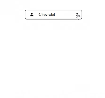 Material UI select option
Other Material UI Select features
Indicator
You can modify the default indicator in the <Select></Select> component by using the indicator prop. The value of the prop can be a string, array, component, or any other React element.
Consider the code below:
import * as React from "react";
import Select, { selectClasses } from "@mui/joy/Select";
import Option from "@mui/joy/Option";
import KeyboardArrowDown from "@mui/icons-material/KeyboardArrowDown";

export default function SelectIndicator() {
  return (
    <Select
      placeholder="what's your favorite car?"
      indicator={<KeyboardArrowDown />}
      sx={{
        width: 240,
        [`& .${selectClasses.indicator}`]: {
          transition: "0.2s",
          [`&.${selectClasses.expanded}`]: {
            transform: "rotate(-180deg)",
          },
        },
      }}
    >
      <Option value="jeep">Jeep</Option>
      <Option value="volkswagen">Volkswagen</Option>
      <Option value="volvo">Volvo</Option>
      <Option value="jaguar">Jaguar</Option>
      <Option value="audi">Audi</Option>
    </Select>
  );
}
In the code above, we used the indicator prop to replace the standard UnfoldMoreIcon with the KeyboardArrowDown icon for the Select options indicator symbol.
Here’s the result:
 Material UI select indicator
Decorator
You can use the startDecorator and endDecorator props to add supporting icons to the Select input field for more context and better emphasis. The startDecorator places the icon at the beginning of the Select field, while the endDecorator places the icon at the end.
Here’s an illustration:
import * as React from "react";
import Select from "@mui/joy/Select";
import Option from "@mui/joy/Option";
import Chip from "@mui/joy/Chip";
import AttachMoneyIcon from "@mui/icons-material/AttachMoney";
import AddCircleIcon from "@mui/icons-material/AddCircle";

export default function SelectDecorators() {
  return (
    <Select
      placeholder="Select a Car…"
      startDecorator={<AttachMoneyIcon />}
      endDecorator={<AddCircleIcon />}
      sx={{ width: 350 }}
    >
      <Option value="porsche">Porsche</Option>
      <Option value="lexus">Lexus</Option>
      <Option value="land rover">Land Rover</Option>
      <Option value="toyota">Toyota</Option>
      <Option value="toyota">Bugatti</Option>
    </Select>
  );
}
The code above depicts a simple Select field with the start and end decorators represented by Material UI's AttachMoneyIcon and AddCircleIcon, respectively.
Here’s the result:
 Material UI select decorator
Grouped Options
Wrap the Option component in the <List /> to group your Select option values. With the ListItem component, you can now provide the Select field with an accompanying label, providing uniform height and the easy use of nested CSS variables.
Consider the code below:
import * as React from "react";
import Select from "@mui/joy/Select";
import Option, { optionClasses } from "@mui/joy/Option";
import Chip from "@mui/joy/Chip";
import List from "@mui/joy/List";
import ListItemDecorator, {
  listItemDecoratorClasses,
} from "@mui/joy/ListItemDecorator";
import ListDivider from "@mui/joy/ListDivider";
import ListItem from "@mui/joy/ListItem";
import Typography from "@mui/joy/Typography";
import Check from "@mui/icons-material/Check";

export default function Demo() {
  const group = {
    Land: ["Car", "Truck", "Train", "Motorcycle", "Bus"],
    Water: ["Ship", "Boat", "Sub Marine"],
    Air: ["Airplane", "Jet", "Helicopter"],
  };
  const colors = {
    Land: "neutral",
    Water: "primary",
    Air: "success",
  };
  return (
    <Select
      placeholder="Choose your transport mode"
      componentsProps={{
        listbox: {
          component: "div",
          sx: {
            maxHeight: 240,
            overflow: "auto",
            "--List-padding": "0px",
          },
        },
      }}
      sx={{ width: 350 }}
    >
      {Object.entries(group).map(([name, transports], index) => (
        <React.Fragment key={name}>
          {index !== 0 && <ListDivider role="none" />}
          <List
            aria-labelledby={`select-group-${name}`}
            sx={{ "--List-decorator-size": "28px" }}
          >
            <ListItem id={`select-group-${name}`} sticky>
              <Typography
                level="body3"
                textTransform="uppercase"
                letterSpacing="md"
              >
                {name} ({transports.length})
              </Typography>
            </ListItem>
            {transports.map((transport) => (
              <Option
                key={transport}
                value={transport}
                label={
                  <React.Fragment>
                    <Chip
                      size="sm"
                      color={colors[name]}
                      sx={{ borderRadius: "xs", mr: 1, ml: -0.5 }}
                    >
                      {name}
                    </Chip>{" "}
                    {transport}
                  </React.Fragment>
                }
                sx={{
                  [`&.${optionClasses.selected} .${listItemDecoratorClasses.root}`]:
                    {
                      opacity: 1,
                    },
                }}
              >
                <ListItemDecorator sx={{ opacity: 0 }}>
                  <Check />
                </ListItemDecorator>
                {transport}
              </Option>
            ))}
          </List>
        </React.Fragment>
      ))}
    </Select>
  );
}
The preceding code shows a Select field with organized input values. As shown below, these values are represented by three modes of transportation (land, air, and water), each with its own set of values. These values are placed in an array that is mapped through to generate the output on the DOM.
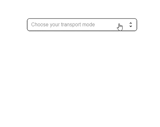 Material UI select grouped
Note: If you wish to specify the maximum height for a list of accessible Select options, simply do so in the listbox component to ensure proper keyboard navigation.
<Select
  optionProps={{
    listbox: {
      sx: {
        maxHeight: 250,
        overflow: 'auto', // to enable scrolling
      }
    }
  }}
>

Clearing the Select field
You can clear the values in the Material UI Select field just like any other input component. Use the IconButton component as a Select decorator, then add the logic that clears the values.
Here’s how:
import React, { useState, useRef } from "react";
import Select from "@mui/joy/Select";
import Option from "@mui/joy/Option";
import IconButton from "@mui/joy/IconButton";
import CloseRounded from "@mui/icons-material/CloseRounded";

export default function SelectBasic() {
  const [value, setValue] = useState("tesla");
  const action = useRef(null);
  return (
    <Select
      action={action}
      value={value}
      placeholder="Favorite car"
      onChange={(e, newValue) => setValue(newValue)}
      {...(value && {
        // When the user has selected a value, the button is displayed, and the select indicator is removed.
        endDecorator: (
          <IconButton
            size="sm"
            variant="plain"
            color="neutral"
            onMouseDown={(event) => {
              // stops the popup from appearing when this button is clicked
              event.stopPropagation();
            }}
            onClick={() => {
              setValue(null);
              action.current?.focusVisible();
            }}
          >
            <CloseRounded />
          </IconButton>
        ),
        indicator: null,
      })}
      sx={{ minWidth: 300 }}
    >
      <Option value="tesla">Tesla</Option>
      <Option value="bmw">BMW</Option>
      <Option value="bentley">Bentley</Option>
      <Option value="bugatti">Bugatti</Option>
    </Select>
  );
}
Here’s the result:
 Material UI select clearing
Accessibility
To make Material UI Select accessible, you must associate it with a label. The FormControl component automatically produces a unique id that ties the Select to the FormLabel component.
Consider the code below:
<FormControl>
  <FormLabel id="select-field-demo-label" htmlFor="select-field-demo-button">
    {/* Define a random label */}
  </FormLabel>
  <Select
    componentsProps={{
      button: {
        id: "select-field-demo-button",
        "aria-labelledby": "select-field-demo-label select-field-demo-button",
      },
    }}
  >
    <Option>...</Option>
  </Select>
</FormControl>
Note that: When making use of FormControl with the outlined variant of the Select component, you must provide a label in two places: in the InputLabel component and the label prop of the Select component.
Building a Sign-up Form UI with React and Material UI Select
You can use Material UI Select for a wide range of purposes on a website, but nothing fully demonstrates its capabilities like a form component. For the sake of this tutorial, we will showcase the use of Material UI Select in a simple Sign-up form.
Here’s the code:
import React, { useState, useRef } from "react";
import Select from "@mui/joy/Select";
import Option from "@mui/joy/Option";
import IconButton from "@mui/joy/IconButton";
import CloseRounded from "@mui/icons-material/CloseRounded";

export default function SelectBasic() {
  const [value, setValue] = useState("tesla");
  const action = useRef(null);
  return (
    <div>
      <section className="login">
        <div className="loginContainer">
          <label>Name</label>
          <input type="text" autoFocus required />
          <label>Email</label>
          <input type="email" required />

          <label>Gender</label>
          <Select
            action={action}
            value={value}
            placeholder="What is your Gender?"
            onChange={(e, newValue) => setValue(newValue)}
            {...(value && {
              // When the user has selected a value, the button is displayed, and the select indicator is removed.
              endDecorator: (
                <IconButton
                  size="sm"
                  variant="plain"
                  color="neutral"
                  backgroundColor="none"
                  onMouseDown={(event) => {
                    // stops the popup from appearing when this button is clicked
                    event.stopPropagation();
                  }}
                  onClick={() => {
                    setValue(null);
                    action.current?.focusVisible();
                  }}
                >
                  <CloseRounded />
                </IconButton>
              ),
              indicator: null,
            })}
            sx={{ minWidth: 300, backgroundColor: "#202124" }}
          >
            <Option value="male">Male</Option>
            <Option value="female">Female</Option>
            <Option value="non-binary">Non-Binary</Option>
            <Option value="other">Other</Option>
            <Option value="no-answer">Prefer not to answer</Option>
          </Select>
        </div>
      </section>
    </div>
  );
}
And the result:
 Material UI select option
Advanced Styling with Material UI Select
Material UI Select has more detailed customization with the sx prop and themes. On this page you can show how to:
- Override default styles for hover, focus, and selected states.
- Integrate custom themes to maintain consistent styling throughout the application.
- Add animations for dropdown behavior or transitions.
<Select
  placeholder="Choose an option"
  sx={{
    borderRadius: "8px",
    boxShadow: "0px 4px 6px rgba(0, 0, 0, 0.1)",
    "&:hover": {
      backgroundColor: "#f0f0f0",
    },
    "& .Mui-selected": {
      fontWeight: "bold",
    },
  }}
>
  <Option value="one">Option One</Option>
  <Option value="two">Option Two</Option>
  <Option value="three">Option Three</Option>
</Select>
Integration with Form Libraries (Formik and React Hook Form)
This section would appeal to developers building forms with validation.
Example with React Hook Form:
import { useForm, Controller } from "react-hook-form";
import Select from "@mui/joy/Select";
import Option from "@mui/joy/Option";

export default function FormWithSelect() {
  const { control, handleSubmit } = useForm();

  const onSubmit = (data) => {
    console.log(data);
  };

  return (
    <form onSubmit={handleSubmit(onSubmit)}>
      <Controller
        name="carBrand"
        control={control}
        defaultValue=""
        render={({ field }) => (
          <Select {...field} placeholder="Select a Car Brand">
            <Option value="tesla">Tesla</Option>
            <Option value="bmw">BMW</Option>
            <Option value="audi">Audi</Option>
          </Select>
        )}
      />
      <button type="submit">Submit</button>
    </form>
  );
}
Conclusion
This article covered the Material UI Select component, navigated its features, and highlighted its functionalities in a React application. We also investigated a use case by developing a Sign-up form UI in React with Material UI Select. I hope you find this post helpful.