
This article was last updated on December 24, 2024, to include advanced techniques for optimizing React-DND performance, such as avoiding unnecessary re-renders, virtualizing large lists, and supporting mobile devices with the Touch Backend, along with simplified explanations for better clarity.
 Drag-and-drop board demo

Introduction
The HTML Drag-and-Drop API is a pioneering feature of the web, whose introduction has inspired developers to find innovative ways of using it to enhance the user experience on their websites.
However, utilizing this API can be challenging, as the implementation demands a significant amount of boilerplate code, which might prove difficult, especially for beginners. Fortunately, libraries like React-Beautiful-DND and React-DND simplify the process.
This article will examine the process of implementing drag-and-drop functionality into a React project using the React-DND library.
Why Refine?
Refine is a headless React-based framework that helps you quickly build CRUD applications such as admin panels, dashboards, and internal tools. The framework provides a collection of helper hooks, components, and data providers that give you full control over your application's user interface.
Refine is a headless framework, meaning it does not come with any pre-designed components or UI elements. Instead, it is designed to integrate seamlessly with any custom designs or UI libraries, such as Ant design, Mantine, and Material design, giving you full control over the appearance of your application's user interface. This allows you to easily tailor your application to match your organization's branding and design standards.
Using Refine in your applications offers many benefits, including:
- A UI-agnostic design that allows for seamless integration with different UI frameworks and custom designs.
- An easy learning curve.
- Backend agnostic, with support for a wide range of backend technologies.
- Built-in support for authentication, state management, data fetching, and routing.
- Open-source, so you don't have to worry about constraints.
Overall, Refine is a powerful and meta framework for building CRUD applications with React.
What is React DND?
React-dnd is a library for implementing complex drag-and-drop functionalities in React. It uses the HTML5 drag-and-drop API and provides a set of hooks that you can use to build drag-and-drop interfaces, with support for both mouse and touch events. With React DnD, you can create complex drag-and-drop interfaces while keeping your components and the overall application architecture highly maintainable.
React-dnd provides a lower-level solution for implementing drag-and-drop functionality in React. Unlike its counterparts that provide pre-made components, React DnD wraps your existing components and injects props into them. This allows it to focus on the core functionality of the react drag-and-drop interface while you concentrate on the visual aspects of the application.
The library is made up of two main hooks: useDrag and useDrop. These are functions that enable drag-and-drop behavior in a React application. They allow you to create draggable elements and drop targets that accept and handle dropped items.
useDrag
The useDrag hook is a function that allows us to create draggable elements that can be moved around the screen. It accepts an object containing the specification of the type of draggable being generated, the item object representing the drag source, what props to collect and more.
Here's an example of how you can use the useDrag hook:
const [{ isDragging }, dragRef] = useDrag({
  item: { type: "item", item: myitem },
  begin: () => {
    console.log("drag began");
  },
  end: (dropResult) => {
    console.log("drag end");
  },
  collect: (monitor) => ({
    isDragging: monitor.isDragging(),
  }),
});
In this example, useDrag is returning two variable, the first one is an object containing the current state of the drag, and the second one is a ref to the draggable element.
The item prop, allows you to define the data that you want to be available during the drag operation, it's recommended to include a type property, to match it with the accept property in useDrop hook.
The collect prop is a callback function that allows you to access the drag-and-drop monitor, which provides information about the current state of the drag. In this case, it collects a single property isDragging which is a boolean indicating whether an item is currently being dragged.
Lastly, the begin and end props are callback functions that are invoked when the drag starts and ends, respectively.
useDrop
The useDrop hook is a function used in conjunction with the useDrag hook, it allows you to create drop targets that can accept items that are being dragged by the users on the screen. It also accepts an object containing the specification of the type of data items the drop-target will accept, what props to collect, and more.
Here's an example of how to use the useDrop hook:
const [{ isOver, canDrop }, dropRef] = useDrop({
  accept: "item",
  drop: (item, monitor) => {
    console.log(`Dropped item: ${JSON.stringify(item)}`);
  },
  collect: (monitor) => ({
    isOver: monitor.isOver(),
    canDrop: monitor.canDrop(),
  }),
});
In this example, the useDrop hook is being used to create a drop target that will accept items of type item.
When an item is dragged over the target, the isOver and canDrop properties of the object returned by the hook will be true, and when the item is dropped, the drop function will be called. In the drop function a log is printed showing the dropped item.
As you can see, the accepted property of the options object passed to the useDrop hook is set to item, which corresponds to the type of item that the drop target will accept.
Getting started with Refine
To set up the example project for this article, we'll use superplate, a command line tool for quickly setting up a React and Refine project, to create a Refine project with pre-defined CRUD pages. This will allow us to set up the project more efficiently and save time, compared to starting from scratch.
To begin, open your computer's command line tool. Navigate to the desired folder or create a new one using the cd command. Then, run the following command to install Refine:
npm create refine-app@latest
The command will prompt you to select your preferences for the project. Refer to the options below as a guide.
✔ Choose a project template · Refine(Next.js)
✔ What would you like to name your project?: · refine-dnd
✔ Choose your backend service to connect: · REST API
✔ Do you want to use a UI Framework?: · Ant Design
✔ Do you want to add example pages?: · Yes
✔ Do you need any Authentication logic?: · No
✔ Do you need i18n (Internationalization) support?: · No
✔ Choose a package manager: · npm
Once the installation is finished, navigate to the newly created project folder using the cd command and run the following command to install react-dnd and its required packages.
npm install react-dnd react-dnd-html5-backend
To start the development server for the project, type and run npm run dev in the terminal. This will automatically open a preview of the app in your default browser. If the preview does not appear automatically, you can manually navigate to it by entering the URL http://localhost:3000 in your browser.
 List of draggable tasks
If everything goes well, you should see a similar page rendered to the browser.
Setting up the dashboard page
The boilerplate project we bootstrapped does not include a dashboard page as a standard feature, so we need to set one up before integrating React DnD.
To begin, navigate to the pages folder and create a new dashBoardPage.tsx file:
You can add the following placeholder code to prevent typescript from throwing an error:
import { Typography } from "antd";

function DashBoardPage() {
  return <Typography>This is the Dashboard page</Typography>;
}

export default DashBoardPage;
Next, open the App.tsx file and import the newly created dashBoardPage.tsx file. Then, add a DashboardPage component to the <Route /> as a element. After that add dashboard to the resources array in the <Refine /> component.
src/App.tsx
import { Refine } from "@refinedev/core";
import { RefineKbar, RefineKbarProvider } from "@refinedev/kbar";

import {
  ErrorComponent,
  useNotificationProvider,
  ThemedLayout,
  ThemedSider,
} from "@refinedev/antd";
import "@refinedev/antd/dist/reset.css";

import routerProvider, {
  DocumentTitleHandler,
  UnsavedChangesNotifier,
} from "@refinedev/react-router";
import dataProvider from "@refinedev/simple-rest";
import { BrowserRouter, Outlet, Route, Routes } from "react-router-dom";
import { Header } from "./components/header";
import { ColorModeContextProvider } from "./contexts/color-mode";
import {
  BlogPostCreate,
  BlogPostEdit,
  BlogPostList,
  BlogPostShow,
} from "./pages/blog-posts";
import {
  CategoryCreate,
  CategoryEdit,
  CategoryList,
  CategoryShow,
} from "./pages/categories";
import DashBoardPage from "./pages/dashboardPage";

function App() {
  return (
    <BrowserRouter>
      <RefineKbarProvider>
        <ColorModeContextProvider>
          <Refine
            dataProvider={dataProvider("https://api.fake-rest.refine.dev")}
            notificationProvider={useNotificationProvider}
            routerProvider={routerProvider}
            resources={[
              {
                name: "dashboard",
                list: "/",
              },
              {
                name: "blog_posts",
                list: "/blog-posts",
                create: "/blog-posts/create",
                edit: "/blog-posts/edit/:id",
                show: "/blog-posts/show/:id",
                meta: {
                  canDelete: true,
                },
              },
              {
                name: "categories",
                list: "/categories",
                create: "/categories/create",
                edit: "/categories/edit/:id",
                show: "/categories/show/:id",
                meta: {
                  canDelete: true,
                },
              },
            ]}
            options={{
              syncWithLocation: true,
              warnWhenUnsavedChanges: true,
            }}
          >
            <Routes>
              <Route
                element={
                  <ThemedLayout
                    Header={() => <Header sticky />}
                    Sider={(props) => <ThemedSider {...props} fixed />}
                  >
                    <Outlet />
                  </ThemedLayout>
                }
              >
                <Route index element={<DashBoardPage />} />
                <Route path="/blog-posts">
                  <Route index element={<BlogPostList />} />
                  <Route path="create" element={<BlogPostCreate />} />
                  <Route path="edit/:id" element={<BlogPostEdit />} />
                  <Route path="show/:id" element={<BlogPostShow />} />
                </Route>
                <Route path="/categories">
                  <Route index element={<CategoryList />} />
                  <Route path="create" element={<CategoryCreate />} />
                  <Route path="edit/:id" element={<CategoryEdit />} />
                  <Route path="show/:id" element={<CategoryShow />} />
                </Route>
                <Route path="*" element={<ErrorComponent />} />
              </Route>
            </Routes>

            <RefineKbar />
            <UnsavedChangesNotifier />
            <DocumentTitleHandler />
          </Refine>
        </ColorModeContextProvider>
      </RefineKbarProvider>
    </BrowserRouter>
  );
}

export default App;
Refer to the documentation to learn about the <Refine /> component.
Lastly, return to the browser and click the Dashboard button in the sidebar. The application should take you to the dashboard page.
 Kanban-style dashboard layout
Now that our project is set up and working as expected, we can go ahead and integrate react-dnd into the project.
Integrating React-dnd
To use react-dnd in our project, we must first wrap the application's root component with the DndProvider.
To do this, go back to the App.tsx file and import the <DndProvider /> and HTML5Backend from the react-dnd and react-dnd-html5-backend packages, respectively.
The import statement will look like this:
import { DndProvider } from  "react-dnd";
import { HTML5Backend } from  "react-dnd-html5-backend";\
react-dnd provides individual backends for creating drag-and-drop interfaces for both touch and non-touch devices. The HTML5 backend package we installed alongside the React-dnd earlier is responsible for handling the latter. It is built on the HTML5 drag-and-drop API, which means it is subject to the same browser limitations and inconsistencies. However, It works fine on most modern browsers and is the most straightforward backend.
Next, wrap the Refine component inside the App.tsx file with <DndProvider /> and pass the HTML5Backend backend as a prop, like so:
...
import { Refine } from  "@refinedev/core";
import { DndProvider } from  "react-dnd";
import { HTML5Backend } from  "react-dnd-html5-backend";

function  App() {

    return (
        <DndProvider backend={HTML5Backend}>
            <Refine
             ...
            />
        </DndProvider>
    );
}

export  default  App;
With that, we've successfully integration react-dnd into our project. Next, we'll move on to creating an example of a kanban board project.
A kanban board is a visual management tool that allows for the efficient organization and management of tasks through the use of draggable items. If you have experience with tools like Trello and Jira, you should be familiar with the concept of a kanban board.
Before implementing the drag-and-drop functionality in our project, we must set up the necessary components and files. These include a cards component and a column component to create the draggable items and droppable elements. We also need a useData hook, enums, and models files, which we'll use to fetch and modify data, define the types of columns and items, and declare the interfaces for the item models, respectively.
To begin, create a folder named "component" within the "src" folder, then add the specified files and folders as shown in the image below. This includes adding the "column.tsx" and "card.tsx" components, as well as a "constants" folder containing "useData.ts", "enums.ts", and "models.ts" files.
It is logical to populate the files within the constant folder first, as they will contain constant codes that will not change throughout this article.
As a first step, open the enums.ts file and add the following code:
export enum ColumnTypes {
  ORDERS = "Orders",
  IN_PROGRESS = "In Progress",
  DELIVERED = "Delivered",
  RETURNED = "Returned",
}

export enum cardType {
  ORDER = "Order",
}
Here, we created two enums, one for column types and the other for item types. The data in the enums file indicates that the kanban board will have four columns for available orders, orders in progress, delivered orders, and returned orders. Each column will have a droppable zone that accepts draggable items of type Order.
Next, go to the models.ts file and add the following code:
import { ColumnTypes } from "./enums";

export interface OrderProps {
  id: number;
  title: string;
  desc: string;
  column: ColumnTypes;
}

export interface dragItem {
  index: number;
  id: OrderProps["id"];
}

export interface IProduct {
  id: number;
  name: string;
  material: string;
  column?: ColumnTypes.ORDERS;
}
In this code, we created two interfaces: one for the properties of each order and their types and the other for the item being dragged.
Lastly, navigate back to the useData.ts hook and add the following code:
import React from "react";
import { ColumnTypes } from "./enums";
import { IProduct } from "components/constants/models";
import { useList } from "@refinedev/core";

function useData() {
  //Fetching data from the products endpoint
  //using Refine's useList hook
  const {
    result: { data },
  } = useList<IProduct>({
    config: {
      pagination: {
        currentPage: 2,
      },
    },
    resource: "products",
  });

  //modifying fetched data and adding column property

  const newArr = data?.map((i: IProduct) => {
    return {
      ...i,
      column: ColumnTypes.ORDERS,
    };
  });

  return [newArr, data?.data];
}

export default useData;
Here, we are using the useList hook from Refine to retrieve data from the "products" endpoint of a fake REST API, which has been assigned to the dataProvider property on the <Refine /> component.
const {
  result: { data },
} = useList<IProduct>({
  config: {
    pagination: {
      currentPage: 2,
    },
  },
  resource: "products",
});
This is basically the same as doing the following, but with the getItem query function from the dataProvider.
fetch("https://api.fake-rest.refine.dev/products");
Then we're modifying the returned data array using the map method and adding a column property to each object in the array.
import { IProduct } from "./constants/models";

const newArr = data?.data.map((i: IProduct) => {
  return {
    ...i,
    column: ColumnTypes.ORDERS,
  };
});
The column property will determine which column an item is a child of. Right now, we're giving every item on the list a column value of Order, which means they'll all be children of the "Orders" column. We'll learn about this in the subsequent sections.
Finally, we're returning the new and old array of data:
return [newArr, data?.data];
That's it for the constants, the next step is to populate both the cards and column components with the necessary codes for visualizing the board and its columns.
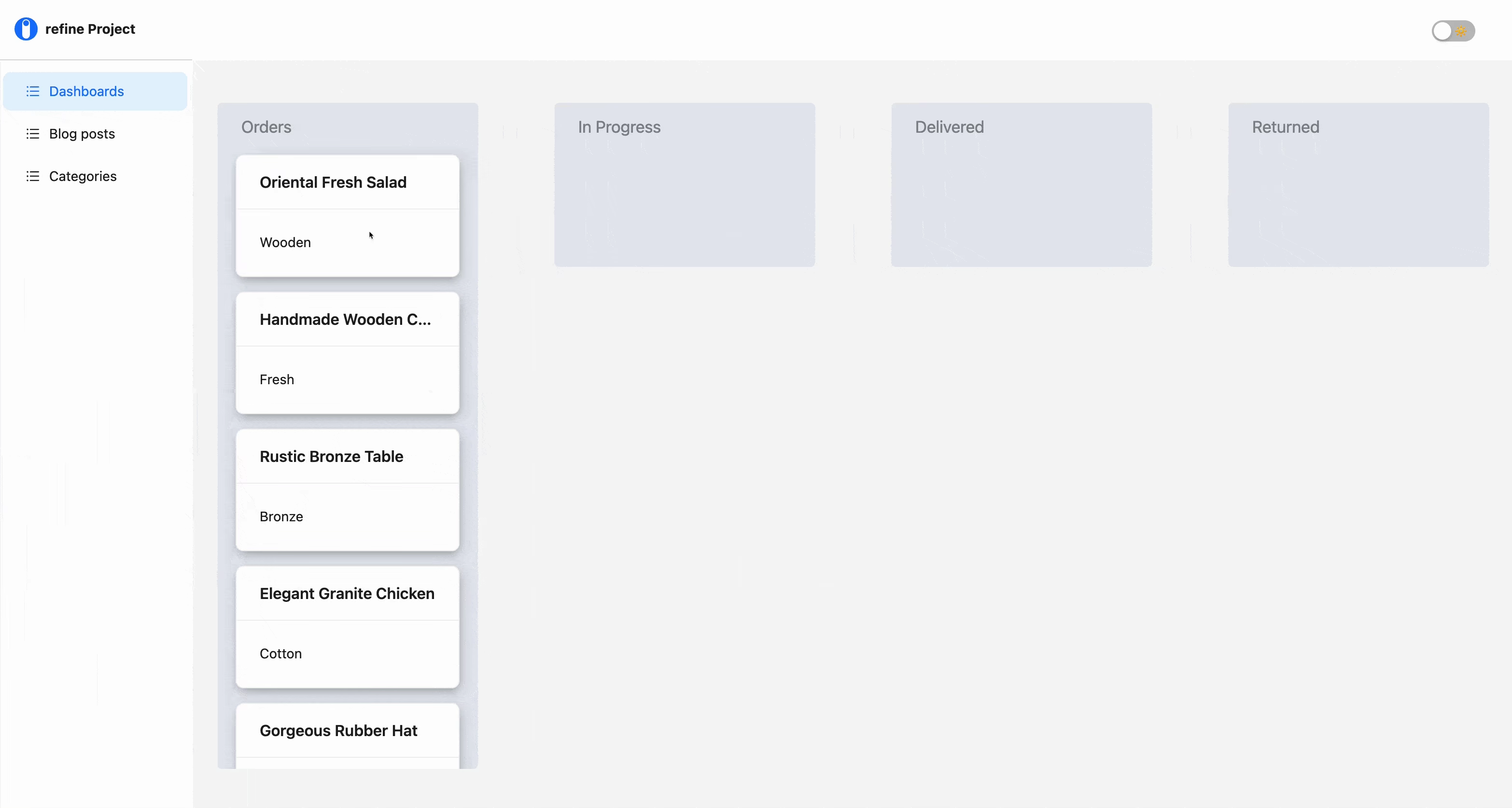
Board composition
As previously stated, the board will consist of four columns for Orders, In_progress, Delivered, and Rejected. To achieve this, we'll compose the column component to accept a name prop and the order cards as children. This allows for the reusability of the component in rendering other columns to the board.
To begin, navigate to the column file and add the following code:
import React from "react";
import { Row, Col } from "antd";

function Column({ children, name }: { children: any; name: string }) {
  return (
    <Row gutter={30}>
      <Col
        style={{
          backgroundColor: "#e3e7ee",
          width: "270px",
          padding: "15px",
          minHeight: "170px",
          maxHeight: "690px",
          borderRadius: "5px",
          overflowY: "scroll",
        }}
      >
        <div
          style={{
            fontSize: "17px",
            marginLeft: "10px",
            marginBottom: "15px",
            color: "#84878c",
          }}
        >
          {name}
        </div>
        <div
          style={{
            width: "100%",
            height: "75%",
            padding: "4px",
          }}
        >
          {children}
        </div>
      </Col>
    </Row>
  );
}

export default Column;
This is a simple component that accepts two props: children and name, and renders them declaratively using Ant design's Row and Col components.
Next, import the column component into the DashboardPage page and render it multiple times with the column types passed to the name prop like so:
import React from "react";
import Column from "../components/column";
import { ColumnTypes } from "../components/constants/enums";
import { Space } from "antd";

function DashboardPage() {
  const { ORDERS, IN_PROGRESS, DELIVERED, RETURNED } = ColumnTypes;

  return (
    <div>
      <Space
        direction="horizontal"
        align="baseline"
        size={109}
        style={{
          display: "flex",
          justifyContent: "center",
          marginTop: "20px",
        }}
      >
        <Column name={ORDERS}>{}</Column>
        <Column name={IN_PROGRESS}>{}</Column>
        <Column name={DELIVERED}>{}</Column>
        <Column name={RETURNED}>{}</Column>
      </Space>
    </div>
  );
}

export default DashboardPage;
Now, if you save your progress and go back to the browser, you should see a similar output to the image provided below.
 Board column composition diagram
Rendering the cards
To render the cards, we'll create a state using the useState hook, with the data from the useData hook passed to it as its initial value. Then, we'll map through to retrieve the name, material, and index values of each object, which will be passed as props to the cards components.
To begin, import the useState hook, cards component, and useData hook inside the DashboardPage file with the following statement:
import React, { useEffect, useState } from 'react'
import { Space } from 'antd'
import Column from '../components/column'
import { ColumnTypes } from '../components/constants/enums'
import useData from '../components/constants/data'

function  DashboardPage() {

  const [newArr, products] = useData();
  const [orders, setOrders] = useState<any[] | undefined>([]);

  //creating side effects based on the data's response.
  useEffect(() => {
    setOrders(newArr);
  }, [products]);

    ...
}

export  default  DashboardPage;
Next, create a function called columnItem below the useState declaration and nest the following code within it:
import Cards from "../components/cards";

// ...

const columnItem = (columnName: string) => {
  return (
    orders &&
    orders
      .filter((order) => order.column === columnName)
      .map((order, index) => (
        <Cards
          key={order.id}
          name={order.name}
          material={order.material}
          setOrders={setOrders}
          index={index}
        />
      ))
  );
};
The code above performs a simple task: it iterates through the state data, passing the relevant properties to the cards component as props.
However, you'll notice the columnItem function takes a columnName parameter, and the state data is filtered before being iterated. This is because we want the cards to be rendered on a single column (Order column) instead of every column on the board.
  const columnItem = (columnName: string) => {
    return (
      orders &&
      orders
        .filter((order) => order.column === columnName)

    // ...
The filter method checks for the column type of each card and renders them to their corresponding columns. As every object in the data array has its "column" property set to Order, the cards will be rendered on the Order column.
Right now, we can't see the cards, that's because we're yet to set up the cards component.
To do so, head over to the cards.tsx file and add the following code:
import React from "react";
import { Card } from "antd";

function Cards({
  name,
  material,
  setOrders,
}: {
  name: string;
  material: string;
  setOrders: any;
  index: number;
}) {
  return (
    <Card
      title={name}
      className="card"
      style={{
        marginBottom: "15px",
        boxShadow: "1px 4px 11px -2px rgba(135,135,135,0.75)",
      }}
    >
      {material}
    </Card>
  );
}

export default Cards;
Likewise the code inside the column component, this is also a simple component that accepts the properties being passed to it from the column component and rendering them using Ant design's card component.
Lastly, go back to the DashboardPage file and pass the columnItem function as children of each columns declared, with their respective column type passed to it as an argument:
import Column from "../components/column";

// ...

<div className="App">
    <Space ... >
        <Column name={ORDERS}>{columnItem(ORDERS)}</Column>
        <Column name={IN_PROGRESS}>{columnItem(IN_PROGRESS)}</Column>
        <Column name={DELIVERED}>{columnItem(DELIVERED)}</Column>
        <Column name={RETURNED}>{columnItem(RETURNED)}</Column>
    </Space>
</div>;
Now, if you save your project go back to the browser, you should see the cards rendered within the orders column like so:
 Rendered draggable cards
Using the useDrag hook
To make our cards draggable, we'll declare the useDrag hook inside the cards component, give it a type and item value, and then pass the dragRef variable to the card component using the ref attribute.
import React from "react";
import { Card } from "antd";
import { cardType } from "./constants/enums";
import { useDrag } from "react-dnd";

function Cards({
  name,
  material,
  setOrders,
}: {
  name: string;
  material: string;
  setOrders: any;
  index: number;
}) {
  const [{ isDragging }, drag] = useDrag({
    type: cardType.ORDER,
    item: { name },
    collect: (monitor) => ({
      isDragging: monitor.isDragging(),
    }),
  });

  return (
    <Card
      ref={drag}
      title={name}
      className="card"
      style={{
        opacity: isDragging ? "0.5" : "1",
        marginBottom: "15px",
        boxShadow: "1px 4px 11px -2px rgba(135,135,135,0.75)",
      }}
    >
      {material}
    </Card>
  );
}

export default Cards;
Here, the cardType enum is utilized to provide the useDrag hook with an order type, while the collect callback function instantiates the monitor method which is used to determine if a card is being dragged. The card's opacity is set to 0.5 during the drag, or to 1 if otherwise.
The steps required to make the cards draggable have been completed. When you return to the browser, you should find that you can now drag each card.
 useDrag hook in action
Next, we'll examine how to use the useDrop hook to create a droppable area within each columns for cards.
Using the useDrop hook
Since droppable zones will be created on each column, it makes sense to declare the useDrop hook within the columns.tsx file.
To begin, open the columns.tsx file and add the following declaration:
import React from "react";
import { Row, Col } from "antd";
import { useDrop } from "react-dnd";
import { cardType } from "./constants/enums";

function Column({ children, name }: { children: any; name: string }) {
  const [{ canDrop, isOver }, dropref] = useDrop({
    accept: cardType.ORDER,
    drop: () => ({
      name,
    }),
    collect: (monitor) => ({
      isOver: monitor.isOver(),
      canDrop: monitor.canDrop(),
    }),
  });

  return (
    <Row gutter={30}>
      <Col
        style={{
          backgroundColor: "#e3e7ee",
          width: "270px",
          padding: "15px",
          minHeight: "170px",
          maxHeight: "690px",
          borderRadius: "5px",
          overflowY: "scroll",
        }}
      >
        <div
          style={{
            fontSize: "17px",
            marginLeft: "10px",
            marginBottom: "15px",
            color: "#84878c",
          }}
        >
          {name}
        </div>
        <div
          ref={dropref}
          style={{
            width: "100%",
            height: "75%",
            padding: "4px",
            border: isOver ? "dashed 1px black" : "  ",
          }}
        >
          {children}
        </div>
      </Col>
    </Row>
  );
}

export default Column;
This declaration is likewise straightforward, all we're doing is passing the Order value to the accept property via the cardType enum, and passing an object with each card name to the drop property.
As explained earlier, the useDrop hook needs to accept a type for the draggable element, in this case, the Order type. If we log the isOver and canDrop variables to the console and try to drop the cards on the adjacent columns, we'll get the following results:
 Dragging cards into drop targets
Note that both methods returns true when the card is hovering over a drop zone, this is because the useDrag and useDrop hooks share the same types. This highlights why the useDrop hook must accept the same value as the useDrag hook's type.
As seen, dropping cards on the columns is not possible yet. An ordering function must be created to reorder each card and change the column type when dropped on a specific column.
To do this, go back to the cards.tsx file and add the following function above the useDrag declaration:
// ..

const orderColumnChange = (CurrentOrder: any, columnName: string) => {
  setOrders((prevState: string[]) => {
    return prevState.map((item: any) => {
      return {
        ...item,
        column: item.name === CurrentOrder.name ? columnName : item.column,
      };
    });
  });
};
Here, we are looping through the previous state and altering the column name of the currently dragged order to that of the column it will be dropped on, making it a child of that column.
Next, we'll create a switch statement that checks which column a card is dropped on and passes its name to the orderColumnChange function created earlier. To accomplish this, scroll down to the useDrag declaration and add an end object with the following callback function:
import { ColumnTypes, cardType } from "./constants/enums";
import { useDrag } from "react-dnd";
import { IProduct } from "./constants/models";

// ...

const [{ isDragging }, drag] = useDrag({
  type: cardType.ORDER,
  item: { name },
  end: (order, monitor) => {
    const dropResult = monitor.getDropResult<IProduct>();

    if (dropResult) {
      const { name } = dropResult;
      const { ORDERS, IN_PROGRESS, DELIVERED, RETURNED } = ColumnTypes;
      switch (name) {
        case ORDERS:
          orderColumnChange(order, ColumnTypes.ORDERS);
          break;
        case IN_PROGRESS:
          orderColumnChange(order, ColumnTypes.IN_PROGRESS);
          break;
        case DELIVERED:
          orderColumnChange(order, ColumnTypes.DELIVERED);
          break;
        case RETURNED:
          orderColumnChange(order, ColumnTypes.RETURNED);
          break;
        default:
          break;
      }
    }
  },
  collect: (monitor) => ({
    isDragging: monitor.isDragging(),
  }),
});
If you save your progress and revisit the browser, you should now be able to drag and drop each card onto any column on the board.
Final drag-and-drop board demoThat's all. We have successfully created a kanban board with draggable cards and columns with drop zones. You can enhance the appearance by adding designs based on the state of each card and column.
Optimizing Performance with React-DND
Performance can become an issue when working with React-DND, especially with a large number of draggable items. Below are some tips to keep things running efficiently:
Avoid Unnecessary Re-Renders
Utilize React.memo or useMemo to avoid unnecessary re-renders. For instance, if your draggable items remain unchanged, memoizing them can save a lot of processing time.
Batch State Updates
When updating multiple items after a drop, batch those updates instead of triggering multiple state changes. This minimizes React’s render cycles.
Minimize the collect Function’s Scope
The collect function in useDrag and useDrop is powerful, but adding excessive logic can degrade performance. Only gather data that’s absolutely necessary.
Virtualize Large Lists
For hundreds of draggable items, consider using libraries like react-window or react-virtualized. These libraries render only the visible items, reducing React’s workload.
By applying these strategies, you’ll achieve a drag-and-drop experience that is both fast and functional.
Error Handling and Debugging
React-DND is a robust library, but you might encounter some common issues. Here’s how to resolve them:
Missing DndProvider
If you forget to wrap your app with DndProvider, nothing will work. Ensure your root component includes it:
import { DndProvider } from "react-dnd";
import { HTML5Backend } from "react-dnd-html5-backend";

function App() {
  return (
    <DndProvider backend={HTML5Backend}>
      <YourApp />
    </DndProvider>
  );
}
Type Mismatches Between useDrag and useDrop
The type property in useDrag must match the accept property in useDrop. Otherwise, the drop zone won’t recognize the dragged item:
const [{ isDragging }, dragRef] = useDrag({ type: "item" });
const [{ isOver }, dropRef] = useDrop({ accept: "item" });
Monitor Data Not Updating
If collect isn’t providing accurate data, ensure you’re returning the correct values from the monitor:
collect: (monitor) => ({ isDragging: monitor.isDragging() });
Debugging these small issues can save significant time. Always refer to the documentation and browser console for detailed error messages.
Mobile Device Support
React-DND’s default backend (HTML5Backend) works well on desktop browsers but struggles on mobile devices. Here’s how to enable drag-and-drop for touchscreens:
Use the Touch Backend
Install the react-dnd-touch-backend package designed for touch devices:
npm install react-dnd-touch-backend
Set Up the Touch Backend
Replace HTML5Backend with TouchBackend in your app’s DndProvider:
import { DndProvider } from "react-dnd";
import { TouchBackend } from "react-dnd-touch-backend";

function App() {
  return (
    <DndProvider backend={TouchBackend}>
      <YourApp />
    </DndProvider>
  );
}
Customize Touch Behavior
You can tweak the touch backend’s settings for better performance, such as adjusting the drag delay:
const backendOptions = {
  enableMouseEvents: true,
  delay: 100,
};

<DndProvider backend={TouchBackend} options={backendOptions}>
  <YourApp />
</DndProvider>;
With these adjustments, your drag-and-drop features will work seamlessly across both desktop and mobile devices.
Conclusion
This article introduced Refine and React-DND, detailing the process of setting up a Refine project with predefined CRUD pages via the Superplate CLI and integrating React-DND. It also covered the creation of a dashboard page featuring a kanban board that utilizes the useDrag and useDrop hooks from React-DND for its drag-and-drop functionality.
Live CodeSandbox Example
npm create refine-app@latest -- --example blog-react-dnd