
This article was last updated on Jun 26, 2024, to add techniques and examples for React search bar and filtering


Introduction
Filtering systems are common for most modern web applications. They are especially useful if there are large amounts of data. They allow users to save time and easily access the information they are looking for.
You will often meet various implementations in e-commerce stores, human resource management systems, video/blogging platforms, and many other sites.
Today we will be building a filtering system that will let us sort the results through filter buttons and custom search queries.
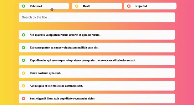
 Final app view
We will use the Refine framework, which is based on React and allows users to build tools rapidly.
Why Refine framework?
Every Refine project is easy to set up since it allows users to use the interactive terminal wizard. It takes less than a minute, with complete user control and no trade-offs between speed and flexibility.
Refine includes a built-in data provider that enables users to connect to any API. The data providers come with built-in support for pagination, sorting, filtering, and other features. Refine also provides some useful hooks and components that make it easier to build the app.
Just like data providers, Refine also provides providers for authentication, authorization, and internationalization etc. These providers are optional and can be easily replaced with custom ones.
Refine is a headless framework, meaning it does not include any UI components by default. This allows users to use any UI library they prefer or even create their own.
App wireframe
The whole application will be wrapped in the layout component.
We will place the filtering UI on the top section of the app. There will be separate filter buttons for different types of content and a search bar, allowing users to narrow down their searches.
The content cards will be listed directly below. When putting everything into the wireframe, we get the following schema:
 Filter UI wireframe
Setting up the Refine
We'll use the npm create refine-app command to interactively initialize the project, which will let us choose the project name, package manager, and other options.
npm create refine-app@latest filtering-tutorial
Select the following optionYs when prompted:
✔ Choose a project template · refine-vite
✔ What would you like to name your project?: · filtering-tutorial
✔ Choose your backend service to connect: · REST API
✔ Do you want to use a UI Framework?: · Headless
✔ Do you want to add example pages?: · No
✔ Do you need any Authentication logic?: · None
✔ Do you need i18n (Internationalization) support?: · No
✔ Choose a package manager: · npm
Once the setup is complete, navigate to the project folder and start your app with:
npm run dev
After the app has started, you should see the following page:
 Welcome Page
Add global styling
Refine is a headless Framework, so it does not include any UI components by default. However, Refine supports all major UI libraries, including Ant Design, Material UI, Mantine, and Chakra UI.
For this tutorial, we selected headless option, so we will create our own UI components. Let's start by adding some global styles.
In order to create the global styles, we will replace the src/App.css file with the following code:
* {
  margin: 0;
  padding: 0;
  box-sizing: border-box;
  font-family: "Montserrat", sans-serif;
}

body {
  padding: 20px;
  height: 100vh;
  background-color: #fee140;
  background-image: linear-gradient(90deg, #fee140 0%, #fa709a 100%);
}
We don't need to import the App.css file anywhere since it is already imported in the src/index.tsx file by default.
Creating the components
In this section, we will create the components that will be used in the app. We will create a filter box, a search bar, and a content card.
Creating a filter box
The filter box will contain the filter buttons. It will be used to select the content based on its type - draft, published, or rejected.
To create the component files, run the following command:
mkdir src/components/filter && touch src/components/filter/index.tsx src/components/filter/index.module.css
After creating the files, we will add the following code to the src/components/filter/index.tsx file:
import styles from "./index.module.css";

const capitalize = (str: string) =>
  str.charAt(0).toUpperCase() + str.slice(1).toLowerCase();

export const Filter = ({
  title,
  isActive,
  onClick,
}: {
  title: string;
  isActive: boolean;
  onClick: React.MouseEventHandler;
}) => {
  return (
    <div
      className={styles.wrapper}
      onClick={onClick}
      style={{ backgroundColor: `${isActive ? "lavender" : "white"}` }}
    >
      <div
        className={styles.circle}
        style={{
          borderColor: `${
            title === "draft"
              ? "gold"
              : title === "rejected"
              ? "tomato"
              : "limegreen"
          }`,
        }}
      ></div>
      <h3 className={styles.title}>{capitalize(title)}</h3>
    </div>
  );
};
We began by importing the style sheet file.
Next, we created a capitalize function that capitalizes the filter name used in the button.
We used the isActive prop to determine if the filter is active and assigned the background color accordingly using JavaScript template syntax.
Additionally, we used the title prop to assign the filter type and give it a specific color tag. The title prop is also used for the name of the filter.
Finally, we used the onClick prop to control the behavior when the filter button is pressed. We will pass it in during the later phase of the tutorial when implementing the main logic.
To style the component, we will add the following code to the src/components/filter/index.module.css file:
.wrapper {
  display: flex;
  padding: 10px 20px;
  margin-bottom: 20px;
  background-color: white;
  align-items: center;
  border-radius: 10px;
  transition: transform 0.2s;
}

.wrapper:hover {
  cursor: pointer;
  transform: scale(1.05);
}

.title {
  text-align: left;
}

.circle {
  display: flex;
  width: 20px;
  height: 20px;
  margin-right: 30px;
  border-radius: 50%;
  border-style: solid;
  border-width: 5px;
}
Initially, we set the flex layout for the component, along with some padding and margin. We then set the background color of the button to white and aligned the items vertically.
Next, we implemented the hover effect, which zooms in the button when the user moves the cursor over it.
We positioned the button's title to the left for the button's contents. For the color tag, we used a flex layout, added static width and height, set some margins, and described the border parameters.
Creating a search bar
The search bar will be used to filter the content based on the user's search queries.
To create the component files, run the following command:
mkdir src/components/search && touch src/components/search/index.tsx src/components/search/index.module.css
After creating the files, we will add the following code to the src/components/search/index.tsx file:
import styles from "./index.module.css";

export const Search = ({
  onChange,
}: {
  onChange: React.ChangeEventHandler;
}) => {
  return (
    <input
      className={styles.search}
      type="text"
      onChange={onChange}
      placeholder="Search by the title ..."
    />
  );
};
We began by importing the style sheet.
Next, we set the input type to text and added placeholder text to be displayed when there is no input. We also used the onChange prop to determine the behavior when the user enters input.
To style the component, we will add the following code to the src/components/search/index.module.css file:
.search {
  width: 100%;
  margin-bottom: 50px;
  padding: 20px;
  border: none;
  border-radius: 10px;
  font-size: 20px;
}
To style the search bar, we made it use all the available width of the parent wrapper, added margin and padding, removed the default border, made the search box rounded, and defined a specific font size.
Content card
The content card will be used to display the content.
To create the component files, run the following command:
mkdir src/components/card && touch src/components/card/index.tsx src/components/card/index.module.css
After creating the files, we will add the following code to the src/components/card/index.tsx file:
import styles from "./index.module.css";

import { motion } from "framer-motion";

export const Card = ({ title, status }: { title: string; status: string }) => {
  return (
    <motion.div
      className={styles.wrapper}
      animate={{ opacity: 1 }}
      initial={{ opacity: 0 }}
      exit={{ opacity: 0 }}
    >
      <div
        className={styles.circle}
        style={{
          borderColor: `${
            status === "draft"
              ? "gold"
              : status === "rejected"
              ? "tomato"
              : "limegreen"
          }`,
        }}
      ></div>
      <h3 className={styles.title}>{title}</h3>
    </motion.div>
  );
};
We began by importing the style sheet.
Next, we imported the framer-motion library to animate the cards when the filters are applied. We passed it to the wrapper div and set it to animate from invisible to fully visible on entry and back to invisible on exit.
We used the status prop to assign a specific color tag to each card.
Finally, we used the title prop to display the content of the card.
To style the component, we will add the following code to the src/components/card/index.module.css file:
.wrapper {
  display: grid;
  grid-template-columns: 50px auto;
  padding: 20px;
  margin-bottom: 20px;
  background-color: white;
  font-weight: bold;
  align-items: center;
  border-radius: 10px;
}

.wrapper:hover {
  cursor: pointer;
}

.circle {
  display: inline-block;
  width: 20px;
  height: 20px;
  border-style: solid;
  border-width: 5px;
  border-radius: 50%;
}
To style the content card, we used a grid layout with two columns, added padding and margin, set the background color to white, bolded the font, centered everything vertically, and assigned slightly rounded borders.
We also improved the user experience by changing the cursor to a pointer when the user hovers over the content cards.
For the color tag, we used an inline-block layout with specified width and height and set custom border properties.
Implementing the logic
Now that we have created the components, we will implement the logic of the app.
To do so, run the following command to create component files:
mkdir src/pages && mkdir src/pages/posts && touch src/pages/posts/index.tsx src/pages/posts/index.module.css
After creating the files, we will add the following code to the src/pages/posts/index.tsx file:
import { useState } from "react";
import { useMany } from "@refinedev/core";
import { motion, AnimatePresence } from "framer-motion";

import { Filter } from "../../components/filter";
import { Search } from "../../components/search";
import { Card } from "../../components/card";

import styles from "./index.module.css";

export const Posts = () => {
  const [inputValue, setInputValue] = useState("");
  const [activeFilter, setActiveFilter] = useState("");

  const posts = useMany<{
    id: number;
    title: string;
    status: string;
  }>({
    resource: "posts",
    ids: Array.from(Array(8).keys()).slice(1),
  }).data?.data;

  const filters: string[] = ["published", "draft", "rejected"];

  return (
    <motion.div>
      <div className={styles.filters}>
        {filters.map((filter, index) => {
          return (
            <Filter
              key={index}
              title={filter}
              isActive={filter === activeFilter}
              onClick={(e: React.MouseEvent) => {
                const el = e.target as HTMLElement;
                el.textContent?.toLowerCase() !== activeFilter
                  ? setActiveFilter(filter)
                  : setActiveFilter("");
              }}
            />
          );
        })}
      </div>
      <Search
        onChange={(e: React.ChangeEvent<HTMLInputElement>) => {
          setInputValue(e.target.value);
        }}
      />
      <AnimatePresence>
        {posts
          ?.filter((el) =>
            el.title.toLowerCase().includes(inputValue.toLowerCase()),
          )
          .filter((e) => e.status.includes(activeFilter))
          .map((post: { title: string; status: string }, index: number) => {
            return <Card key={index} title={post.title} status={post.status} />;
          })}
      </AnimatePresence>
    </motion.div>
  );
};
We first imported the useState hook to track the state of the app. Then we imported the useMany hook from Refine to access the records of the integrated data API.
Then we imported all the components we created in the earlier phase of the tutorial, as well as the framer-motion library for animations and custom style rules to style the layout.
We used the inputValue variable to store the current state of the search input and the activeFilter variable to track the currently active filter.
Next, we accessed the posts route of the API and made sure we fetch data from it. We also created filters array to define the filters that we will be using.
We first looped through all the filter elements and displayed them using the <Filter/> component. We passed the title prop to show the name of the filter, the isActive prop to show whether or not the particular filter is active, and the onClick prop to make an inactive filter active in the case of a click event and the other way around.
Then we displayed the <Search /> component and passed the onChange prop to it, which updates the inputValue variable each time the user enters any value in the search bar.
Finally, we looped through the posts and used the filter method to display only content values that include the results from the currently active search query and includes the type of currently active filter. We passed the title prop to display the content and the status prop to assign the type of each <Card /> component being rendered.
Notice that we also wrapped the whole <Card /> component into the <AnimatePresence /> tags imported from the framer-motion library. Thanks to these tags, we will be able to provide the initial and exit transformations we assigned to the <Card /> component in the previous section.
And that's it! We have successfully implemented the logic of the app. Now let's add some styles to make it look better.
.filters {
  display: grid;
  grid-template-columns: repeat(3, 1fr);
  gap: 20px;
}

@media only screen and (max-width: 650px) {
  .filters {
    grid-template-columns: 1fr;
    gap: 0;
  }
}
To style the filter buttons, we created a grid layout with three equally wide columns and assigned some gap between them.
Next, we added a media rule to the layout to switch to a single column layout for smaller screens. This means that each of the filter buttons will be shown directly above each other. We also removed the gap between them since each individual filter component already comes with a margin on the bottom.
Now that we have implemented the logic and added some styles, let's add the <Posts /> component as a route to the app. To do so, we will replace the content of the src/App.tsx file with the following code:
import { Refine, ErrorComponent } from "@refinedev/core";
import { RefineKbar, RefineKbarProvider } from "@refinedev/kbar";
import dataProvider from "@refinedev/simple-rest";
import routerProvider, {
  UnsavedChangesNotifier,
  DocumentTitleHandler,
} from "@refinedev/react-router";
import { BrowserRouter, Outlet, Route, Routes } from "react-router-dom";

import { Posts } from "./pages/posts";

import "./App.css";

function App() {
  return (
    <BrowserRouter>
      <RefineKbarProvider>
        <Refine
          dataProvider={dataProvider("https://api.fake-rest.refine.dev")}
          routerProvider={routerProvider}
          resources={[{ name: "posts", list: "/" }]}
          options={{
            syncWithLocation: true,
            warnWhenUnsavedChanges: true,
          }}
        >
          <Routes>
            <Route
              element={
                <div
                  style={{
                    maxWidth: "1000px",
                    margin: "0 auto",
                  }}
                >
                  <Outlet />
                </div>
              }
            >
              <Route index element={<Posts />} />
              <Route path="*" element={<ErrorComponent />} />
            </Route>
          </Routes>
          <RefineKbar />
          <UnsavedChangesNotifier />
          <DocumentTitleHandler />
        </Refine>
      </RefineKbarProvider>
    </BrowserRouter>
  );
}

export default App;
This is the root file of the Refine app, where we passed routeProvider for the routing, dataProvider to access the data API, and included the resources on the / route to use the Posts component we created in the previous step of the tutorial.
TIP
Dataproviders are Refine components making it possible to consume different API's and data services conveniently.
Refer to the dataProvider documentation for detailed usage. →
Finally, we used wrapped the routes with div tags to add some styles to the layout.
Testing the app
Check if your development server is still running in the terminal. If it is not run npm run dev to start it again.
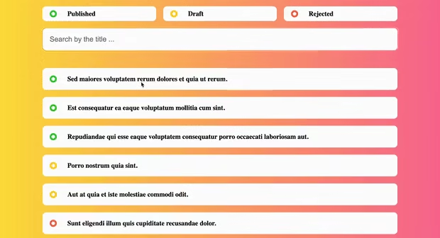
First, we will test the functionality of the filter buttons.
 Filter panel options
If the filter button is pressed, only the corresponding cards of that category is filtered. If the filter is already active and is pressed again, the filter is disabled and all the records are shown.
Now type in some search queries in the search bar.
 Search input with filters
Search results are fully dynamic, meaning the filtering is updated each time you add a new character to the query.
Finally, let's test the app on mobile screen sizes.
 Mobile responsive filter UI
React filtering tips
Filter Optimization for Large Data Volumes
Filtering, when it has a vast data set to go over, can get kind of slow. Here are some things you can do to speed things up:
- Debouncing Input: The debouncing input will prevent the filtering process from triggering for every single character entered or deleted because it.
const debounce = (func, delay) => {
  let timer;
  return function (...args) {
    clearTimeout(timer);
    timer = setTimeout(() => func.apply(this, args), delay);
  };
};

const handleSearch = debounce((query) => {
  // Filtering logic here
}, 300);
- Memoizing Computations: Memorize the results of expensive computations and reuse them when the same input occurs again.
const memoizedFilteredPosts = useMemo(() => {
  return posts.filter((post) => post.title.includes(searchQuery));
}, [posts, searchQuery]);
- Using Virtualization: Render only the items that are currently in the view instead of all the items in a list for performance.
import { FixedSizeList as List } from "react-window";

<List height={500} itemCount={filteredPosts.length} itemSize={50} width={300}>
  {({ index, style }) => <div style={style}>{filteredPosts[index].title}</div>}
</List>;
When Do You Need a Search Bar in React?
Search bars are an essential element in most web applications and will lead a person to a piece of information he is interested in quickly and effectively. The following are some of the most common cases in which a search bar becomes an irreplaceable tool:
1. Large Data Sets
If your application contains lots of data, such as a database of products, articles, or user profiles, then a search bar helps the user find their desired item without having to scroll through many lists.
Example:
- E-commerce websites where users search for products by name, category, or brand.
- Blogs or news sites where users search articles through keywords or tags.
2. Dynamic Content Filtering
A search bar is used to filter dynamic content, where when a user inputs a text query, the content gets updated in real-time to represent only the relevant items, providing a more interactive and user-friendly experience.
Example:
- Job portals where users search job listings based on titles, locations, and companies.
- Online marketplaces where users filter products based on search terms and categories.
3. User Directories
A search bar in applications that have a large number of users will come in handy when there is a particular person or persons whom the user is in search of. This is useful in a social networking site, enterprise applications, or CRM systems.
Example:
- Social networking websites on which users seek friends or connections.
- Firm intranets where staff lookup coworkers by name or department.
4. Navigation and Quick Access
Another use of a search bar is for navigating an application or easily and quickly accessing some particular feature. Doing so improves the overall user experience by reducing the hassles one might go through to get certain features or parts within the app.
Example:
- Dashboard applications in which users query for specific reports, data points, or tools.
- Content management systems through which users quickly visit specific pages or posts.
5. Autocomplete and Suggestions
In most of the search bars, there is an implementation with autocomplete and suggestions; this provides an improvement in user experience, and in fact, instant feedback is available. In general, it shortens the work time of typing, which makes a great deal of convenience for the user. It is especially very useful for applications for which users may not know the precise term they are looking for.
Example:
- Search engines that provide suggestions on queries as the user types them.
- Form fields with an autosuggest of options based on partial input: Address forms, tag selectors.
6. Filters and Sorting Options
The search bar, combined with the other filter and sort functions, allows users to filter results with many different criteria. This will make the data manageable and easily accessible.
Example:
- A music and video streaming service where users search for content by a title, genre or artist.
- Real estate listings with users performing property searches by location, price, and features.
The search bar is, in essence, a flexible and powerful tool within React applications that adds to the user experience of finding, filtering, and interacting with high volumes of information. From e-commerce to content management, directories of users to navigation, this will make your applications more usable and functional.
Bonus: Using npm Packages for React Search Bar
There are several npm packages available that can help you create a search bar in your React application quickly and efficiently. Here are some popular ones along with brief descriptions and examples of how to use them:
1. react-search-input
This is a simple and lightweight component that allows you to create a search bar with minimal configuration.
Installation:
npm install react-search-input
Usage:
import React, { useState } from "react";
import SearchInput, { createFilter } from "react-search-input";

const KEYS_TO_FILTERS = ["name", "description"];

const App = () => {
  const [searchTerm, setSearchTerm] = useState("");
  const data = [
    { name: "Apple", description: "A type of fruit" },
    { name: "Banana", description: "A type of fruit" },
    // Add more items
  ];

  const filteredData = data.filter(createFilter(searchTerm, KEYS_TO_FILTERS));

  return (
    <div>
      <SearchInput
        className="search-input"
        onChange={(term) => setSearchTerm(term)}
        placeholder="Search..."
      />
      <ul>
        {filteredData.map((item, index) => (
          <li key={index}>
            {item.name} - {item.description}
          </li>
        ))}
      </ul>
    </div>
  );
};

export default App;
2. react-select
react-select is a flexible and powerful package that provides a customizable select box with support for search functionality.
Installation:
npm install react-select
Usage:
import React from "react";
import Select from "react-select";

const options = [
  { value: "apple", label: "Apple" },
  { value: "banana", label: "Banana" },
  // Add more options
];

const App = () => {
  const handleChange = (selectedOption) => {
    console.log("Selected:", selectedOption);
  };

  return (
    <Select options={options} onChange={handleChange} placeholder="Search..." />
  );
};

export default App;
3. downshift
downshift is a flexible package for building autocomplete, combobox, dropdown, and select components.
Installation:
npm install downshift
Usage:
import React from "react";
import { useCombobox } from "downshift";

const items = ["Apple", "Banana", "Orange", "Grapes"];

const App = () => {
  const {
    isOpen,
    getMenuProps,
    getInputProps,
    getComboboxProps,
    getItemProps,
    highlightedIndex,
    selectedItem,
  } = useCombobox({
    items,
    onSelectedItemChange: ({ selectedItem }) => {
      console.log("Selected:", selectedItem);
    },
  });

  return (
    <div {...getComboboxProps()}>
      <input {...getInputProps()} placeholder="Search..." />
      <ul {...getMenuProps()}>
        {isOpen &&
          items.map((item, index) => (
            <li
              {...getItemProps({ item, index })}
              key={index}
              style={{
                backgroundColor:
                  highlightedIndex === index ? "lightgray" : "white",
                fontWeight: selectedItem === item ? "bold" : "normal",
              }}
            >
              {item}
            </li>
          ))}
      </ul>
    </div>
  );
};

export default App;
4. react-autosuggest
react-autosuggest is a popular library for creating an autosuggest or autocomplete input field.
Installation:
npm install react-autosuggest
Usage:
import React, { useState } from "react";
import Autosuggest from "react-autosuggest";

const languages = [
  { name: "C" },
  { name: "C++" },
  { name: "JavaScript" },
  // Add more items
];

const App = () => {
  const [value, setValue] = useState("");
  const [suggestions, setSuggestions] = useState([]);

  const onSuggestionsFetchRequested = ({ value }) => {
    setSuggestions(getSuggestions(value));
  };

  const onSuggestionsClearRequested = () => {
    setSuggestions([]);
  };

  const getSuggestions = (value) => {
    const inputValue = value.trim().toLowerCase();
    const inputLength = inputValue.length;

    return inputLength === 0
      ? []
      : languages.filter(
          (lang) =>
            lang.name.toLowerCase().slice(0, inputLength) === inputValue,
        );
  };

  const getSuggestionValue = (suggestion) => suggestion.name;

  const renderSuggestion = (suggestion) => <div>{suggestion.name}</div>;

  return (
    <Autosuggest
      suggestions={suggestions}
      onSuggestionsFetchRequested={onSuggestionsFetchRequested}
      onSuggestionsClearRequested={onSuggestionsClearRequested}
      getSuggestionValue={getSuggestionValue}
      renderSuggestion={renderSuggestion}
      inputProps={{
        placeholder: "Type a programming language",
        value,
        onChange: (e, { newValue }) => setValue(newValue),
      }}
    />
  );
};

export default App;
By using these npm packages, you can easily add a search bar with powerful features to your React application.
Conclusion
In this tutorial, we first designed the overall layout for the app, then set up the Refine project and created the global style rules. Then we created the individual components, put together the logic, and passed it to the Refine app.
Two different types of content filtering (filter buttons and search bar) were implemented. In order to improve the overall user experience, we used the Framer motion library to add some great animations.
Feel free to modify the app with your own custom features. Play around with different color schemes, layouts, and font families. Also, since Refine comes with a rich data provider, feel free to extend the content card with description, author, dates, or even images.
Example
npm create refine-app@latest -- --example blog-refine-filtering