


Introduction:
React is a well-known front-end framework used to create interactive user interfaces. It has aided in the building of data-intensive front-end applications like admin dashboards, and analytics applications, among others. However, in building these applications, there exists a tedious, repetitive process that usually comprises the setup of the boilerplate application, the application design, styling, API Client setup, server state, and client state management setup, amongst others.
Refine is a React-based front-end application framework that eliminates these tedious, repetitive processes. It is a "headless" framework by design, which implies that it is not opinionated about your styling and design choices. It has built-in router providers for the most popular React routing libraries, like React Router, Next.js Router, React Location and Remix Router, and is shipped with integrations of popular component libraries and design systems, like Ant Design, Material UI, Chakra UI, and Mantime. It also contains hooks and providers, that allow for data management and easy integration with custom backend APIs and popular backend services such as Appwrite, Hasura, Strapi, and others.
In this tutorial, we will be building a React admin dashboard application using Refine and highlighting the features of Refine that may convince you to use Refine to build your next frontend React admin application.
You can find the live example demo here
Why use Refine?
Refine as a framework of React is headless in design. this implies that you can build an app with Refine with so much customization or you can integrate component libraries like Ant Design, Material UI, Chakra UI, and Mantime into your application with less difficulty.
Refine creates a higher abstraction of functionalities like authentication, routing, client state management, internationalization and many more. You can integrate external API services and BAAS(Backend as a service) with little effort and you are sure of building scalable applications without the unnecessary overhead accompanied with building applications from scratch.
A short note on migrating from Refine 3 to Refine 4
Recently, the Refine team decided to address and tackle most of the issues raised by the community on Refine version 3 such as developer experience and core functionality issues by releasing Refine version 4 which addresses those issues while also adding new functionality to the framework. Some of the significant changes and improvements added to the new version are:
- Codemod support: The addition of codemod to the Refine core package implies that one can easily migrate from Refine version 3 to Refine version 4 with a single command on the root directory of your project:
npx @refinedev/codemod@latest refine3-to-refine4
The command above handles the changes on your existing project and ensures that you do not manually update the project with those changes. Pretty awesome right?
New NPM Organization: The Refine NPM organization changes from
@pankodto@refinedevthus implies that the package name for Refine changes to@refinedevautomatically.Enterprise based Routing and Router independence: In Refine version 4, the
routerProvideracts solely a bridge between the router and Refine and doesn’t specify the manner at which routes are created as opposed to version 3. Routes are detached from Refine and are more flexible and customizable.
In order to view more on the updates on Refine version 4, refer to the comprehensive guide on the documentation. Its guide is comprehensive enough to get you up to speed in using the new version.
Building A Refine Admin Dashboard – A Food delivery React Admin dashboard
In this article, we will be building a food delivery React admin dashboard in order to illustrate how you can build your next react-based admin dashboard with refine.
Setting up/Bootstrapping the Refine Application.
To create our Refine application for this article, we will use the refine CLI. The CLI generates a project with the basic structure and configurations of refine. In order to use it, launch your terminal and type the following command:
npm create refine-app@latest -- -o refine-antd refine-react-admin-dashboard
On the command above, we used the refine-antd prefix because we will be building our application using ant-design.
N/B: If you wish to utilize other component library types like chakra-ui, material-ui, headless or mantime, you can always change the prefix to either refine-chakra-ui, refine-mui, refine-headless, or refine-mantine. However, we will be using the ant-design Component library for the course of this tutorial.
On running the command, we should see a menu on the terminal as shown below:
 Refine CLI project setup prompt
Following installation, we will go into our newly created project directory and execute the following command:
npm run dev
The Refine application should be up on http://localhost:3000 after you run the command. To access it, go to
 Finefoods dashboard welcome screen
Add properties to component
So, we will navigate to the App.tsx file under the src folder and see the code bootstrapped for us on creating the Refine application.
import { GitHubBanner, Refine, WelcomePage } from "@refinedev/core";
import { RefineKbar, RefineKbarProvider } from "@refinedev/kbar";

import { useNotificationProvider } from "@refinedev/antd";
import "@refinedev/antd/dist/reset.css";

import routerProvider, {
  UnsavedChangesNotifier,
} from "@refinedev/react-router";
import dataProvider from "@refinedev/simple-rest";
import { BrowserRouter, Route, Routes } from "react-router-dom";
import { ColorModeContextProvider } from "./contexts/color-mode";

function App() {
  return (
    <BrowserRouter>
      <GitHubBanner />
      <RefineKbarProvider>
        <ColorModeContextProvider>
          <Refine
            notificationProvider={useNotificationProvider}
            routerProvider={routerProvider}
            dataProvider={dataProvider("https://api.fake-rest.refine.dev")}
            options={{
              syncWithLocation: true,
              warnWhenUnsavedChanges: true,
            }}
          >
            <Routes>
              <Route index element={<WelcomePage />} />
            </Routes>
            <RefineKbar />
            <UnsavedChangesNotifier />
          </Refine>
        </ColorModeContextProvider>
      </RefineKbarProvider>
    </BrowserRouter>
  );
}

export default App;
In the code above, we can see that the app comes preconfigured with providers such as
the ColorModeContextProvider, dataProvider, notificationProvider and many others. Also, there is a new addition of BrowserRouter, Route, Routes imports from react-router-dom. This goes in line with what was explained on the previous section on Refine version 4 detaching the Routes from Refine in order to give more flexibility and customizability.
However, in building our food delivery React admin dashboard application, we will add providers that handles data Management and Authentication as well as add routes for the auth pages and dashboard.
Adding the Data Provider
A dataProvider in Refine simply allows application to communicate with an external API or service. A dataProvider uses predefined methods to send HTTP requests and receive responses as below.
The jsonServerDataProvider Provider in Refine
The jsonServerDataProvider provider was introduced in Refine version 4 as a replacement of the dataProvider of the simple-rest dependency of the Refine core package. The provider will handle the HTTP requests we will make on our application.
So, we will update the contents of to the app.tsx in the src directory with the code below:
...
// highlisght-next-line
import jsonServerDataProvider from "@refinedev/simple-rest";

function App() {
  const API_URL = "https://api.finefoods.refine.dev";
  const dataProvider = jsonServerDataProvider(API_URL);

  return (
    <BrowserRouter>
           ...
          <Refine
           ...
            dataProvider={dataProvider}
          >
            ...
    </BrowserRouter>
  );
}

export default App;
In the course of the tutorial, we will be using Refine's demo finefoodsAPI (https://api.finefoods.refine.dev) in building the application. In the code above, we added the API to our jsonServerDataProvider .
Adding the Auth provider
An Auth Provider in Refine contains predefined methods that handle authentication and access control on the application. the predefined methods are shown below:
import { AuthProvider } from "@refinedev/core";

const authProvider: AuthProvider = {
  // required methods
  login: async (params: any) => ({}),
  check: async (params: any) => ({}),
  logout: async (params: any) => ({}),
  onError: async (params: any) => ({}),
  // optional methods
  register: async (params: any) => ({}),
  forgotPassword: async (params: any) => ({}),
  updatePassword: async (params: any) => ({}),
  getPermissions: async (params: any) => ({}),
  getIdentity: async (params?: any) => ({}),
};
In order to add an authProvider to our application, we create a file authProvider.ts file in the src/authProvider.ts directory. We then map the prefined methods for an authProvider in Refine into the authProvider.ts file. This is as shown in the code below:
src/authProvider.ts
import { AuthProvider } from "@refinedev/core";
import { notification } from "antd";

export const TOKEN_KEY = "refine-auth";

export const authProvider: AuthProvider = {
  login: async ({ email, password }) => {
    localStorage.setItem(TOKEN_KEY, `${email}-${password}`);
    return {
      success: true,
      redirectTo: "/",
    };
  },
  register: async ({ email, password }) => {
    try {
      await authProvider.login({ email, password });
      return {
        success: true,
      };
    } catch (error) {
      return {
        success: false,
        error: new Error("Invalid email or password"),
      };
    }
  },
  updatePassword: async () => {
    notification.success({
      message: "Updated Password",
      description: "Password updated successfully",
    });
    return {
      success: true,
    };
  },
  forgotPassword: async ({ email }) => {
    notification.success({
      message: "Reset Password",
      description: `Reset password link sent to "${email}"`,
    });
    return {
      success: true,
    };
  },
  logout: async () => {
    localStorage.removeItem(TOKEN_KEY);
    return {
      success: true,
      redirectTo: "/login",
    };
  },
  onError: async (error) => {
    console.error(error);
    return { error };
  },
  check: async () => {
    const token = localStorage.getItem(TOKEN_KEY);
    if (token) {
      return {
        authenticated: true,
      };
    }

    return {
      authenticated: false,
      error: new Error("Invalid token"),
      logout: true,
      redirectTo: "/login",
    };
  },
  getPermissions: async () => null,
  getIdentity: async () => {
    const token = localStorage.getItem(TOKEN_KEY);
    if (!token) {
      return null;
    }

    return {
      id: 1,
      name: "James Sullivan",
      avatar: "https://i.pravatar.cc/150",
    };
  },
};
Next, we will import authProvider.tsx into the App.tsx file.
Creating the Authentication Page
To create the Authentication Page which will serve for both login and register actions, we will create a file index.tsx in src/pages/auth directory. In this file, we will add the block of code below:
import { AuthPage as AntdAuthPage, AuthProps } from "@refinedev/antd";
import { Link } from "react-router-dom";

const authWrapperProps = {
  style: {
    background:
      "radial-gradient(50% 50% at 50% 50%,rgba(255, 255, 255, 0) 0%,rgba(0, 0, 0, 0.5) 100%),url('images/login-bg.png')",
    backgroundSize: "cover",
  },
};

const renderAuthContent = (content: React.ReactNode) => {
  return (
    <div
      style={{
        maxWidth: 408,
        margin: "auto",
      }}
    >
      <Link to="/">
        <img
          style={{ marginBottom: 26 }}
          src="/images/fine-foods-login.svg"
          alt="Finefoods logo"
          width="100%"
        />
      </Link>
      {content}
    </div>
  );
};

export const AuthPage: React.FC<AuthProps> = ({ type, formProps }) => {
  return (
    <AntdAuthPage
      type={type}
      wrapperProps={authWrapperProps}
      renderContent={renderAuthContent}
      formProps={formProps}
    />
  );
};
In the code above, we created a component AuthPage where we used the AntdAuthPage component provided by @refinedev/antd, which holds the authentication page's form and inputs. The renderAuthContent and authWrapperProps functions as page wrappers and layouts. The type and formProps parameters are accepted by the page component. The type specifies the page's type (whether a login page or register page). while the formProps specifies the initialValues that can be added to the AntdAuthPage component's form inputs if any exist.
Next, we will import the AuthPage into the into the App.tsx file and add the code below:
src/App.tsx
import { GitHubBanner, Refine, Authenticated } from "@refinedev/core";
import { RefineKbar, RefineKbarProvider } from "@refinedev/kbar";
import { WelcomePage, useNotificationProvider } from "@refinedev/antd";
import "@refinedev/antd/dist/reset.css";
import routerProvider, {
  UnsavedChangesNotifier,
} from "@refinedev/react-router";
import jsonServerDataProvider from "@refinedev/simple-rest";
import { BrowserRouter, Route, Routes, Outlet } from "react-router-dom";
import { ColorModeContextProvider } from "./contexts/color-mode";
import { authProvider } from "authProvider";
import { AuthPage } from "pages/auth";

function App() {
  const API_URL = "https://api.finefoods.refine.dev";
  const dataProvider = jsonServerDataProvider(API_URL);

  return (
    <BrowserRouter>
      <GitHubBanner />
      <RefineKbarProvider>
        <ColorModeContextProvider>
          <Refine
            notificationProvider={useNotificationProvider}
            routerProvider={routerProvider}
            authProvider={authProvider}
            dataProvider={dataProvider}
            options={{
              syncWithLocation: true,
              warnWhenUnsavedChanges: true,
            }}
          >
            <Routes>
              <Route index element={<WelcomePage />} />
              <Route
                element={<Authenticated fallback={<Outlet />}></Authenticated>}
              >
                <Route
                  path="/login"
                  element={
                    <AuthPage
                      type="login"
                      formProps={{
                        initialValues: {
                          email: "demo@refine.dev",
                          password: "demodemo",
                        },
                      }}
                    />
                  }
                />
                <Route
                  path="/register"
                  element={
                    <AuthPage
                      type="register"
                      formProps={{
                        initialValues: {
                          email: "demo@refine.dev",
                          password: "demodemo",
                        },
                      }}
                    />
                  }
                />
              </Route>
            </Routes>
            <RefineKbar />
            <UnsavedChangesNotifier />
          </Refine>
        </ColorModeContextProvider>
      </RefineKbarProvider>
    </BrowserRouter>
  );
}

export default App;
In the code above, we created routes for login, register using the AuthPage imported into the App.tsx file. We also included the <Authenticated/> component which is a component form of the useIsAuthenticated hook which saves the authentication status of the user. The component is used when you want to render a fallback or redirect to a certain page where the authentication status of the user is either true or false. The view of the login and register pages are shown below:
 Finefoods login page
In the previous code, we added the <Authenticated/> component to our login and register routes but did not include a fallback because the fallback for the <Authenticated/> component is to be redirected to the dashboard page (an authenticated user should be redirected to the dashboard page). We are still in the process of building the dashboard page and we will go in depth into it in the next section.
Creating The Dashboard Page
An Overview of the Dashboard:
The application which is a Food delivery React admin dashboard will display 5 sections namely:
- Daily Revenue section: Displays the daily revenue of the application.
- Daily Orders Section: Displays the daily orders in the application.
- New Customers Section: Displays the new customers ordering from the application.
- Order Timeline Section:Displays the timeline of orders in the format of either pending, completed or cancelled.
- Delivery Map Section: Displays the application's delivery map.
So, on obtaining the information about this section of the application, we will now create the Dashboard Page index.tsx file in the src/pages/Dashboard directory and add the block of code shown below:
src/pages/Dashboard/index.tsx
import { Row, Col, Card, Typography } from "antd";
const { Text } = Typography;

const dashboardCardStyles = {
  dailyRevenue: {
    bodyStyle: {
      padding: 10,
      paddingBottom: 0,
    },
    style: {
      background: "url(images/daily-revenue.png)",
      backgroundRepeat: "no-repeat",
      backgroundPosition: "right",
      backgroundSize: "cover",
    },
  },

  dailyOrders: {
    bodyStyle: {
      padding: 10,
      paddingBottom: 0,
    },
    style: {
      background: "url(images/daily-order.png)",
      backgroundRepeat: "no-repeat",
      backgroundPosition: "right",
      backgroundSize: "cover",
    },
  },

  newCustomers: {
    bodyStyle: {
      padding: 10,
      paddingBottom: 0,
    },
    style: {
      background: "url(images/new-orders.png)",
      backgroundRepeat: "no-repeat",
      backgroundPosition: "right",
      backgroundSize: "cover",
    },
  },

  deliveryMap: {
    bodyStyle: {
      height: 550,
      padding: 0,
    },
  },

  orderTimeline: {
    bodyStyle: {
      height: 550,
      overflow: "scroll",
    },
  },
};

export const DashboardPage: React.FC = () => {
  return (
    <Row gutter={[16, 16]}>
      <Col md={24}>
        <Row gutter={[16, 16]}>
          <Col xl={10} lg={24} md={24} sm={24} xs={24}>
            <Card
              bodyStyle={dashboardCardStyles.dailyRevenue.bodyStyle}
              style={dashboardCardStyles.dailyRevenue.style}
            >
              <></>
            </Card>
          </Col>

          <Col xl={7} lg={12} md={24} sm={24} xs={24}>
            <Card
              bodyStyle={dashboardCardStyles.dailyOrders.bodyStyle}
              style={dashboardCardStyles.dailyOrders.style}
            >
              <></>
            </Card>
          </Col>

          <Col xl={7} lg={12} md={24} sm={24} xs={24}>
            <Card
              bodyStyle={dashboardCardStyles.newCustomers.bodyStyle}
              style={dashboardCardStyles.newCustomers.style}
            >
              <></>
            </Card>
          </Col>
        </Row>
      </Col>
      <Col xl={17} lg={16} md={24} sm={24} xs={24}>
        <Card
          bodyStyle={dashboardCardStyles.deliveryMap.bodyStyle}
          title={<Text strong>Delivery map</Text>}
        >
          <></>
        </Card>
      </Col>
      <Col xl={7} lg={8} md={24} sm={24} xs={24}>
        <Card
          bodyStyle={dashboardCardStyles.orderTimeline.bodyStyle}
          title={
            <Text strong style={{ textTransform: "capitalize" }}>
              Timeline
            </Text>
          }
        >
          <></>
        </Card>
      </Col>
    </Row>
  );
};
In the code above, we divided the page into 5 columns and styled the columns appropriately.
We will dive into creating the <DailyRevenue/>, <DailyOrders/>, <NewCustomers/>, <DeliveryMap/> and the <OrderTimeline/>, components which will occupy the columns.
Building the daily revenue component
The daily revenue component will be made up of two components
- The component that styles the daily revenue component
- The daily revenue component with its business logic.
Before creating these components, there are packages we need to install for these components.
- Emotion: This package will help us style the components. To get more information on how to use emotion, visit here.
to install, type the command below:
npm i @emotion/react @emotion/styled
- Ant design charts: This package will be used on the daily revenue component for visualization tool of the daily revenue in the form of a chart. To get more insight on how to use this packagr, visit here.
to install, type the commands below;
npm i @ant-design/charts
After installing these dependencies, we create a styled.tsx file in the src/components/dashboard/dailyRevenue directory and add the appropriate styling as shown in the code below:
src/components/dashboard/dailyRevenue/styled.tsx
import styled from "@emotion/styled";
import { DatePicker } from "antd";

export const DailyRevenueWrapper = styled.div`
  height: 232px;
  display: flex;
  flex-direction: column;
  justify-content: space-between;
`;

export const TitleArea = styled.div`
  display: flex;
  justify-content: space-between;
  align-items: flex-start;
`;

export const TitleAreaAmount = styled.div`
  display: flex;
  flex-direction: column;

  h3,
  span {
    color: #ffffff !important;
    margin-bottom: 0 !important;
  }

  @media screen and (max-width: 576px) {
    span {
      font-size: 16px !important;
      line-height: 1.2;
    }
  }
`;

export const TitleAreNumber = styled.div`
  display: flex;
  align-items: center;
  line-height: 1;

  img {
    margin-left: 5px;
  }

  @media screen and (max-width: 576px) {
    span {
      font-size: 30px !important;
      line-height: 0.9;
    }
  }
`;

export const RangePicker = styled(DatePicker.RangePicker)`
  height: 35px;
  float: "right";
  color: "#fffff !important";
  background: "rgba(255, 255, 255, 0.3)";

  .ant-picker-input > input {
    color: #ffffff !important;
  }

  &.ant-picker-focused {
    .ant-picker-separator {
      color: #ffffff;
    }
  }

  .ant-picker-separator,
  .ant-picker-suffix {
    color: #ffffff;
  }
`;
Before we going to creating the core dailyRevenue component, let's explain what we are trying to achieve.
- We will import the styles into the
dailyRevenuecomponent. - We will fetch the daily revenue data from the API
- We will Add a date picker which we can use to get the daily revenue of date ranges.
- We will visualize the daily revenue using the ant-design chart library
- We will memoize the daily revenue values represented on the chart to optimize performance.
In order to know the type of data we will be working with, we will create types for the response data. create a index.d.ts file in the src/interfaces directory and add the code below:
export interface ISalesChart {
  date: string;
  title: "Order Count" | "Order Amount";
  value: number;
}
Now, we create the dailyRevenue component. create an index.tsx file in the src/components/dashboard/dailyRevenue directory and add the code below:
src/components/dashboard/dailyRevenue/index.tsx
import { useMemo, useState } from "react";
import { useApiUrl, useCustom } from "@refinedev/core";
import { NumberField } from "@refinedev/antd";
import { Typography } from "antd";
import Line, { LineConfig } from "@ant-design/plots/lib/components/line";
import dayjs, { Dayjs } from "dayjs";

import { IncreaseIcon, DecreaseIcon } from "components/icons";

import { ISalesChart } from "interfaces";
import {
  DailyRevenueWrapper,
  TitleAreNumber,
  TitleArea,
  TitleAreaAmount,
  RangePicker,
} from "./styled";

export const DailyRevenue: React.FC = () => {
  const API_URL = useApiUrl();

  const [dateRange, setDateRange] = useState<[Dayjs, Dayjs]>([
    dayjs().subtract(7, "days").startOf("day"),
    dayjs().startOf("day"),
  ]);
  const [start, end] = dateRange;

  const query = {
    start,
    end,
  };

  const url = `${API_URL}/dailyRevenue`;
  const { data, isLoading } = useCustom<{
    data: ISalesChart[];
    total: number;
    trend: number;
  }>({
    url,
    method: "get",
    config: {
      query,
    },
  });

  const config = useMemo(() => {
    const config: LineConfig = {
      data: data?.data.data || [],
      loading: isLoading,
      padding: "auto",
      xField: "date",
      yField: "value",
      color: "rgba(255, 255, 255, 0.5)",
      tooltip: {
        customContent: (title, data) => {
          return `<div style="padding: 8px 4px; font-size:16px; font-weight:600">${data[0]?.value} $</div>`;
        },
      },

      xAxis: {
        label: null,
        line: null,
      },
      yAxis: {
        label: null,
        grid: null,
      },
      smooth: true,
      lineStyle: {
        lineWidth: 4,
      },
    };

    return config;
  }, [data]);

  const disabledDate = (date: Dayjs) => date > dayjs();

  return (
    <DailyRevenueWrapper>
      <TitleArea>
        <TitleAreaAmount>
          <Typography.Title level={3}>Daily Revenue</Typography.Title>
          <TitleAreNumber>
            <NumberField
              style={{ fontSize: 36 }}
              strong
              options={{
                currency: "USD",
                style: "currency",
                notation: "compact",
              }}
              value={data?.data.total ?? 0}
            />
            {(data?.data?.trend ?? 0) > 0 ? <IncreaseIcon /> : <DecreaseIcon />}
          </TitleAreNumber>
        </TitleAreaAmount>

        <RangePicker
          size="small"
          value={dateRange}
          onChange={(values) => {
            if (values && values[0] && values[1]) {
              setDateRange([values[0], values[1]]);
            }
          }}
          disabledDate={disabledDate}
          style={{
            float: "right",
            color: "#fffff !important",
            background: "rgba(255, 255, 255, 0.3)",
          }}
          ranges={{
            "This Week": [dayjs().startOf("week"), dayjs().endOf("week")],
            "Last Month": [
              dayjs().startOf("month").subtract(1, "month"),
              dayjs().endOf("month").subtract(1, "month"),
            ],
            "This Month": [dayjs().startOf("month"), dayjs().endOf("month")],
            "This Year": [dayjs().startOf("year"), dayjs().endOf("year")],
          }}
          format="YYYY/MM/DD"
        />
      </TitleArea>
      <Line
        padding={0}
        appendPadding={10}
        height={135}
        style={{ maxHeight: "135px" }}
        {...config}
      />
    </DailyRevenueWrapper>
  );
};
In the code above:
- We use the use
useApiUrl()hook to get the base url of the API endpoint. To get more information on theuseApiUrl(), visit here. - We used the
useCustom()hook to handle sending a request to the endpoint. TheuseCustomhook expects aurl,methodandconfigproperties.- the
urlproperty accepts the endpoint url. - the
methodproperty accepts the type of method of the endpoint (a "get" endpoint in our case) - the
configproperty accepts values like theheadersfor the endpoint,queryparameters,sorters,filters,payloadsand many more.
- the
To get more information on the useCustom hook, take a look at its documentation here. In our case, we passed dateRange values as query parameters into the useCustom hook in order to obtain daily revenue values between date intervals using a DatePicker component.
- These parameters will be passed to the
custommethod from thedataProvideras a parameter. When properties are changed, theuseCustomhook will trigger a new request. - On getting the data back from the endpoint using the
useCustomhook, we add the data to theLinechart component from the@ant-design chartswe installed previously.we also memoize the data represented on the chart to optimize performance.
Output:
 Revenue analytics card and chart
Building the daily orders component.
The dailyRevenue directory will also be made up of two components:
- The component that styles the daily orders component
- The daily revenue component with its business logic.
Create a styled.tsx file in the src/components/dashboard/dailyOrders directory and add the appropriate styling as shown in the code below:
src/components/dashboard/dailyOrders/styled.tsx
import styled from "@emotion/styled";

export const DailyOrderWrapper = styled.div`
  height: 232px;
  display: flex;
  flex-direction: column;
  justify-content: space-between;

  @media screen and (max-width: 576px) {
    height: 192px;
  }
`;

export const TitleArea = styled.div`
  display: flex;
  justify-content: space-between;
  align-items: flex-start;

  h3,
  span {
    color: #ffffff !important;
    margin-bottom: 0 !important;
  }

  @media screen and (max-width: 576px) {
    span {
      font-size: 16px !important;
      line-height: 1.2;
    }
  }
`;

export const TitleAreNumber = styled.div`
  display: flex;
  align-items: center;
  line-height: 1.1;

  span {
    font-size: 28px;
    margin-right: 5px;
  }

  @media screen and (max-width: 576px) {
    span {
      font-size: 30px !important;
      line-height: 0.9;
    }
  }
`;
Before we going to creating the core dailyOrders component, let's explain what we are trying to achieve:
- We will import the styles into the
dailyOrderscomponent. - We will fetch the daily orders data from the API
- Visualize the daily Orders using the
ant-design chartlibrary. - We will memoize the daily orders data represented on the chart to optimize performance.
Now, we create the dailyOrders component. Create an index.tsx file in the src/components/dashboard/dailyOrders directory and add the code below:
src/components/dashboard/dailyOrders/index.tsx
import { useMemo } from "react";
import { useApiUrl, useCustom } from "@refinedev/core";
import { Typography } from "antd";
import Column, { ColumnConfig } from "@ant-design/plots/lib/components/column";
import { IncreaseIcon, DecreaseIcon } from "components/icons";
import { ISalesChart } from "interfaces";
import { DailyOrderWrapper, TitleAreNumber, TitleArea } from "./styled";

export const DailyOrders: React.FC = () => {
  const API_URL = useApiUrl();

  const url = `${API_URL}/dailyOrders`;
  const { data, isLoading } = useCustom<{
    data: ISalesChart[];
    total: number;
    trend: number;
  }>({ url, method: "get" });

  const { Text, Title } = Typography;

  const config = useMemo(() => {
    const config: ColumnConfig = {
      data: data?.data.data || [],
      loading: isLoading,
      padding: 0,
      xField: "date",
      yField: "value",
      maxColumnWidth: 16,
      columnStyle: {
        radius: [4, 4, 0, 0],
      },
      color: "rgba(255, 255, 255, 0.5)",
      tooltip: {
        customContent: (title, data) => {
          return `<div style="padding: 8px 4px; font-size:16px; font-weight:600">${data[0]?.value}</div>`;
        },
      },

      xAxis: {
        label: null,
        line: null,
        tickLine: null,
      },
      yAxis: {
        label: null,
        grid: null,
        tickLine: null,
      },
    };

    return config;
  }, [data]);

  return (
    <DailyOrderWrapper>
      <TitleArea>
        <Title level={3}>Daily Orders</Title>
        <TitleAreNumber>
          <Text strong>{data?.data.total ?? 0} </Text>

          {(data?.data?.trend ?? 0) > 0 ? <IncreaseIcon /> : <DecreaseIcon />}
        </TitleAreNumber>
      </TitleArea>
      <Column
        style={{ padding: 0, height: 135 }}
        appendPadding={10}
        {...config}
      />
    </DailyOrderWrapper>
  );
};
In the code above,
- We use the use
useApiUrl()hook to get the base url of the API endpoint. - We used the
useCustom()hook to handle sending a request to the endpoint. - On getting the data back from the endpoint using the
useCustomhook, we add the data to theColumnchart component from@ant-design charts.we also memoize the data represented on the chart to optimize performance.
Output:
 Orders summary card and chart
Building the new customers component.
The newCustomers directory will also be made up of two components:
- The component that styles the daily orders component
- The new Customers component with its business logic.
Create a styled.tsx file in the src/components/dashboard/newCustomers directory and add the appropriate styling as shown in the code below:
src/components/dashboard/newCustomers/styled.tsx
import styled from "@emotion/styled";

export const NewCustomersWrapper = styled.div`
  height: 232px;
  display: flex;
  flex-direction: column;
  justify-content: space-between;

  @media screen and (max-width: 576px) {
    height: 212px;
  }
`;

export const Header = styled.div`
  display: flex;
  justify-content: space-between;
  align-items: flex-start;
`;

export const HeaderNumbers = styled.div`
  font-size: 28px;
  text-align: right;
  line-height: 1.2;

  div {
    font-size: 20px;
  }

  img {
    margin-left: 5px;
  }

  @media screen and (max-width: 576px) {
    font-size: 30px;

    div {
      font-size: 20px;
    }
  }
`;
Before we going to creating the core newCustomers component, let's explain what we are trying to achieve:
- We will import the styles into the
newCustomerscomponent. - We will fetch the new customers data from the API
- visualize the daily Orders using the
ant-design chartlibrary. - We will memoize the new customers data represented on the chart to optimize performance.
Now, we create the newCustomers component. Create an index.tsx file in the src/components/dashboard/newCustomers directory and add the code below:
src/components/dashboard/newCustomers/index.tsx
import { useMemo } from "react";
import { useApiUrl, useCustom, useTranslate } from "@refinedev/core";
import { ConfigProvider, theme, Typography } from "antd";
import Column, { ColumnConfig } from "@ant-design/plots/lib/components/column";
import { IncreaseIcon, DecreaseIcon } from "components/icons";
import { ISalesChart } from "interfaces";
import { Header, HeaderNumbers, NewCustomersWrapper } from "./styled";

export const NewCustomers: React.FC = () => {
  const t = useTranslate();
  const API_URL = useApiUrl();

  const url = `${API_URL}/newCustomers`;
  const { data, isLoading } = useCustom<{
    data: ISalesChart[];
    total: number;
    trend: number;
  }>({ url, method: "get" });

  const { Text, Title } = Typography;

  const config = useMemo(() => {
    const config: ColumnConfig = {
      data: data?.data.data || [],
      loading: isLoading,
      padding: 0,
      xField: "date",
      yField: "value",
      maxColumnWidth: 16,
      columnStyle: {
        radius: [4, 4, 0, 0],
      },
      color: "rgba(255, 255, 255, 0.5)",
      tooltip: {
        customContent: (title, data) => {
          return `<div style="padding: 8px 4px; font-size:16px; font-weight:600">${data[0]?.value}</div>`;
        },
      },

      xAxis: {
        label: null,
        line: null,
        tickLine: null,
      },
      yAxis: {
        label: null,
        grid: null,
        tickLine: null,
      },
    };

    return config;
  }, [data]);

  return (
    <ConfigProvider
      theme={{
        algorithm: theme.darkAlgorithm,
      }}
    >
      <NewCustomersWrapper>
        <Header>
          <Title level={3}>New Customers</Title>
          <HeaderNumbers>
            <Text strong>{data?.data.total ?? 0}</Text>
            <div>
              <Text strong>{data?.data.trend ?? 0}%</Text>
              {(data?.data?.trend ?? 0) > 0 ? (
                <IncreaseIcon />
              ) : (
                <DecreaseIcon />
              )}
            </div>
          </HeaderNumbers>
        </Header>
        <Column
          style={{ padding: 0, height: 162 }}
          appendPadding={10}
          {...config}
        />
      </NewCustomersWrapper>
    </ConfigProvider>
  );
};
In the code above:
- We use the use
useApiUrl()hook to get the base url of the API endpoint. - We used the
useCustom()hook to handle sending a request to the endpoint. - On getting the data back from the endpoint using the
useCustomhook, we add the data to theColumnchart component from@ant-design charts.
Output:
 Customers summary card and chart
Building the orders timeline component
The order timeline section displays food orders as anAntdTimeline component and also in a text format of either pending, completed or cancelled order.
The orderTimeline directory will also be made up of two components:
*The component that styles the orderTimeline component
- The
orderTimelinecomponent with its business logic.
Create a styled.tsx file in the src/components/dashboard/orderTimeline directory and add the appropriate styling as shown in the code below:
import styled from "@emotion/styled";
import { Typography, Timeline as AntdTimeline } from "antd";

export const Timeline = styled(AntdTimeline)`
  .ant-timeline-item-head {
    background-color: transparent;
  }
`;

export const TimelineItem = styled(AntdTimeline.Item)``;

export const TimelineContent = styled.div<{ backgroundColor: string }>`
  display: flex;
  flex-direction: column;
  padding: 12px;
  border-radius: 6px;
  background-color: ${({ backgroundColor }) => backgroundColor};
`;

export const CreatedAt = styled(Typography.Text)`
  font-size: 12px;
  cursor: default;
`;

export const Number = styled(Typography.Text)`
  cursor: pointer;
`;
Before we going to creating the core orderTimeline component, let's explain what we are trying to achieve:
- We will import the styles into the
orderTimelinecomponent. - We will fetch the new customers data from the API
- Visualize the daily Orders using the
ant-design chartlibrary. - We will memoize the new customers data represented on the chart to optimize performance.
In order to know the type of data we will be working with, we will create an interface for the response data. Update the index.d.ts file in the src/interfaces directory with the code below:
src/interfaces/index.d.ts
import { Dayjs } from "dayjs";
/* main interface used on the component*/
export interface IOrder {
  id: number;
  user: IUser;
  createdAt: string;
  products: IProduct[];
  status: IOrderStatus;
  address: IAddress;
  store: IStore;
  courier: ICourier;
  events: IEvent[];
  orderNumber: number;
  amount: number;
}

/* interfaces existing in the field of the main interface */
export interface IUser {
  id: number;
  firstName: string;
  lastName: string;
  fullName: string;
  gender: string;
  gsm: string;
  createdAt: string;
  isActive: boolean;
  avatar: IFile[];
  addresses: IAddress[];
}

export interface IIdentity {
  id: number;
  name: string;
  avatar: string;
}

export interface IAddress {
  text: string;
  coordinate: [string, string];
}

export interface IFile {
  name: string;
  percent: number;
  size: number;
  status: "error" | "success" | "done" | "uploading" | "removed";
  type: string;
  uid: string;
  url: string;
}

export interface IEvent {
  date: string;
  status: string;
}

export interface IStore {
  id: number;
  title: string;
  isActive: boolean;
  createdAt: string;
  address: IAddress;
  products: IProduct[];
}

export interface ICourier {
  id: number;
  name: string;
  surname: string;
  email: string;
  gender: string;
  gsm: string;
  createdAt: string;
  accountNumber: string;
  licensePlate: string;
  address: string;
  avatar: IFile[];
  store: IStore;
}
export interface IProduct {
  id: number;
  name: string;
  isActive: boolean;
  description: string;
  images: IFile[];
  createdAt: string;
  price: number;
  category: ICategory;
  stock: number;
}

export interface ICategory {
  id: number;
  title: string;
  isActive: boolean;
}

export interface IOrderFilterVariables {
  q?: string;
  store?: string;
  user?: string;
  createdAt?: [Dayjs, Dayjs];
  status?: string;
}

export interface IUserFilterVariables {
  q: string;
  status: boolean;
  createdAt: [Dayjs, Dayjs];
  gender: string;
  isActive: boolean;
}

export interface ICourier {
  id: number;
  name: string;
  surname: string;
  gender: string;
  gsm: string;
  createdAt: string;
  isActive: boolean;
  avatar: IFile[];
}

export interface IReview {
  id: number;
  order: IOrder;
  user: IUser;
  star: number;
  createDate: string;
  status: "pending" | "approved" | "rejected";
  comment: string[];
}
Now, we create the orderTimeline component. Create an index.tsx file in the src/components/dashboard/orderTimeline directory and add the code below:
src/components/dashboard/orderTimeline/index.tsx
import { useNavigation } from "@refinedev/core";
import { useSimpleList } from "@refinedev/antd";
import {
  Typography,
  List as AntdList,
  Tooltip,
  ConfigProvider,
  theme,
} from "antd";
import dayjs from "dayjs";
import relativeTime from "dayjs/plugin/relativeTime";

import { IOrder } from "interfaces";
import {
  TimelineContent,
  CreatedAt,
  Number,
  Timeline,
  TimelineItem,
} from "./styled";

dayjs.extend(relativeTime);

export const OrderTimeline: React.FC = () => {
  const { show } = useNavigation();

  const { listProps } = useSimpleList<IOrder>({
    resource: "orders",
    sorters: {
      initial: [
        {
          field: "createdAt",
          order: "desc",
        },
      ],
    },
    pagination: {
      pageSize: 6,
    },
    syncWithLocation: false,
  });

  const { dataSource } = listProps;

  const { Text } = Typography;

  const orderStatusColor = (
    id: string,
  ):
    | { indicatorColor: string; backgroundColor: string; text: string }
    | undefined => {
    switch (id) {
      case "1":
        return {
          indicatorColor: "orange",
          backgroundColor: "#fff7e6",
          text: "pending",
        };
      case "2":
        return {
          indicatorColor: "cyan",
          backgroundColor: "#e6fffb",
          text: "ready",
        };
      case "3":
        return {
          indicatorColor: "green",
          backgroundColor: "#e6f7ff",
          text: "on the way",
        };
      case "4":
        return {
          indicatorColor: "blue",
          backgroundColor: "#e6fffb",
          text: "delivered",
        };
      case "5":
        return {
          indicatorColor: "red",
          backgroundColor: "#fff1f0",
          text: "cancelled",
        };
      default:
        break;
    }
  };

  return (
    <AntdList
      {...listProps}
      pagination={{
        ...listProps.pagination,
        simple: true,
      }}
    >
      <ConfigProvider theme={{ algorithm: theme.defaultAlgorithm }}>
        <Timeline>
          {dataSource?.map(({ createdAt, orderNumber, status, id }) => (
            <TimelineItem
              key={orderNumber}
              color={orderStatusColor(status.id.toString())?.indicatorColor}
            >
              <TimelineContent
                backgroundColor={
                  orderStatusColor(status.id.toString())?.backgroundColor ||
                  "transparent"
                }
              >
                <Tooltip
                  overlayInnerStyle={{ color: "#626262" }}
                  color="rgba(255, 255, 255, 0.3)"
                  placement="topLeft"
                  title={dayjs(createdAt).format("lll")}
                >
                  <CreatedAt italic>{dayjs(createdAt).fromNow()}</CreatedAt>
                </Tooltip>
                <Text>
                  Food Order {orderStatusColor(status.id.toString())?.text}
                </Text>
                <Number onClick={() => show("orders", id)} strong>
                  #{orderNumber}
                </Number>
              </TimelineContent>
            </TimelineItem>
          ))}
        </Timeline>
      </ConfigProvider>
    </AntdList>
  );
};
In the code above:
We used the
useSimpleList()hook to handle sending a request to the endpoint. TheuseSimpleList()hook in Refine allows you to get data directly from the API in a list format that is compatible with Ant Design List component. some parameters that theuseSimpleList()passes include:The resource parameter. This parameter is usually used as an API endpoint path.
The
paginationparameter which accounts for paginating the endpoint using thepageSizeandpageNumberparams.The
sortersproperty which contains aninitialproperty that sets the initial sorting method and apermanentproperty that set the sorting value as a permanent one.To get more information about the hook, visit its documentation here.
On getting the data back from the endpoint, we map the data to a
TimelineItemcomponent and render the orders based on their status(pending, completed, and cancelled).
Output:
 Order activity timeline widget
Building the delivery map component
The delivery map section displays the position of orders on transit on the map. In the section will:
- Create the
Mapcomponent using google map. - Create the
Markercomponent that will be used to tag the orders on the map. - We will fetch the orders data from the API
- render the orders on the
Mapcomponent and Mark the orders using the markers.
Before creating these components, there are packages we need to install as well as configurations we need to add.
- @googlemaps/react-wrapper: This package acts as a react-wrapper for the google map API.
to install, type the command below:
npm i @googlemaps/react-wrapper
- google-map-react: This package allows the rendering of react components on google map. in our case, we need it to render the markers to be created on the map.
To install, type the command below:
npm i google-map-react
- @types/google.maps : This package provides types for the google map API.
To install, type the commands below;
npm i @types/google.maps
Since we are using google maps API, we will use the google map id. We will create an env file on the root directory of the project and add an env variable that will hold the google map ID.
REACT_APP_MAP_ID = "<your google map id>";
After adding the packages and configurations, we create the Map component. Create an map.tsx file in the src/components/map directory and add the code below:
src/components/map/map.tsx
import {
  Children,
  cloneElement,
  FC,
  isValidElement,
  PropsWithChildren,
  useEffect,
  useRef,
  useState,
} from "react";
import { Wrapper } from "@googlemaps/react-wrapper";

interface MapProps extends Exclude<google.maps.MapOptions, "center"> {
  center?: google.maps.LatLngLiteral;
}

const MapComponent: FC<PropsWithChildren<MapProps>> = ({
  children,
  center,
  zoom = 12,
  ...options
}) => {
  const ref = useRef<HTMLDivElement>(null);
  const [map, setMap] = useState<google.maps.Map>();

  useEffect(() => {
    if (map) {
      map.setOptions({ ...options, zoom, center });
    }
  }, [map]);

  useEffect(() => {
    if (ref.current && !map) {
      setMap(new window.google.maps.Map(ref.current, {}));
    }
  }, [ref, map]);

  return (
    <>
      <div ref={ref} style={{ flexGrow: "1", height: "100%" }} />
      {Children.map(children, (child) => {
        if (isValidElement(child)) {
          // eslint-disable-next-line
          return cloneElement<any>(child, { map });
        }
      })}
    </>
  );
};

const MapWrapper: FC<PropsWithChildren<MapProps>> = (props) => {
  return (
    <Wrapper apiKey={process.env.REACT_APP_MAP_ID as string}>
      <MapComponent {...props} />
    </Wrapper>
  );
};

export default MapWrapper;
From the code above, the env variable is added to the Map wrapper obtained from the @googlemaps/react-wrapper and the MapComponent component is a wrapped with the Map wrapper.
Next, we create the Marker component. Create a marker.tsx file in the src/components/map directory and add the code below:
import { useState, useEffect, memo } from "react";

interface MarkerProps extends google.maps.MarkerOptions {
  onClick?: () => void;
}

const Marker: React.FC<MarkerProps> = ({ onClick, ...options }) => {
  const [marker, setMarker] = useState<google.maps.Marker>();

  useEffect(() => {
    if (!marker) {
      setMarker(new google.maps.Marker());
    }

    // remove marker from map on unmount
    return () => {
      if (marker) {
        marker.setMap(null);
      }
    };
  }, [marker]);

  useEffect(() => {
    if (marker) {
      marker.setOptions({
        ...options,
        clickable: !!onClick,
      });
      marker.addListener("click", () => {
        onClick?.();
      });
    }

    return () => {
      if (marker) {
        google.maps.event.clearListeners(marker, "click");
      }
    };
  }, [marker, options]);

  return null;
};

export default memo(Marker);
After creating the Map component and Marker component, we will create an index.tsx on the src/components/map directory where we will import the Map and MapMarker components so that they could be both exported from one file.
import Map from "./map";
import MapMarker from "./marker";

export { MapMarker, Map };
We will go further to create the deliveryMap component. Create an index.tsx file in the src/components/dashboard/deliveryMap directory and add the code below:
src/components/dashboard/deliveryMap.tsx
import { useList, useNavigation } from "@refinedev/core";
import { Map, MapMarker } from "components/map";
import { IOrder } from "interfaces";

export const DeliveryMap: React.FC = () => {
  const { result } = useList<IOrder>({
    resource: "orders",
    config: {
      filters: [
        {
          field: "status.text",
          operator: "eq",
          value: "On The Way",
        },
      ],
      pagination: {
        pageSize: 1000,
      },
    },
  });

  const defaultProps = {
    center: {
      lat: 40.73061,
      lng: -73.935242,
    },
    zoom: 13,
  };

  const { show } = useNavigation();

  return (
    <Map {...defaultProps}>
      {result?.data.map((order) => {
        return (
          <MapMarker
            key={order.id}
            onClick={() => show("orders", order.id)}
            icon={{
              url: "/images/marker-courier.svg",
            }}
            position={{
              lat: Number(order.address.coordinate[0]),
              lng: Number(order.address.coordinate[1]),
            }}
          />
        );
      })}
      {result?.data.map((order) => {
        return (
          <MapMarker
            key={order.id}
            onClick={() => show("orders", order.id)}
            icon={{
              url: "/images/marker-location.svg",
            }}
            position={{
              lat: Number(order.store.address.coordinate[0]),
              lng: Number(order.store.address.coordinate[1]),
            }}
          />
        );
      })}
    </Map>
  );
};
In the code above:
We used the
useList()hook to handle sending a request to the endpoint. TheuseList()hook in Refine allows you to get data directly from the API in a list format. This is a different hook from theuseSimpleList()hook. While theuseSimpleList()hook returns a list compatible with Ant design's List component, theuseList()hook returns a regular list. To get more information about the hook, visit its documentation here.On getting the data back from the endpoint, we render the position of the order on the map using the marker.
Output:
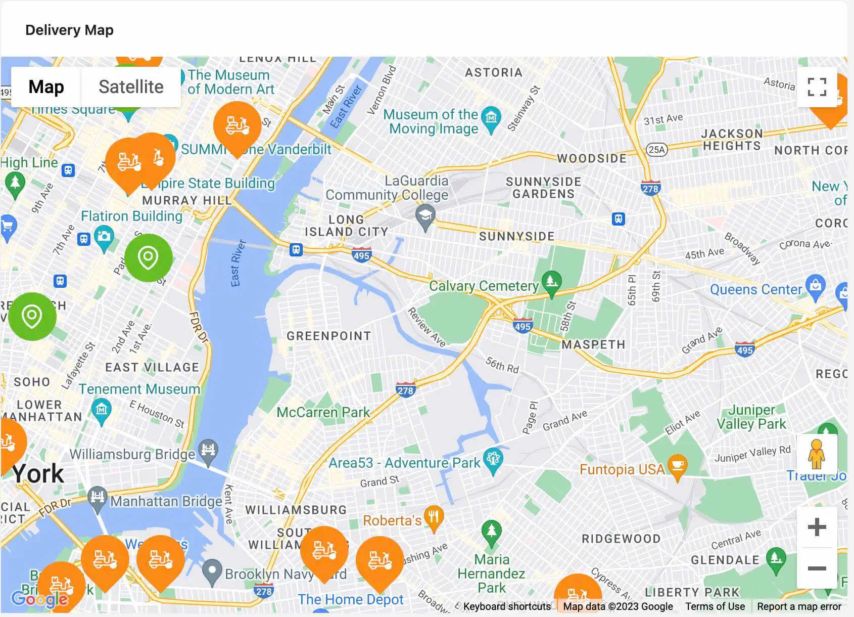 Delivery map visualization
Phew!, we have come a long way and thanks for sticking around during the tutorial. We have created the dashboard components. Now, we will import the components to the Dashboard page and add them to the Dashboard Page index.tsx file located in the src/pages/Dashboard directory on the project as shown in the code below.
src/pages/Dashboard/index.tsx
import { Row, Col, Card, Typography } from "antd";
import {
  DailyRevenue,
  DailyOrders,
  NewCustomers,
  DeliveryMap,
  OrderTimeline,
} from "components/dashboard";

const { Text } = Typography;

const dashboardCardStyles = {
  dailyRevenue: {
    bodyStyle: {
      padding: 10,
      paddingBottom: 0,
    },
    style: {
      background: "url(images/daily-revenue.png)",
      backgroundRepeat: "no-repeat",
      backgroundPosition: "right",
      backgroundSize: "cover",
    },
  },

  dailyOrders: {
    bodyStyle: {
      padding: 10,
      paddingBottom: 0,
    },
    style: {
      background: "url(images/daily-order.png)",
      backgroundRepeat: "no-repeat",
      backgroundPosition: "right",
      backgroundSize: "cover",
    },
  },

  newCustomers: {
    bodyStyle: {
      padding: 10,
      paddingBottom: 0,
    },
    style: {
      background: "url(images/new-orders.png)",
      backgroundRepeat: "no-repeat",
      backgroundPosition: "right",
      backgroundSize: "cover",
    },
  },

  deliveryMap: {
    bodyStyle: {
      height: 550,
      padding: 0,
    },
  },

  orderTimeline: {
    bodyStyle: {
      height: 550,
      overflow: "scroll",
    },
  },
};

export const DashboardPage: React.FC = () => {
  return (
    <Row gutter={[16, 16]}>
      <Col md={24}>
        <Row gutter={[16, 16]}>
          <Col xl={10} lg={24} md={24} sm={24} xs={24}>
            <Card
              bodyStyle={dashboardCardStyles.dailyRevenue.bodyStyle}
              style={dashboardCardStyles.dailyRevenue.style}
            >
              <DailyRevenue />
            </Card>
          </Col>

          <Col xl={7} lg={12} md={24} sm={24} xs={24}>
            <Card
              bodyStyle={dashboardCardStyles.dailyOrders.bodyStyle}
              style={dashboardCardStyles.dailyOrders.style}
            >
              <DailyOrders />
            </Card>
          </Col>

          <Col xl={7} lg={12} md={24} sm={24} xs={24}>
            <Card
              bodyStyle={dashboardCardStyles.newCustomers.bodyStyle}
              style={dashboardCardStyles.newCustomers.style}
            >
              <NewCustomers />
            </Card>
          </Col>
        </Row>
      </Col>
      <Col xl={17} lg={16} md={24} sm={24} xs={24}>
        <Card
          bodyStyle={dashboardCardStyles.deliveryMap.bodyStyle}
          title={<Text strong>Delivery map</Text>}
        >
          <DeliveryMap />
        </Card>
      </Col>
      <Col xl={7} lg={8} md={24} sm={24} xs={24}>
        <Card
          bodyStyle={dashboardCardStyles.orderTimeline.bodyStyle}
          title={
            <Text strong style={{ textTransform: "capitalize" }}>
              Timeline
            </Text>
          }
        >
          <OrderTimeline />
        </Card>
      </Col>
    </Row>
  );
};
Add Dashboard Page and resource to the Refine component
We will add the Dashboard page as a route and resource on the Refine component located at the src/App.tsx directory. We update the src/App.tsx file with the code below:
import {
  Authenticated,
  ErrorComponent,
  GitHubBanner,
  Refine,
  WelcomePage,
} from "@refinedev/core";
import { RefineKbar, RefineKbarProvider } from "@refinedev/kbar";
import { useNotificationProvider, Layout } from "@refinedev/antd";
import "@refinedev/antd/dist/reset.css";
import routerProvider, {
  CatchAllNavigate,
  NavigateToResource,
  UnsavedChangesNotifier,
} from "@refinedev/react-router";
import { BrowserRouter, Outlet, Route, Routes } from "react-router-dom";
import { ColorModeContextProvider } from "./contexts/color-mode";
import { DashboardOutlined } from "@ant-design/icons";
import { DashboardPage } from "pages/Dashboard";
import { Header, Title, OffLayoutArea } from "components";
import { authProvider } from "authProvider";
import { AuthPage } from "pages/auth";
import jsonServerDataProvider from "@refinedev/simple-rest";

function App() {
  const API_URL = "https://api.finefoods.refine.dev";
  const dataProvider = jsonServerDataProvider(API_URL);

  return (
    <BrowserRouter>
      <GitHubBanner />
      <RefineKbarProvider>
        <ColorModeContextProvider>
          <Refine
            notificationProvider={useNotificationProvider}
            routerProvider={routerProvider}
            authProvider={authProvider}
            dataProvider={dataProvider}
            options={{
              syncWithLocation: true,
              warnWhenUnsavedChanges: true,
            }}
            resources={[
              {
                name: "dashboard",
                list: "/",
                meta: {
                  label: "Dashboard",
                  icon: <DashboardOutlined />,
                },
              },
            ]}
          >
            <Routes>
              <Route
                element={
                  <Authenticated fallback={<CatchAllNavigate to="/login" />}>
                    <Layout
                      Header={Header}
                      Title={Title}
                      OffLayoutArea={OffLayoutArea}
                    >
                      <Outlet />
                    </Layout>
                  </Authenticated>
                }
              >
                <Route index element={<DashboardPage />} />
              </Route>

              <Route
                element={
                  <Authenticated fallback={<Outlet />}>
                    <NavigateToResource resource="dashboard" />
                  </Authenticated>
                }
              >
                <Route
                  path="/login"
                  element={
                    <AuthPage
                      type="login"
                      formProps={{
                        initialValues: {
                          email: "demo@refine.dev",
                          password: "demodemo",
                        },
                      }}
                    />
                  }
                />
                <Route
                  path="/register"
                  element={
                    <AuthPage
                      type="register"
                      formProps={{
                        initialValues: {
                          email: "demo@refine.dev",
                          password: "demodemo",
                        },
                      }}
                    />
                  }
                />
              </Route>

              <Route
                element={
                  <Authenticated>
                    <Layout
                      Header={Header}
                      Title={Title}
                      OffLayoutArea={OffLayoutArea}
                    >
                      <Outlet />
                    </Layout>
                  </Authenticated>
                }
              >
                <Route path="*" element={<ErrorComponent />} />
              </Route>
            </Routes>
            <RefineKbar />
            <UnsavedChangesNotifier />
          </Refine>
        </ColorModeContextProvider>
      </RefineKbarProvider>
    </BrowserRouter>
  );
}

export default App;
Lets explain the block of code we just added:
- We added a dashboard resource to the
<Refine/>component. A resource is a fundamental component of a Refine application. A resource acts as a bridge between the Data/API layer and the Document/Page Layer. The resources property accepts an array of objects in the format:
/* snippet of the resource parameter on the Refine component in app.tsx */

    resources={[
      {
        name: "dashboard",
        list: "/",
        meta: {
          label: "Dashboard",
          icon: <DashboardOutlined />,
        },
      },
    ]}
A resource object may include properties that define the resource's name, action routes(list), and additional metadata such as label, icon, audit log settings, sider menu nesting, and so on.
To read more on resources, view here.
- After Adding a resource, we specify the route that the resource will be linked to which is shown below:
/* snippet of the dashboard route on the App.tsx */

<Route
  element={
    <Authenticated fallback={<CatchAllNavigate to="/login" />}>
      <Layout Header={Header} Title={Title} OffLayoutArea={OffLayoutArea}>
        <Outlet />
      </Layout>
    </Authenticated>
  }
>
  <Route index element={<DashboardPage />} />
</Route>
We included a route that has a fallback of the
<Authenticated/>component which saves the authentication status of the user to enclose theDashboardPageroute. This is because, an unauthenticated user Should not be able to access the dashboard page by default unless the user is logged in. If the user is not authenticated, the fallback is triggered and the user is redirected to the login page to insert the credentials.We also included a fallback that redirects user to the dashboard page on the
loginandsignuproutes. This is because, once a user is authenticated on either of these pages, the user should be redirected in to the dashboard.
/* snippet of the login and register route on the App.tsx */
<Route
  element={
    <Authenticated fallback={<Outlet />}>
      <NavigateToResource resource="dashboard" />
    </Authenticated>
  }
>
  <Route
    path="/login"
    element={
      <AuthPage
        type="login"
        formProps={{
          initialValues: {
            email: "demo@refine.dev",
            password: "demodemo",
          },
        }}
      />
    }
  />
  <Route
    path="/register"
    element={
      <AuthPage
        type="register"
        formProps={{
          initialValues: {
            email: "demo@refine.dev",
            password: "demodemo",
          },
        }}
      />
    }
  />
</Route>
- We also included
layoutsthat give the dashboard page a bit of structure and also included an error route that displays an error component when a user accesses a route that does not exist.
View of the finished Application
Login Page:
Finefoods login pageAdmin Dashboard:
 Finefoods dashboard overview
Conclusion
In this Article, We covered how to create a React Admin Dashboard with Refine. We also learned:
- How to migrate successfully from Refine version 3 to Refine version 4.
- How to work with
jsonServerDataProvider. - How to add resources and work with Refine's new routing pattern.
- How to use utility hooks like
UseSimpleList,useList,useCustomand many more.
This article demonstrates the versatility of using Refine to create applications like a React Admin Dashboard. Refine is an excellent tool for accelerating development by abstracting many time-consuming tasks, allowing the developer to devote more time to the application's core business logic. To access the documentation, go to here.