
This article was last updated on September 17, 2024, to expand usage of Chakra UI.


Introduction
Chakra UI has attracted a lot of attention over the years due to its versatility, ease of use, and customizable approach to integrating into any front-end application.
In this article, we’ll look at how Chakra UI can help developers implement a fluid design with its simple configurations.
What is Chakra UI?
Chakra UI is a comprehensive library of React components made to make creating user interfaces easier. Chakra UI differs from traditional libraries in that it provides a distinct set of movable elements that put simplicity and adaptability first.
Without compromising their ability to customize designs to meet the demands of individual projects, developers can create sleek, modern interfaces with Chakra UI.
From buttons and forms to navigation elements, the library offers a wide range of pre-designed components that ensure developers can get started quickly while still allowing for extensive customization.
Standout Features of Chakra UI
We'll do a practical application in this section.
Components
Developers nowadays don't have the luxury of time to create components like overlays, disclosure, forms, layouts, and many more. Using components in applications is made simple right out of the box with a UI library like Chakra UI.
Consider the following scenario: you have a limited amount of time to develop fundamental components like Slider, and your team needs to release features in batches. It will be intimidating to write the entire logic from scratch.
Slider
Users can choose from a variety of values by using the Slider. The Slider component is useful in scenarios where you have a variety of options on a page and you want the user to choose a specific value and then use that value to perform additional actions. Under the hood, Chakra UI handles stress by providing you with only one state.
Create the components subfolder by going to the src folder. To use the code below, create a Slider.tsx file and copy and paste it.
"use client";

import {
  Box,
  Slider,
  SliderFilledTrack,
  SliderMark,
  SliderThumb,
  SliderTrack,
  Text,
} from "@chakra-ui/react";
import { useState } from "react";

export const SliderComp = () => {
  const [sliderValue, setSliderValue] = useState(50);

  const labelStyles = {
    mt: "2",
    ml: "-2.5",
    fontSize: "1.5rem",
  };

  return (
    <Box>
      <Text fontSize="2rem">1. Slider Component</Text>
      <Box py="2rem">
        <Slider
          aria-label="slider-comp"
          onChange={(val) => setSliderValue(val)}
        >
          <SliderMark value={0} {...labelStyles}>
            0%
          </SliderMark>
          <SliderMark value={50} {...labelStyles}>
            50%
          </SliderMark>
          <SliderMark value={100} {...labelStyles}>
            100%
          </SliderMark>
          <SliderTrack>
            <SliderFilledTrack bg="brand.green100" />
          </SliderTrack>
          <SliderThumb />
        </Slider>
        <Text mt="4rem" fontWeight="700">
          Selected Value: {sliderValue}%
        </Text>
      </Box>
    </Box>
  );
};
The code above controls how the user interacts with the slider by retaining the states of each selected percentage. The useState listens for changes around the Slider and then displays the selected value to the user.
Then, in the app folder, copy and paste this code into the page.tsx.
import { SliderComp } from "@/components/Slider";
import { Box } from "@chakra-ui/react";

const Home = () => {
  return (
    <Box bg="brand.white200" p="3rem">
      <SliderComp />
    </Box>
  );
};
export default Home;
This calls the SliderComp and displays it on the browser.
The output can be seen below.
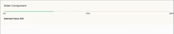 chakra ui
Stepper
Stepper is most commonly found in form applications, data collection, and onboarding processes. It is a widely used component because it provides a smooth user experience.
It's also a new feature in Chakra UI due to its high demand, revealing that creating such a component from scratch is a lot of work because one will end up with a lot of states(previous and current) to maintain in an application.
Navigate to the components folder and create a Stepper.tsx file. Copy and paste the code below.
Show Stepper.tsx
import {
  Box,
  Button,
  Flex,
  Stack,
  Step,
  StepIcon,
  StepIndicator,
  StepSeparator,
  StepStatus,
  Stepper,
  Text,
  useSteps,
} from "@chakra-ui/react";
import { useState } from "react";

const ContactInfo = () => {
  return (
    <Box py="2rem">
      <Text>I'm Samuel Ogunleye.</Text>
      <Text>
        Frontend Engineer, as well as a Technical Writer. A big fan of
        open-source software.
      </Text>
    </Box>
  );
};

const Stacks = () => {
  return (
    <Box>
      <Text py="2rem">
        I love JavaScript, TypeScript, and Next.js – all aspects of frontend
        development!
      </Text>
    </Box>
  );
};

const Final = () => {
  return (
    <Box>
      <Text py="2rem">Any other information?</Text>
    </Box>
  );
};

const steps = [
  { title: "Contact", description: ContactInfo },
  { title: "Stacks", description: Stack },
  { title: "Final", description: Final },
];

export const StepperComp = () => {
  const { activeStep } = useSteps({
    index: 1,
    count: steps.length,
  });

  const [currentStep, setCurrentStep] = useState<number>(activeStep);

  const handleNextClick = () => {
    setCurrentStep((prevStep) => (prevStep < 3 ? prevStep + 1 : prevStep));
  };

  const handlePreviousClick = () => {
    setCurrentStep((prevStep) => (prevStep > 1 ? prevStep - 1 : prevStep));
  };

  return (
    <Box mt="5rem">
      <Text fontSize="2rem">2. Stepper Component</Text>
      <Stack py="2rem">
        <Stepper size="lg" colorScheme="green" index={currentStep} gap="2rem">
          {steps.map((step, idx) => {
            return (
              <Step key={idx}>
                {step.title}
                <StepIndicator>
                  <StepStatus complete={<StepIcon />} />
                </StepIndicator>
                <StepSeparator />
              </Step>
            );
          })}
        </Stepper>
        <Box>
          {currentStep === 1 ? (
            <ContactInfo />
          ) : currentStep === 2 ? (
            <Stacks />
          ) : (
            <Final />
          )}
        </Box>

        <Flex columnGap="2rem">
          <Button
            onClick={handlePreviousClick}
            bg="brand.green100"
            color="brand.white100"
            fontSize="1.3rem"
            py="1.8rem"
            cursor={currentStep === 1 ? "not-allowed" : "pointer"}
          >
            Previous
          </Button>

          <Button
            onClick={handleNextClick}
            bg="brand.green100"
            color="brand.white100"
            fontSize="1.3rem"
            py="1.8rem"
            cursor={currentStep === 3 ? "not-allowed" : "pointer"}
          >
            Next
          </Button>
        </Flex>
      </Stack>
    </Box>
  );
};
ContactInfo, Stacks, and Final components contain basic information about a user that will be dynamically rendered inside the StepperComp component.
StepperComp: This is the main component that contains all of the minor components (ContactInfo, Stacks, and Final). It is the component that will be exported to the page.tsx file within the app folder in order to be rendered to the browser.
useSteps: useSteps has a built-in state that keeps track of all the logic for us.
useState: An additional state was added to handle the Previous and Next buttons, allowing the user to navigate through each stepper information that is used inside the handlePreviousClick and handleNextClick functions.
steps: This variable stores each Stepper's data and is dynamically rendered based on the currentStep state.
The output can be seen below.
 chakra ui
Building a stepper component from scratch can be a real headache. The complexity of handling various states makes it a difficult task to create a custom solution tailored to your needs.
With Chakra UI, you get the flexibility to leverage and extend existing components that seamlessly handle all the complicated logic behind the scenes.
Hooks
If you've been coding for a while and have encountered the complexity of React logic firsthand, especially dealing with operations within classes, you'll truly appreciate the revolutionary introduction of React hooks.
With the increasing shift from classes to hooks, UI libraries like Chakra UI have made writing logic a breeze. Let’s explore some of the available hooks in Chakra UI.
useClipboard
This is a hook that allows a user to copy any content to the clipboard.
Let's use our Slider component once more. Remember that there is a state that keeps track of how the user selects any value on the Slider. Let's now add the ability to copy the selected stored value to the clipboard.
Navigate to the components folder and create a SliderWithClipboard.tsx file. Copy and paste the code below.
"use client";

import {
  Box,
  Button,
  Editable,
  EditableInput,
  EditablePreview,
  Flex,
  Slider,
  SliderFilledTrack,
  SliderMark,
  SliderThumb,
  SliderTrack,
  Text,
  useClipboard,
} from "@chakra-ui/react";
import { useEffect, useState } from "react";

export const SliderWithClipboardComp = () => {
  const [sliderValue, setSliderValue] = useState(50);
  const { onCopy, setValue, hasCopied } = useClipboard("");

  const labelStyles = {
    mt: "2",
    ml: "-2.5",
    fontSize: "1.5rem",
  };

  useEffect(() => {
    setValue(String(`${sliderValue}%`));
  }, [sliderValue, setValue]);

  return (
    <Box mt="5rem">
      <Text fontSize="2rem">3. Slider With Clipboard Component</Text>
      <Box py="2rem">
        <Slider
          aria-label="slider-comp"
          onChange={(val) => setSliderValue(val)}
        >
          <SliderMark value={0} {...labelStyles}>
            0%
          </SliderMark>
          <SliderMark value={50} {...labelStyles}>
            50%
          </SliderMark>
          <SliderMark value={100} {...labelStyles}>
            100%
          </SliderMark>
          <SliderTrack>
            <SliderFilledTrack bg="brand.green100" />
          </SliderTrack>
          <SliderThumb />
        </Slider>
        <Flex mt="4rem" columnGap="1rem">
          <Text fontWeight="700">Selected Value: {sliderValue}%</Text>
          <Button
            fontSize="1.5rem"
            bg="brand.green100"
            color="brand.white100"
            onClick={onCopy}
          >
            {hasCopied ? "Copied!" : "Copy"}
          </Button>
        </Flex>
        <Editable placeholder="Paste here" mt=".5rem">
          <EditablePreview
            border="1px solid"
            borderColor="brand.green100"
            borderRadius="1rem"
            p=".5rem 1rem"
            w="10%"
          />
          <EditableInput _focus={{ boxShadow: "none" }} />
        </Editable>
      </Box>
    </Box>
  );
};
To achieve the copy functionality, the useClipboard hook was added to the existing Slider component. It provides properties destructured from the useClipboard hook, such as setValue, onCopy, and hasCopied.
The setValue function is used within a useEffect to track and set the current sliderValue whenever a change occurs.
The Editable component previews what was copied from the clipboard.
The output can be seen below.
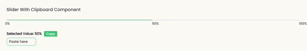 chakra ui
useDisclosure
This is another type of hook that helps in triggering the action of modals. It is very simple to use because it makes use of readily available components that handle everything under the hood for us.
Creating modals without using prebuilt components involves tracking several user events.
Navigate to the components folder and create a Disclosure.tsx file. Copy and paste the code below.
"use client";

import {
  Box,
  Button,
  Drawer,
  DrawerBody,
  DrawerContent,
  DrawerHeader,
  DrawerOverlay,
  Text,
  useDisclosure,
} from "@chakra-ui/react";

export const DisclosureComp = () => {
  const { isOpen, onOpen, onClose } = useDisclosure();

  return (
    <Box mt="5rem">
      <Text fontSize="2rem">4. Disclosure Component</Text>
      <Button
        onClick={onOpen}
        fontSize="1.3rem"
        bg="brand.green100"
        color="brand.white100"
        p="1.8rem 2rem"
        mt=".5rem"
      >
        View Profile
      </Button>
      <Drawer placement="bottom" onClose={onClose} isOpen={isOpen}>
        <DrawerOverlay />
        <DrawerContent>
          <DrawerHeader
            borderBottomWidth=".2rem"
            borderBottomColor="brand.green100"
            fontSize="1.8rem"
          >
            Basic Information
          </DrawerHeader>
          <DrawerBody py="2rem">
            <Text>Name: Samuel</Text>
            <Text py="1rem">Title: Frontend Engineer</Text>
            <Text>Language: JavaScript, TypeScript</Text>
          </DrawerBody>
        </DrawerContent>
      </Drawer>
    </Box>
  );
};
The code above returns three values: isOpen which indicates whether the modal is open, onOpen which indicates a function to open the modal, and onClose which indicates a function to close the modal.
The Drawer component handles the rest of the display because it has some logic attached to it that works behind the scenes. This handles some heavylifting that users ought to do.
The output can be seen below.
 chakra ui
useTheme
This hook provides you with the ability to alter the theme object. There may be times when you need to change the colors or fonts in an application on a global scale; the theme object allows you to customize to your needs.
Navigate to the components folder and create a Theme.tsx file. Copy and paste the code below.
"use client";
import { Box, Text, useTheme } from "@chakra-ui/react";
export const ThemeComp = () => {
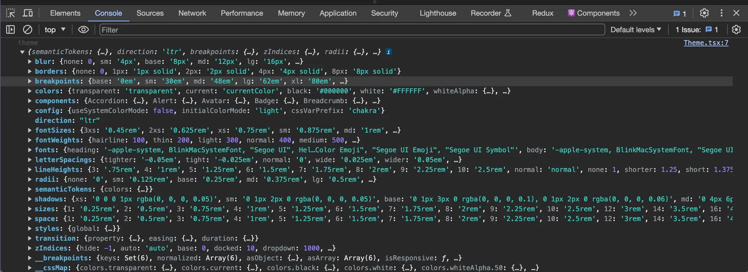
const theme = useTheme();
// console.log("theme", theme);
const customStyle = {
background: theme.colors.black,
color: theme.colors.brand.white100,
fontSize: theme.fontSizes.lg,
};
return (
<Box mt="5rem">
<Text fontSize="2rem">5. Theme Component</Text>
<Box
py="2rem"
bg="brand.green100"
color="brand.white100"
p="1rem"
rounded="lg"
// style={customStyle}
>
<Text>This text is styled using the color from the theme.</Text>
<Text py="2rem">
This text is styled using the color from the theme.
</Text>
<Text>This text is styled using the color from the theme.</Text>
</Box>
</Box>
);
};
The console.log in the above code displays all of the application's configurations. It provides complete access to what your application entails. Take a look at the console.log result below.
 chakra ui
The customStyle variable is used to modify our app's existing configurations. Look at the output below before making any changes.
 chakra ui
Now, let's uncomment the styles prop - styles={customStyle} and look at the new output below.
 chakra ui
The background color, the text color, and the font size have all been modified.
Doesn't it look good? That's the power of the useTheme hook!
Theming
Theming is an important aspect of an application; it can be referred to as the application's design system because it involves you having configurations for fonts, colors, and anything else you can think of.
Creating and Customizing Themes:
We'll take a hands-on approach here, demonstrating how to create and customize Chakra UI themes. In our application, we'll be changing the colors and typography.
This configuration structure may differ depending on the developers' knowledge of code architecture.
Navigate to styles folder and you'll see that the configuration was done when you cloned the repo at the start of the application.
globals.css is a file in the styles folder where you can put your CSS styles. Only the font used in our application was imported in our application.
@import url("https://fonts.googleapis.com/css2?family=Andika:wght@400;700&family=Nunito:wght@300;400;500;600;700;800;900&display=swap");
themes is a subfolder inside the styles folder. There are files named index.ts and global.ts inside the themes folder, as well as another folder called the foundation folder.
To manage all of the colors we will be using in the application, a color.ts file was made and placed inside the foundation folder.
const customColors = {
  brand: {
    white100: "rgba(255, 255, 255, 1)",
    white200: "rgba(255, 253, 248, 1)",
    dark100: "rgba(41, 42, 47, 1)",
    dark200: "rgba(25, 28, 45, 1)",
    green100: "rgba(69, 205, 129, 1)",
  },
};

export { customColors };
The global configuration for the fontFamily and fontSize used throughout the body of the HTML is contained in the global.ts file.
const globalStyles = {
  global: {
    html: {
      fontSize: "62.5%",
      scrollBehavior: "smooth !important",
    },
    body: {
      fontFamily: "'Poppins', sans-serif",
      fontSize: "1.6rem",
    },
  },
};

export { globalStyles };
The index.ts file acts as a bridge, linking all of the separated config files via the extendTheme function. It overrides the application's default theme.
import { extendTheme } from "@chakra-ui/react";
import { customColors as colors } from "@/styles/themes/foundation/colors";
import { globalStyles as styles } from "@/styles/themes/global";

const customTheme = extendTheme({
  colors,
  styles,
});

export { customTheme };
Navigate to the app folder to find the providers.tsx file. This is where the customTheme is now registered within the ChakraProvider, making it available to all components and pages globally.
"use client";

import { customTheme } from "@/styles/themes";
import { ChakraProvider } from "@chakra-ui/react";
import "@/styles/globals.css";

export const Providers = ({ children }: { children: React.ReactNode }) => {
  return <ChakraProvider theme={customTheme}>{children}</ChakraProvider>;
};
- Implementing dark mode You may be aware of the popular trend of users switching from dark to light mode on their themes. To demonstrate how it can be utilized in an application, let's build a basic component.
Navigate to the app folder and create a DarkModeToggle.tsx file. Copy and paste the code below.
"use client";
import {
Box,
Button,
Text,
useColorMode,
useColorModeValue,
} from "@chakra-ui/react";
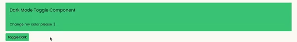
export const DarkModeToggleComp = () => {
const { colorMode, toggleColorMode } = useColorMode();
const bgValue = useColorModeValue("brand.green100", "brand.dark100");
const colorValue = useColorModeValue("brand.dark100", "brand.green100");
return (
<Box mt="5rem">
<Text p="2rem" bg={bgValue} fontSize="2rem" color={colorValue}>
6. Dark Mode Toggle Component
</Text>
<Box p="2rem" bg={bgValue}>
<Text color={colorValue}>Change my color please :)</Text>
</Box>
<Button
mt="1rem"
fontSize="1.5rem"
py="1.8rem"
bg={bgValue}
color={colorValue}
onClick={toggleColorMode}
>
Toggle {colorMode === "light" ? "Dark" : "Light"}
</Button>
</Box>
);
};
The useColorMode hook makes it simple to control the light or dark color mode in our application. This makes it easy for developing dynamic user interfaces that change based on the preferences of the user.
UseColorModeValue lets you change particular elements like font sizes, colors, and backgrounds. It works inside the specific component. It accepts two arguments(first and second) which are lightModeValue and darkModeValue respectively.
The output can be seen below.
 chakra ui
Integrations
The most fascinating feature of Chakra UI is its compatibility with various other frameworks. It allows us to utilize all of the features, including hooks and components, while combining them with the capabilities of the framework.
Refine offers a dedicated integration package for the Chakra UI framework, which includes a collection of ready-to-use components and hooks designed to seamlessly link Refine with Chakra UI elements.
Refer to Chakra UI docs in Refine here.
Refer to complete tutorial on how to integrate Chakra UI with Refine here.
Let's look at Refine, a React-based framework as a usecase. We will build another simple app from scratch.
Open your terminal, copy and paste the code below.
npm create refine-app@latest
Choosing "Chakra UI" as your UI framework will automatically install all necessary dependencies and create a starter template for you.
Here is an example component that uses Refine and Chakra UI together.
import { Box, Flex } from "@chakra-ui/react";
import { DateField, List, TagField, TextField } from "@refinedev/chakra-ui";
import { useList } from "@refinedev/core";

type ProductProps = {
  id: number;
  title: string;
  status: string;
  publishedAt: string;
  status_color: string;
};

export const RefineWithChakraUIComp = () => {
  const { data, isLoading } = useList<ProductProps>({
    resource: "posts",
  });
  const posts = data?.data;

  return (
    <Box>
      {isLoading ? (
        <TextField p="2rem" value="Fetching posts..." />
      ) : (
        <List title="7. Refine With Chakra UI">
          {posts?.slice(0, 6).map((item) => (
            <Box
              key={item.id}
              bg="brand.white200"
              border="1px solid"
              borderColor="brand.green100"
              borderRadius="1rem"
              mb="1rem"
              overflow="hidden"
              p="1rem"
            >
              <Flex>
                <TextField fontWeight="700" mr="1rem" value="Title:" />
                <TextField value={item.title} />
              </Flex>

              <Flex>
                <TextField fontWeight="700" mr="1rem" value="Status:" />
                <TagField
                  bg={item.status_color}
                  color="brand.white100"
                  value={item.status}
                />
              </Flex>
              <Flex>
                <TextField fontWeight="700" mr="1rem" value="Published Date:" />
                <DateField value={item.publishedAt} />{" "}
              </Flex>
            </Box>
          ))}
        </List>
      )}
    </Box>
  );
};
In the above code, we created a simple application that makes use of Refine features such as DateField, List, TagField, TextField and useList.
DateField: This component manages data formatting without the need for an additional library such as moment.js or day.js. It handles it without any further logic.
List: This acts as a layout and provides default spacing for components like TextField. It allows for the addition of a title prop that can take any value.
TagField: This acts as a Tag, providing a default wrapper for text and the ability to add extra customization such as colors.
TextField: It functions as text, allowing you to render any text.
One interesting feature is how the data retrieval process was set up using the useList hook.
useList: This is a hook that Refine provides out of the box when using their framework. It allows us to dynamically fetch data while also allowing us to filter, sort, and paginate any data retrieved from an API.
Under the hood, it uses react-query, which, by convention, requires a significant amount of setup and configuration in an app before it can function properly. However, because it has been handled by Refine, we can utilize hooks like useList without doing complex configurations.
This differentiates Refine and makes it reliable because it provides a user with two options: the flexibility of using any external UI library or the flexibility of utilizing the hook and other features in Refine in a single application.
It has two destructured properties: data and isLoading. data is the result of an API call, and isLoading helps in rendering useful information to the user before the results are available. This has the standard react-query features.
The resource argument in useList points to the name "posts". This comes from the root layer of our application where Refine was configured.
As you can see from the above output, using Refine components and hooks makes everything function exactly the same way.
Here is the humanized version of the "Chakra UI Ecosystem and Plugins" section:
Chakra UI Ecosystem and Plugins
Chakra UI has a strong backbone, but it also integrates very well with several plugins and tools that can make development even faster and more powerful. Here are some key things worth knowing:
Chakra UI Icons
Chakra includes, by default, an installed icon set, but we can extend it very easily by integrating it with React Icons or any other icon library. This will open up a lot of flexibility for using icons in our components.
Example:
import { FaHome } from "react-icons/fa";
import { Icon } from "@chakra-ui/react";

<Icon as={FaHome} boxSize={6} />;
By doing this, we can easily use any popular icon set.
Chakra UI and Form Libraries
Chakra UI works very well with form management libraries like Formik and React Hook Form. These libraries make it easier for us to handle things such as form validation, form submissions, and managing state, while their components fit well with Chakra's styling.
Here is how you can use Chakra UI with Formik:
import { Formik, Form, Field } from "formik";
import { Button, Input } from "@chakra-ui/react";

<Formik
  initialValues={{ name: "" }}
  onSubmit={(values) => {
    console.log(values);
  }}
>
  <Form>
    <Field name="name">
      {({ field }) => <Input {...field} placeholder="Name" />}
    </Field>
    <Button type="submit">Submit</Button>
  </Form>
</Formik>;
Another good choice is React Hook Form, which also ties in nicely with Chakra's components.
Chakra UI with Framer Motion
Chakra UI has built-in support for the powerful animation library Framer Motion, making it super easy to create smooth animations and transitions for any Chakra UI component.
Example:
import { motion } from "framer-motion";
import { Box } from "@chakra-ui/react";

const MotionBox = motion(Box);

<MotionBox
  animate={{ scale: 1.2 }}
  transition={{ duration: 0.5 }}
  bg="blue.500"
  p={5}
>
  Animated Box
</MotionBox>;
This integration enables us to add animations without much extra code or setup.
Chakra UI and Storybook
Storybook works especially well to construct UI components in isolation, and Chakra UI plays along perfectly. We can document and test each Chakra component within Storybook, making it easier to build and showcase reusable components.
By installing @chakra-ui/storybook-addon, we get Chakra's theme and components set directly in Storybook:
npm install @chakra-ui/storybook-addon
Once installed, we can start creating or developing components through Storybook while maintaining Chakra UI's styling system.
Chakra UI with Tailwind CSS
While Chakra UI has its own design system, it can also be combined with Tailwind CSS if we need utility-based styles. Using both approaches together is not very common, but some developers do like combining Chakra components with Tailwind utility classes for added flexibility.
Chakra UI Pro
Chakra UI has a paid version called Chakra UI Pro, which contains pre-built, ready-to-use templates for things like dashboards and e-commerce sites. This saves a lot of development time if you need high-quality, ready-made components and layouts.
Bonus: Testing Chakra Components
Well, what I have been looking into is the testing of Chakra UI components. In fact, it is quite easy. We can test his components like regular React components using React Testing Library and Jest. It is cool to know that Chakra will handle lots of styling and accessibility out of the box, and we just have to check how the components behave.
Here is a simple example of how one might test a Chakra UI button:
import { render, screen } from "@testing-library/react";
import { Button } from "@chakra-ui/react";

test("renders Chakra UI button", () => {
  render(<Button>Click me</Button>);
  // check if the button is in document
  const buttonElement = screen.getByText(/click me/i);
  expect(buttonElement).toBeInTheDocument();
});
For this example, we are rendering, using React Testing Library, a button and checking if it's on the page with the text "Click me." Chakra's styling does not impact how we test it, working just like testing any React component.
We can also test interactions. For example, let's say we want to test that a button calls a function when clicked:
import { render, screen, fireEvent } from "@testing-library/react";
import { Button } from "@chakra-ui/react";

test("calls onClick when button is clicked", () => {
  let handleClick = jest.fn();
  render(<Button onClick={handleClick}>Click me</Button>);

  const buttonElement = screen.getByText(/click me/i);
  // Simulate click
  fireEvent.click(buttonElement);

  // Check if handleClick was called
  expect(handleClick).toHaveBeenCalledTimes(1);
});
Here we make use of fireEvent to simulate a button click and ensure it calls the onClick function.
For more involved components—like modals or forms—we do the exact same thing: render the component, perform whatever interaction with that component (actually opening the modal in this case), and assert whatever we expect to happen ends up happening.
Conclusion
By the end of this article, you should have a good understanding of how Chakra UI works, why it’s significant in web applications, and how to integrate it with a React-based framework such as Refine.