
This article was last updated on July 03, 2024, to add sections for Accessibility Features, Security Considerations, and Formik Integration with AutoComplete to Material UI AutoComplete.


Introduction
Material UI provides a unique set of components and utilities to help developers have a better creative experience with web applications. One such component is the Material UI <Autocomplete/> component. This article will dive deep into the Material UI Autocomplete component, highlight its accompanied features and explore a potential use case in a real-world application.
What is Material UI?
Developed in 2014, Material UI is a React framework that provides adequate tools(components and utilities) to create a web application. Material UI enables the use of various customizable components to create a UI for a company's web and mobile apps. Many developers now use Material UI to structure their projects because it makes web design more straightforward and effective.
Material UI offers several component categories, including Navigations components, Input components, Data Display components, Feedback components, e.t.c. The Material UI Autocomplete component is a prime example of the Input components.
You can install Material UI into your React project with:
npm npm install @mui/material @emotion/react @emotion/styled
yarn: yarn add @mui/material @emotion/react @emotion/styled
Getting Started with Material UI Autocomplete
The Material UI <Autocomplete /> component can be identified as an improved React text input that includes several suggested options for better optimization. It is an enhanced version of react-select or downshift packages.
The <Autocomplete /> component is best used for modifying single-line textbox values to accommodate more options. The component’s value is obtained from a predetermined range of acceptable values/options.
Here’s how to structure your option values:
interface AutocompleteOption {
  label: string;
}
// or
type AutocompleteOption = string;
Below is a simple illustration of Material UI Autocomplete in play:
import * as React from "react";
import TextField from "@mui/material/TextField";
import Autocomplete from "@mui/material/Autocomplete";

// Top 5 Nigerian songs on Apple Music
const top5Songs = [
  { label: "Organize" },
  { label: "Joha" },
  { label: "Terminator" },
  { label: "Dull" },
  { label: "Nzaza" },
];

export default function ComboBox() {
  return (
    <Autocomplete
      disablePortal
      id="combo-box-demo"
      options={top5Songs}
      sx={{ width: 300 }}
      renderInput={(params) => <TextField {...params} label="Songs" />}
    />
  );
}
The code above showcases an input text field that displays 5 songs as predefined option values.
 Autocomplete input with song options
Material UI Autocomplete props
RenderInput
The renderInput prop allows you to customize the rendered input to display the option values in whatever form you please.
Consider the code below:
import * as React from "react";
import Autocomplete from "@mui/material/Autocomplete";

const options = ["Option 1", "Option 2"];

export default function CustomInputAutocomplete() {
  return (
    <label>
      Value:{" "}
      <Autocomplete
        sx={{
          width: 200,
        }}
        id="custom-input-demo"
        options={options}
        renderInput={(params) => (
          <div ref={params.InputProps.ref}>
            <input type="text" {...params.inputProps} />
          </div>
        )}
      />
    </label>
  );
}
The code above illustrates the use of the renderInput prop. Take special note of the ref and inputProps keys.
Here’s the result:
 Custom renderInput autocomplete field
GetOptionLabel
getOptionLabel is used to display the text in the dropdown menu.
const top5Songs = [
  { title: 'Organize'},
  { title: 'Joha'},
  { title: 'Terminator'},
  { title: 'Dull'},
  { title: 'Nzaza'},
]


<Autocomplete
  id="combo-box-demo"
  options={top5Songs}
  getOptionLabel={(option) => option.year.toString()} // this displays a dropdown that uses option.title to show the title of the songs as option values.
......
GetOptionSelected
The getOptionSelected is used to determine the selected value of a specified array.
const top5Songs = [
  { title: 'Organize'},
  { title: 'Joha'},
  { title: 'Terminator'},
  { title: 'Dull'},
  { title: 'Nzaza'},
]

<Autocomplete
  id="combo-box-demo"
  options={top5Songs)
  getOptionSelected={(option) => option.title === 'dull'}
....
//this will select all the option with the song title 'dull' and make the background of that option darker
Other Material UI Autocomplete props include:
Free solo
When you add the freeSolo prop to the <Autocomplete /> component, it enables the text field to accept undetermined values. The prop's primary purpose is to provide suggestions for a search input like Google search does.
Here’s a simple illustration:
import * as React from "react";
import TextField from "@mui/material/TextField";
import Stack from "@mui/material/Stack";
import Autocomplete from "@mui/material/Autocomplete";

// Top 5 Nigerian songs on Apple Music
const top5Songs = [
  { title: "Organize" },
  { title: "Joha" },
  { title: "Terminator" },
  { title: "Dull" },
  { title: "Nzaza" },
];

export default function FreeSolo() {
  return (
    <Stack spacing={2} sx={{ width: 300 }}>
      <Autocomplete
        id="free-solo-demo"
        // calling the freeSolo prop inside the Autocomplete component
        freeSolo
        options={top5Songs.map((option) => option.title)}
        renderInput={(params) => <TextField {...params} label="freeSolo" />}
      />
    </Stack>
  );
}
Here’s the result:
 Free solo autocomplete input
GroupBy
You can sort the Material UI Autocomplete options with the groupBy prop. To do this, you must ensure that the values are sorted systematically in the same dimension as they are grouped to avoid duplicate headers.
Here’s what I mean:
import * as React from "react";
import TextField from "@mui/material/TextField";
import Autocomplete from "@mui/material/Autocomplete";

// Top 100 films as rated by IMDb users. http://www.imdb.com/chart/top
const movies = [
  // An array of movie objects with ‘title’ as the key and the movie name as the value.
];

export default function Grouped() {
  const options = movies.map((option) => {
    const firstLetter = option.title[0].toUpperCase();
    return {
      firstLetter: /[0-9]/.test(firstLetter) ? "0-9" : firstLetter,
      ...option,
    };
  });

  return (
    <Autocomplete
      id="grouped-demo"
      options={options.sort(
        (a, b) => -b.firstLetter.localeCompare(a.firstLetter),
      )}
      groupBy={(option) => option.firstLetter}
      getOptionLabel={(option) => option.title}
      sx={{ width: 300 }}
      renderInput={(params) => (
        <TextField {...params} label="Grouped Options" />
      )}
    />
  );
}
The code above illustrates the use of the groupBy prop in the <Autocomplete/>. It groups an array containing 100 movies, displays them alphabetically and highlights the first letter of the movie title when scrolling through.
Here’s the result:
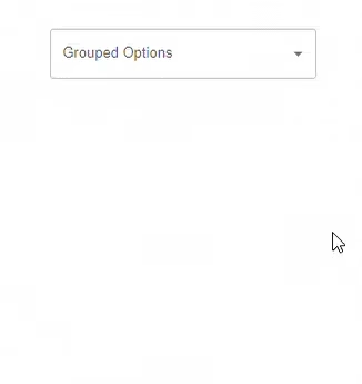 Grouped autocomplete options list
Material UI Autocomplete features
Material UI Autocomplete State Management
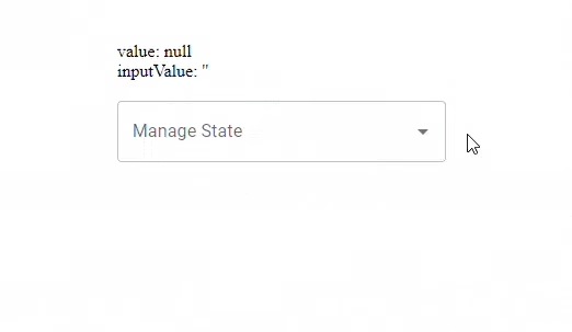
The Autocomplete component has two manageable states:
The value state represents the value chosen by the user by clicking or pressing “Enter.”
The input value represents the value displayed in the textbox.
Study the code below:
import React, { useState } from "react";
import TextField from "@mui/material/TextField";
import Autocomplete from "@mui/material/Autocomplete";

const options = ["Value 1", "Value 2"];

// Creating the manageable states
export default function ManageableStates() {
  const [value, setValue] = useState<string | null>(options[0]);
  const [inputValue, setInputValue] = useState("");

  return (
    <div>
      {/* displaying the state values with template literals */}
      <div>{`value: ${value !== null ? `'${value}'` : "null"}`}</div>
      <div>{`inputValue: '${inputValue}'`}</div>
      <br />

      {/* Calling the Autocomplete component and updating its state features */}
      <Autocomplete
        value={value}
        onChange={(event: any, newValue: string | null) => {
          setValue(newValue);
        }}
        inputValue={inputValue}
        onInputChange={(event, newInputValue) => {
          setInputValue(newInputValue);
        }}
        id="manageable-states-demo"
        options={options}
        sx={{ width: 300 }}
        renderInput={(params) => <TextField {...params} label="Manage State" />}
      />
    </div>
  );
}
The code showcases how the values of the AutoComplete component can be controlled and altered in state.
 Autocomplete state management example
The useAutocomplete Hook
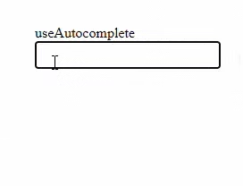
Material UI Autocomplete comes with a headless useAutocomplete hook which can serve as an alternative search input to the <Autocomplete /> component. It accepts nearly the same option props as the Autocomplete component without the ones about DOM rendering.
You can import this hook into your React project like this:
import useAutocomplete from "@mui/material/useAutocomplete";
Consider the code below:
import * as React from "react";
import { useAutocomplete } from "@mui/base/AutocompleteUnstyled";
import { styled } from "@mui/system";

// Styling the <Label /> component
const Label = styled("label")({
  display: "block",
});

// Styling the Input component
const Input = styled("input")(({ theme }) => ({
  width: 200,
  backgroundColor: theme.palette.mode === "light" ? "#fff" : "#000",
  color: theme.palette.mode === "light" ? "#000" : "#fff",
}));

// Styling the <Listbox /> component
const Listbox = styled("ul")(({ theme }) => ({
  width: 200,
  margin: 0,
  padding: 0,
  zIndex: 1,
  position: "absolute",
  listStyle: "none",
  backgroundColor: theme.palette.mode === "light" ? "#fff" : "#000",
  border: "1px solid rgba(0,0,0,.5)",
  "& li.Mui-focused": {
    backgroundColor: "#4a8df6",
    color: "white",
    cursor: "pointer",
  },
  "& li:active": {
    backgroundColor: "#2977f5",
    color: "white",
  },
}));

// Top 5 Nigerian songs on Apple Music
const top5Songs = [
  { label: "Organize" },
  { label: "Joha" },
  { label: "Terminator" },
  { label: "Dull" },
  { label: "Nzaza" },
];

// Using the useAutocomplete hook to set up the songs as search options.
export default function UseAutocomplete() {
  const {
    getRootProps,
    getInputLabelProps,
    getInputProps,
    getListboxProps,
    getOptionProps,
    groupedOptions,
  } = useAutocomplete({
    id: "use-autocomplete-demo",
    options: top5Songs,
    getOptionLabel: (option) => option.label,
  });

  // Rendering our parameters on the DOM
  return (
    <div>
      <div {...getRootProps()}>
        <Label {...getInputLabelProps()}>useAutocomplete</Label>
        <Input {...getInputProps()} />
      </div>
      {groupedOptions.length > 0 ? (
        <Listbox {...getListboxProps()}>
          {(groupedOptions as typeof top5Songs).map((option, index) => (
            <li {...getOptionProps({ option, index })}>{option.label}</li>
          ))}
        </Listbox>
      ) : null}
    </div>
  );
}
The code above showcases a simple use case for the useAutocomplete hook. It helps display songs in an array as search options without using the <Autocomplete /> component.
Here’s the result:
 Autocomplete with option list
Asynchronous Requests
The <Autocomplete /> component can display search input options with two different asynchronous requests:
Load on open: It waits until the component is interacted with before loading the options. It displays a progress bar when your local network is pending/loading Search as you type: Each keystroke generates a new request..
Consider the code below:
import React, { useState } from "react";
import TextField from "@mui/material/TextField";
import Autocomplete from "@mui/material/Autocomplete";
import CircularProgress from "@mui/material/CircularProgress";

// Setting the delay function
function sleep(delay = 0) {
  return new Promise((resolve) => {
    setTimeout(resolve, delay);
  });
}

// Top 5 Nigerian songs on Apple Music
const top5Songs = [
  { title: "Organize" },
  { title: "Joha" },
  { title: "Terminator" },
  { title: "Dull" },
  { title: "Nzaza" },
];

// managing state
export default function Asynchronous() {
  const [open, setOpen] = useState(false);
  const [options, setOptions] = useState<readonly Film[]>([]);
  const loading = open && options.length === 0;

  // Setting the logic for the asynchronous function on page reload
  React.useEffect(() => {
    let active = true;

    if (!loading) {
      return undefined;
    }

    (async () => {
      await sleep(1e3); // For demo purposes.

      if (active) {
        setOptions([...top5Songs]);
      }
    })();

    return () => {
      active = false;
    };
  }, [loading]);

  React.useEffect(() => {
    if (!open) {
      setOptions([]);
    }
  }, [open]);

  // Rendering our parameters on the DOM
  return (
    <Autocomplete
      id="asynchronous-demo"
      sx={{ width: 300 }}
      open={open}
      onOpen={() => {
        setOpen(true);
      }}
      onClose={() => {
        setOpen(false);
      }}
      isOptionEqualToValue={(option, value) =>
        value === undefined ||
        option?.id?.toString() === (value?.id ?? value)?.toString()
      }
      getOptionLabel={(option) => option.title}
      options={options}
      loading={loading}
      renderInput={(params) => (
        <TextField
          {...params}
          label="Asynchronous"
          slotProps={{
            input: {
              ...params.slotProps,
              endAdornment: (
                <React.Fragment>
                  {loading ? (
                    <CircularProgress color="inherit" size={20} />
                  ) : null}
                  {params.slotProps.endAdornment}
                </React.Fragment>
              ),
            },
          }}
        />
      )}
    />
  );
}
The code above showcases an asynchronous DOM display of the Material UI Autocomplete component illustrating the “Load on open” feature.
 Async autocomplete loading options
Multiple Values
Material UI Autocomplete also provides a feature for users to select more than one value. You can do that by calling the multiple prop inside the <Autocomplete /> component. You can also set a default option value like this:
import * as React from "react";
import Autocomplete from "@mui/material/Autocomplete";
import TextField from "@mui/material/TextField";
import Stack from "@mui/material/Stack";

// Top 5 Nigerian songs on Apple Music
const top5Songs = [
  { title: "Organize" },
  { title: "Joha" },
  { title: "Terminator" },
  { title: "Dull" },
  { title: "Nzaza" },
];

export default function Tags() {
  return (
    <Stack spacing={3} sx={{ width: 300 }}>
      <Autocomplete
        multiple
        id="tags-standard"
        options={top5Songs}
        getOptionLabel={(option) => option.title}
        defaultValue={[top5Songs[2]]}
        renderInput={(params) => (
          <TextField
            {...params}
            variant="standard"
            label="Multiple values"
            placeholder="Favorites"
          />
        )}
      />
    </Stack>
  );
}
Here’s the result:
 Multiple values autocomplete selection
Fixed Options
In a scenario where you want a fixed default tag that cannot be deleted or removed you can set the chips disabled.
Here’s how:
import React, { useState } from "react";
import Chip from "@mui/material/Chip";
import TextField from "@mui/material/TextField";
import Autocomplete from "@mui/material/Autocomplete";

// Top 100 films as rated by IMDb users. http://www.imdb.com/chart/top
const movies = [
  // An array of movie objects with ‘title’ as the key and the movie name as the value.
];

export default function FixedTags() {
  const fixedOptions = [movies[6]];
  const [value, setValue] = useState([...fixedOptions, movies[13]]);

  return (
    <Autocomplete
      multiple
      id="fixed-options-demo"
      value={value}
      onChange={(event, newValue) => {
        setValue([
          ...fixedOptions,
          ...newValue.filter((option) => fixedOptions.indexOf(option) === -1),
        ]);
      }}
      options={movies}
      getOptionLabel={(option) => option.title}
      renderTags={(tagValue, getTagProps) =>
        tagValue.map((option, index) => (
          <Chip
            label={option.title}
            {...getTagProps({ index })}
            disabled={fixedOptions.indexOf(option) !== -1}
          />
        ))
      }
      style={{ width: 500 }}
      renderInput={(params) => (
        <TextField {...params} label="Fixed tag" placeholder="Movies" />
      )}
    />
  );
}
The code above illustrates how you can set a fixed default value on the <AutoComplete component that cannot be deleted or removed.
Here’s the result:
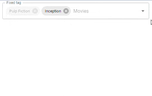 Fixed options autocomplete example
Checkboxes
When using the Material UI <Autocomplete component, you can choose to use checkboxes as search input option values. This helps you choose your options definitively and makes for a better user experience.
Consider the code below:
import * as React from "react";
import Checkbox from "@mui/material/Checkbox";
import TextField from "@mui/material/TextField";
import Autocomplete from "@mui/material/Autocomplete";
import CheckBoxOutlineBlankIcon from "@mui/icons-material/CheckBoxOutlineBlank";
import CheckBoxIcon from "@mui/icons-material/CheckBox";

const icon = <CheckBoxOutlineBlankIcon fontSize="small" />;
const checkedIcon = <CheckBoxIcon fontSize="small" />;

// Top 5 Nigerian songs on Apple Music
const top5Songs = [
  { title: "Organize" },
  { title: "Joha" },
  { title: "Terminator" },
  { title: "Dull" },
  { title: "Nzaza" },
];

export default function CheckboxesTags() {
  return (
    <Autocomplete
      multiple
      id="checkboxes-tags-demo"
      options={top5Songs}
      disableCloseOnSelect
      getOptionLabel={(option) => option.title}
      renderOption={(props, option, { selected }) => (
        <li {...props}>
          <Checkbox icon={icon} checkedIcon={checkedIcon} checked={selected} />
          {option.title}
        </li>
      )}
      style={{ width: 500 }}
      renderInput={(params) => (
        <TextField {...params} label="Checkboxes" placeholder="Checkboxes" />
      )}
    />
  );
}
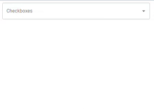 Checkbox autocomplete options
Accessibility Features
I have added a new section to the article about our Material-UI AutoComplete component that addresses accessibility features. This section explains how to treat accessibility in general and gives some specific examples of how ARIA attributes might be implemented in a product, along with keyboard navigation.
ARIA Properties
Introduction: It is essential that we make our applications accessible to every user. ARIA, or Accessible Rich Internet Applications, attributes help increase accessibility within our components.
Example: Make the AutoComplete component more accessible by adding in ARIA attributes as shown below:
- Adding ARIA Attributes to Input:
- If possible, use
aria-label,aria-labelledby, oraria-describedbyto describe the input for accessible purposes.
<Autocomplete
  options={top5Songs}
  renderInput={(params) => (
    <TextField
      {...params}
      label="Songs"
      slotProps={{
        input: {
          ...params.slotProps.input,
          "aria-label": "Songs",
          "aria-labelledby": "autocomplete-label",
          "aria-describedby": "autocomplete-desc",
        },
      }}
    />
  )}
/>
- Describing the Role and Status:
role="combobox": Describes the role of the AutoComplete input.- Be sure to use
aria-expandedto let users know if the dropdown is opened or closed.
<Autocomplete
  options={top5Songs}
  renderInput={(params) => (
    <TextField
      {...params}
      slotProps={{
        input: {
          ...params.slotProps.input,
          role: "combobox",
          "aria-expanded": open ? "true" : "false",
        },
      }}
    />
  )}
/>
- Providing Accessible Descriptions:
- Use
aria-liveandaria-relevantto manage announcements about dropdown changes made visible to screen readers.
<Autocomplete
  options={top5Songs}
  renderInput={(params) => (
    <TextField
      {...params}
      slotProps={{
        input: {
          ...params.slotProps.input,
          "aria-live": "polite",
          "aria-relevant": "additions removals",
        },
      }}
    />
  )}
/>
Keyboard Navigation
Introduction: It is important to make sure that the functionality of our AutoComplete component can also be accessed by using the keyboard so that it could be operated even without a pointing device. This will require that we handle keyboard events in such a way that a user could interact with our component only through the use of the keyboard.
Example:
Below are some code snippets and tips to improve keyboard navigation:
- Keyboard Events:
- Use
onKeyDownto implement navigation with the arrow keys, selection with Enter, and closing the dropdown with Escape.
<Autocomplete
  options={top5Songs}
  onKeyDown={(event) => {
    if (event.key === "ArrowDown") {
      // Navigate to next option
    } else if (event.key === "ArrowUp") {
      // Navigate to previous option
    } else if (event.key === "Enter") {
      // Select the option
    } else if (event.key === "Escape") {
      // Close the dropdown
    }
  }}
  renderInput={(params) => <TextField {...params} label="Songs" />}
/>
- Focus Management:
- Ensure that it behaves responsibly concerning focus with the dropdown open and closed.
- Use
tabindexto control the tabbing order of dropdown items.
<Autocomplete
  options={top5Songs}
  renderInput={(params) => (
    <TextField
      {...params}
      slotProps={{
        input: {
          ...params.slotProps.input,
          tabindex: 0, // Ensure the input is focusable
        },
      }}
    />
  )}
  ListboxProps={{
    "aria-labelledby": "autocomplete-label",
    id: "autocomplete-options",
  }}
/>
These accessibility features ensure all users can use our AutoComplete component without issue, including screen reader users and keyboard navigators.
Cloning Google’s Home Page UI with Material UI Autocomplete
The majority of products incorporate search inputs into various elements of their web applications. Google's Home page layout illustrates how search inputs might be used in typical real-world application. For the sake of this tutorial, we will use React and Material UI Autocomplete to replicate Google's home page layout.
Here’s the code:
import React from "react";
import TextField from "@mui/material/TextField";
import Stack from "@mui/material/Stack";
import Autocomplete from "@mui/material/Autocomplete";
import AppsIcon from "@mui/icons-material/Apps";

// Top 5 Nigerian songs on Apple Music
const top5Songs = [
  { title: "Organize" },
  { title: "Joha" },
  { title: "Terminator" },
  { title: "Dull" },
  { title: "Nzaza" },
];

const Home = () => {
  const style = {
    root: {
      width: 600,
      color: "#fff",
      marginLeft: "25em",
    },
  };
  return (
    <>
      <main>
        <Stack spacing={2} sx={{ width: 300 }}>
          <nav>
            <p>Gmail</p>
            <p>Images</p>
            <AppsIcon />
            <div>
              <img
                src="https://refine.ams3.cdn.digitaloceanspaces.comage from "
                alt="Google apps icon"
              />
            </div>
          </nav>

          <div id="logo-div">
            <img
              src="https://refine.ams3.cdn.digitaloceanspaces.comgo from "
              alt="Google logo"
            />
          </div>

          <div id="autocomplete-div">
            <Autocomplete
              id="auto-complete"
              freeSolo
              options={top5Songs.map((option) => option.title)}
              style={style.root}
              slotProps={{
                input: {
                  style: { backgroundColor: "#333", borderRadius: "24px" },
                },
              }}
              renderInput={(params) => (
                <TextField {...params} label="freeSolo" />
              )}
            />
          </div>

          <article>
            <div className="below-input">Google Search</div>
            <div className="below-input">I'm feeling Lucky</div>
          </article>

          <footer className="footer">
            <div className="aside1">
              <p>About</p>
              <p>Advertising</p>
              <p>Business</p>
              <p>How Search works</p>
            </div>

            <div className="aside2">
              <img
                src="some image"
                alt="Carbon neutral icon"
                data-atf="1"
                data-frt="0"
              ></img>
              <p>Carbon Neutral since 2007</p>
            </div>

            <div className="aside3">
              <p>Privacy</p>
              <p>Terms</p>
              <p>Settings</p>
            </div>
          </footer>
        </Stack>
      </main>
    </>
  );
};

export default Home;
Here’s the result:
 Google-style search UI with autocomplete
Material UI Autocomplete Limitations
autocomplete/autofill
Heuristics are built into browsers to assist users in filling out form inputs, but tend to hurt the component's UX. With the autoComplete="off" attribute, the component disables the input autocomplete feature (remembering what the user wrote for a specific field in a previous session). One possible fix is removing the id and letting the component generate one randomly.
In addition to remembering previously entered information, the browser may make autofill suggestions (saved login, address, or username). If you wish to avoid autofill, you can attempt the following:
Name the input without revealing any information that the browser can utilize. id="field1" instead of id="country" If you leave the id field empty, the component generates a random id.
Set autoComplete="new-password". Some browsers will recommend a secure password for inputs with this attribute set.
Using AutoComplete with Formik
I've added a new section on integrating the Material UI AutoComplete component with Formik. In this section, I will give an overview of how integration can be done without actual code snippets.
Overview
Formik is an already well-known library for managing form states in React. Since Material-UI's AutoComplete component is integrated with Formik, it will provide us with all the good features of Formik in terms of validation and state management for the robust form, and, in parallel, it would allow user input.
Example
The following shows how you can use the Material UI AutoComplete component in combination with Formik:
- Setup: The first thing you need to do is install Formik and Yup if you haven't done so yet.
npm install formik yup @mui/material @emotion/react @emotion/styled
- Custom AutoComplete Component:
- Make a custom component combining Material UI's AutoComplete with Formik.
- Use the
useFieldhook from Formik to sync your AutoComplete component with the form state from Formik.
import React from "react";
import { Formik, Form, Field } from "formik";
import * as Yup from "yup";
import { TextField, Autocomplete } from "@mui/material";
import { useField } from "formik";

// Custom AutoComplete component with Formik integration
const FormikAutoComplete = ({ label, ...props }) => {
  const [field, meta, helpers] = useField(props);
  const { setValue } = helpers;

  return (
    <Autocomplete
      {...props}
      onChange={(event, value) => setValue(value)}
      renderInput={(params) => (
        <TextField
          {...params}
          {...field}
          label={label}
          error={meta.touched && Boolean(meta.error)}
          helperText={meta.touched && meta.error}
        />
      )}
    />
  );
};

// Validation schema using Yup
const validationSchema = Yup.object({
  song: Yup.string().required("Required"),
});

const options = [
  { title: "Organize" },
  { title: "Joha" },
  { title: "Terminator" },
  { title: "Dull" },
  { title: "Nzaza" },
];

const AutoCompleteForm = () => {
  return (
    <Formik
      initialValues={{ song: "" }}
      validationSchema={validationSchema}
      onSubmit={(values) => {
        console.log(values);
      }}
    >
      {({ setFieldValue }) => (
        <Form>
          <Field
            name="song"
            component={FormikAutoComplete}
            options={options}
            getOptionLabel={(option) => option.title}
            label="Song"
          />
          <button type="submit">Submit</button>
        </Form>
      )}
    </Formik>
  );
};

export default AutoCompleteForm;
Validation Schema:
- Define a validation schema using Yup, which enforces the validation requirement on the AutoComplete field.
Form Implementation:
- Make use of Formik's custom AutoComplete component.
- Handle form submission and validations with the help of Formik's components like Form and Field.
By following these steps, you can now easily use the Material UI AutoComplete component in combination with Formik in a way that maintains the state and validates form elements.
Conclusion
In this article, we discussed the Material UI Autocomplete component, its 'option' props, functionalities and variations. We then moved on to clone Google's Home page using the Autocomplete component. . Despite its limitations, Material UI Autocomplete assists developers in generating a responsive and interactive search input for any web interface. I hope you find this post useful.