.png?fm=webp&auto=format&w=1788)


Introduction
In building data-intensive applications like React admin dashboards and in-house applications, among others, speed, customizability, and performance are of the essence as these applications are pivotal in the management of most businesses and software. This has led developers to opt for solutions like Refine that provide these qualities out of the box. Refine is a React-based framework that helps to build data-intensive applications in due time. It does this by providing hooks, providers, and components that provide room for UI customizability, and data management, as well as easy integration with any custom backend APIs and popular backend services like Strapi, Hasura, etc.
In this React admin panel tutorial, we will be creating an admin application with Refine that will be built with ChakraUI, an enterprise-level React component library, and Strapi, a popular backend service, as its backend provider.
Benefits of using Refine
Refine accelerates development by creating a higher abstraction of most functionalities such as routing, data providers, authentication, internationalization, layouts, asynchronous state management, and many others that developers would have to set up from scratch if building the application from the ground up.
With Refine, you have the choice to build your application with a custom design (a headless approach) or a UI component library. Refine includes integrations for some component libraries and design systems, like Material UI, Chakra UI, Ant Design, and Mantime.
It can also be integrated into any REST or GraphQL backend service and includes out-of-the-box support for popular BAAS (backend as a service) such as NestJs CRUD, Airtable, Strapi, Supabase, and others.
A peculiarity of Refine is that it provides a lot of out-of-the-box functionality for rapid development while still allowing for extreme customization. You can build a variety of applications with Refine, and it isn't limited to major use cases like React admin panels, B2B applications, and dashboards. In this React admin tutorial, we will be illustrating how to build a CRUD app with refine.
Whether you're a beginner or an experienced developer, this React admin tutorial will walk you through the entire process, step by step, and show you how to integrate Strapi as your backend CMS to create an amazing React admin panel.
What is Strapi?
Strapi is a free and open-source headless Content Management System built on Node.js. It allows developers to easily create, manage, and consume content through a customizable API. Strapi provides a user-friendly admin panel for content editors to manage content without having to write code, while also providing a flexible content modeling system that can be tailored to fit specific project needs.
Constituents of A Refine Application
Before delving in to build the CRUD React admin tutorial app, we need to know the constitutes of an Refine application.
The <Refine/> Component
The <Refine/> acts as the entrypoint of the application. it is a component that receives the configurations passed into it as react props.
import { Refine } from "@refinedev/core";
import dataProvider from "@refinedev/simple-rest";
import routerProvider, { NavigateToResource } from "@refinedev/react-router";

import { PostList, PostCreate, PostEdit, PostShow } from "pages/posts";

const API_URL = "https://api.fake-rest.refine.dev";

const App: React.FC = () => {
  return (
    <Refine
      routerProvider={routerProvider}
      dataProvider={dataProvider(API_URL)}
      resources={[
        {
          name: "posts",
          list: "/posts",
          create: "/posts/create",
          edit: "/posts/edit/:id",
          show: "/posts/show/:id",
          meta: {
            canDelete: true,
          },
        },
      ]}
    >
      <Routes>
        <Route index element={<NavigateToResource resource="posts" />} />

        <Route path="/posts">
          <Route index element={<PostList />} />
          <Route path="create" element={<PostCreate />} />
          <Route path="edit/:id" element={<PostEdit />} />
          <Route path="show/:id" element={<PostShow />} />
        </Route>
      </Routes>
    </Refine>
  );
};

export default App;
There are a variety of configurations that can be passed into a Refine application. They are:
Data Provider
Data provider enables a Refine application to connect to an external API or service. A dataProvider sends HTTP requests and receives responses via predefined methods.
Here is a sample on how to adding a dataProvider to the Refine component.
import { Refine } from "@refinedev/core";
import { authProvider, axiosInstance } from "./authProvider";
import { DataProvider } from "@refinedev/strapi-v4";

function App() {
  return (
    <Refine
      dataProvider={DataProvider(API_URL + `/api`, axiosInstance)}
      //...
    />
  );
}

export default App;
Resource
A resources is a fundamental component of a Refine application. A resource acts as a bridge between the Data/API layer and the Document/Page Layer. A resource enables the application's pages to interact with the API.
To create a resource; define our resources and their action paths. This will inform Refine to use these paths when generating the breadcrumbs, menus, handling redirections and inferring the current resource and action.
In accordance with the path definitions in a resource object, we have to assign a <Route /> for each path and an element to display at that path.
The <Route> corresponding to the created actions is defined. It is important to remember that the path specified in the resource definition should match the path specified in the route definition.
Refer to React Router docs for more information.
import { Refine } from "@refinedev/core";
import { PostList, PostCreate, PostEdit, PostShow } from "pages/posts";

const API_URL = "https://api.fake-rest.refine.dev";

const App: React.FC = () => {
  return (
    <Refine
      //...
      resources={[
        {
          name: "posts",
          list: "/posts",
          create: "/posts/create",
          edit: "/posts/edit/:id",
          show: "/posts/show/:id",
          meta: {
            canDelete: true,
          },
        },
      ]}
    >
      <Routes>
        <Route path="/posts">
          <Route index element={<PostList />} />
          <Route path="create" element={<PostCreate />} />
          <Route path="edit/:id" element={<PostEdit />} />
          <Route path="show/:id" element={<PostShow />} />
        </Route>
      </Routes>
    </Refine>
  );
};

export default App;
Bootstrapping the Refine Application
To create our Refine application for this article, we will use the create refine-app wizard.
create refine-app comes with built-in templates for the CRA, Next.js, and Remix environments, allowing you to setup a Refine project quickly. It also provides an array of options for automatically configuring your UI framework, i18n, router, authentication, and data provider settings.
In order to use this, execute the following command:
npm create refine-app@latest <name of your application>
You will be directed to the CLI wizard after running the command. To complete the CLI wizard, select the following options:
✔ Choose a project template · Refine(Vite)
✔ What would you like to name your project? · blog-ra-chakra-tutorial
✔ Choose your backend service to connect · Strapi V4
✔ Do you want to use a UI Framework? · Chakra UI
✔ Do you want to add example pages? · No
✔ Do you need i18n (Internationalization) support? · No
✔ Choose a package manager · npm
When these options are selected, the CLI will bootstrap a Refine application with the Strapi-v4 provider.
Following installation, we will execute the following command:
npm run dev
The Refine application should be up and running after you run the command. To access it, go to http://localhost:5173.
 Chakra admin dashboard welcome screen
Setting AuthProvider
The create-refine-app command generates a new Refine application with a default AuthProvider. If you followed the steps above to create your application using create-react-app, you should already have the src/authProvider.ts file.
It's worth noting that the authProvider's login method is especially important. We'll be using email and password to sign in to our application, so make sure that the login method contains the code provided below.
export const authProvider: AuthProvider = {
    login: async ({ email, password }) => {
        const { data, status } = await strapiAuthHelper.login(email, password);
        if (status === 200) {
            localStorage.setItem(TOKEN_KEY, data.jwt);

            // set header axios instance
            axiosInstance.defaults.headers.common = {
                Authorization: `Bearer ${data.jwt}`,
            };

            return {
                success: true,
                redirectTo: "/",
            };
        }
        return {
            success: false,
            error: {
                message: "Login Error",
                name: "Invalid email or password",
            }
        };
    },
    ...
};
Using <Authentication> Component
The <Authenticated> component is used to manage authenticated routes. This component leverages the useIsAuthenticated hook to determine the authentication status of the user. It handles redirection and rendering specific elements based on this status through children and fallback props.
To achieve protected routes, the <Outlet> component from react-router-dom is utilized, ensuring routes are only accessible when the user is authenticated.
To handle scenarios where a user is not authenticated, we've established a /login route. This utilizes the <AuthPage> component found in Refine UI packages, with the 'type' prop set to "login". This configuration effectively renders the login page.
import { Authenticated, Refine } from "@refinedev/core";
import { AuthPage } from "@refinedev/chakra-ui";
import { Outlet, Route, Routes } from "react-router-dom";

function App() {
  return (
    <Refine
    //...
    >
      <Routes>
        <Route
          element={
            <Authenticated fallback={<CatchAllNavigate to="/login" />}>
              <ThemedLayout>
                <Outlet />
              </ThemedLayout>
            </Authenticated>
          }
        >
          {/* We will define `resource` routes here. */}
        </Route>
        <Route
          element={
            <Authenticated fallback={<Outlet />}>
              <NavigateToResource resource="posts" />
            </Authenticated>
          }
        >
          <Route path="/login" element={<AuthPage type="login" />} />
        </Route>
        //...
      </Routes>
      //...
    </Refine>
  );
}

export default App;
TIP
The <NavigateToResource> is a basic component to navigate to a resource page. It is useful when you want to navigate to a resource page from the index route of your app.
The <ThemedLayout>component offers a convenient way to integrate both a sidebar and a header into your application. This is a helpful feature if you aim to include these elements in your app's layout.
Implementing CRUD operations on React admin panel
We will implement CRUD operations such as listing, creating, and editing records in our React admin tutorial application.
In this article, we describe our React admin tutorial app, which is one that can track the list of posts created, as well as have the functionality of viewing a post as well as updating and deleting a post, respectively.
Listing records
To display data on the UI, we must create a <PostList/> page.
To begin, we'll require an interface to interact with the data from the API endpoint.
If you don't already have one, we'll create one under the src folder called interfaces. Then, create a file called index.d.ts with the following code:
export interface IPost {
  id: number;
  title: string;
  content: string;
  category: any;
  publishedAt: string;
  createdAt: string;
}
Next, we create a new folder named pages under the src folder. Under that folder, create a posts folder and add a list.tsx file with the following code:
pages/posts/list.tsx
import React from "react";
import { useTable } from "@refinedev/react-table";
import { List, ShowButton, EditButton, DateField } from "@refinedev/chakra-ui";
import {
  Table,
  Thead,
  Tbody,
  Tr,
  Th,
  Td,
  TableContainer,
  HStack,
} from "@chakra-ui/react";
import { ColumnDef, flexRender } from "@tanstack/react-table";
import { IPost } from "../../interfaces";

export const PostList = () => {
  const columns = React.useMemo<ColumnDef<IPost>[]>(
    () => [
      {
        id: "id",
        accessorKey: "id",
        header: "Id",
      },
      {
        id: "title",
        accessorKey: "title",
        header: "Title",
      },
      {
        id: "createdAt",
        accessorKey: "createdAt",
        header: "Created At",
        cell: function render({ getValue }) {
          return <DateField value={getValue() as string} format="LLL" />;
        },
      },
      {
        id: "actions",
        accessorKey: "id",
        header: "Actions",
        cell: function render({ getValue }) {
          return (
            <HStack>
              <ShowButton hideText recordItemId={getValue() as string} />
              <EditButton hideText recordItemId={getValue() as string} />
            </HStack>
          );
        },
      },
    ],
    [],
  );

  const {
    reactTable: { getHeaderGroups, getRowModel, setOptions },
  } = useTable({
    columns,
  });

  setOptions((prev) => ({
    ...prev,
    meta: {
      ...prev.meta,
    },
  }));

  return (
    <List>
      <TableContainer whiteSpace="pre-line">
        <Table variant="simple">
          <Thead>
            {getHeaderGroups().map((headerGroup) => (
              <Tr key={headerGroup.id}>
                {headerGroup.headers.map((header) => (
                  <Th key={header.id}>
                    {!header.isPlaceholder &&
                      flexRender(
                        header.column.columnDef.header,
                        header.getContext(),
                      )}
                  </Th>
                ))}
              </Tr>
            ))}
          </Thead>
          <Tbody>
            {getRowModel().rows.map((row) => (
              <Tr key={row.id}>
                {row.getVisibleCells().map((cell) => (
                  <Td key={cell.id}>
                    {flexRender(cell.column.columnDef.cell, cell.getContext())}
                  </Td>
                ))}
              </Tr>
            ))}
          </Tbody>
        </Table>
      </TableContainer>
    </List>
  );
};
In the code above, we use the useTable() hook from the @refinedev/react-table package to fetch records from Strapi. the useTable() maps the records into rows based on the columns variable definition.
After this, we need to add a path (/posts) for the list action to our resources in the App.tsx file.
function App() {
  return (
    <Refine
      //...
      resources={[
        {
          name: "posts",
          list: "/posts",
        },
      ]}
    />
  );
}

export default App;
For this, we need to create a <Route> with the same path. To do this, we should create a <Route> with the same path and provide the <PostList> component to the element prop.
import { NavigateToResource, Route, Routes } from "@refinedev/react-router";
import { PostList } from "./pages/posts/list";

function App() {
  return (
    <Refine
    //...
    >
      <Routes>
        //...
        <Route index element={<NavigateToResource resource="posts" />} />
        <Route path="/posts">
          <Route index element={<PostList />} />
        </Route>
        //...
      </Routes>
    </Refine>
  );
}

export default App;
To avoid encountering an empty screen when going to the homepage, we use the <NavigateToResource> component to redirect to the posts resource.
It will prompt you to log in to the app. Since we are using Refine's fake strapi-v4 API, Try these credentials:
Username: demo@refine.dev Password: demodemo
Check that the URL is routed to /posts and that posts are present.
Handling Relationships
When retrieving recorda, relations are not populated. Hence, We will use the meta option to populate the Strapi v4 API with relational data (category data in our case).
Refer to docs for handling relations with strapi
We will populate records with a category id field from the /posts endpoint with their respective titles. To automatically get category titles from the /categories endpoint for each record and display them on our table, we must use Strapi v4's populate feature.
We'll use the populate parameter to specify which fields should be filled in. we will assign an array to the populate parameter which will contain the map the values from the /categories endpoint to the records with a category id on the /posts endpoint. The populate parameter will be a property of the meta property which is subsequently a property of the refineCoreProps object.
const {
  reactTable: { getHeaderGroups, getRowModel, setOptions },
} = useTable({
  columns,
  refineCoreProps: {
    meta: {
      populate: ["category"],
    },
  },
});
To show category field in table, we need to add new column to the PostList component.
const columns = React.useMemo<GridColumns<IPost>>(
  () => [
    // ...
    {
      id: "category",
      accessorKey: "category.title",
      header: "Category",
      cell: function render({ getValue }) {
        return getValue();
      },
    },
    // ...
  ],
  [],
);
 Handling relationships table view
Pagination Of Listed Records
Next, we will add Pagination to our application. In order to achieve this, the usePagination hook provides certain functions that handle pagination.
Create a new file called pagination.tsx under the components folder. This file will contain the code for the pagination component.
currentPage: This property holds the current page number obtained from theuseTable()hook,pageCount: This property holds the total amount of pages present from theuseTable()hook,setCurrentPage(): This property sets the current page number to an value. it handles the navigation to either the next page or the previous page.
src/components/pagination/index.tsx
import { FC } from "react";
import { HStack, Button, Box } from "@chakra-ui/react";
import { IconChevronRight, IconChevronLeft } from "@tabler/icons-react";
import { usePagination } from "@refinedev/chakra-ui";

import { IconButton } from "@chakra-ui/react";

type PaginationProps = {
  currentPage: number;
  pageCount: number;
  setCurrentPage: (page: number) => void;
};

export const Pagination: FC<PaginationProps> = ({
  currentPage,
  pageCount,
  setCurrentPage,
}) => {
  const pagination = usePagination({
    currentPage,
    pageCount,
  });

  return (
    <Box display="flex" justifyContent="flex-end">
      <HStack my="3" spacing="1">
        {pagination?.prev && (
          <IconButton
            aria-label="previous page"
            onClick={() => setCurrentPage(currentPage - 1)}
            disabled={!pagination?.prev}
            variant="outline"
          >
            <IconChevronLeft size="18" />
          </IconButton>
        )}

        {pagination?.items.map((page) => {
          if (typeof page === "string") return <span key={page}>...</span>;

          return (
            <Button
              key={page}
              onClick={() => setCurrentPage(page)}
              variant={page === currentPage ? "solid" : "outline"}
            >
              {page}
            </Button>
          );
        })}
        {pagination?.next && (
          <IconButton
            aria-label="next page"
            onClick={() => setCurrentPage(currentPage + 1)}
            variant="outline"
          >
            <IconChevronRight size="18" />
          </IconButton>
        )}
      </HStack>
    </Box>
  );
};
We'll update the <PostList/> component with the code below:
src/pages/posts/list.tsx
import { Pagination } from "../../components/pagination";

export const PostList = () => {
  //...
  const {
    reactTable: { getHeaderGroups, getRowModel },
    setOptions,
    refineCore: {
      currentPage: currentPage,
      pageCount,
      setCurrentPage: setCurrentPage,
    },
  } = useTable({
    columns,
    refineCoreProps: {
      meta: {
        populate: ["category"],
      },
    },
  });

  return (
    <List>
      ...
      <Pagination
        currentPage={currentPage}
        pageCount={pageCount}
        setCurrentPage={setCurrentPage}
      />
    </List>
  );
};
Viewing a record
To view a record, we will use the useShow() hook, which is included in the @refinedev/core package.
The hook useShow() allows you to retrieve the desired record. It uses the getOne method from the dataProvider passed to <Refine/> as the query function.
We'll add a show.tsx file in the posts folder under the pages folder next, with the following code:
src/pages/posts/show.tsx
import { useOne, useShow } from "@refinedev/core";
import { Show, NumberField, TextField, DateField } from "@refinedev/chakra-ui";
import { Heading } from "@chakra-ui/react";

export const PostShow = () => {
  const { query } = useShow({
    meta: {
      populate: ["category"],
    },
  });
  const { data, isLoading } = query;

  const record = data?.data;

  const { data: categoryData, isLoading: categoryIsLoading } = useOne({
    resource: "categories",
    id: record?.category?.id || "",
    queryOptions: {
      enabled: !!record,
    },
  });

  return (
    <Show isLoading={isLoading}>
      <Heading as="h5" size="sm" mt={4}>
        Id
      </Heading>
      <NumberField value={record?.id ?? ""} />

      <Heading as="h5" size="sm" mt={4}>
        Title
      </Heading>
      <TextField value={record?.title} />

      <Heading as="h5" size="sm" mt={4}>
        Category
      </Heading>

      {categoryIsLoading ? <>Loading...</> : <>{categoryData?.data?.title}</>}

      <Heading as="h5" size="sm" mt={4}>
        Content
      </Heading>
      <TextField value={record?.content} />

      <Heading as="h5" size="sm" mt={4}>
        Created At
      </Heading>
      <DateField value={record?.createdAt} />

      <Heading as="h5" size="sm" mt={4}>
        Published At
      </Heading>
      <DateField value={record?.publishedAt} />

      <Heading as="h5" size="sm" mt={4}>
        Locale
      </Heading>
      <TextField value={record?.locale} />
    </Show>
  );
};
After this, we can now add the component <PostShow/> in the show.tsx file to our resource present in the App.tsx file
//...
import {
  PostList,
  PostShow,
} from "./pages/posts";

function App() {
  return (
    <Refine
      //...
      resources={[
        {
          name: "posts",
          list: "/posts",
          show: "/posts/show/:id",
        },
      ]}
    >
      <Routes>
        //...
        <Route index element={<NavigateToResource resource="posts" />} />
        <Route path="/posts">
          <Route index element={<PostList />} />
          <Route path="/posts/show/:id" element={<PostShow />} />
        </Route>
        //...
      </Routes>
    </Refine>
  );
}

export default App;
At this point, the Show page looks like this:
 Record details view
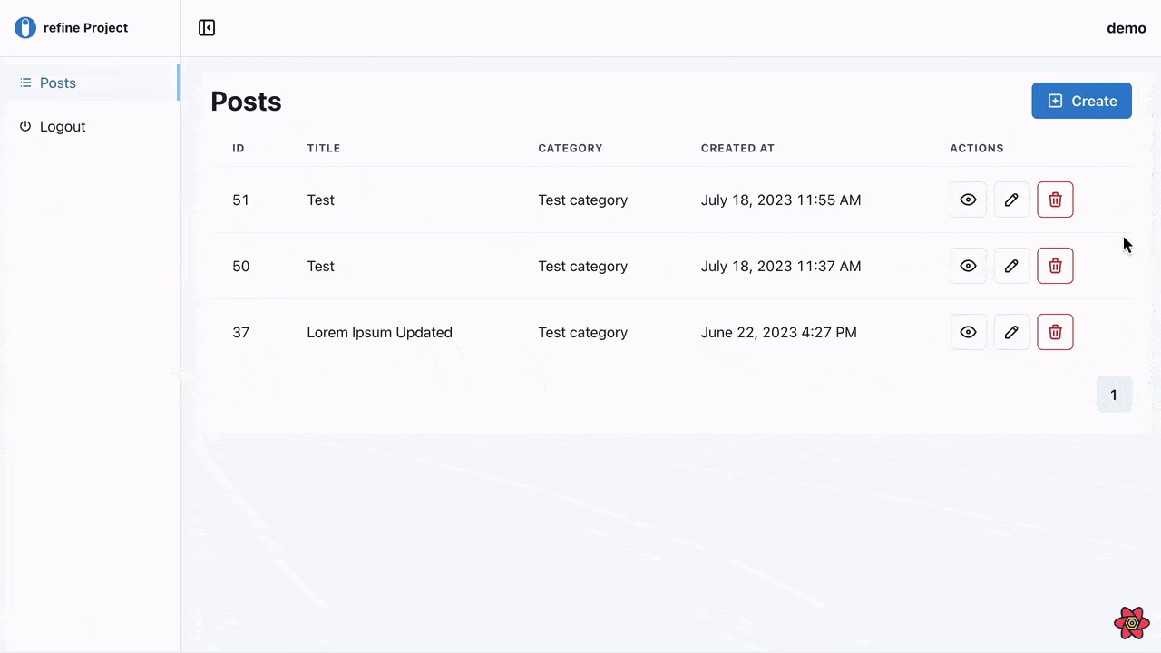
Creating a record
To create a record, we will use the @refinedev/react-hook-form package.
It provides the useForm() hook, which includes form validation and handles our form submission request to Strapi.
Next, in the posts folder under the pages folder, we'll include a create.tsx file with the following code:
src/pages/posts/create.tsx
import React from "react";
import { Create } from "@refinedev/chakra-ui";
import {
  FormControl,
  FormLabel,
  FormErrorMessage,
  Input,
  Textarea,
  Select,
} from "@chakra-ui/react";
import { useSelect } from "@refinedev/core";
import { useForm } from "@refinedev/react-hook-form";

export const PostCreate = () => {
  const {
    refineCore: { formLoading, query },
    saveButtonProps,
    register,
    resetField,
    formState: { errors },
  } = useForm();

  const postsData = query?.data?.data;

  const { options: categoryOptions } = useSelect({
    resource: "categories",
    defaultValue: postsData?.category?.id,
  });

  React.useEffect(() => {
    resetField("category.id");
  }, [categoryOptions]);

  return (
    <Create isLoading={formLoading} saveButtonProps={saveButtonProps}>
      <FormControl mb="3" isInvalid={!!(errors as any)?.title}>
        <FormLabel>Title</FormLabel>
        <Input
          type="text"
          {...register("title", {
            required: "This field is required",
          })}
        />
        <FormErrorMessage>
          {(errors as any)?.title?.message as string}
        </FormErrorMessage>
      </FormControl>

      <FormControl mb="3" isInvalid={!!(errors as any)?.title}>
        <FormLabel>Content</FormLabel>
        <Textarea
          {...register("content", {
            required: "This field is required",
          })}
        />
        <FormErrorMessage>
          {(errors as any)?.title?.message as string}
        </FormErrorMessage>
      </FormControl>

      <FormControl mb="3" isInvalid={!!errors?.category}>
        <FormLabel>Category</FormLabel>
        <Select
          placeholder="Select category"
          {...register("category.id", {
            required: "This field is required",
          })}
        >
          {categoryOptions?.map((option) => (
            <option value={option.value} key={option.value}>
              {option.label}
            </option>
          ))}
        </Select>
        <FormErrorMessage>
          {(errors as any)?.category?.id?.message as string}
        </FormErrorMessage>
      </FormControl>
    </Create>
  );
};
In the code above, we used the useForm() hook to create records. This hook comes from the (@refinedev/react-hook-form) which is a Refine adapter of the React Hook Form library. This library allows you to use the React Hook Form library with refine. More information about the useForm() hook can be obtained here.
we use methods provided by the useForm() hook like register() to validate the new post we will add into Strapi.
The hooks also provide an object like saveButtonProps which accepts the properties shown below:
{
    disabled: boolean;
    onClick: (e: React.BaseSyntheticEvent<object, any, any>) => void;
}
These properties handles the submission of the form action, button loading, and disable states.
After this, we can now add the component <PostCreate/> in the create.tsx file to our resource present in the App.tsx file
//...
import {
  PostList,
  PostShow,
  PostCreate,
} from "./pages/posts";

function App() {
  return (
    <Refine
      //...
      resources={[
        {
          name: "posts",
          list: "/posts",
          show: "/posts/show/:id",
          create: "/posts/create",
        },
      ]}
    >
      <Routes>
        //...
        <Route index element={<NavigateToResource resource="posts" />} />
        <Route path="/posts">
          <Route index element={<PostList />} />
          <Route path="/posts/show/:id" element={<PostShow />} />
          <Route path="/posts/create" element={<PostCreate />} />
        </Route>
        //...
      </Routes>
    </Refine>
  );
}

export default App;
 Create record form
Modifying/Editing records
For editing a record, we will add an edit.tsx file In the posts folder under the pages folder and add the code below to the file:
src/pages/posts/edit.tsx
import React from "react";
import { Edit } from "@refinedev/chakra-ui";
import {
  FormControl,
  FormLabel,
  FormErrorMessage,
  Input,
  Select,
} from "@chakra-ui/react";
import { useForm } from "@refinedev/react-hook-form";
import { useSelect } from "@refinedev/core";

export const PostEdit = () => {
  const {
    refineCore: { formLoading, query },
    saveButtonProps,
    register,
    resetField,
    formState: { errors },
  } = useForm({
    refineCoreProps: {
      meta: {
        populate: ["category"],
      },
    },
  });

  const postsData = query?.data?.data;

  const { options: categoryOptions } = useSelect({
    resource: "categories",
    defaultValue: postsData?.category?.id,
  });

  React.useEffect(() => {
    resetField("category.id");
  }, [categoryOptions]);

  return (
    <Edit isLoading={formLoading} saveButtonProps={saveButtonProps}>
      <FormControl mb="3" isInvalid={!!(errors as any)?.id}>
        <FormLabel>Id</FormLabel>
        <Input
          disabled
          type="number"
          {...register("id", {
            required: "This field is required",
          })}
        />
        <FormErrorMessage>
          {(errors as any)?.id?.message as string}
        </FormErrorMessage>
      </FormControl>

      <FormControl mb="3" isInvalid={!!(errors as any)?.title}>
        <FormLabel>Title</FormLabel>
        <Input
          type="text"
          {...register("title", {
            required: "This field is required",
          })}
        />
        <FormErrorMessage>
          {(errors as any)?.title?.message as string}
        </FormErrorMessage>
      </FormControl>

      <FormControl mb="3" isInvalid={!!(errors as any)?.content}>
        <FormLabel>Content</FormLabel>
        <Input
          type="text"
          {...register("content", {
            required: "This field is required",
          })}
        />
        <FormErrorMessage>
          {(errors as any)?.content?.message as string}
        </FormErrorMessage>
      </FormControl>

      <FormControl mb="3" isInvalid={!!errors?.category}>
        <FormLabel>Category</FormLabel>
        <Select
          placeholder="Select category"
          {...register("category.id", {
            required: "This field is required",
          })}
        >
          {categoryOptions?.map((option) => (
            <option value={option.value} key={option.value}>
              {option.label}
            </option>
          ))}
        </Select>
        <FormErrorMessage>
          {(errors as any)?.category?.id?.message as string}
        </FormErrorMessage>
      </FormControl>

      <FormControl mb="3" isInvalid={!!(errors as any)?.createdAt}>
        <FormLabel>Created At</FormLabel>
        <Input
          disabled
          {...register("createdAt", {
            required: "This field is required",
          })}
        />
        <FormErrorMessage>
          {(errors as any)?.createdAt?.message as string}
        </FormErrorMessage>
      </FormControl>

      <FormControl mb="3" isInvalid={!!(errors as any)?.updatedAt}>
        <FormLabel>Updated At</FormLabel>
        <Input
          disabled
          {...register("updatedAt", {
            required: "This field is required",
          })}
        />
        <FormErrorMessage>
          {(errors as any)?.updatedAt?.message as string}
        </FormErrorMessage>
      </FormControl>

      <FormControl mb="3" isInvalid={!!(errors as any)?.publishedAt}>
        <FormLabel>Published At</FormLabel>
        <Input
          disabled
          {...register("publishedAt", {
            required: "This field is required",
          })}
        />
        <FormErrorMessage>
          {(errors as any)?.publishedAt?.message as string}
        </FormErrorMessage>
      </FormControl>

      <FormControl mb="3" isInvalid={!!(errors as any)?.locale}>
        <FormLabel>Locale</FormLabel>
        <Input
          disabled
          type="text"
          {...register("locale", {
            required: "This field is required",
          })}
        />
        <FormErrorMessage>
          {(errors as any)?.locale?.message as string}
        </FormErrorMessage>
      </FormControl>
    </Edit>
  );
};
In the code above, just like in the <PostCreate/> component, we use methods provided by the useForm() hook like register() to validate the new post we will add into Strapi.
The hooks also provide an object like saveButtonProps which handles the submission of the form action, button loading, and disable states
After this, we can now add the component <PostEdit/> in the edit.tsx file to our resource present in the App.tsx file
//...
import {
  PostList,
  PostShow,
  PostCreate,
  PostEdit,
} from "./pages/posts";

function App() {
  return (
    <Refine
      //...
      resources={[
        {
          name: "posts",
          list: "/posts",
          show: "/posts/show/:id",
          create: "/posts/create",
          edit: "/posts/edit/:id",
        },
      ]}
    >
      <Routes>
        //...
        <Route index element={<NavigateToResource resource="posts" />} />
        <Route path="/posts">
          <Route index element={<PostList />} />
          <Route path="/posts/show/:id" element={<PostShow />} />
          <Route path="/posts/create" element={<PostCreate />} />
          <Route path="/posts/edit/:id" element={<PostEdit />} />
        </Route>
        //...
      </Routes>
    </Refine>
  );
}

export default App;
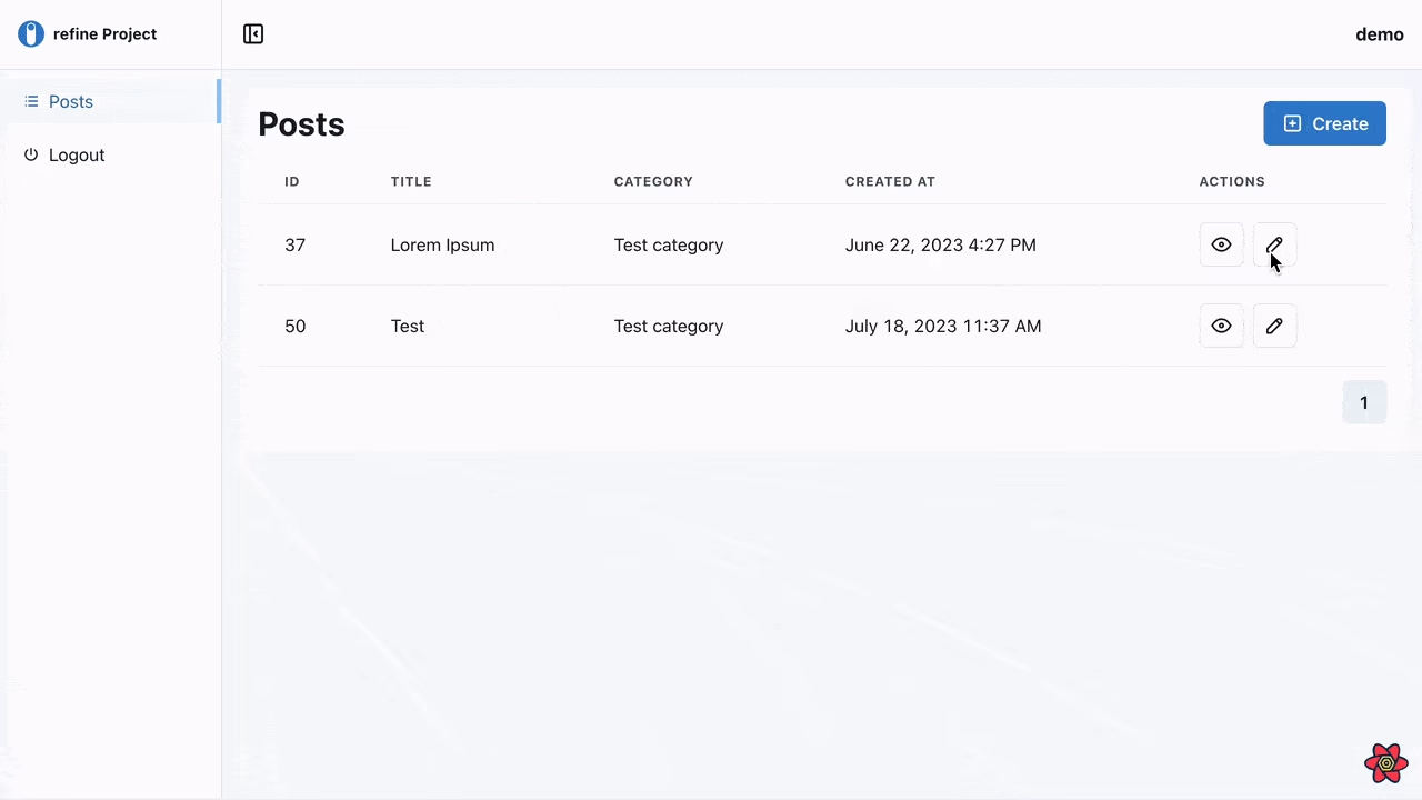 Edit record form
Deleting post record
To delete a record, We'll add a Delete button so we'll need to update our <PostList/> component to include the button to the actions row. Add the highlighted lines below to the existing list component.
...
import {
    ShowButton,
    EditButton,
    DeleteButton,
} from "@refinedev/chakra-ui";

export const PostList = () => {
    //...
    const columns = React.useMemo<ColumnDef<IPost>[]>(
        () => [
            //...
            {
                id: "actions",
                accessorKey: "id",
                header: "Actions",
                cell: function render({ getValue }) {
                return (
                    <HStack>
                        <ShowButton hideText recordItemId={getValue() as string} />
                        <EditButton hideText recordItemId={getValue() as string} />
                        <DeleteButton hideText recordItemId={getValue() as string} />
                    </HStack>
                    );
                },
            },
        ],
    []
  );
  //...
};
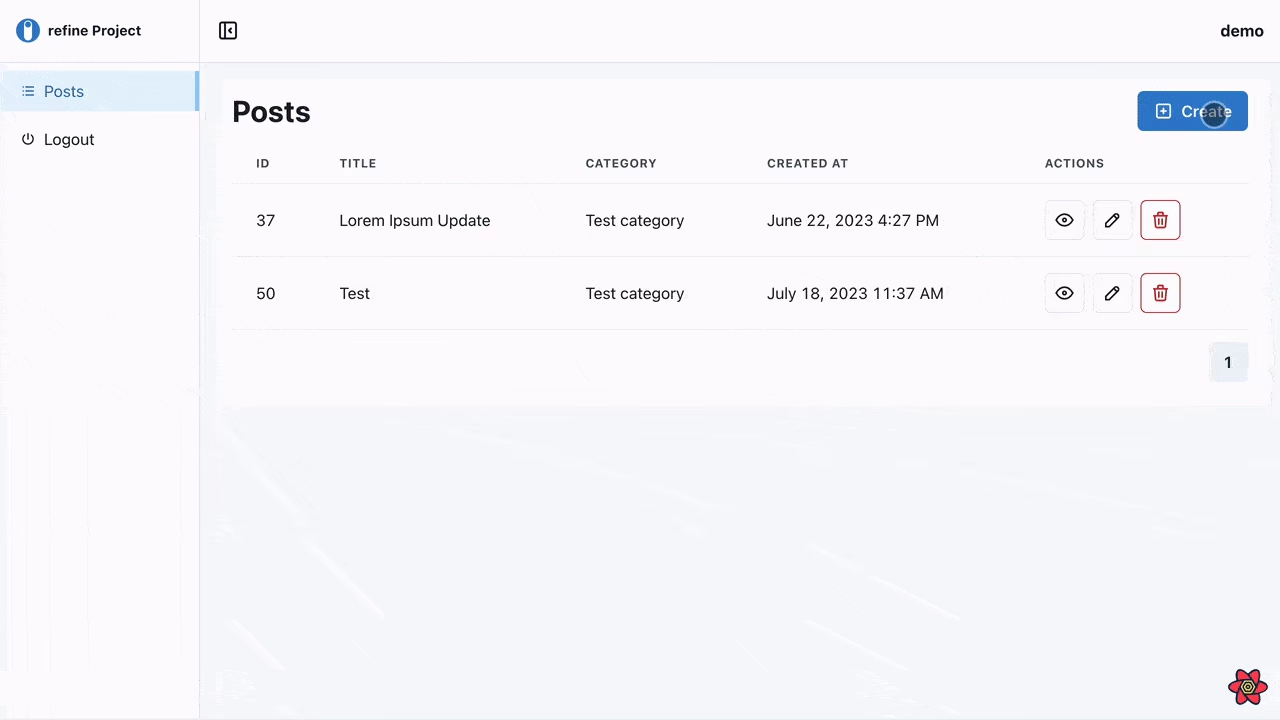
Another way to include a delete button on the <PostEdit> page. To display the delete button on the edit page and the view page, the canDelete prop must be passed to the resource object.
//...
function App() {
  return (
    <Refine
      //...
      resources={[
        {
          name: "posts",
          list: "/posts",
          show: "/posts/show/:id",
          create: "/posts/create",
          meta: {
            canDelete: true,
          },
        },
      ]}
    />
  );
}

export default App;
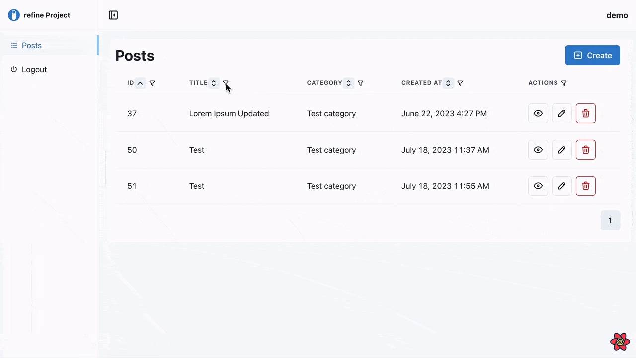
 Delete record confirmation
Implement sorting of listed records
Since the @refinedev/react-table package is based on the Tanstack Table package, we can add sorting and filtering features to our table.
Let's make a <ColumnSorter/> component for our table header. This component will be in charge of changing the table's sorting state.
we create a new folder named components under the src folder. Under that folder, add a ColumnSorter.tsx file with the following code:
src/components/ColumnSorter.tsx
import { IconButton } from "@chakra-ui/react";
import {
  IconChevronDown,
  IconSelector,
  IconChevronUp,
} from "@tabler/icons-react";
import { Column } from "@tanstack/react-table";

export const ColumnSorter: React.FC<{ column: Column<any, any> }> = ({
  column,
}) => {
  if (!column.getCanSort()) {
    return null;
  }

  const sorted = column.getIsSorted();

  const Icon = () => {
    if (!sorted) {
      return <IconSelector size={18} />;
    }

    if (sorted === "asc") {
      return <IconChevronDown size={18} />;
    }

    if (sorted === "desc") {
      return <IconChevronUp size={18} />;
    }

    return null;
  };

  return (
    <IconButton
      aria-label="Sort"
      size="xs"
      onClick={column.getToggleSortingHandler()}
      style={{
        transition: "transform 0.25s",
        transform: `rotate(${sorted === "asc" ? "180" : "0"}deg)`,
      }}
      icon={<Icon />}
    />
  );
};
In the code above, the <ColumnSorter/> is a simple component that displays a button.
The column.getToggleSortingHandler() method is called when the user clicks on the button. This method will alter the table's sorting state.
Also, we use the column.getCanSort() method to determine if the column is sortable. If it is, We will render the <ColumnSorter/> component and vice-versa.
Once the column is sorted, the IconChevronDown icon will be rendered. Otherwise, the IconSelector icon will be rendered.
Next, we import the <ColumnSorter/> component to the list.tsx file located at the src/pages/posts/ directory and add the component to the <Th/> of the table as a child as shown below:
...
import { ColumnSorter } from "../../components/column-sorter";

//...
<Table variant="simple">
    <Thead>
        {getHeaderGroups().map((headerGroup) => (
            <Tr key={headerGroup.id}>
                {headerGroup.headers.map((header) => (
                    <Th key={header.id}>
                        {!header.isPlaceholder &&
                            flexRender(
                                header.column.columnDef.header,
                                header.getContext()
                            )}
                        <ColumnSorter column={header.column} />
                    </Th>
                ))}
            </Tr>
        ))}
    </Thead>
    //...
</Table>
You can set the enableSorting property of the column to false in the column definition to disable sorting for the `actions column, as shown below:
{
    id: "actions",
    accessorKey: "id",
    header: "Actions",
    enableSorting: false,
    ...
},
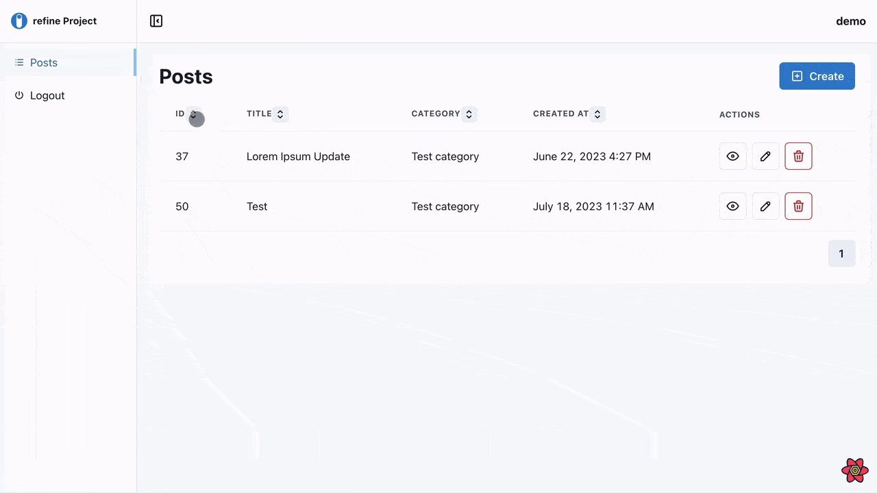 Sorting records table
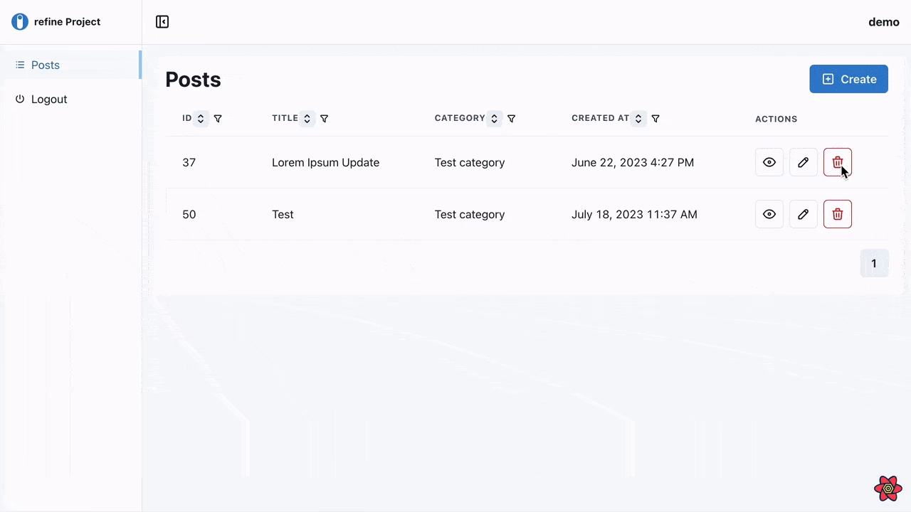
Implement filters on listed records
Firstly, Let's make a <ColumnFilter/> component for our table header. This component will handle the filtering of listed records.
we create a new folder named components under the src folder. Under that folder, add a ColumnFilter.tsx file with the following code:
src/components/ColumnFilter.tsx
import React, { useState } from "react";
import {
  Input,
  Menu,
  IconButton,
  MenuButton,
  MenuList,
  VStack,
  HStack,
} from "@chakra-ui/react";
import { IconFilter, IconX, IconCheck } from "@tabler/icons-react";
import { Column } from "@tanstack/react-table";

export const ColumnFilter: React.FC<{ column: Column<any, any> }> = ({
  column,
}) => {
  const [state, setState] = useState(null as null | { value: any });

  if (!column.getCanFilter()) {
    return null;
  }

  const open = () =>
    setState({
      value: column.getFilterValue(),
    });

  const close = () => setState(null);

  const change = (value: any) => setState({ value });

  const clear = () => {
    column.setFilterValue(undefined);
    close();
  };

  const save = () => {
    if (!state) return;
    column.setFilterValue(state.value);
    close();
  };

  const renderFilterElement = () => {
    const FilterComponent = (column.columnDef?.meta as any)?.filterElement;

    if (!FilterComponent && !!state) {
      return (
        <Input
          borderRadius="md"
          size="sm"
          autoComplete="off"
          value={state.value}
          onChange={(e) => change(e.target.value)}
        />
      );
    }

    return (
      <FilterComponent
        value={state?.value}
        onChange={(e: any) => change(e.target.value)}
      />
    );
  };

  return (
    <Menu isOpen={!!state} onClose={close}>
      <MenuButton
        onClick={open}
        as={IconButton}
        aria-label="Options"
        icon={<IconFilter size="16" />}
        variant="ghost"
        size="xs"
      />
      <MenuList p="2">
        {!!state && (
          <VStack align="flex-start">
            {renderFilterElement()}
            <HStack spacing="1">
              <IconButton
                aria-label="Clear"
                size="sm"
                colorScheme="red"
                onClick={clear}
              >
                <IconX size={18} />
              </IconButton>
              <IconButton
                aria-label="Save"
                size="sm"
                onClick={save}
                colorScheme="green"
              >
                <IconCheck size={18} />
              </IconButton>
            </HStack>
          </VStack>
        )}
      </MenuList>
    </Menu>
  );
};
In the code above, <ColumnFilter/> is a button. on clicking the button, a menu will be opened. In the menu exists a filter element of the column that is being rendered. The filter element is an <Input/> component in which you can add a value which will be used to subsequently filter the records based on that value.
Next, we Import the <ColumnFilter/> component to the list.tsx file located at the src/pages/posts/ directory and add the component to the <Th/> of the table just like we did the <ColumnSorter/> component.
...
import { ColumnSorter } from "../../components/column-sorter";
import { ColumnFilter } from "../../components/column-filter";

//...
<Table variant="simple">
    <Thead>
        {getHeaderGroups().map((headerGroup) => (
            <Tr key={headerGroup.id}>
                {headerGroup.headers.map((header) => (
                    <Th key={header.id}>
                        {!header.isPlaceholder &&
                            flexRender(
                                header.column.columnDef.header,
                                header.getContext()
                            )}
                        <ColumnSorter column={header.column} />
                        <ColumnFilter column={header.column} />
                    </Th>
                ))}
            </Tr>
        ))}
    </Thead>
    //...
</Table>
We can change the filter operator for columns to "contains". The filterOperator is set to "eq" by default. As a result, we changed the filterOperator for specific columns to "contains" as shown below:
{
    id: "id",
    accessorKey: "id",
    header: "Id",
    meta: {
        filterOperator: "eq",
    },
},
{
    id: "title",
    accessorKey: "title",
    header: "Title",
    meta: {
        filterOperator: "contains",
    },
},
{
    id: "category",
    accessorKey: "category.title",
    header: "Category",
    meta: {
        filterOperator: "contains",
    },
    ...
},
{
    id: "createdAt",
    accessorKey: "createdAt",
    header: "Created At",
    ...
},
We can also disable filtering for the actions column by setting the column's enableColumnFilter property to false in the column definition, as shown below:
{
    id: "actions",
    accessorKey: "id",
    header: "Actions",
    enableColumnFilter: false,
    ...
},
 Filtering records table
Implementing mutation mode.
Mutation modes controls how side-effects or actions like deletion, creation, updating, etc are applied. Refine provides three mutation modes namely:
- pessimistic: In this mode, UI updates are delayed until the server confirms the mutation.
- undoable: In this mode, UI updates are immediately applied, but the mutation can be reversed.
- optimistic: UI updates are immediately updated before confirmed by server.
We will implement undoable mutation mode. The mutation is applied locally, and redirection and UI updates are performed as soon as the mutation is successful. It then Waits for a configurable amount of time before applying the mutation.
During the timeout, the mutation from the notification can be cancelled using an undo button and the UI will revert the changes to its previous state.
To enable mutation mode, we will set the mutationMode property in the Refine component options property.
...
function App() {
  return (
        <Refine
            //...
            options={{
              syncWithLocation: true,
              warnWhenUnsavedChanges: true,
              mutationMode: "undoable"
            }}
        />
    );
}
export default App;
 Mutation mode options UI
Conclusion
In this article, we covered how to create a React admin panel with refine. We also learned:
- How to bootstrap a Refine application.
- Connecting a Strapiv4 data provider to a Refine application.
- implemented CRUD operations on a Refine application.
If you're looking to build a robust and dynamic admin panel for your web application, then this React admin tutorial is just what you need.
This article demonstrates the flexibility that comes with using Refine to create web applications. Refine is a fantastic tool that accelerates development by abstracting many time-consuming tasks, giving the developer more time to focus on the application's core business logic.
It also comes with detailed documentation that will get you started. Visit here to access the documentation.
Live CodeSandbox Example
npm create refine-app@latest -- --example blog-ra-chakra-tutorial