


Introduction
This post provides an in-depth guide on creating two dimensional layouts using CSS Grid. We cover grid related concepts and properties in detail, and explore how to implement common webpage layouts using implicit tracks and explicit templates.
CSS Grid Layout is a two dimensional layout system that utilizes both columns and rows for placing HTML elements and setting their flow inside a container. Grid gives developers better control over layouts by helping in concretely deciding how grid elements should be placed and behave in both horizontal and vertical directions.
The Grid Layout became part of the CSS specs in 2017 and has since been widely adopted by modern browsers. It is designed to work alongside other CSS layout techniques, such as floats and Flexbox.
In this post, we get deeply acquainted with CSS Grid related concepts. We first make sense of the grid container, grid items and how they are laid across block and inline axes in column and row tracks inside a grid context. We get familiar with the Grid Formatting Context, which is initialized with display: grid set on a container, and how grid items conform to grid column and row auto flows. We cover related CSS Grid properties that are set on the container, as well as on the grid items.
We explore different ways of defining grid layouts, such as with implicit grid tracks, column and row based templates (grid-template-columns and grid-template-rows), as well as with template areas (with grid-template-areas). With examples from these various types, we illustrate how CSS Grid offers line numbers and line names that are utilized to place column/row based layout items, and how area names help conveniently place items in responsive layouts. We also delve into what CSS subgrids are, how they work and how they differ from nested grids.
We round off all the useful concepts by building some common layouts: a partially explicit layout for a list of post items, a 12 column grid with named lines, and a webpage layout with named areas placed with grid-template-areas. Finally, we demonstrate how to implement responsive webpage layouts with two break points for the grid area based grid and the 12 column grid.
Steps we'll cover in this post include:
- Understanding CSS Grid
- Essential Concepts of CSS Grid
- Working with Implicit Grid and Default Tracks
- Creating Layouts with Column and Row Templates
- Building Responsive Webpage Layouts
What is CSS Grid ?
CSS Grid is a two dimensional layout system that allows developers to place and align HTML elements in both column and rows directions. It implements a Grid Formatting Context in which elements flow in block and inline axes at the same time:
 css grid
Grid is different from Flexbox in that it implements a flow in both directions, as opposed to Flexbox in which the document flows in one direction -- either column or row. As such, CSS Grid helps divide a webpage into well placed, rearrangeable regions such as a header, navigation areas, sidebars, advertising area, main content area and footers.
CSS Grid places a two way grid on top of the HTML document's existing normal flow. In other words, a CSS grid is an abstraction layer on top of the document's block and inline axes.
CSS Grid: Essential Concepts
A grid layer is created inside a parent container with child elements either auto placed or explicitly laid as items. The grid is composed of tracks of cells across column and row directions.
This section presents a conceptual overview of terminologies involved in a CSS Grid layout, along with visualizations as appropriate -- as well as related CSS properties and default behaviors. We expound on the most useful of these concepts with examples in subsequent sections throughout this post.
CSS Grid: The Parent Container
A CSS Grid is initialized inside a parent with its display set to display: grid:
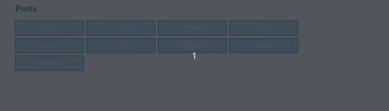
<main>
  <h1>Posts</h1>
  <div style="display: grid;">
    <div>ONE</div>
    <div>TWO</div>
    <div>THREE</div>
    <div>FOUR</div>
    <div>FIVE</div>
    <div>SIX</div>
    <div>SEVEN</div>
    <div>EIGHT</div>
    <div>NINE</div>
  </div>
</main>
CSS Grid: Tracks Across Columns and Rows
After initialization, CSS Grid creates an independent Grid Formatting Context inside the container. The GFC is scoped inside the parent and produces tracks that run in both directons. Tracks are made up of cells formed at intersections of a column and a row.
 css grid
CSS Grid: Default Tracks and The Auto Flow
CSS Grid creates default tracks when a grid is initialized in a container.
For example, the grid for the above <div> gives default tracks with one column spanning full width and arbitrary rows added automatically. Elements that are direct children of the parent occupy these track cells:
 css grid
Notice, the default track is the same as the typical block layout that is implemented in the normal flow. It is effectively the grid version of the Block Formatting Context. This track follows the grid's default auto flow directed by the container's Grid Formatting Context to place items on the grid. It forms the backbone of the implicit grid.
The default auto flow of the grid is towards new rows across the block axis. In other words, for this example, items are placed automatically in new rows down the column direction.
CSS Grid: How to Change Grid Auto Flow
The auto flow of a grid can be changed to add new columns across the inline axis with the grid-auto-flow: column property set on the container:
<div
  style="
        display: grid;
        grid-auto-flow: column;
    "
>
  <!-- Grid items here -->
</div>
[RELATION BETWEEN GRID AXES AND TEXT DIRECTION]
A CSS Grid's column and row axes take the document's block and inline axes respectively as their references. The block and inline axes of the document run perpendicular to each other. They, in turn, take their references from the physical text direction or writing mode of the document or the local element. Text direction/writing mode may be changed by setting the document's dir property on the <html> element, the local text direction or the writing-mode applied to an element. So, a change in the text direction alters the physical value of block and inline axes.
This makes visualizing and understanding CSS Grid a bit difficult at first. So, it is important that we be aware how block and inline based normal flow changes first with changes in text direction/writing mode in a region. We can only then understand how they impact the local grid flow.
This MDN guide on CSS Grid axes provides an in-depth explanation.
CSS Grid: What is a Grid Cell ?
A CSS Grid cell is a logical representation of an individual area unit of a grid. Cells are created along tracks by intersection of column and row lines.
CSS Grid cells are particularly useful for visualizing the grid. They help define item size and placements across tracks.
CSS Grid: Grid Lines and Spans
A CSS Grid creates lines across tracks that define boundaries of their cell areas. These grid lines are generated according to default track settings and also explicit track definitions with grid templates.
Grid track lines are numbered by default and can be named for convenient implementation of complex grid layouts. We discuss grid lines in detail in this later section.
CSS Grid lines are used to set item areas in the grid. Item areas can also defined by spans that start from one line and end at another lines. Spans for a grid item can be set in both column and row directions.
CSS Grid: Grid Items
Grid items are direct child elements of a grid container. They participate in the Grid Formatting Context for determining their width, height, placement, alignment and flow.
Items that are placed explicitly with grid-area or grid-column and grid-row, or grid-column-* and grid-row-* CSS properties are part of the explicit grid. Items that are not explicitly placed using these properties are placed inside the implicit grid.
CSS Grid: Implicit vs Explicit Grids
The default track follows the grid auto flow which makes up part of the implicit grid. The implicit grid basically means it does not depend on a configured template for sizing and placing items across particular columns and rows. In contrast, an explicit grid uses well defined templates to configure size and placement of items across intended grid tracks.
The Implicit Grid in CSS Grid
The implicit grid uses default grid tracks to size and place items. It houses the items not explicitly placed with grid-area or grid-column and grid-row, or grid-column-* and grid-row-* properties.
The default / implicit grid is always out there and is never replaced by an explicit one. An explicit grid only gets added to it. While working with an explicit grid, we are in fact able to override the size of default implicit tracks with grid-auto-rows and grid-auto-columns properties.
Implicit grid items are placed according to the auto flow that is set with the grid-auto-flow property.
[ONE ITEM PER CELL IN IMPLICIT GRID]
The auto flow places one item per track cell in the default track. The default track is populated with items when no explicit grid is present, or when items are not placed in an explicit grid.
CSS Grid: Explicit Grid with Templates
We are able to define an explicit grid for selectively sizing and positioning items in columns and rows. An explicit grid is defined with templates that set tracks across the column, row or both directions.
CSS Grid offers three kinds of templates for defining grid tracks:
- Column templates with
grid-template-columns. - Row templates with
grid-template-rows. - Area templates with
grid-template-areas.
Grid tracks defined with these templates are also called track lists. Track lists specify the number of cells, their sizes and positions in the grid relative to each other. For example, the following columns definition specifies a three column track with varying sizes positioned in sequence:
.container {
  display: grid;
  grid-template-columns: 200px 3fr 1fr;
}
[CHOOSING APPRORPIATE GRID TEMPLATES]
Depending on use cases, column templates and row templates can be used together for concretely setting how items are laid out two dimensionally along columns and rows. And either one of these can be used without the other.
For example, templates can be defined only for columns without needing to specify any rows template. In such cases, when the other axis follows its default auto track.
Area templates are nifty ways of quickly setting up designs, for example while prototyping.
We can combine all three types of templates into a master template with the grid-template shorthand. Typically, combined templates are not preferred, as layouts are meant to make life easy for designers and developers. But here is an example anyway. It combines templates columns, rows, and areas:
.layout {
  display: grid;
  grid-template:
    [header-left] "head head" 30px [header-right]
    [main-left] "nav  main" 1fr [main-right]
    [footer-left] "nav  foot" 30px [footer-right]
    / 120px 1fr;
}
We elaborate the use cases of different templates with examples in upcoming sections.
CSS Grid: Placing Explicit Grid Items
Placing items in an explicit grid is authored by the developer. Child elements are turned into grid items by applying on them the following CSS properties:
grid-area: can be set with line boundaries or a template area name.grid-column: defines boundaries of the item's columns. Is set with line numbers for start and end, and their line names orspansgrid-row: defines boundaries of the item's rows. Is set with line numbers for start and end, and line names orspansgrid-column-startandgrid-column-end: explicit form ofgrid-columngrid-row-startandgrid-row-end: explicit form ofgrid-row
Any child element not placed with these properties are placed in the implicit grid.
CSS Grid: Gutters
CSS Grid gutters are set by the gap property:
<div
  style="
        display: grid;
        grid-auto-flow: column;
        gap: 16px;
"
>
  <!-- Grid items here -->
</div>
CSS Grid: Aligning the Grid and Items
Alignment in CSS Grid is associated with aligning the grid itself against the block-inline axes of the normal flow. It also involves aligning items relative to each other and the container. Both forms of alignment are covered by the CSS Box Alignment specifications.
CSS Grid: Aligning Grid Tracks
Since CSS grid tracks take the normal flow as reference, a track must be made to align with the block and inline axes. We can use the following properties to align the grid tracks:
justify-content: to align the grid across the inline axis.align-content: to align the grid across the block axis.
These are the same Box alignment properties used in Flexbox.
CSS Grid: Aligning Grid Items
We can align grid items relative to the container and other siblings. We can specify alignments for all items together from container with the following Box alignment properties. In other words, they are applied on the container:
justify-items: aligns items with respect to the grid's inline axis.align-items: aligns items with respect to the grid's block axis.
Additionally, we can align items individually by specifying within items the following properties:
justify-self: aligns the item across inline axis.align-self: aligns the item across the block axis.
Grid Formatting Context Under the Hood: How CSS Grid Works
CSS Grid creates a Grid Formatting Context inside the container. The context is scoped within the parent element and introduces an implicit grid with rules for laying out items across column and row tracks. These rules specify the grid's track settings -- with their numbers, sizes, alignment and the flow of items. These rules can be recomposed and mostly overridden with CSS Grid properties to implement necessary design specs.
The tracks are created on top of the block and inline axes of the document's normal flow. The container interacts with other outside items according to usual formatting context of its own parent and siblings.
Items inside the grid are placed with the Grid item placement algorithm. They occupy the implicit grid if not designated a place in an explicit grid. If an explicit grid track is defined with a template and the items are placed in them, they are displayed inside the explicit grid.
As the grid is placed on underlying block and inline axes, the grid itself has to be aligned when necessary. Besides the items participating in the GFC.
The block and inline axes are subject to change depending on the text direction and writing mode of an element. So, the text direction and writing mode of the grid container decides which directions the block and inline axes run. And hence impacts which physical directions the column and row tracks are created by CSS Grid.
[THINK OF BLOCK AND INLINE AXES]
Text direction and writing modes are important factors in deciding the inline axis. If they change in either the HTML document or on a particular container, the physical directions of the column and row tracks in a CSS grid track also change.
However, it is useful to keep in mind that the column tracks always run in the block axis and the row tracks pursue the inline axis. So, when the document language, the text direction or the writing mode is changed -- regardless of how the physical directions change -- column tracks will remain in the block axis and row tracks will still be in the inline direction.
This MDN article on Grids, logical values, and writing modes explains grid axes behavior in sound details.
In the upcoming sections, we elaborate on the use of implicit and explicit CSS grids with examples of commonly used webpage components and layouts.
CSS Grid Auto Layouts: Working with the Implicit Grid and Default Tracks
In this section, we demonstrate how CSS Grid addresses the limitation of linear space distribution in Flexbox. We make some revealing inferences about Grid's two dimensional placement mechanism while styling a list of items.
We mostly make use of a partly explicit column grid, the implicit row grid and the auto flow. While doing so, we explore relevant CSS properties and discuss about associated grid behavior.
Let's first begin with the a Flexbox implementation of the list of items. The HTML for this looks like below:
Show HTML code
<main>
  <h1 class="title">Posts</h1>
  <div class="container">
    <div class="item">ONE</div>
    <div class="item">TWO</div>
    <div class="item">THREE</div>
    <div class="item">FOUR</div>
    <div class="item">FIVE</div>
    <div class="item">SIX</div>
    <div class="item">SEVEN</div>
    <div class="item">EIGHT</div>
    <div class="item">NINE</div>
  </div>
</main>
The items are styled with Flexbox with each growing equally to available spaces in a new line:
main {
  width: 95%;
  margin: auto;
}

.title {
  color: rgb(16, 98, 122);
}

.container {
  margin: auto;

  display: flex;
  flex-wrap: wrap;
  justify-content: flex-start;
  gap: 8px;
}

.item {
  flex-grow: 1;
  padding: 8px;

  display: flex;
  justify-content: center;
  align-items: center;

  border: 3px solid rgb(54, 150, 202);
  background-color: rgba(130, 196, 236, 0.6);
  color: rgb(255, 255, 255);
  font-size: 24px;
}
The resulting layout has items wrapped into new rows. When the last row doesn't have enough items, they grow to take up all remaining space. This gives an inconsistent look due to disproportionate width on the last row compared to prior rows:
 css grid
This happens because in Flexbox, space distribution of items takes place in new lines. And items are allocated their inline space afresh when a new row is occupied.
For practical purposes, we'd better have the items align to their side after keeping their width same as we add items to new rows. This is easily done by distributing the space more accurately in both inline and block axes with CSS Grid. In particular, with the help of a column template and the implicit grid.
Let's have a look.
CSS Grid: Space Distribution in Two Dimensions
We can apply a grid container, with a column template that distributes the horizontal space equally into n number of columns:
.container {
  margin: auto;

  display: grid;
  grid-template-columns: 1fr 1fr 1fr 1fr 1fr 1fr 1fr;
  gap: 8px;
}

.item {
  padding: 8px;

  display: flex;
  justify-content: center;
  align-items: center;

  border: 3px solid rgb(54, 150, 202);
  background-color: rgba(130, 196, 236, 0.6);
  color: rgb(255, 255, 255);
  font-size: 24px;
}
The CSS Grid based styles above gives us a grid with items placed in seven equally wide column tracks. Item widths remain same when new rows fall short of items:
 css grid
Here, we are using a column template with grid-template-columns that gives a grid with seven1fr columns in the block axis.
NOTE
The fr unit stands for fraction, which basically divides available space relatively into indicated fractions. So, seven 1frs would mean dividing any free space by into sevent fractions, calculating their actual widths and allocating each grid cell one part.
We can use other units such as px, percentage (%) and other length units for template definitions. Each unit offers convenience particular to their use cases. The fr unit is very useful for setting dynamic widths on grid items.
CSS Grid: Repeating Tracks with repeat()
In the above style, we repeatedly used the 1fr string. We can express it more succinctly with the repeat() utility to get a string of 7 1frs:
.container {
  margin: auto;

  display: grid;
  grid-template-columns: repeat(7, 1fr);
  gap: 8px;
}
CSS Grid: Implicit Grid Takes Over When Explicit Grid is Missing
Notice, we have to two rows of items. Yet, we are not using any explicit row templates. The rows are added to the implicit grid according to default track settings. This becomes obvious when we customize the height of the default row with grid-auto-rows:
.container {
  margin: auto;

  display: grid;
  grid-template-columns: repeat(7, 1fr);
  grid-auto-rows: 200px;
  gap: 8px;
}
NOTE
grid-auto-rows and grid-auto-columns are properties of the implicit grid. grid-auto-rows sets the height of a row in the inline axis and grid-auto-columns sets the width of columns in the block axis.
You can find more about the usage of grid auto properties in this MDN Grid reference docs.
Notice, the above grid is partially explicit with dynamic column widths. This gives us good flexibility in item widths, while the number of desired columns are fixed to n.
It's row tracks are implicit. This is because we have not defined any explicit grid template rows. So, the implicit row tracks take over. And the items are placed according to the auto flow.
CSS Grid: Auto-filling and Auto-fitting Grid Tracks
We can make the items behave more "flex-like" by auto-filling grid tracks. For auto filling, we ask the template to set a track count of auto-fill:
.container {
  margin: auto;

  display: grid;
  grid-template-columns: repeat(auto-fill, 200px);
  gap: 8px;
}
In the above change, we are creating arbitrarily repeating column cells that have 200px width and get filled up automatically according to their document order. Auto generation of track cells with auto-fill like this is magical. However, using auto-fill with fixed with comes with a downside -- because it leaves unused space at the end of the column as is:
 css grid
We can overcome this drawback easily by Box alignment properties like justify-content and justify-items. However, CSS Grid offers more tools, such as the auto-fit property.
Auto-placing Grid Items with auto-fit
With auto-fit and with a combination of minmax(), we can create arbitrary number of extremely flexible equally spanned track cells that fit to occupy the entire column/row track while maintaining a minimum fixed width:
.container {
  margin: auto;

  display: grid;
  grid-template-columns: repeat(auto-fit, minmax(200px, 1fr));
  gap: 8px;
}
This is actually what we'd want starting from the Flexbox example. And on top of everything, CSS Grid now makes it permanently responsive. Thanks to CSS Grid, that's just with one line of CSS. And without using any media queries:
 css grid
We can now place infinite number of rows into this grid. They'll occupy the entire row. And the number of columns will change according to the screen size.
CSS Grid Layouts with Column & Row Templates
In this section, we dig deeper into the quirks of using column and row templates. We consider two examples. In the first one, we explore a way of combining column and row based templates by expanding the above items example in the rows direction. In the second one, while implementing a typical webpage layout, we work with item areas in depth and examine what entails defining item areas with named lines.
CSS Grids with Numbered Lines: Using Both Columns and Rows
In this example, we expand the earlier items grid in which we have an explicit column track depending on implicit row track. Here, we gradually adopt a grid which has a top heading section that spans all columns, a featured posts section that has two rows of full columns, a second heading area that spans all columns, and a bottom area that can house arbitrary number of items.
Basically this sub-layout:
 css grid
First, let's adjust some markup with styled classes. Update the <main> section to this:
Show updated HTML markup
<main>
  <div class="container">
    <h1 class="title featured heading">Featured Posts</h1>
    <div class="item">ONE</div>
    <div class="item">TWO</div>
    <div class="item">THREE</div>
    <div class="item">FOUR</div>
    <div class="item">FIVE</div>
    <div class="item">SIX</div>
    <div class="other-posts heading">
      <h1 class="title ">Other Posts</h1>
    </div>
    <div class="item">SEVEN</div>
    <div class="item">EIGHT</div>
    <div class="item">NINE</div>
  </div>
</main>
So, we have an additional <div> to house a row for the item with .other-posts.heading class.
We need to then add explicit row tracks to the container. And then allocate space to grid items individually. So, update the CSS to this:
Show updated CSS with row tracks
main {
  width: 95%;
  margin: auto;
}

.title {
  color: rgb(16, 98, 122);
}

.container {
  margin: auto;

  display: grid;
  grid-template-columns: repeat(auto-fit, minmax(200px, 1fr));
  grid-template-rows: 100px 300px 300px 100px;
  grid-auto-rows: 300px;
  gap: 8px;
}

.item {
  display: flex;
  justify-content: center;
  align-items: center;

  padding: 8px;
  border: 3px solid rgb(54, 150, 202);
  background-color: rgba(130, 196, 236, 0.7);
  color: rgb(255, 255, 255);
  font-size: 24px;
}

.featured.heading {
  /* Place item */
  grid-area: 1 / 1 / 2 / -1;

  display: flex;
  justify-content: flex-start;
  align-items: center;

  padding: 16px;
  background: rgba(130, 196, 236, 0.6);
}

.other-posts.heading {
  /* Another syntax for placing items */
  grid-row: 4 / 5;
  grid-column: 1 / -1;

  display: flex;
  align-items: center;

  padding: 16px;
  background: rgba(130, 196, 236, 0.6);
}
CSS Grid: Explicit Row Tracks
With grid-template-rows rule on the container, we have four explicit rows in our grid:
grid-template-rows: 100px 300px 300px 100px;
With the pixel values, we set each row track to be of fixed heights. We could have written them like this as well:
grid-template-rows: 100px repeat(2, 300px) 100px;
[USE REPEAT UTILITY WHERE NEEDED]
The repeat() utility is very handy in generating templates of repeating tracks on columns and rows.
It is also possible to generate repeating patterns from multiple track units. For example, the following rule would produce two tracks of the 300px 200px sequence:
grid-template-rows: 100px repeat(2, 300px 200px) 100px;

/* Produces this: grid-template-rows: 100px 300px 200px 300px 200px 100px; */
Using CSS Grid Lines: Placing Items on An Explicit Grid
We are then placing a couple of our items on the explicit grid. For example, with the following grid-*-* rules, we are placing the .featured.heading item in the first row to span all columns:
.featured.heading {
  grid-row-start: 1;
  grid-column-start: 1;
  grid-row-end: 2;
  grid-column-end: -1;
}
These rule properties are pretty intuitive. grid-column-* properties indicate the start and end lines for the columns that the item spans, while grid-row-* properties represent the start and end lines for grid rows. In this case, we are saying the item with .featured.heading class should span from row line 1 to row line 2 and from column line 1 to column line -1.
[GRID LINE NUMBERING]
Explicit grid tracks are created when we declare explicit templates. Created tracks are numbered by default. Here are some rules related to track line numbers:
- For
nnumber of cells across a track, the generated number of lines isn + 1. - CSS Grid line numbering follows a
1index. This means lines start counting at1. - Lines can be denoted with negative numbers. Negative line numbers means counting backwards from the end.
Line numbers allow us to place items on the grid.
The negative line -1 line number denotes the last line. In other words, first line counted from the end. We are able to specify grid areas entirely with negative line numbers as well. In this case, we have allocated the first row in the grid to the .featured.heading item by spanning all columns. In our HTML, the item with .featured.heading class houses the heading of the posts list.
CSS Grid: Item Placement Alternatives
We are also placing the item with .other-posts.heading class into our explicit grid. This time, we are using a couple of shorthand properties:
.other-posts.heading {
  grid-row: 4 / 5;
  grid-column: 1 / -1;

  /* Other styles */
}
grid-row and grid-column are alternative syntax for specifying track boundaries for an item. For both of these properties, the first value is the start line and the second value is the end line. So, with grid-row: 4 / 5; we want the item's height to span one row along the block axis from line 4 to line 5. And with grid-column: 1 / -1; we want its width to span all columns on the inline axis.
[GRID AREA SHORTHAND]
We can combine all four boundaries into one property by declaring the grid-area with an one-liner:
grid-area: 1 / 1 / 2 / -1;
The sequence of the one-liner shorthand follows this counter-clockwise order:
grid-row-startgrid-column-startgrid-row-endgrid-column-end
In other words, item placement with the one-liner syntax starts with the line from where the rows start, extends to the line where columns start, joins the line where its rows end and meets the line where columns end to complete the area.
It is useful to remember that it follows the opposite convention of margin and padding shorthand rules which are structured in clockwise direction. This section Grids, logical values, and writing modes MDN post on block and inline axes explains the underlying reasons.
CSS Grid: Using a Hybrid Grid
Notice in the HTML of this example, that we have only placed the heading items. In other words, we have not explicitly placed any of the post items:
<div class="container">
  <h1 class="title featured heading">Posts</h1>
  <div class="item">ONE</div>
  <div class="item">TWO</div>
  <div class="item">THREE</div>
  <div class="item">FOUR</div>
  <div class="item">FIVE</div>
  <div class="item">SIX</div>
  <div class="other-posts heading">
    <h1 class="title">Other Posts</h1>
  </div>
  <div class="item">SEVEN</div>
  <div class="item">EIGHT</div>
  <div class="item">NINE</div>
</div>
This is because, it was not necessary to place any of the post items in the explicit grid. Although we defined the explicit column and row grids, since we have not placed the post items on it, they are not part of the explicit grid. However, they were placed automatically by the Grid item placement algorithm using the default tracks and the auto flow.
[THE GRID ITEMS PLACEMENT ALGORITHM]
The Grid items placement algorithm prioritizes on the explicit grid placement rules. So, they first place any item that are given a real estate on the explicit grid.
It keeps a list of unplaced items and any anonymous item. It then calculates the remaining free space available, and places them in available spaces. When free space is used up, it starts placing them on the implicit tracks.
CSS Grid with Named Lines
CSS Grid allows giving convenient names to grid lines. We name grid lines in the template definitions. In this part, we will rework the above posts list grid with named lines.
An updated CSS with line names applied to row templates in the above posts list example looks like this:
Show CSS with named grid lines
main {
  width: 95%;
  margin: auto;
}

.title {
  color: rgb(16, 98, 122);
}

.container {
  margin: auto;

  display: grid;
  grid-template-columns: repeat(auto-fit, minmax(200px, 1fr));
  grid-template-rows:
    [posts-start featured-heading-start] 100px [featured-heading-end] repeat(
      2,
      300px
    )
    [other-posts-heading-start] 100px [other-posts-heading-end posts-end];
  grid-auto-rows: 300px;
  gap: 8px;
}

.item {
  display: flex;
  justify-content: center;
  align-items: center;

  padding: 8px;
  border: 3px solid rgb(54, 150, 202);
  background-color: rgba(130, 196, 236, 0.7);
  color: rgb(255, 255, 255);
  font-size: 24px;
}

.featured.heading {
  grid-row-start: featured-heading-start;
  grid-column-start: 1;
  grid-row-end: featured-heading-end;
  grid-column-end: -1;

  display: flex;
  justify-content: flex-start;
  align-items: center;

  padding: 16px;
  background: rgba(130, 196, 236, 0.6);
}

.other-posts.heading {
  background: rgba(130, 196, 236, 0.6);
  grid-row: other-posts-heading-start / other-posts-heading-end;
  grid-column: 1 / -1;

  display: flex;
  align-items: center;
  padding: 16px;
}
CSS Grid: Grid Line Naming Syntax
The syntax for setting grid line names on templates looks like this:
[line-start-name another-name] 200px [line-end-name] 1fr
Grid line naming lets us set easy-to-follow names that describe our design specs. In our example, we are adding line names to the rows template:
grid-template-rows:
  [posts-start featured-heading-start] 100px [featured-heading-end] repeat(
    2,
    300px
  )
  [other-posts-heading-start] 100px [other-posts-heading-end posts-end];
Notice, we are adding descriptive names for our use case. Names can be added to the start and end of a track unit. And a line can have multiple names.
[CSS GRID LINE NAMING RULES]
The rules for naming grid lines include:
- Line names are enclosed in square brackets.
- Line names can be added to both the beginning and end of a track unit.
- Multiple names can be assigned to a line.
- Multiple names on a line are separated by a
.
CSS Grid: Using Named Grid Lines in Placing Items
Using these line names are as straight-forward as using numbers. For example, we reworked the row boundaries of a couple our grid items like this:
featured.heading {
  grid-row-start: featured-heading-start;
  grid-column-start: 1;
  grid-row-end: featured-heading-end;
  grid-column-end: -1;

  background: rgba(130, 196, 236, 0.6);
  display: flex;
  justify-content: flex-start;
  align-items: center;
  padding: 16px;
}

.other-posts.heading {
  background: rgba(130, 196, 236, 0.6);
  grid-row: other-posts-heading-start / other-posts-heading-end;
  grid-column: 1 / -1;

  display: flex;
  align-items: center;
  padding: 16px;
}
Using named lines along with spans prove very sound and expressive for defining grid areas. We're going to see more line naming in the next section where we define a 12-column based grid for a webpage layout.
CSS Grid: How to Implement a 12-column Grid with Named Lines
In this section, we employ line numbers and names in combination with spans to implement a grid for typical webpage layouts.
The layout we're aiming for looks like this:
 css grid
The HTML we have for this is available here:
Show HTML code for webpage layout
<!DOCTYPE html>
<html lang="en">
  <head>
    <meta charset="UTF-8" />
    <meta name="viewport" content="width=device-width, initial-scale=1.0" />
    <link rel="stylesheet" href="./normalize.css" />
    <link rel="stylesheet" href="./index.css" />
    <title>CSS Grid</title>
  </head>
  <body class="layout">
    <nav class="nav item">HEADER</nav>
    <aside class="menu item">MENU</aside>
    <div class="content item">CONTENT</div>
    <aside class="title-list item">TITLE LIST</aside>
    <footer class="footer item">FOOTER</footer>
  </body>
</html>
The style for this looks like this:
Show 12-column grid styles
.layout {
  display: grid;
  grid-template-columns: repeat(12, [col-start] 1fr);
  gap: 16px;
}

.nav {
  grid-column: col-start / span 12;
  grid-row: 1 / span 2;
}

.menu {
  grid-column: col-start / span 3;
  grid-row: 3 / span 9;
}

.content {
  grid-column: col-start 4 / span 6;
  grid-row: 3 / span 9;
}

.title-list {
  grid-column: col-start 10 / span 3;
  grid-row: 3 / span 9;
}

.footer {
  grid-column: col-start / span 12;
  grid-row: 12;
}

.item {
  display: flex;
  justify-content: center;
  align-items: center;

  padding: 8px;
  border: 3px solid rgb(54, 150, 202);
  background-color: rgba(130, 196, 236, 0.7);
  color: rgb(255, 255, 255);
  font-size: 24px;
}
For the explicit tracks, we are getting 12 1fr column units with repeat():
.layout {
  display: grid;
  grid-template-columns: repeat(12, [col-start] 1fr);
  gap: 16px;
}
CSS Grid: Developing a Grid Language with Line Names and spans
Notice, this time we are naming each column with [col-start] so we can describe the start of a column when we set the grid area of an item.
Then we just set real estate for the items participating in the layout.
Here, the standalone col-start line represents the line name of the first column. For example, we are using col-start on .nav to start at the first column line:
.nav {
  grid-column: col-start / span 12;
  grid-row: 1 / span 2;
}
We use the initial col-start also on .menu and .footer for them to start in the first column line. For other lines, we are appending the line number to col-start. For example, on the .content item:
.content {
  grid-column: col-start 4 / span 6;
  grid-row: 3 / span 9;
}
Appending numbers after a common line name like this makes area definitions both semantic and conflict-free.
[USING THE SAME NAME FOR MULTIPLE GRID LINES]
CSS Grid allows assigning the same name to multiple grid lines. Using same names is helpful in describing track or line attributes common to all columns.
For example, we can describe the start of a column with col-start and its end with col-end. And the start of a row with row-start and its end with row-end. Practically, these names are assignable to all columns and rows. So, we can repeat the same name for all lines. We can then conveniently apply it to an item's grid area:
.item {
  grid-area: col-start 4 / span 6;
}
Notice, we did not need to use any explicit row templates for this layout, yet we are able to set row boundaries. We depended on implicit row track numbers for this.
[TAKE ADVANTAGE OF IMPLICIT TRACKS WHERE POSSIBLE]
It is a good practice to take advantage of the implicit grid at any point, because it is already baked in. For doing so, we should make sure that we are really aware of what goes under the hood in a CSS Grid.
For effective usage of the implicit grid with the explicit one, aspects to always keep in mind are:
- How the block and inline axes are positioned with respect to text direction and writing mode.
- How the explicit grid is laid out. Whether with either column or row templates only, or with both. Whether area templates are used, or all are combined together.
- How the Grid items placement algorithm works.
- Whether there are subgrids or not.
- How anonymous items behave.
CSS Grid: How to Use spans in a Grid Item
Notice also that we use spans to set the grid item areas here:
.title-list {
  grid-column: col-start 10 / span 3;
  grid-row: 3 / span 9;
}
The span syntax takes a number after it. The number describes the number of cells after the start line the area should cover.
CSS Grid calculates the line numbers from this number. spans should not be confused with line numbers.
CSS Grid: Layouts Based on Area Templates
In this section, we use grid area templates to build a similar looking layout as the above.
For this we have the same HTML as the above 12-column grid example. We'll need to only tamper with the grid template and item placement rules.
Here's the updated CSS:
Show updated CSS for area template based grid
.layout {
  display: grid;
  grid-template-columns: 1fr 4fr 1fr;
  grid-template-areas:
    "nav nav nav"
    "menu content title-list"
    "footer footer footer";
  gap: 16px;
}

.nav {
  grid-area: nav;
}

.menu {
  grid-area: menu;
}

.content {
  grid-area: content;
}

.title-list {
  grid-area: title-list;
}

.footer {
  grid-area: footer;
}

.item {
  padding: 8px;
  border: 3px solid rgb(54, 150, 202);
  background-color: rgba(130, 196, 236, 0.7);
  color: rgb(255, 255, 255);
  font-size: 24px;

  display: flex;
  justify-content: center;
  align-items: center;
}
CSS Grid: Working with Template Areas
Notice, we have applied a template area to our grid:
.layout {
  display: grid;
  grid-template-columns: 1fr 4fr 1fr;
  grid-template-areas:
    "nav nav nav"
    "menu content title-list"
    "footer footer footer";
  gap: 16px;
}
We can see that, we have specified strings of text on the area template values.
[GRID TEMPLATE AREAS SYNTAX]
CSS Grid template areas offer alternate ways of positioning items on a two dimensional layout. Grid items are each assigned an area name with grid-area which are then placed on a template by specifying them in the positions they should appear on the layout.
The syntax for defining area templates follows these rules:
- The template is made from strings of texts.
- Each string represents a row.
- Each string specifies the items placed in grid columns.
- There can be as many strings as the number of explicit rows.
- There can be a single string for each implicit row.
- There can be as many items in each string as the number of explicit columns.
- Empty cells are represented by a
.(dot).
Area templates are like maps which shows where items are placed in the grid. They are also called ascii-art templates. It's always suggested to keep the art intuitive.
For example, in our layout, we want the .nav items to span across the first row in all columns. With three "menu content title-list", we have placed the .menu item to the start of the line, the .content in the center and .title-list to the end of the line -- all spanning three rows. And we have the .footer item in the last row spanning all three columns.
:::warning[REMOTE AREAS BREAK THE GRID]
It is important that we don't set inconsistent regions on the area based template. For example, an item allocated multiple non-adjacent areas breaks the layout:
.layout {
  display: grid;
  grid-template-columns: 1fr 4fr 1fr;
  grid-template-areas:
    "nav nav nav"
    "menu content title-list"
    "menu content nav"
    "footer footer nav";
  gap: 16px;
}
In general, an item's region should be defined with adjacent areas, in order to be able to merge all allocated cells in that region.
:::
Space Distribution in CSS Grid
CSS Grid: Space Distribution on Tracks with Fractions
Notice also in the above template definitions, we have defined a template with grid-template-columns. This column template defines an explicit track of three units:
grid-template-columns: 1fr 4fr 1fr;
You can notice that we want to allocate 4frs to the center column. Using fractions in the template is one of the ways by which we are able to distribute amount of space on a grid.
CSS Grid: Space Distribution by Placement
The physical space occupied by an item is also determined by how many cells we allocate to it. For example, with a sequence of 3 navs, we are giving away an entire row to the nav bar that actually consists of two 1frs and one 4fr:
grid-template-columns: 1fr 4fr 1fr;
grid-template-areas:
        /* highlight-next-line */ "nav nav nav";
How CSS Grid Template Areas Work
Template area based grids can be built both on column and row template definitions and also on the implicit tracks. So, CSS Grid area templates can work hand in hand with explicit tracks defined with grid-template-columns and grid-template-rows.
If an explicit grid exists, the area template should comply to those track definitions by complying with their total column and row tracks. Otherwise, the grid breaks. Also, as in other cases, unplaced items are placed on the implicit grid.
How to Place Items in a Template Area Based Grid
Before we actually place items on the grid, we have to assign these area names to their items:
.nav {
  grid-area: nav;
}

.menu {
  grid-area: menu;
}

.content {
  grid-area: content;
}

.title-list {
  grid-area: title-list;
}

.footer {
  grid-area: footer;
}
So, we have set the area names of the items to their CSS classes with the grid-area property. These assigned items will areas occupy their regions in the template when we add the classed to their markup in the HTML document.
Notice this time, we are using the area names as CSS entities (such as content) to set the grid-area value, not as strings. Since we defined these names on the template, they are treated as entities. And strings versions will not work.
CSS Grid Examples: Implementing Responsive Layouts
In this section, we produce responsive layouts from the template areas based grid we just built and also from the 12-column responsive grid we defined previously.
The HTML document remains the same with .header, .menu, .content, .title-list and .footer sections.
Show HTML
<!DOCTYPE html>
<html lang="en">
  <head>
    <meta charset="UTF-8" />
    <meta name="viewport" content="width=device-width, initial-scale=1.0" />
    <link rel="stylesheet" href="./normalize.css" />
    <link rel="stylesheet" href="./index.css" />
    <title>CSS Grid</title>
  </head>
  <body class="layout">
    <nav class="nav item">HEADER</nav>
    <aside class="menu item">MENU</aside>
    <div class="content item">CONTENT</div>
    <aside class="title-list item">TITLE LIST</aside>
    <footer class="footer item">FOOTER</footer>
  </body>
</html>
CSS Grid: A Template Areas Based Responsive Layout
We are implementing two @media queries for three screen sizes. We apply a mobile first approach, because doing so allows us to make use of existing styles from a lower screen width on larger ones.
Here's the updated styles:
Show responsive layout with grid template areas
.layout {
  display: grid;
  grid-template-areas:
    "nav"
    "menu"
    "title-list"
    "content"
    "footer";
  gap: 16px;
}

.nav {
  grid-area: nav;
}

.menu {
  grid-area: menu;
}

.content {
  grid-area: content;
}

.title-list {
  grid-area: title-list;
}

.footer {
  grid-area: footer;
}

.item {
  padding: 8px;
  border: 3px solid rgb(54, 150, 202);
  background-color: rgba(130, 196, 236, 0.7);
  color: rgb(255, 255, 255);
  font-size: 24px;

  display: flex;
  justify-content: center;
  align-items: center;
}

@media (min-width: 560px) {
  .layout {
    grid-template-columns: 1fr 4fr;
    grid-template-areas:
      "nav nav"
      "menu menu"
      "title-list content"
      "title-list content"
      "footer footer";
    gap: 16px;
  }
}

@media (min-width: 780px) {
  .layout {
    grid-template-columns: 1fr 4fr 1fr;
    grid-template-areas:
      "nav nav nav"
      "menu content title-list"
      "menu content title-list"
      "menu content title-list"
      "footer footer footer";
  }
}
CSS Grid Responsive Layouts: Mobile First Approach
We start with a base template areas map which places items on one column and a row for each layout item:
.layout {
  display: grid;
  grid-template-areas:
    "nav"
    "menu"
    "title-list"
    "content"
    "footer";
  gap: 16px;
}
Responsive Layout with CSS Grid: Media Queries with Minimal Overhaul
And then in the media queries, we are introducing two and three columns at 560px and 780px respectively:
@media (min-width: 560px) {
  .layout {
    grid-template-columns: 1fr 4fr;
    grid-template-areas:
      "nav nav"
      "menu menu"
      "title-list content"
      "title-list content"
      "footer footer";
    gap: 16px;
  }
}

@media (min-width: 780px) {
  .layout {
    grid-template-columns: 1fr 4fr 1fr;
    grid-template-areas:
      "nav nav nav"
      "menu content title-list"
      "menu content title-list"
      "menu content title-list"
      "footer footer footer";
  }
}
Notice, we have changed the order of title-list on mobile and at 560px. It's original position on the document flow is after the .content class:
<body class="layout">
  <nav class="nav item">HEADER</nav>
  <aside class="menu item">MENU</aside>
  <div class="content item">CONTENT</div>
  <aside class="title-list item">TITLE LIST</aside>
  <footer class="footer item">FOOTER</footer>
</body>
It is generally suggested not to mess with the visual order of items on a grid, but here the visual order of title-list does not bring much harm -- as we are trying to keep changes minimal.
[KEEP TAB ORDER CONSISTENT]
CSS Grid lets radically rearranging grid items. However, it is harmful to change the visual order drastically in a way that is inconsistent with the document's flow.
Changing visual order harms accessibility by changing the tab order of grid items. So, it is important that we don't make any rearrangements that disrupts the tab order of the document.
We can definitely do some reordering, if doing so has not much impact on the tab order of items. A useful way to test out the changes is by tabbing through the region and see if they remain in the same flow.
Notice, we are also resorting to an explicit grid with column templates. Using an explicit track helps when we need to adopt track lengths of various sizes, which are not normally possible with the implicit tracks. Here our explicit column tracks are allocating 4fr units to the second column.
CSS Grid: A Responsive Layout from Line Names Based 12-column Grid
The same layout with 12-columns using named lines has this style:
Show responsive layout from 12-column grid with named lines
.layout {
  display: grid;
  grid-template-columns: repeat(12, [col-start] 1fr);
  gap: 16px;
}

.nav,
.menu,
.content,
.footer {
  grid-column: col-start / span 12;
}

.title-list {
  grid-column: col-start / span 12;
  grid-row: 3;
}

@media (min-width: 560px) {
  .nav {
    grid-column: col-start / span 12;
    grid-row: 1 / span 2;
  }

  .menu {
    grid-column: col-start / span 12;
    grid-row: 3;
  }

  .content {
    grid-column: col-start / span 9;
    grid-row: 4 / span 9;
  }

  .title-list {
    grid-column: col-start 10 / span 3;
    grid-row: 4 / span 9;
  }

  .footer {
    grid-column: col-start / span 12;
    grid-row: 13;
  }
}

@media (min-width: 780px) {
  .nav {
    grid-column: col-start / span 12;
    grid-row: 1 / span 2;
  }

  .menu {
    grid-column: col-start / span 3;
    grid-row: 3 / span 9;
  }

  .content {
    grid-column: col-start 4 / span 6;
    grid-row: 3 / span 9;
  }

  .title-list {
    grid-column: col-start 10 / span 3;
    grid-row: 3 / span 9;
  }

  .footer {
    grid-column: col-start / span 12;
    grid-row: 12;
  }
}
CSS Grid: Best Practices
Throughout this post, as we delved into the CSS Grid concepts with examples, we have also touched extensively on most of the best practices while implementing a CSS Grid based layout. It is worth having them revisited, along with some others.
So, here is the list:
- Think of the grid in terms of block and inline axes. This is useful because plain column and row axes are visual references which change from region to region in a document.
- Be aware of how document language, text direction and writing mode changes. This is because they change the orientation of the block and inline axes, and hence the direction of grid column and row axes.
- Understand how the implicit grid behaves, both on its own and on its interaction with an explicit grid. Make use of the implicit grid, when it is enough and an explicit grid can be avoided.
- Keep in perspective how the Grid items placement algorithm works and how the auto flow places items on the implicit and the explicit grid.
- Try to build composable templates and make reasonable tradeoffs on whether our layout best works with one template or the other.
- Use the
repeat()syntax to compose repeating patterns of cells in track lists. frs,pxels,%s andspans all have their appropriate use cases. Feel free to combine track units that best fit our use cases.- Conserve the document order by changing the visual order of grid items in ways that does not distort tab order. This is especially necessary for accessibility with screen readers.