
This article was last updated on Nov 18, 2024 to add more information, use cases on Material UI DataGrid component.


Introduction
A grid layout is a set of measurements used to position elements or components on a page based on successive columns and rows. With the daily demand for responsive web design, using grids in web applications has become a necessity. It is almost impossible to assemble a web layout without incorporating a grid system. Grid layouts significantly increase any web application's aesthetic value and user experience.
Material UI comes with its grid system that helps developers create a responsive grid layout that adjusts to any screen size or orientation, ensuring consistency across layouts. This article will deeply explore Material UI Grid, its features, implementations, and limitations in any React application.
What is Material UI?
Material UI is a free and open-source library based on Material Design. It provides predefined and customizable React UI components to help with web development. More developers have incorporated Material UI into their projects over the years because it simplifies and speeds up the web design process.
Material UI provides different categories of components, including Navigation components, Input components, Data Display components, Feedback components, Layout components, e.t.c. The Material UI Grid is a perfect example of the Layout components.
Install the Material UI library as a dependency in your project's package.json with the following command:
Use npm
npm install @mui/material @emotion/react @emotion/styled
Use yarn
npm install @mui/material @emotion/react @emotion/styled
What is Material UI DataGrid component?
The Material-UI DataGrid is designed to be a powerful and flexible solution for data tables in React applications. It's built with Material-UI (MUI) and comes with an expanded set of functionality for rendering, managing, and working with tabular data in a React application.
MUI DataGrid Component Essential Features:
Data Presentation: Effectively visualize large datasets via virtualization. Customizable columns, rows, and cells for more personal displays. Sorting and Filtering: Columns support sorting in ascending or descending order. Filters that allow you to see only the rows containing certain criteria.
Pagination: Pagination controls to easily navigate back and forth through long lists.
Selection: Can choose a row and cell, single and multi-selection.
Editing: One-click cell editing allowing entries for data directly within the table.
Aggregation and Grouping: Aggregate data and group rows on columns to be able to visualize summaries.
Customizable Look: Advanced theming opportunities to harmonize with the visual style and experience of your application.
Responsive and Accessible: Responsive design to fit the screen properly. Accessibility features to make sure it is user-friendly for everyone. Spacing: Easily integrate with backend services for data retrieving, updating, and management.
Getting Started with Material UI Grid
The Material Design's grid system is visually balanced based on a 12-column grid layout. It provides a container that allows visual consistency across different screen sizes and viewports. You can use the <Grid /> component to implement Material Design’s grid system in your React application.
When using Material UI Grid:
- Item widths are set in percentages to ensure the layouts are adaptive to all screen sizes.
- You can create space between individual grid items with
padding - The grid has five breakpoints:
xs,sm,md,lg, andxl. - The breakpoint can be assigned an value that indicates how many of the 12 columns are occupied by the component when it reaches that width.
Note that: The Grid /> component employs Flexbox properties for greater flexibility.
How to use Material UI Grid in your React project?
To get started, import the <Grid /> component into your project like this:
import Grid from "@mui/material/Grid2";
or;
import { Grid } from "@mui/material";
Containers and Items
Typically, Material UI Grid provides two types of layouts; containers and items. The container prop provides the CSS properties of a flex container to the Grid /> component, and the item prop provides the CSS properties of a flex child.
The items need to be wrapped in a container:
import Grid from "@mui/material/Grid2";

return (
  <>
    {/* A flexbox container represented in an Material UI Grid container */}
    <Grid container>
      Container
      {/* A Child grid container */}
      <Grid>
        <div>A flex item</div> {/* A simple flex item */}
      </Grid>
    </Grid>
  </>
);
Spacing
To create space between grid child items, you can use the spacing prop that accompanies the <Grid /> component. Any positive number and including decimals can be used as the spacing value.
Consider the code below:
import React, { useState } from "react";
import Grid from "@mui/material/Grid2";
import FormControlLabel from "@mui/material/FormControlLabel";
import RadioGroup from "@mui/material/RadioGroup";
import Radio from "@mui/material/Radio";
import Paper from "@mui/material/Paper";
import { Camera } from "@mui/icons-material";

//create our style
const styles = {
  paper: {
    height: 100,
    width: 100,
    color: "#808080",
  },

  radio: {
    backgroundColor: "#808080",
    color: "#fff",
  },
};

const MUIspacing = () => {
  //Make our variable for spacing. The default value is 0.
  const [spacing, setSpacing] = useState(0);

  //When executed, change the value of the spacing Hook to the value specified.
  const changeSpacing = (e) => {
    setSpacing(Number(e.target.value));
  };
  return (
    <div>
      <div>
        {/* User will determine spacing according to their preference*/}
        <Grid container spacing={spacing}>
          {/*Rethreeder 3 empty black boxes as items of this container*/}
          {[0, 1, 2].map((value) => (
            <Grid key={value}>
              <Camera style={styles.paper} />
            </Grid>
          ))}
        </Grid>
      </div>
      <div>
        <Paper>
          <div>
            {/* Show user's chosen spacing value*/}
            {spacing}
            <RadioGroup
              name="spacing"
              aria-label="spacing"
              value={spacing.toString()}
              onChange={changeSpacing}
              row
              style={styles.radio}
            >
              {/*Create a form with multiple spacing values. */}
              {[0, 1, 2, 3, 4, 5, 6, 7, 8, 9, 10].map((value) => (
                <FormControlLabel
                  key={value}
                  value={value.toString()}
                  control={<Radio />}
                  label={value.toString()}
                />
              ))}
            </RadioGroup>
          </div>
        </Paper>
      </div>
    </div>
  );
};

export default MUIspacing;
The code above showcases a dynamic change of the spacing prop value. There are three grid elements(camera icons), each interactively spaced with every click of a radio button that corresponds with the spacing value.
Here’s the result:
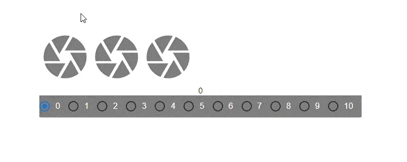 Grid spacing options demo
Fluid Grids
Fluid Grids in Material UI use column widths and breakpoints to scale grid items and resize content within them. We can create layouts for different screen sizes using the size prop on the grid items.
Basic Fluid Grids
Basic Fluid Grids provide column widths that are represented with integer values from 1 to 12. They are applicable at any breakpoint and indicate how many columns the component occupies. A value assigned to a breakpoint applies to all preset width modifications.
Here’s a simple illustration of how to use Basic Fluid Grids in Material UI.
import React from "react";
import Box from "@mui/material/Box";
import Grid from "@mui/material/Grid2";
import "../App.css";

const BasicGrid = () => {
  return (
    <Box sx={{ flexGrow: 1 }}>
      {/* Setting up the Fluid Grid system */}
      <Grid container spacing={2}>
        <Grid
          size={{
            xs: 6,
          }}
        >
          <div className="grid-elements">xs=6</div>
        </Grid>
        <Grid
          size={{
            xs: 6,
          }}
        >
          <div className="grid-elements">xs=6</div>
        </Grid>
        <Grid
          size={{
            xs: 8,
          }}
        >
          <div className="grid-elements">xs=4</div>
        </Grid>
        <Grid
          size={{
            xs: 4,
          }}
        >
          <div className="grid-elements">xs=8</div>
        </Grid>
      </Grid>
    </Box>
  );
};

export default BasicGrid;
Here’s the result;
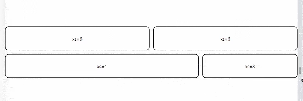 Fluid grid layout example
Fluid Grids with multiple breakpoints
Components may be defined with multiple widths, causing the layout to change at the defined breakpoint. Width values assigned to larger breakpoints precede those assigned to smaller ones.
For example with the prop size={{ xs: 6, md: 8 }}, the component will take up half of the 12-column grid (6 columns) when the viewport is 600px or wider, and it will fill all 12 columns on smaller screens.
Consider the code below:
import * as React from "react";
import Box from "@mui/material/Box";
import Grid from "@mui/material/Grid2";

const ComplexFluidGrid = () => {
  return (
    <Box sx={{ flexGrow: 1 }}>
      <Grid container spacing={2}>
        <Grid item xs={6} md={8}>
          <div className="grid-elements">xs=6 md=8</div>
        </Grid>
        <Grid item xs={6} md={4}>
          <div className="grid-elements">xs=6 md=4</div>
        </Grid>
        <Grid item xs={6} md={4}>
          <div className="grid-elements">xs=6 md=4</div>
        </Grid>
        <Grid item xs={6} md={8}>
          <div className="grid-elements">xs=6 md=8</div>
        </Grid>
      </Grid>
    </Box>
  );
};

export default ComplexFluidGrid;
The code above is a simple Material UI Grid system with four grid children elements. The elements are set to take space according to a 3:1 ratio when the screen size is 600 px or greater and a 2:2 percentage when the screen size is 600px or less.
Here’s the result:
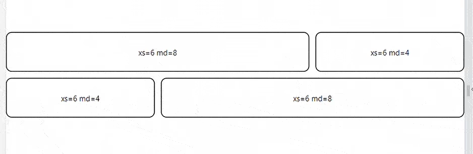 Responsive fluid grid layout preview
Auto Layout
The auto-layout feature allows grid items to auto-resize and occupy available space without specifying the item’s width. You can set the width for an item and have all others resize to fit.
Consider the code below:
import * as React from "react";
import Box from "@mui/material/Box";
import Grid from "@mui/material/Grid2";

const AutoGrid = () => {
  return (
    <Box sx={{ flexGrow: 1 }}>
      <Grid container spacing={3}>
        <Grid size="grow">
          <div className="grid-elements">xs</div>
        </Grid>
        <Grid
          size={{
            xs: 6,
          }}
        >
          <div className="grid-elements">xs=6</div>
        </Grid>
        <Grid size="grow">
          <div className="grid-elements">xs</div>
        </Grid>
      </Grid>
    </Box>
  );
};

export default AutoGrid;
The code above depicts three grid elements. The middle element is set to take half the screen's width while the other two dynamically take the space remaining on either side.
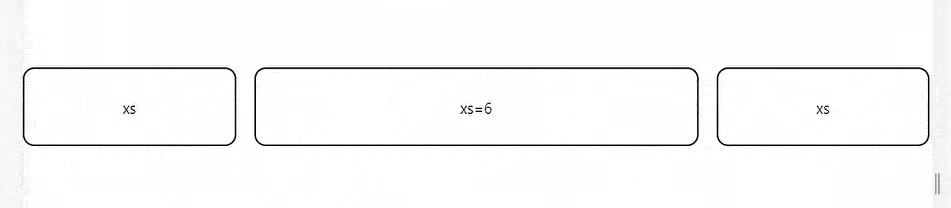 Auto layout grid example
Nested Grids
The <Grid container /> that renders as a direct child inside another <Grid container /> is a nested grid that inherits its columns and spacing from the top level. This allows you to create complex layouts with multiple grid items.
Consider the code below:
import * as React from "react";
import Box from "@mui/material/Box";
import Grid from "@mui/material/Grid2";

function NestedGrid() {
  return (
    <React.Fragment>
      <Grid
        size={{
          xs: 4,
        }}
      >
        <div className="grid-elements">Grid Element</div>
      </Grid>
      <Grid
        size={{
          xs: 4,
        }}
      >
        <div className="grid-elements">Grid Element</div>
      </Grid>
      <Grid
        size={{
          xs: 4,
        }}
      >
        <div className="grid-elements">Grid Element</div>
      </Grid>
    </React.Fragment>
  );
}

export default function NestedGridGroup() {
  return (
    <Box sx={{ flexGrow: 1 }}>
      <Grid container spacing={1}>
        <Grid container spacing={3}>
          <NestedGrid />
        </Grid>
        <Grid container spacing={3}>
          <NestedGrid />
        </Grid>
        <Grid container spacing={3}>
          <NestedGrid />
        </Grid>
      </Grid>
    </Box>
  );
}
The code above showcases a nested Material UI Grid system. The <FrontRow /> component is a grid setup called inside another <Grid /> component multiple times to produce a result like this:
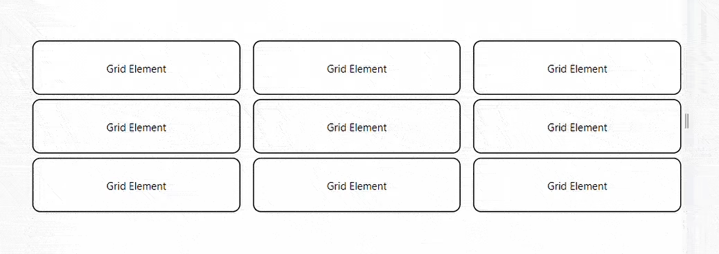 Nested grid layout example
Building a simple Blog Page UI with Material UI Grid
Material UI Grid assists developers with the measurements needed to create a more easily responsive UI. This can be depicted in a simple Blog Page layout created with React and Material UI. Material UI Grid is used in three app components; Blog, FeaturedPost, and MainFeaturedPost.
The <MainFeaturedPost/> Component
This component contains all the elements in the blog layout's main featured post section.
Study the code:
import * as React from "react";
import Paper from "@mui/material/Paper";
import Typography from "@mui/material/Typography";
import Grid from "@mui/material/Grid2";
import Box from "@mui/material/Box";

function MainFeaturedPost(props) {
  const { post } = props;

  return (
    <Paper
      sx={{
        position: "relative",
        backgroundColor: "grey.800",
        color: "#fff",
        mb: 4,
        backgroundSize: "cover",
        backgroundRepeat: "no-repeat",
        backgroundPosition: "center",
        backgroundImage: `url(${post.image})`,
      }}
    >
      {
        <img
          style={{ display: "none" }}
          src="https://refine.ams3.cdn.digitaloceanspaces.comundefined"
          alt={post.imageText}
        />
      }
      <Box
        sx={{
          position: "absolute",
          top: 0,
          bottom: 0,
          right: 0,
          left: 0,
          backgroundColor: "rgba(0,0,0,.3)",
        }}
      />
      <Grid container>
        <Grid
          size={{
            md: 6,
          }}
        >
          <Box
            sx={{
              position: "relative",
              p: { xs: 3, md: 6 },
              pr: { md: 0 },
            }}
          >
            <Typography component="h3" variant="h2">
              {post.title}
            </Typography>
            <Typography variant="h5" color="inherit" paragraph>
              {post.description}
            </Typography>
            {post.linkText}
          </Box>
        </Grid>
      </Grid>
    </Paper>
  );
}

export default MainFeaturedPost;
<FeaturedPost/> component
This component holds the elements in the Blog page layout featured posts section. There are two of them, and they are set the share the available screen space in a 3:6 ratio when the viewport is 600px or more. They are also set to stack on top of each other when the viewport is 600px or less.
Study the code below:
import * as React from "react";
import Typography from "@mui/material/Typography";
import Grid from "@mui/material/Grid2";
import Card from "@mui/material/Card";
import CardActionArea from "@mui/material/CardActionArea";
import CardContent from "@mui/material/CardContent";
import CardMedia from "@mui/material/CardMedia";

function FeaturedPost(props) {
  const { post } = props;

  return (
    <Grid
      size={{
        xs: 12,
        md: 6,
      }}
    >
      <CardActionArea component="a" href="#">
        <Card sx={{ display: "flex" }}>
          <CardContent sx={{ flex: 1 }}>
            <Typography component="h2" variant="h5">
              {post.title}
            </Typography>
            <Typography variant="subtitle1" color="text.secondary">
              {post.date}
            </Typography>
            <Typography variant="subtitle1" paragraph>
              {post.description}
            </Typography>
            <Typography variant="subtitle1" color="primary">
              Continue reading...
            </Typography>
          </CardContent>
          <CardMedia
            component="img"
            sx={{ width: 160, display: { xs: "none", sm: "block" } }}
            image={post.image}
            alt={post.imageLabel}
          />
        </Card>
      </CardActionArea>
    </Grid>
  );
}

export default FeaturedPost;
The <Blog/> Component
This component handles housing and displays the other components with the Material UI grid.
Here’s the code for the Blog component:
import * as React from "react";
import CssBaseline from "@mui/material/CssBaseline";
import Grid from "@mui/material/Grid2";
import Container from "@mui/material/Container";
import { createTheme, ThemeProvider } from "@mui/material/styles";
import Header from "./Header";
import MainFeaturedPost from "./MainFeaturedPost";
import FeaturedPost from "./FeaturedPost";

const sections = [
  { title: "Technology", url: "#" },
  { title: "Design", url: "#" },
  { title: "Culture", url: "#" },
  { title: "Business", url: "#" },
  { title: "Politics", url: "#" },
  { title: "Opinion", url: "#" },
  { title: "Science", url: "#" },
  { title: "Health", url: "#" },
  { title: "Style", url: "#" },
  { title: "Travel", url: "#" },
];

const mainFeaturedPost = {
  title: "Title of a longer featured blog post",
  description:
    "Multiple lines of text that form the lede, informing new readers quickly and efficiently about what's most interesting in this post's contents.",
  image: "https://source.unsplash.com/random",
  imageText: "main image description",
  linkText: "Continue reading…",
};

const featuredPosts = [
  {
    title: "Featured post",
    date: "Nov 12",
    description:
      "This is a wider card with supporting text below as a natural lead-in to additional content.",
    image: "https://source.unsplash.com/random",
    imageLabel: "Image Text",
  },
  {
    title: "Post title",
    date: "Nov 11",
    description:
      "This is a wider card with supporting text below as a natural lead-in to additional content.",
    image: "https://source.unsplash.com/random",
    imageLabel: "Image Text",
  },
];

const theme = createTheme();

export default function Blog() {
  return (
    <ThemeProvider theme={theme}>
      <CssBaseline />
      <Container maxWidth="lg">
        <Header title="Blog" sections={sections} />
        <main>
          <MainFeaturedPost post={mainFeaturedPost} />
          <Grid container spacing={4}>
            {featuredPosts.map((post) => (
              <FeaturedPost key={post.title} post={post} />
            ))}
          </Grid>
        </main>
      </Container>
    </ThemeProvider>
  );
}
We have a simple Blog Layout created with React and Material UI.
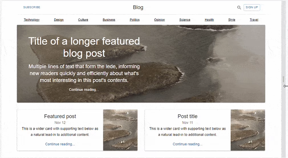 Featured blog post hero section
When to use Material UI DataGrid Component?
Making Lots of Data Understandable
Material UI DataGrid has the capability to render a huge amount of data and is efficient in rendering performance.
Data Wrangling If your application needs advanced data-handling features, such as sorting, filtering, pagination, or grouping, Material UI DataGrid natively supports this.
Editable Data Tables Material UI DataGrid features many cell-editing features, which work great when you need to let your users interact and edit the data right inside the table. The tables are very flexible and expandable. If you need to make a table that is highly configurable and extensible by design, Material UI DataGrid allows you to change the components' look and behavior to match your app design.
Integrating with Backend Services: When you need to integrate the table to backend services for fetching, updating, and committing data, Material UI DataGrid API provides robust support for data sources and changes.
Data-heavy Tables Material UI DataGrid comes with out-of-the-box features like column resizing, reordering, pinning, and virtualization.
Accessibility: For those times when you need a data grid that is accessible by WAI-ARIA standards, MUI DataGrid comes accessibility-featured and baked right in, out of the box.
Examples of Use Cases
Admin Dashboards: Display user data, product lists, and sales data, among others, allowing the data to be sorted and filtered.
Reporting Tools: The tools to be used in reporting complex datasets containing different groupings and aggregations.
Content Management Systems: Inline editing and batch processes for managing articles, user comments, user roles, and more.
Project Management Apps: Real-time updated lists of tasks and tables which indicate project details and resource allocation.
Material UI Grid Drawbacks
Some of the drawbacks of using Material UI Grid include:
Negative Margin
Material UI employs a negative margin to create space between grid items. This could result in unexpected behaviors. To apply a background color, for example, you must use display: flex; on the parent grid element.
white-space no-wrap
On flex items, the default setting is min-width: auto. This causes a positioning conflict when the child uses the white-space: nowrap. You can set min-width: 0 to ensure that the item stays within the container.
In practice, you can set the zeroMinWidth property as follows:
<Grid item xs zeroMinWidth>
  <Typography noWrap>
 </Grid>
direction: column | column-reverse
direction="column" and direction="column-reverse" containers do not support the size={{ xs, sm, md , lg ,xl }} prop. These breakpoints are primarily concerned with controlling width and have no effect on height within column containers.
Conclusion
This article covered Material UI Grid, its features, application and installment inside any React application. We also further explored the Material UI Grid functionalities in a simple Blog post Layout. Despite the limitations enlisted above, Material UI Grid aids developers in creating a responsive and interactive web user interface. I hope this article becomes valuable to you.