
Dashboards are everywhere, but most teams still struggle with the same question: what should be on the screen?
A useful dashboard does more than display numbers. It helps someone decide what to do next. This guide breaks down dashboard types, what separates good dashboards from noisy ones, and how to build one without turning it into a month-long project.


What is a Dashboard?
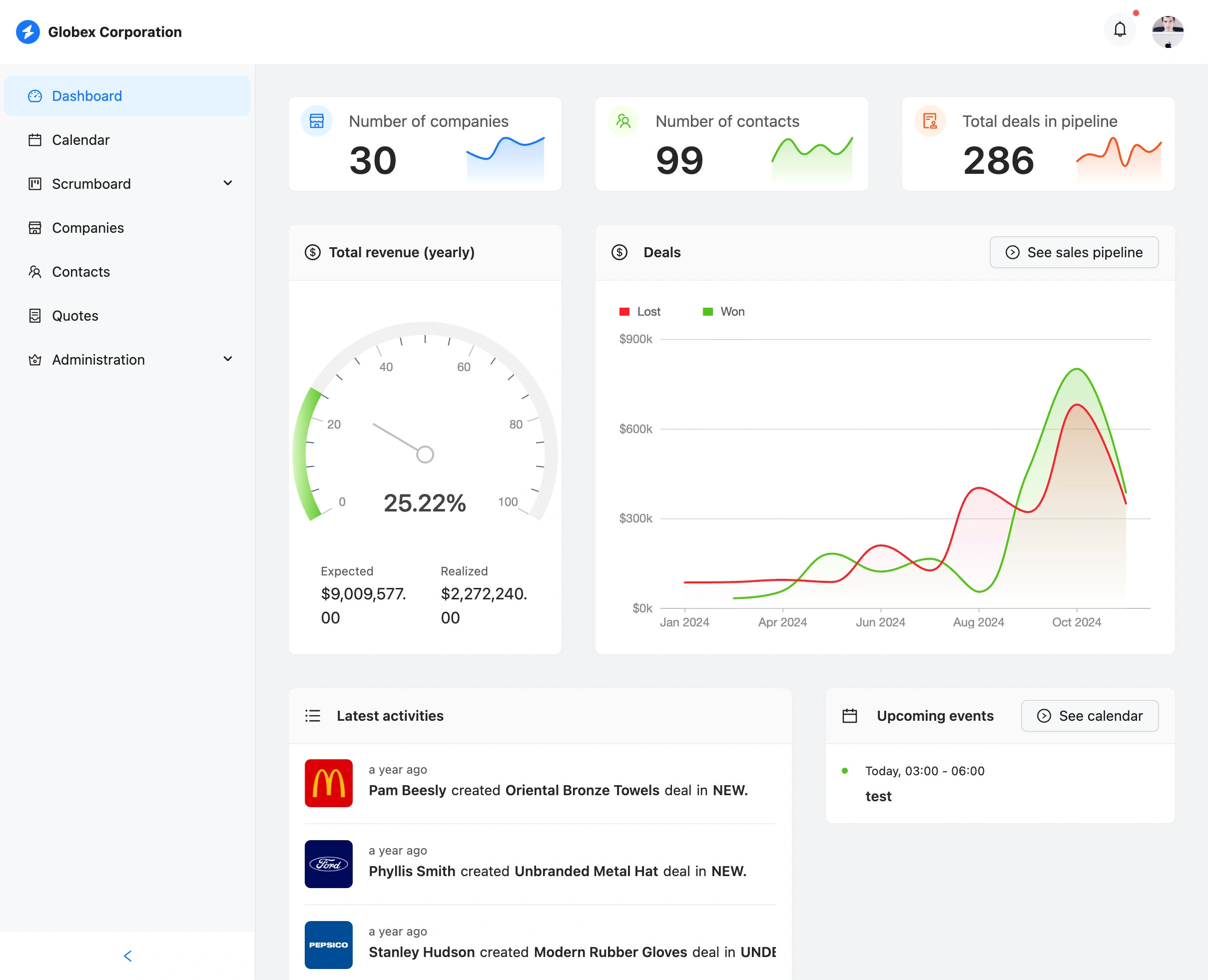 Example dashboard showing key metrics and visualizations
A dashboard is a visual interface that displays metrics and data in a single view. Think of it like a car dashboard: you see speed, fuel, and temperature at a glance without checking separate gauges.
In business, dashboards pull data from multiple sources (databases, APIs, spreadsheets) and show it in one place. Instead of logging into five different tools to understand what's happening, you open one screen. This is why dashboards are a core pattern in modern internal tools.
A good dashboard has a few things in common:
- It shows live or near-live data, not last week's numbers
- It's visual: charts, graphs, progress bars, big numbers
- It's focused on what matters and hides the rest
- Every metric on it should inform a decision
Types of dashboards
Not all dashboards serve the same purpose. The right type depends on the decision you need to make and how fast you need to make it.
Operational dashboards
Operational dashboards monitor what is happening right now. They update every few seconds or minutes and support real-time decisions.
Typical question: "Are we okay right now?"
Common examples:
- Server monitoring (uptime, error rates, CPU usage)
- Live sales tracking
- Support ticket queue
- Warehouse order status
Most common users: operations teams, support managers, DevOps engineers.
Analytical dashboards
Analytical dashboards focus on trends over time. They help answer "what happened?" and "why did it happen?"
Typical question: "What changed, and where did it break?"
Common examples:
- Monthly revenue trends
- Customer acquisition funnel analysis
- Campaign performance over time
- Churn analysis
Most common users: analysts, marketing teams, product managers.
Strategic dashboards
Strategic dashboards show high-level KPIs for executives. They're updated less frequently (weekly or monthly) and focus on company health.
Typical question: "Are we on track this quarter?"
Common examples:
- Revenue vs. target
- OKR progress
- Customer satisfaction scores
- Market share
Most common users: executives, board members, leadership teams.
Tactical dashboards
Tactical dashboards are department-specific. They track metrics that matter to a particular team's daily work.
Typical question: "What does this team need to fix this week?"
Common examples:
- Engineering velocity and sprint progress
- Sales pipeline by stage
- Customer success health scores
- Recruiting funnel
Most common users: team leads, department managers.
If you're building a dashboard that also needs record management, you'll usually pair it with CRUD app patterns or a dedicated admin panel.
Why businesses need dashboards
Without dashboards, teams face common problems:
Data is scattered across tools. Revenue is in Stripe. Users are in your database. Marketing is in HubSpot. Customer feedback is in Intercom. Everyone has data, but no one has the same view.
"Where do I find X?" requests keep interrupting the week. A quick number check turns into 30 minutes of exports, filters, and screenshot sharing.
Decisions slow down. By the time the data is collected, the moment has passed. Teams fall back to gut feel.
Manual reporting eats hours. Someone copies the same metrics into a slide deck every week instead of solving the actual problem.
Dashboards fix these problems by creating a single source of truth. Everyone looks at the same numbers. Decisions happen faster. Problems get spotted before they escalate.
What makes a good dashboard?
A dashboard isn't just charts on a screen. Here's what separates good ones from bad ones:
1. Focus
Show what matters. Hide what does not. The biggest mistake is cramming too many metrics onto one screen, a pattern I call "dashboard soup." If everything is important, nothing is.
Rule of thumb: if you can't explain why a metric is there, remove it.
2. Clarity
Anyone should understand the dashboard in 5 seconds. Labels should be clear. Numbers should have context (is 500 good or bad?). Colors should mean something consistent.
3. Real data
A dashboard connected to live data sources is much more valuable than one with manual entry. Manual data goes stale. People forget to update it. Automation wins.
4. Actionable metrics
Every metric should answer: "What would I do differently if this number changed?" If the answer is "nothing," the metric doesn't belong on your dashboard.
5. Speed
Dashboards that take 30 seconds to load don't get used. Performance matters.
Common mistakes
- Too many metrics. Stick to 5-10, not 50.
- Vanity metrics. Pageviews feel good but don't drive decisions.
- No filtering. Users need to drill down by date, segment, or category.
- Outdated data. Manual entry that nobody maintains.
- No comparison. Show current vs. previous period or target.
Dashboard readiness checklist (Refine 7-point score)
Before building, score your dashboard idea from 0 to 2 on each dimension:
| Dimension | 0 | 1 | 2 |
|---|---|---|---|
| Decision clarity | No clear decisions tied to the dashboard | Some decisions are known | Specific decisions and owners are defined |
| Metric quality | Mostly vanity metrics | Mixed vanity + actionable metrics | Mostly leading and actionable metrics |
| Data reliability | Manual or inconsistent data | Partial automation | Automated, trusted data pipeline |
| Freshness requirements | Unknown update frequency | General update target | Clear SLA (real-time, hourly, daily) |
| Audience definition | Broad or unclear audience | One primary audience, vague needs | Explicit audience and use cases |
| Workflow fit | "Nice-to-have" screen | Used occasionally | Embedded in daily workflow |
| Actionability | No direct next actions | Some actions possible | Clear actions tied to each metric |
How to use the score:
- 0-6: Don't build yet. Clarify business outcomes first.
- 7-10: Build a simple MVP dashboard.
- 11-14: Strong candidate for production use and broader rollout.
How to build a dashboard
There are several approaches, each with trade-offs:
Option 1: Code from scratch
Build a custom frontend with React, Vue, or another framework. Connect to your database. Create API endpoints. Build chart components.
Pros: Full control, exactly what you want. Cons: Takes weeks or months. Requires dedicated developers. Ongoing maintenance.
Best for companies with engineering resources and unique requirements.
Option 2: Business intelligence tools
Use tools like Metabase, Tableau, Looker, or Power BI. They connect to your database and let you build dashboards with a visual interface.
Pros: Powerful analytics, good for data teams. Cons: Learning curve. Can be expensive. Limited customization. Not great for operational dashboards.
Best for data teams doing deep analysis.
Option 3: Low-code platforms
Use platforms like Retool, Appsmith, or Budibase. Drag-and-drop components, connect to databases, build dashboards without much code.
Pros: Faster than coding from scratch. Cons: Still takes time to learn. Limited customization. Vendor lock-in. Per-seat pricing adds up.
Best for teams with some technical ability who want faster iteration.
Option 4: AI-powered generation
Describe the dashboard you want in plain language. AI generates a working dashboard connected to your data. You customize from there.
Pros: Fastest path to a working dashboard. Full code ownership. Cons: Newer approach, so fewer people know about it yet.
Best for teams that want speed without sacrificing flexibility.
Refine uses this approach. Connect your database (Supabase, PostgreSQL, or a REST API), describe what you want, and get a working dashboard in minutes. The generated code is React/TypeScript that you fully own and can customize.
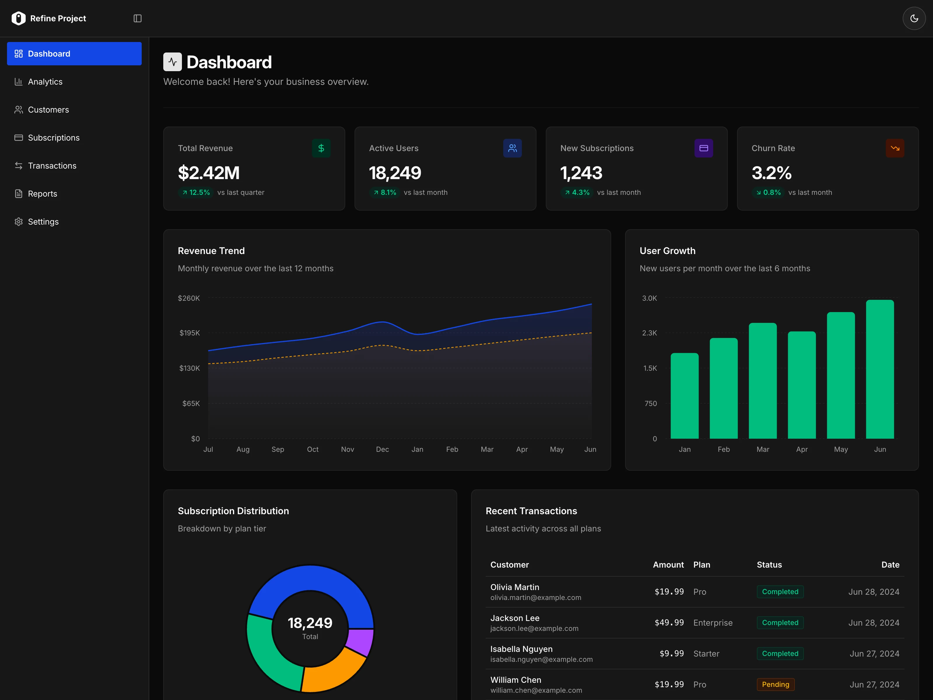 Refine AI generating a dashboard from natural language description
Dashboard build approach comparison
| Approach | Time to first version | Customization | Code ownership | Typical cost model | Best fit |
|---|---|---|---|---|---|
| Code from scratch | Weeks to months | Very high | Full | Engineering time | Unique workflows and strong dev team |
| BI tools | Days to weeks | Medium | Low to medium | Seat-based or enterprise | Deep reporting and analyst workflows |
| Low-code platforms | Days to weeks | Medium | Low to medium | Seat-based + platform limits | Fast internal ops tools |
| AI-powered generation | Hours to days | High | Full | Usage-based + infra | Teams optimizing for speed and flexibility |
Best dashboard tools (and when to use them)
If you're comparing dashboard tools, use this rule of thumb:
- Use BI tools (Metabase, Tableau, Looker, Power BI) when analysts need ad hoc exploration and historical analysis.
- Use low-code tools (Retool, Appsmith, Budibase) when operations teams need internal apps quickly and can accept platform constraints.
- Use framework + code when you need full control, custom UX, and long-term ownership.
- Use AI-powered generation when you want a working React/TypeScript starting point fast, then iterate in code.
Most teams end up with a hybrid stack: BI for deep analysis, plus dashboard and admin views in internal tools for daily operations.
Dashboard KPIs by team
A useful dashboard KPI is one that triggers action, not just observation.
| Team | Core KPIs | Typical action when metric changes |
|---|---|---|
| Sales | Pipeline coverage, win rate, sales cycle length | Reprioritize deals, coaching, pricing changes |
| Marketing | CAC, conversion rate by channel, MQL-to-SQL | Reallocate budget, adjust campaigns and targeting |
| Product | Activation rate, retention, feature adoption | Improve onboarding, ship fixes, Refine roadmap |
| Support | First response time, resolution time, CSAT | Rebalance staffing, improve triage, update SOPs |
| Operations | Throughput, incident count, SLA attainment | Remove bottlenecks, adjust staffing, improve process |
Dashboard examples
Here are common dashboard patterns across different functions:
Sales dashboard
- Total revenue (today, this month, this year)
- Pipeline value by stage
- Win rate
- Average deal size
- Top deals closing this month
- Revenue by sales rep
Marketing dashboard
- Website traffic (visitors, sessions)
- Conversion rate by channel
- Cost per acquisition
- Campaign performance (spend vs. return)
- Lead sources
- Email engagement metrics
Operations dashboard
- System uptime
- Error rates and alerts
- Active users right now
- API response times
- Queue depth
- Server resource usage
Customer success dashboard
- Churn rate (monthly, annual)
- Net Promoter Score (NPS)
- Support ticket volume and resolution time
- Customer health scores
- Renewal pipeline
- Feature adoption rates
If you need a full implementation walkthrough, see Building a Dashboard with Tremor.
Dashboard vs. report vs. admin panel
These terms get confused. Here's the difference:
| Dashboard | Report | Admin Panel | |
|---|---|---|---|
| Purpose | Monitor metrics | Analyze historical data | Manage data and operations |
| Interactivity | View and filter | View only | Full CRUD (create, read, update, delete) |
| Update frequency | Real-time | Periodic (weekly, monthly) | Real-time |
| Primary user | Decision-makers | Analysts | Operators and admins |
A dashboard shows you what's happening. A report explains what happened. An admin panel lets you do something about it.
Many internal tools combine all three: a dashboard view for metrics, reporting capabilities for analysis, and admin functionality for taking action.
Getting started
If you need a dashboard, here's the fastest path:
Know your data source. Is it in a database (PostgreSQL, MySQL)? A backend service (Supabase, Firebase)? A REST API? A spreadsheet?
Define 5-10 metrics. What decisions will this dashboard inform? What would you check every morning?
Choose your approach. Code from scratch if you have time and resources. Use BI tools if you need deep analytics. Try AI-powered generation if you want a working dashboard in minutes.
Start simple. Launch with the essentials. Add complexity based on what users actually need.
Building dashboards used to take weeks. With modern tools, you can have something working in an afternoon. The hard part is deciding what metrics actually matter.
Frequently asked questions
What should a dashboard include?
Start with 5-10 metrics tied to decisions your team makes regularly. Include trend context (previous period or target), filters (date, segment), and clear ownership for each metric.
How often should dashboard data update?
It depends on the use case. Operational dashboards may refresh every few seconds or minutes. Strategic dashboards are often updated daily, weekly, or monthly.
What's the difference between a KPI dashboard and a report?
A KPI dashboard is for ongoing monitoring and fast decisions. A report is usually periodic and deeper, focused on explaining what happened and why.
How many metrics should be on a dashboard?
For most teams, 5-10 primary metrics per dashboard is the right starting point. If users need many metrics, split them across focused dashboards instead of one overloaded screen.
Do dashboards replace admin panels?
No. Dashboards are mostly for visibility. Admin panels are for taking actions on records and system settings. Most production internal tools include both.
Related content
- What is an Internal Tool? — The complete guide
- Admin Panel Frameworks — Best frameworks for building admin panels
- What is a CRUD App? — CRUD patterns and architecture
- Building a Dashboard with Tremor — Step-by-step tutorial
Start building with Refine
Connect your database and describe the dashboard you want. Get started free — no credit card required.