
 Refine and Supabase logos
This guide is a comprehensive, seven-part tutorial that walks you through building two full-stack apps with Refine and Supabase. By the end, you'll have a fully functional CRUD app called "Pixels" and an admin dashboard called "Pixels Admin".
The live version of the app is available here.
The final apps source codes are available on GitHub:
Pixels Client
To get completed client source code simply run:
npm create refine-app@latest -- --example pixels
Pixels Admin
To get completed admin source code simply run:
npm create refine-app@latest -- --example pixels-admin


Part 1: Pilot & Refine Architecture
What is Refine ?
Refine is a highly customizable React based framework for building CRUD apps that comes with a headless core package and supplementary "pick-and-plug" modules for the UI, backend API clients and Internationalization support.
Refine's (intentionally decapitalized) core is strongly opinionated about RESTful conventions, HTTPS networking, state management, authentication and authorization. It is, however, unopinionated about the UI and render logic. This makes it customizable according to one's choice of UI library and frameworks.
In a nutshell, you can build rock-solid CRUD apps easily using Refine✨.
Refine Architecture
Everything in Refine is centered around the <Refine /> component, which is configured via a set of provider props that each requires a provider object to be passed in. A typical application of providers on the <Refine /> component looks like this:
import { Refine } from "@refinedev/core";
import dataProvider from "@refinedev/simple-rest";
import routerProvider from "@refinedev/react-router";
import { liveProvider } from "@refinedev/supabase";
import authProvider from "./authProvider";

<Refine
    dataProvider={dataProvider("https://api.fake-rest.refine.dev")}
    routerProvider={routerProvider}
    liveProvider={liveProvider(supabaseClient)}
    authProvider={authProvider}
    resources={[]}
    ...
/>;
The above snippet lists a few of the props and their objects.
However, rather than precisely being a component, <Refine /> is largely a monolith of provider configurations backed by a context for each. Hence, inside dataProvider, we have a standard set of methods for making API requests; inside authProvider, we have methods for dealing with authentication and authorization; inside routerProvider, we have exact definitions of routes and the components to render for that route, etc. And each provider comes with its own set of conventions and type definitions.
For example, a dataProvider object has the following signature to which any definition of a data provider conform:
dataProvider.ts
const dataProvider = {
  create: ({ resource, variables, meta }) => Promise,
  createMany: ({ resource, variables, meta }) => Promise,
  deleteOne: ({ resource, id, variables, meta }) => Promise,
  deleteMany: ({ resource, ids, variables, meta }) => Promise,
  getList: ({ resource, pagination, pagination, sort, filters, meta }) =>
    Promise,
  getMany: ({ resource, ids, meta }) => Promise,
  getOne: ({ resource, id, meta }) => Promise,
  update: ({ resource, id, variables, meta }) => Promise,
  updateMany: ({ resource, ids, variables, meta }) => Promise,
  custom: ({ url, method, sort, filters, payload, query, headers, meta }) =>
    Promise,
  getApiUrl: () => "",
};
The underlying architecture involves any presentational component passed to <Refine /> to be able to consume these configured methods via corresponding hooks. Each method in a provider has a corresponding hook via which a consumer component is able to fetch data from the backend, i.e. the useList() hook is the corresponding function accessing the dataProvider.getList() provider method.
An example hook usage looks like this:
const { result } = useList<Canvas>({
  resource: "canvases",
  pagination: {
    mode: "off",
  },
  sorters: {
    initial: [
      {
        field: "created_at",
        order: "desc",
      },
    ],
  },
});
The hooks, in turn, leverage React Query hooks in order to make API calls asked by the provider methods. Here's an early sneak peek into the action under the hood:
Show Refine `useList` hook code
const queryResponse = useQuery<GetListResponse<TData>, TError>(
  queryKey.list(config),
  ({ queryKey, pagination, signal }) => {
    const { pagination, meta, ...restConfig } = config || {};
    return getList<TData>({
      resource,
      ...restConfig,
      pagination,
      meta: {
        ...meta,
        queryContext: {
          queryKey,
          pageParam,
          signal,
        },
      },
    });
  },
  {
    ...queryOptions,
    onSuccess: (data) => {
      queryOptions?.onSuccess?.(data);

      const notificationConfig =
        typeof successNotification === "function"
          ? successNotification(data, { meta, config }, resource)
          : successNotification;

      handleNotification(notificationConfig);
    },
    onError: (err: TError) => {
      checkError(err);
      queryOptions?.onError?.(err);

      const notificationConfig =
        typeof errorNotification === "function"
          ? errorNotification(err, { meta, config }, resource)
          : errorNotification;

      handleNotification(notificationConfig, {
        key: `${resource}-useList-notification`,
        message: translate(
          "common:notifications.error",
          { statusCode: err.statusCode },
          `Error (status code: ${err.statusCode})`,
        ),
        description: err.message,
        type: "error",
      });
    },
  },
);
We'll be visiting code like this often, but if you examine closely you can see that Refine uses React Query to handle caching, state management as well as errors out-of-the-box.
The following diagram illustrates the interactions:
 Refine data flow diagram
Providers and Hooks
Refine's power lies in the abstraction of various app component logic such as authentication, authorization, routing and data fetching - inside individual providers and their corresponding hooks.
Common providers include:
authProvider- for authentication and authorization.dataProvider- for CRUD operations.routerProvider- for defining routes, RESTful and non-RESTful.liveProvider- for implementing real time features.accessControlProvider- for access control management.auditLogProvider- for logging appwide activities.
For an exhaustive list of providers, please visit the Refine providers documentation from here.
Each method in these providers comes with its corresponding hook to be used from inside UI components and pages. For more details, please refer to the Refine hooks documentation starting here.
Support Packages
Refine is inherently headless in its core API and deliberately agnostic about the UI and backend layers. Being so, it is able to provide fantastic support for major UI libraries and frameworks as well as popular backend frameworks and services. To name a few, Refine's UI support packages include Ant Design, Material UI, Chakra UI and Mantine. Backend supplementary modules include Supabase, GraphQL, and NestJS
For a complete list of all these modules, check out this page.
What is Supabase?
Supabase is an open source alternative to Firebase. It is a hosted backend that provides a realtime database, authentication, storage, and API services.
Refine has a built-in data provider support for Supabase. You can find the advanced tutorial here.
We'll be using Supabase to build our backend for Pixels app.
A week of Refine ft. Supabase
 Pixels app logo banner
In this tutorial series, we will be going through most of the core features of Refine by building two apps related to drawing pixels on a canvas. This section is intended to provide an overview.
The first one, the client app - Pixels, allows a logged in user to create a canvas and draw on it together with other users. It also displays a public gallery of all canvases and a "Featured Canvases" page.
The second app, Pixels Admin is an admin dashboard that allows authorized users like editors and admins to view the list of users registered with Pixels app and manage user drawn canvases, with actions like promoting, unpromoting and deleting a canvas.
We will be building these two apps day-by-day over a period of 7 days. And while doing so, we will dive deep into the details of related providers, hooks, UI components and how Refine works behind the scenes.
As far as our features and functionalities go, we will cover most of the providers and some of the related hooks. For the UI side, we will be using the optional Ant Design package supported by Refine. For the backend, we will use a PostgreSQL database hosted on the Supabase cloud.
Here are the detailed outlines split per day:
Day One - On RefineWeek
This post. Hello! 👋 👋 Refine welcomes you! We are here 😄 😄
Day Two - Setting Up the Client App
We set up the Pixels client app using create refine-app with Ant Design and Supabase modules. We explore the boilerplate code and look into the dataProvider and authProvider objects.
Day Three - Adding CRUD Actions & Authentication
We add features: canvas creation, pixel drawing, a public gallery, featured canvases page, and user authentication with email, Google and GitHub.
Day Four - Adding Realtime Collaboration
We add real time collaboration using the liveProvider prop and Supabase's Realtime PostgreSQL CDC, enabling multiple users to draw on a canvas simultaneously.
Day Five - Initialize and Build Pixels Admin App
We build an admin dashboard with Ant Design that lists users and canvases, implementing CRUD operations for managing these resources.
Day Six - Add Role Based Authorization
We implement RBAC using Casbin and Refine's accessControlProvider for editor and admin roles.
Day Seven - Add Audit Log to Client App and Admin App
We implement audit logging with the auditLogProvider prop to track pixel drawing activities, saving logs to a Supabase logs table.
Summary
In this post, we introduced the Refine framework and the RefineWeek series itself. We talked about Refine's underlying architecture which consists of providers, hooks and components that help rapidly build internal tools.
We laid out the plans for building a Pixels client app and an admin dashboard app in considerable depth.
Part 2: Setting Up the Client App
In this episode, we initialize our Pixels app using Refine and get familiar with the boilerplate code to be created with the create refine-app CLI tool.
Overview
In the previous post, we got a preview of Refine's underlying architecture, especially on how Refine's core modules abstract and divide an app's logic inside individual providers and allow their methods to be easily accessed and executed with hooks from inside consumer components. This abstraction at the providers layer is where Refine shines and require extensive configuration to begin with.
In this part, we will get into the details of two important providers: namely, the dataProvider and authProvider props of our <Refine /> component. We will be building on this knowledge in the coming episodes.
The providers will be generated by the create refine-app CLI tool based on our choice, so we'll start off with setting up the Pixels app right away.
Project Setup
For this project, we are using a PostgreSQL database hosted in the Supabase cloud. Refine comes with an optional package for Supabase that gives us dataProvider and authProviders out-of-the-box for handling requests for CRUD actions, authentication and authorization against models hosted in a Supabase server.
We are going to include Refine's Ant Design package for the UI side.
Let's go ahead and use the create refine-app CLI tool to interactively initialize the project. Navigate to a folder of your choice and run:
npm create refine-app@latest pixels
create refine-app presents us with a set of questions for choosing the libraries and frameworks we want to work with.
So, I chose the following options:
✔ Choose a project template · Refine(Vite)
✔ What would you like to name your project?: · pixels
✔ Choose your backend service to connect: · Supabase
✔ Do you want to use a UI Framework?: · Ant Design
✔ Do you want to add example pages?: · no
✔ Do you need i18n (Internationalization) support?: · no
✔ Choose a package manager: · npm
This should create a rudimentary Refine app that supports Ant Design in the UI and Supabase in the backend. If we open the app in our code editor, we can see that Refine's optional packages for Ant Design and Supabase are added to package.json:
"dependencies": {
  "@refinedev/antd": "^5.7.0",
  "@refinedev/core": "^4.5.8",
  "@refinedev/react-router-v6": "^4.1.0",
  "@refinedev/supabase": "^5.0.0",
}
We are going to use Ant Design components for our UI thanks to the @refinedev/antd module. @refinedev/supabase module allows us to use Refine's Supabase auth and data providers.
We'll cover these Supabase related providers as we add features to our app in the upcoming episodes. However, let's try building the app for now, and check what we have in the browser after running the development server. In the terminal, run the following command:
npm run dev
After that, navigate to http://localhost:5173, and lo and behold! we have a Refine app:
 Pixels app welcome screen
Exploring the App
Let's now see what Refine scaffolded for us during initialization.
Our main point of focus is the src folder. And for now, especially the <App /> component.
If we look inside the App.tsx file, we can see a <Refine /> component crowded with passed in props:
import { GitHubBanner, Refine, WelcomePage } from "@refinedev/core";
import { RefineKbar, RefineKbarProvider } from "@refinedev/kbar";

import { useNotificationProvider } from "@refinedev/antd";
import "@refinedev/antd/dist/reset.css";

import routerProvider, {
  DocumentTitleHandler,
  UnsavedChangesNotifier,
} from "@refinedev/react-router";
import { dataProvider, liveProvider } from "@refinedev/supabase";
import { BrowserRouter, Route, Routes } from "react-router-dom";
import authProvider from "./authProvider";
import { ColorModeContextProvider } from "./contexts/color-mode";
import { supabaseClient } from "./utility";

function App() {
  return (
    <BrowserRouter>
      <GitHubBanner />
      <RefineKbarProvider>
        <ColorModeContextProvider>
          <Refine
            dataProvider={dataProvider(supabaseClient)}
            liveProvider={liveProvider(supabaseClient)}
            authProvider={authProvider}
            routerProvider={routerProvider}
            notificationProvider={useNotificationProvider}
            options={{
              syncWithLocation: true,
              warnWhenUnsavedChanges: true,
            }}
          >
            <Routes>
              <Route index element={<WelcomePage />} />
            </Routes>
            <RefineKbar />
            <UnsavedChangesNotifier />
            <DocumentTitleHandler />
          </Refine>
        </ColorModeContextProvider>
      </RefineKbarProvider>
    </BrowserRouter>
  );
}

export default App;
Today, we'll examine a few of these props so that we are ready to move to the next episode.
The <Refine /> Component
The <Refine /> component is the entry point of a Refine app. In order to leverage the power of Refine's abstraction layers, we need to have the <Refine /> component.
Then we have to configure the <Refine /> component with the provider objects we want to use in our app. We can see that create refine-app already added the props for us inside <Refine /> out-of-the-box.
We will be using them in our Pixels app. Some provider objects like the routerProvider or the dataProvider are defined for us by Refine's core or support modules and some like the accessControlProvider have to be defined by ourselves.
CAUTION
<Refine /> comes with dark mode support out-of-the-box. However, we will not be using it in this series. So, we will be replace the ColorModeContextProvider with the ConfigProvider.
Also You can remove src/context/color-mode that comes with create refine-app.
// ...
- import { ColorModeContextProvider } from "./contexts/color-mode";
+ import { ConfigProvider } from "antd";

function App() {
    return (
            // ...
-                <ColorModeContextProvider>
+                <ConfigProvider>
                    <Refine
                    // ...
                    >
                        {/* ... */}
                    </Refine>
-                </ColorModeContextProvider>
+                </ConfigProvider>
         // ...
    );
}
<Refine />'s dataProvider Prop
Refine's data provider is the context which allows the app to communicate with a backend API via a HTTP client. It subsequently makes response data returned from HTTP requests available to consumer components via a set of Refine data hooks.
If we look closely, our dataProvider prop derives a value from a call to dataProvider(supabaseClient):
import { Refine } from "@refinedev/core";
import { dataProvider } from "@refinedev/supabase";

import { supabaseClient } from "./utility";

function App() {
  return <Refine dataProvider={dataProvider(supabaseClient)} />;
}
The returned object, also called the dataProvider object, has the following signature:
Show data provider object signature
const dataProvider = {
  create: ({ resource, variables, meta }) => Promise,
  createMany: ({ resource, variables, meta }) => Promise,
  deleteOne: ({ resource, id, variables, meta }) => Promise,
  deleteMany: ({ resource, ids, variables, meta }) => Promise,
  getList: ({ resource, pagination, hasPagination, sort, filters, meta }) =>
    Promise,
  getMany: ({ resource, ids, meta }) => Promise,
  getOne: ({ resource, id, meta }) => Promise,
  update: ({ resource, id, variables, meta }) => Promise,
  updateMany: ({ resource, ids, variables, meta }) => Promise,
  custom: ({ url, method, sort, filters, payload, query, headers, meta }) =>
    Promise,
  getApiUrl: () => "",
};
Each item in this object is a method that has to be defined by us or Refine's packages.
Refine supports 15+ backend dataProvider integrations as optional packages that come with distinct definitions of these methods that handle CRUD operations according to their underlying architectures. The full list can be found here.
Normally, for our own backend API, we have to define each method we need for sending http requests inside a dataProvider object as above. But since we are using the @refinedev/supabase package, dataProvider={dataProvider(supabaseClient)} makes the following object available to us:
Show Refine supabase data provider source code
The full source code for the Supabase data provider can be found in the @refinedev/supabase package on GitHub. It implements all the CRUD methods (getList, getOne, create, update, deleteOne, etc.) using the Supabase client library.
We don't have to get into the mind of the people at Refine yet, but if we skim over closely, the dataProvider object above has pretty much every method we need to perform all CRUD operations against a Supabase database. Notable methods we are going to use in our app are: create(), getOne(), getList() and update().
For the details of how these methods work, please take your time to scan through the dataProvider API reference.
In order to get the Supabase dataProvider object to deliver, first a supabaseClient has to be set up.
Refine's supabaseClient
If we look inside src/utility/, we have a supabaseClient.ts file containing the credentials of a client that provides us access to a Supabase backend:
import { createClient } from "@refinedev/supabase";

const SUPABASE_URL = "https://ifbdnkfqbypnkmwcfdes.supabase.co";
const SUPABASE_KEY =
  "eyJhbGciOiJIUzI1NiIsInR5cCI6IkpXVCJ9.eyJpc3MiOiJzdXBhYmFzZSIsInJlZiI6ImlmYmRua2ZxYnlwbmttd2NmZGVzIiwicm9sZSI6ImFub24iLCJpYXQiOjE2NzA5MTgzOTEsImV4cCI6MTk4NjQ5NDM5MX0.ThQ40H-xay-Hi5cf7H9mKccMCvAX3iCvYVJDe0KiHtw";

export const supabaseClient = createClient(SUPABASE_URL, SUPABASE_KEY, {
  db: {
    schema: "public",
  },
  auth: {
    persistSession: true,
  },
});
This file was also generated for us by create refine-app using Refine's Supabase package.
Inside <Refine /> component, we are getting the value of the dataProvider prop by passing in supabaseClient to the dataProvider() function imported from this package:
import { Refine } from "@refinedev/core";
import { dataProvider } from "@refinedev/supabase";

import { supabaseClient } from "./utility";

function App() {
  return <Refine dataProvider={dataProvider(supabaseClient)} />;
}
We need to tweak the supabaseClient.ts file with our own credentials, which we will do when we add resources to our app.
If we inspect further, setting up Supabase with Refine helps us enable not only the dataProvider prop, but also the authProvider and liveProvider props inside <Refine />. This is because they all depend on supabaseClient to send http requests. We'll explore the liveProvider prop on Day 4, but let's also look at the authProvider here to enhance our understanding.
<Refine />'s authProvider Prop
We can clearly see in our <Refine /> component that create refine-app already enabled the authProvider prop by passing in the corresponding object for us:
authProvider = { authProvider };
Earlier on, the authProvider object was already created by create refine-app inside the authProvider.ts file:
Show Refine supabase auth provider source code
The full source code for the Supabase auth provider can be found in the Pixels example on GitHub. It implements all the auth methods (login, logout, register, check, getPermissions, getIdentity, onError, forgotPassword, updatePassword) using the Supabase auth client.
This object has all the methods we need to implement an email / password based authentication and authorization system in our app.
Notice, as mentioned before, that authProvider relies on supabaseClient to connect to our Supabase database. So, in this case, our authProvider was generated as part of the Supabase package.
As we can infer by now, although we have stated that Refine performs and manages a lot of heavylifting and simplifies the app logic by dividing concerns into separate contexts, providers and hooks, configuring all these providers is a heavy task itself.
It, fortunately, makes configuration easier by composing individual providers inside a single object.
These are pretty much the essentials we should get familiar with in order to accept the invitation to add resources to the <Refine /> component.
Summary
In this post, we went through the process of initializing our Pixels app with a Supabase hosted PostgreSQL database and Ant Design UI framework.
We then explored the boilerplate code created by create refine-app using Refine's Supabase support package, especially the files related to dataProvider and authProvider props of the <Refine /> component. We touched on setting supabaseClient which is used by these providers to send HTTP requests to the Supabase backend.
In the next article, we will use these providers to implement RESTful CRUD actions for creating a canvas, showing a canvas, drawing pixels on it and showing a public gallery that lists canvases. We will also add authentication to our app.
Part 3: Adding CRUD Actions and Authentication
In this post, we build on our existing understanding of dataProvider and authProvider props of <Refine /> to implement CRUD operations in our Pixels app that we initialized in the previous post. While doing so, we discuss the roles of <Refine /> component's resources and routerProvider props as well.
CRUD actions are supported by the Supabase data provider we chose for our project and in this post we use them to build a public gallery of canvases. We implement creation and displaying of individual canvases as well as drawing on them. We also add authentication features supported by the supabaseClient we discussed on Day Two of the RefineWeek series.
Overview
In the last episode, we explored Refine's auth and data providers in significant detail. We saw that <Refine />'s dataProvider and authProvider props were set to support Supabase thanks to the @refinedev/supabase package.
We mentioned that dataProvider methods allow us to communicate with API endpoints and authProvider methods help us with authentication and authorization. We are able to access and invoke these methods from consumer components via their corresponding hooks.
In this post, we will be leveraging Supabase dataProvider methods to implement CRUD operations for a canvases resource. We are going to start by adding canvases as a resource on which we will be able to perform create, show and list actions. We will first work on a public gallery that lists all canvases and a dashboard page that shows a selection of featured canvases by implementing the list action. We will allow users to perform the canvas create action from a modal. Then we will also implement the show action for a canvas.
We will then apply Supabase auth provider to allow only logged in users to carry out create actions on canvases and pixels. On the way, we will explore how Refine does the heavylifting under the hood for us with React Query, and its own set of providers and hooks - making CRUD operations implementation a breeze.
But before we start, we have to set up Supabase with our database tables and get the access credentials.
Setting Up Supabase for Refine
For this app, we are using a PostgreSQL database for our backend. Our database will be hosted in the Supabase cloud. In order to set up a PostgreSQL server, we need to sign up with Supabase first.
After signing up and logging in to a developer account, we have to complete the following steps:
- Create a PostgreSQL server with an appropriate name.
- Create necessary tables in the database and add relationships.
- Get API keys provided by Supabase for the server and set up
supabaseClientinside our Refine project.
Below, we go over these steps one by one.
1. Creating a PostgreSQL Server with Supabase
Creating a database server is quite intuitive in Supabase. Just go over to your organization's dashboard and start doing something. For me, I have initialized a server with the name refine-pixels under a free tier. If you need a quick hand, please follow this quickstart guide.
2. Adding Tables to a Supabase Database
For our app, we have four tables: auth.users, public.users, canvases and pixels. The entity relational diagram for our database looks like this:
 Supabase table editor
We have a fifth, logs table which we are going to use for audit logging with the auditLogProvider on Day Seven. However, as we are progressing step by step, we are not concerned with that at the moment. We will be adding the logs table on its day.
In order to add the above tables to your Supabase database, please follow the below instructions:
2.1 auth.users Table
The auth.users table is concerned with authentication in our app. It is created by Supabase as part of its authentication module, so we don't need to do anything about it.
Supabase supports a myriad of third party authentication providers as well as user input based email / password authentication. In our app, we'll implement GitHub authentication besides the email / password based option.
2.2 public.users Table
Supabase doesn't allow a client to query the auth.users table for security reasons. So, we need to create a shadow of the auth.users table in public.users with additional columns. We need this shadow table to be able to query user information, such as avatar_url and roles from this table.
 Supabase SQL editor
So, in order to create the public.users table, go ahead and run this SQL script in the SQL Editor of your Supabase project dashboard:
-- Create a table for public users
create table users (
  id uuid references auth.users not null primary key,
  updated_at timestamp with time zone,
  username text unique,
  full_name text,
  avatar_url text
);

-- This trigger automatically creates a public.users entry when a new user signs up via Supabase Auth.
-- See https://supabase.com/docs/guides/auth/managing-user-data#using-triggers for more details.
create or replace function public.handle_new_public_user()
returns trigger as $$
begin
  insert into public.users (id, full_name, avatar_url)
  values (new.id, new.raw_user_meta_data->>'full_name', new.raw_user_meta_data->>'avatar_url');
  return new;
end;
$$ language plpgsql security definer;
create trigger on_auth_user_created
  after insert on auth.users
  for each row execute procedure public.handle_new_public_user();

-- Set up Storage!
insert into storage.buckets (id, name)
  values ('avatars', 'avatars');

-- Set up access controls for storage.
-- See https://supabase.com/docs/guides/storage#policy-examples for more details.
create policy "Avatar images are publicly accessible." on storage.objects
  for select using (bucket_id = 'avatars');

create policy "Anyone can upload an avatar." on storage.objects
  for insert with check (bucket_id = 'avatars');
2.3 canvases Table
For the canvases table, run this SQL script inside the Supabase SQL Editor:
create table canvases (
  id text unique primary key not null,
  user_id uuid references users on delete cascade not null,
  name text not null,
  width int8 not null,
  height int8 not null,
  is_featured boolean default false not null,

  created_at timestamp with time zone default timezone('utc'::text, now()) not null,
  updated_at timestamp with time zone default timezone('utc'::text, now()) not null
);
2.4 pixels Table
For the pixels table run the following SQL script:
create table pixels (
  id int8 generated by default as identity primary key not null,
  user_id uuid references users on delete cascade not null,
  canvas_id text references canvases on delete cascade not null,
  x int8 not null,
  y int8 not null,
  color text not null,

  created_at timestamp with time zone default timezone('utc'::text, now()) not null
);
If you want to create the tables using Table Editor from the dashboard, feel free to use the Supabase docs.
2.5 Relationship Between Tables
If we look closely, public.users table has a one-to-many relationship with canvases and a canvas must belong to a user.
Similarly canvases also has a one-to-many relationship with pixels. A canvas has many pixels and a pixel must belong to a canvas.
Also, public.users has a one-to-many relationship with pixels.
2.5 Disable RLS
For simplicity, we'll disable Row Level Security:
 Disable RLS setting
3. Set Up supabaseClient for <Refine /> Providers
Now it's time to use the Supabase hosted database server inside our Refine app.
First, we need to get the access credentials for our server from the Supabase dashboard. We can avail them by following this section in the Supabase quickstart guide.
I recommend storing these credentials in a .env file:
VITE_SUPABASE_URL=YOUR_SUPABASE_URL
VITE_SUPABASE_KEY=YOUR_SUPABASE_KEY
Doing so will let us use these credentials to update the supabaseClient.ts file created by refine at initialization:
import { createClient } from "@refinedev/supabase";

const SUPABASE_URL = import.meta.env.VITE_SUPABASE_URL ?? "";
const SUPABASE_KEY = import.meta.env.VITE_SUPABASE_KEY ?? "";

export const supabaseClient = createClient(SUPABASE_URL, SUPABASE_KEY);
<Refine /> component's dataProvider, authProvider and liveProvider objects utilize this supabaseClient to connect to the PostgreSQL server hosted on Supabase.
With this set up, now we can introduce canvases resource and start implementing CRUD operations for our app so that we can perform queries on the canvases table.
<Refine />'s resources Prop
If we look at our initial App.tsx component, it looks like this:
import { GitHubBanner, Refine, WelcomePage } from "@refinedev/core";
import { RefineKbar, RefineKbarProvider } from "@refinedev/kbar";

import { useNotificationProvider } from "@refinedev/antd";
import "@refinedev/antd/dist/reset.css";

import routerProvider, {
  DocumentTitleHandler,
  UnsavedChangesNotifier,
} from "@refinedev/react-router";
import { dataProvider, liveProvider } from "@refinedev/supabase";
import { BrowserRouter, Route, Routes } from "react-router-dom";
import authProvider from "./authProvider";
import { supabaseClient } from "./utility";

function App() {
  return (
    <BrowserRouter>
      <GitHubBanner />
      <RefineKbarProvider>
        <Refine
          dataProvider={dataProvider(supabaseClient)}
          liveProvider={liveProvider(supabaseClient)}
          authProvider={authProvider}
          routerProvider={routerProvider}
          notificationProvider={useNotificationProvider}
          options={{
            syncWithLocation: true,
            warnWhenUnsavedChanges: true,
          }}
        >
          <Routes>
            <Route index element={<WelcomePage />} />
          </Routes>
          <RefineKbar />
          <UnsavedChangesNotifier />
          <DocumentTitleHandler />
        </Refine>
      </RefineKbarProvider>
    </BrowserRouter>
  );
}

export default App;
Focusing on the top, in order to add a resource to our app, we have to introduce the resources prop to <Refine />. The value of resources prop should be an array of resource items with RESTful routes in our app. A typical resource object contains properties and values related to the resource name, options, and intended actions:
{
  "name": "canvases",
  "list": "/canvases",
  "show": "/canvases/show/:id"
}
We can have as many resource items inside our resources array as the number of entities we have in our app.
Refine simplifies CRUD actions and acts as a bridge between the Data/API layer and the Document/Page Layer. A resource enables the application's pages to interact with the API. It's worth spending a few minutes exploring the possible properties of a resource item from the resources docs here.
For the above canvases resource, the name property denotes the name of the resource. Behind the scenes, Refine auto-magically adds RESTful routes for the actions defined on a resource name to the routerProvider object - i.e. for us here along the /canvases path.
list and show properties represent the CRUD actions we want. And their values are the components we want to render when we navigate to their respective RESTful routes, such as /canvases and /canvases/show/a-canvas-slug.
We will use a modal form for the create action, so we don't need /canvases/create route. Therefore, we won't assign create property for canvases resource.
Adding resources to <Refine />
For our app, we'll configure our resources object with actions for canvases. So, let's add canvases resource with list and show actions:
<Refine
  // ...
  resources={[
    {
      name: "canvases",
      list: "/canvases",
      show: "/canvases/show/:id",
    },
  ]}
/>
We will consider these two actions with their respective components and routes in the coming sections.
We should have the CanvasList and CanvasShow components premade. In a Refine app, CRUD action related components are typically placed in a directory that has a structure like this: src/pages/resource_name/.
In our case, we'll house canvases related components in the src/pages/canvases/ folder.
We are also using index.ts files to export contents from our folders, so that the components are easily found by the compiler in the global namespace.
Adding required files
Here is the finalized version of what we'll be building in this article: https://github.com/refinedev/refine/tree/main/examples/pixels
Before we move on, you need to add required page and components to the project if you want build the app by following the article. Please add the following components and files into the project:
- pages: https://github.com/refinedev/refine/tree/main/examples/pixels/src/pages
- components: https://github.com/refinedev/refine/tree/main/examples/pixels/src/components
- providers: https://github.com/refinedev/refine/tree/main/examples/pixels/src/providers
- utility: https://github.com/refinedev/refine/tree/main/examples/pixels/src/utility
- types: https://github.com/refinedev/refine/tree/main/examples/pixels/src/types
- styles: https://github.com/refinedev/refine/tree/main/examples/pixels/src/styles
- assets: https://github.com/refinedev/refine/tree/main/examples/pixels/public
After creating files above you need to add some imports and routes to src/App.tsx file. Simply add replace your App.tsx with following.
Show App.tsx code
The App.tsx for the Pixels client app sets up ConfigProvider for Ant Design theming, connects to Supabase via dataProvider and liveProvider, and defines routes for the canvas gallery (/), canvas list (/canvases), individual canvas view (/canvases/show/:id), and authentication pages with GitHub social login.
You can find the full code in the Pixels example on GitHub.
NOTE
After creating files above you can remove src/authProvider and src/components/header that comes with create refine-app.
We move this files to src/providers/authProvider.ts and src/components/layout/header for better folder structure.
<Refine /> list Action
The list action represents a GET request sent to the canvases table in our Supabase db. It is done through the dataProvider.getList method that @refinedev/supabase gave us. From the consumer <CanvasList /> component, it can be accessed via the useList() hook.
Refine defines the routes for list action to be the /canvases path, and adds it to the routerProvider object. /canvases path, in turn, renders the <CanvasList /> component, as specified in the resources array.
The contents of our <CanvasList /> component look like this:
import { useSimpleList } from "@refinedev/antd";
import { List, Skeleton } from "antd";

import { CanvasTile } from "../../components/canvas";
import { SponsorsBanner } from "../../components/banners";
import { Canvas } from "../../types";

export const CanvasList: React.FC = () => {
  const { listProps, query } = useSimpleList<Canvas>({
    resource: "canvases",
    pagination: {
      pageSize: 12,
    },
    sorters: {
      initial: [
        {
          field: "created_at",
          order: "desc",
        },
      ],
    },
  });

  const { isLoading } = query;

  return (
    <div className="container">
      <div className="paper">
        {isLoading ? (
          <div className="canvas-skeleton-list">
            {[...Array(12)].map((_, index) => (
              <Skeleton key={index} paragraph={{ rows: 8 }} />
            ))}
          </div>
        ) : (
          <List
            {...listProps}
            className="canvas-list"
            split={false}
            renderItem={(canvas) => <CanvasTile canvas={canvas} />}
          />
        )}
      </div>
      <SponsorsBanner />
    </div>
  );
};
There are a few of things to note here: the first being the use of Ant Design with Refine's @refinedev/antd module. The second thing is the useSimpleList() hook that is being used to access listProps and query items to feed UI elements. And third, the use of pagination and sorting in the query sent.
Let's briefly discuss what's going on:
1. refine-antd and antd Components
We will use the Ant Design <List /> component to show the list of canvases.
<List /> component takes in the props inside listProps object that useSimpleList() hook prepares for us from the fetched canvases array and shows each canvas data inside the <CanvasTile /> component. All the props and presentation logic are being handled inside the Ant Design <List /> component.
Refer to Ant Design documentation for more information About . →
Refer to complete Refine CRUD app with Ant Design tutorial here. →
2. useSimpleList() Hook
The useSimpleList() is a @refinedev/antd hook built on top of the low level useList() hook to fetch a resource collection. After fetching data according to the value of the resource property, it prepares it according to the listProps of the Ant Design's <List /> component.
In our <CanvasList /> component, we are passing the listProps props to <List /> in order to show a list of canvases.
Please feel free to go through the useSimpleList documentation here for as much as information as you need. It makes life a lot easier while creating a dashboard or list of items.
3. Sorting
If you are already looking at the useSimpleList() argument object's properties, notice that we are able to pass options for pagination and sorters.initial for the API call and get the response accordingly.
With this set up - and connected to the Internet - if we run the dev server with npm run dev and navigate to http://localhost:5173, we are faced with a <CanvasFeaturedList/> as a home page.
 Featured canvases gallery
This is because we have configured our routes as public. Furthermore, we have set up our <AuthPage/> component as a route accessible to unauthenticated users. This means that if a user is not authenticated, they can access the <AuthPage/> component. However, if a user is authenticated, they will not be able to access the <AuthPage/> component.
In this project, our goal is to allow unauthenticated users to view created canvases. However, they will not have the ability to create, update, or delete canvases.
We already did this implementation when we created required files before starting the this section. In the next section, we will explain how redirect unauthenticated users to the login page if they attempt to perform create, update, or delete actions on canvases.
Public Routes in Refine
If we revisit the authProvider object, we can see that the check() method only allows logged in users. All other attempts are rejected. We will use this logic to compose our routes. The full authProvider code is in the Pixels app on GitHub.
Refine provides <Authenticated/> component to protect routes from unauthenticated users. It uses authProvider.check method under the hood. To use this component, we need to wrap the routes we want to protect with <Authenticated/> component.
The routes implementation wraps canvas resource routes without <Authenticated /> (making them public), while login, register, forgot-password and update-password routes use <Authenticated /> as a fallback, preventing authenticated users from accessing them. See the full routing setup in the App.tsx on GitHub.
In this example we didn't wrap our canvases resource routes with <Authenticated/> component. This means that we can access the canvases resource routes without being authenticated.
However, we use login, register, forgot-password and update-password routes as a fallback of <Authenticated/> component. This means that we can not access these routes if we are authenticated.
Refer to the Auth Provider tutorial for more information. →
<Refine /> create Action
The create action represents a POST request sent to the canvases table in our Supabase database. It is done with the dataProvider.create() method that @refinedev/supabase package gave us.
We are presenting the canvas form inside a modal contained in a <CreateCanvas /> component, which is placed in the <Header /> component. And the modal is accessed with a Create canvas button we have in the <Header />.
The <Header /> component looks like this:
Show Header component code
The <Header /> component uses useModalForm() to manage a "Create Canvas" modal, useIsAuthenticated() to check login state, and useMenu() / useNavigation() for navigation. It renders a navbar with the app logo, navigation links (Featured, Canvases), a "Create" button, and Login/Logout buttons.
You can find the full code in the Pixels example on GitHub.
Our create action involves the useModalForm() hook which manages UI, state, error and data fetching for the antd <Modal /> and <Form /> components. Let's zoom in on what exactly it is doing.
The useModalForm() Hook
In the <Header /> component above, we are invoking the useModalForm() hook with its argument object containing resource, action and redirect properties. We are getting the modalProps and formProps properties that it prepares for us from the response data.
There are loads of things happening here. So I recommend going through the useModalForm() documentation.
It is also important that we understand how the Ant Design
<Modal /> component accepts the modalProps props from this page and how the <Form /> works with formProps from here.
We are using the <Modal /> and <Form /> inside the <CreateCanvas /> component that receives the modalProps and formProps and relays them to these descendents:
CreateCanvas component code
The <CreateCanvas /> component renders a modal form that accepts modalProps and formProps from the parent <Header /> component. It uses useGetIdentity() for the current user and has fields for canvas name (auto-generated with getRandomName()) and size (10x10 or 20x20). On submit, it calls formProps.onFinish() to trigger the create action.
You can find the full code in the Pixels example on GitHub.
Notice the use of the formProps.onFinish() method on <Form />'s onFinish prop. This is the form event which initiates the create action.
Behind the scenes, useModalForm() ultimately calls the useCreate() data hook which fetches the data with the dataProvider.create() method.
For details about how the useCreate() hook works, please refer to this Refine documentation.
Notice also that we are passing the redirect property to the useModalForm() hook which specifies that we redirect to the show action of the resource. We'll come to this in the next section related to adding show action in our canvases resource.
If we now click on the Create button in our navbar, we will be again redirected to the /login page.
This is because for the onClick event on the Create canvas button inside the <Header /> component, we have asked the router to authenticate the user if they are not logged in:
<Button
  icon={<PlusSquareOutlined />}
  onClick={() => {
    if (isLogin) {
      show();
    } else {
      handleRedirect();
    }
  }}
  title="Create a new canvas"
>
  Create
</Button>
<Refine /> show Action
We noted in the previous section that after a successful create action, useModalForm() is set to redirect the page to the show action.
The show action represents a GET request to the canvases table in our Supabase database. It is done with the dataProvider.getOne() method. In the <CanvasShow /> component, it can be accessed via the useShow() hook.
The <CanvasShow /> component looks like this:
CanvasShow component code
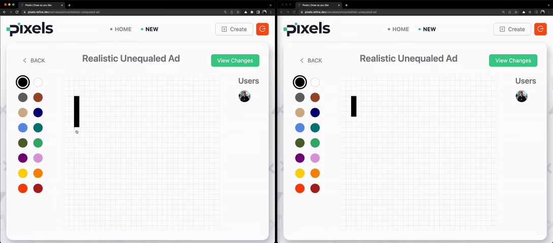
The <CanvasShow /> component uses useShow() to fetch canvas data, useCreate() for pixel creation, and useGetIdentity() / useIsAuthenticated() for auth. It renders the canvas with <DisplayCanvas /> and <CanvasItem />, a <ColorSelect /> for picking colors, an <AvatarPanel /> showing contributors, and a "View Changes" button that opens an audit log modal. The onSubmit handler creates pixels by calling mutate() with the pixel coordinates, color, and canvas metadata.
You can find the full code in the Pixels example on GitHub.
In the code above, we have two instances of data hooks in action. First, with the useShow() hook, we are getting the created canvas data to display it in the grid:
const {
  query: { data: { data: canvas } = {} },
} = useShow<Canvas>();
Additionally, we are letting another mutation to create a pixel in our pixels table with the following:
const { mutate } = useCreate();

const onSubmit = (x: number, y: number) => {
  if (typeof x === "number" && typeof y === "number" && canvas?.id) {
    mutate({
      resource: "pixels",
      values: { x, y, color, canvas_id: canvas?.id },
    });
  }
};
Now that we have our <CanvasShow /> component ready, let's start implementing Supabase authentication for our app.
Supabase Authentication with Refine
Refer to the Auth Provider tutorial for more information. →
<Refine
  // ...
  authProvider={authProvider}
/>
If we click on the Create canvas button, we are redirected to /login route.
Email Authentication with Supabase in Refine
For implementing authentication, we look back at the App.tsx file.
Refine's Supabase module has produced all the auth page variations we need to register an account, login, recover password and update password - along with the code for routing, https requests and authentication providers.
Namely, authentication related routing has been added:
import { Refine, Authenticated } from "@refinedev/core";
import routerProvider, { NavigateToResource } from "@refinedev/react-router";
import { BrowserRouter, Routes, Route, Outlet } from "react-router-dom";
import { GithubOutlined } from "@ant-design/icons";
import { AuthPage } from "./pages/auth";
import { authProvider } from "./providers";

const App = () => {
  return (
    <BrowserRouter>
      <Refine
        // ...
        authProvider={authProvider}
        routerProvider={routerProvider}
      >
        <Routes>
          {/* ... */}
          <Route
            element={
              <Authenticated fallback={<Outlet />}>
                <NavigateToResource />
              </Authenticated>
            }
          >
            <Route
              path="/login"
              element={
                <AuthPage
                  type="login"
                  providers={[
                    {
                      name: "github",
                      icon: (
                        <GithubOutlined
                          style={{
                            fontSize: "18px",
                          }}
                        />
                      ),
                      label: "Sign in with GitHub",
                    },
                  ]}
                />
              }
            />
            <Route path="/register" element={<AuthPage type="register" />} />
            <Route
              path="/forgot-password"
              element={<AuthPage type="forgotPassword" />}
            />
            <Route
              path="/update-password"
              element={<AuthPage type="updatePassword" />}
            />
          </Route>
        </Routes>
      </Refine>
    </BrowserRouter>
  );
};
The LoginPage route was also added:
<Route
  path="/login"
  element={
    <AuthPage
      type="login"
      providers={[
        {
          name: "github",
          icon: (
            <GithubOutlined
              style={{
                fontSize: "18px",
              }}
            />
          ),
          label: "Sign in with GitHub",
        },
      ]}
    />
  }
/>
Custom Login
In order to add a custom login route, we add a new <Route/> as children to the <Routes/> component.
Remember, we've already replaced App.tx code with the following:
Show `App.tsx` code
See the complete App.tsx code in the Adding required files section above, which includes the full routing setup with <Authenticated />, custom login with GitHub, and all canvas routes.
We are also using a customized version of the <AuthPage /> component now. We will not discuss about customizing the <AuthPage /> component since it is pretty straight forward. But you can find the updated <AuthPage /> component in the src/pages/auth directory.
If you haven't already, it is definitely worth spending time to go over the <AuthPage /> customization details here.
Registering an Account
Since we haven't created any account with the auth.users table on our Supabase server, we need to navigate to the /register route where we are presented with the customized sign up form.
At this point, if we register with our email and a password, it gets added to the auth.users table in Supabase.
After registration, the user is automatically signed in and the browser redirects to the root route, which takes us to the /canvases route thanks to Refine's sensible routing defaults.
And now, since we are logged in, we should be able to create a canvas. After successful creation of a canvas, we should be redirected to /canvases/:id:
 Create canvas form
Feel free to create a few more canvases and draw on them so that the gallery gets populated.
With the main features functioning now, let's focus on adding and activating third party authentication.
We have a providers prop on <AuthPage />. We want to add GitHub authentication as well.
GitHub Authentication with Supabase in Refine
We implemented GitHub authentication with Supabase in our app.
In order to do so, we just need to add the following object to the providers prop in <AuthPage /> component:
{
  name: "github",
  icon: <GithubOutlined style={{ fontSize: "18px" }} />,
  label: "Sign in with GitHub",
}
In our Supabase backend, we have to configure and enable GitHub authentication. Feel free to use this Supabase guide.
And now we should be able to sign in to our app with GitHub as well.
Implementing a Public Home Page with Refine
Now it's time to focus on the Home page of our application. We put the <CanvasFeaturedList /> in this page:
import { Refine } from "@refinedev/core";
import routerProvider from "@refinedev/react-router";
import { BrowserRouter, Routes, Route, Outlet } from "react-router-dom";
import { Layout } from "./components/layout";
import { CanvasFeaturedList } from "./pages/canvases";

const App = () => {
  return (
    <BrowserRouter>
      <Refine
        // ...
        routerProvider={routerProvider}
      >
        <Routes>
          {/* ... */}
          <Route
            element={
              <Layout>
                <Outlet />
              </Layout>
            }
          >
            <Route index element={<CanvasFeaturedList />} />
            {/* ... */}
          </Route>
        </Routes>
      </Refine>
    </BrowserRouter>
  );
};
So, now if we visit the root route we can see the <CanvasFeaturedList /> component, and not the <CanvasList /> component.
There will not be any item in the home page because is_featured is set to false for a canvas by default. At this stage, in order to get a list of featured canvases, we have to set is_featured: true from Supabase dashboard for some of the canvases created.
I've done that and the featured canvases are listed in the Home route:
Featured canvases gallerySummary
In this post, we added canvases resource to our <Refine /> component. We implemented list action on a public gallery and a dashboard page and the show action to display a canvas. The create action is implemented from inside a modal accessible on a button click. While working through these, we inspected into individual data provider methods and hooks for these actions.
We also saw how Refine handles a simple email/password based authentication out-of-the-box. We then went ahead implemented social login using GitHub authentication provider.
In the next article, we'll move things to the next level by adding live collaboration features using Refine's Supabase liveProvider.
Part 4: Adding Realtime Collaboration
In this post, we implement realtime broadcast and subscription of pixels updates in our Refine based Pixels app. We do this with the liveProvider prop on <Refine /> and Supabase's Realtime servers. Applying a PubSub feature allows us to receive instant updates in one part of our app for database changes triggered from another part or by a different client.
Here's a quick rundown of the features we'll work on:
- Allow multiple users to draw pixels on a canvas.
- All contributors can see realtime updates on the canvas.
Overview
On Day Three, we implemented CRUD operations using Supabase dataProvider methods and the resources prop, which leveraged RESTful routes in the routerProvider object under the hood.
Today, we are going to explore the liveProvider prop as we implement realtime collaboration on a canvas so that pixels drawn on a canvas by one user is instantly seen by anyone else viewing it from another client.
There are two parts to our endeavor in this post, one in the Supabase backend and one in our Refine app:
- Spin up Realtime servers from Supabase dashboard for the resource we want to publish changes for and subscribe to.
- Registering the
liveProviderprop inside<Refine />component and enabling subscription withliveMode: auto.
Refine has already added the implementation code for Supabase Realtime provider in the liveProvider object it created for us during project initialization. We will mostly play the laymen role here as we tour around the underlying principles and the magic at work behind the scenes.
Let's start by first making sure Realtime servers are set up for the pixels table in the Supabase backend.
Setting Up Supabase Realtime
In order to make drawing collaborative between our users, we have to run Supabase Realtime servers and create channels for our pixels resource.
We can do this from the Supabase dashboard for the database we created. If you haven't already, please go ahead and select Enable Realtime for the pixels table from its editor:
 Supabase realtime data synchronization diagram
Behind the scenes, Supabase spins up globally distributed Realtime servers that facilitate low latency communication between our app and Supabase database tables. Supabase's Realtime feature spares a channel for each resource to be broadcasted. Any change in the resource is published in the channel, and clients that subscribe to the channel receive updates as soon as the change is made.
We are using Supabase Realtime's PostgreSQL Change Data Capture feature which will now allow our app to publish mutation events to the pixels channel and also listen to those changes from a subscriber component.
This means mutation hooks such as useCreate() can now publish events to the pixels channel and consumer hooks like useList() are able to get instant updates for any change to pixels.
<Refine />'s liveProvider Prop
Now, it's time to move our attention back to the <Refine /> component in our app.
We already have the liveProvider prop passed in with the liveProvider() function from @refinedev/supabase:
import { Refine } from "@refinedev/core";
import { liveProvider } from "@refinedev/supabase";
import { supabaseClient } from "./utility";

function App() {
  return (
    <Refine
      // ...
      liveProvider={liveProvider(supabaseClient)}
    />
  );
}
And that's it! The channel for pixels resource that was specified above in Supabase will broadcast all mutations on the pixels table. And any subscriber will be able to receive real time updates about the changes.
Now, let's try opening the app in two browsers, one with Google account and one with GitHub. Navigate to a canvas page, the same one in both and try adding some pixels from each. We'll see that pixels created in one are displayed in the other in real time:
 Live provider implementation for real-time updates
This looks like a magic, because we don't know how this is happening. And very pleasant because create refine-app already generated the code that handles the PubSub logic for Supabase PostregSQL CDC. Let's have a look to see what's happening in the Supabase liveProvider object.
Refine's Supabase liveProvider Object
Refine's liveProvider object has the following signature:
const liveProvider = {
    subscribe: ({ channel, params: { ids }, types, callback }) => any,
    unsubscribe: (subscription) => void,
    publish?: (event) => void,
};
In @refinedev/supabase version 5.0.0, at the time of publishing this article, the liveProvider consists of only the subscribe and unsubscribe methods. Its implementation looks like this:
Let's have a look.
Show `liveProvider` code
The full source code for the Supabase live provider can be found in the @refinedev/supabase package on GitHub. It implements subscribe and unsubscribe methods using Supabase's Realtime channels to listen for PostgreSQL changes and notify the app.
Both methods are concerned with subscription to the changes. That's because the publishing the event is done by mutation methods. In our case, it is done from the useCreate() hook we invoke to create a pixel.
Broadcasting
If we look inside our <CanvasShow /> component that is rendered at /canvases/:id, we have a <CanvasItem /> component which basically displays all pixels that belong to the canvas item being visited. <CanvasItem /> is also the component from where a pixel is created, so let's look at that now:
import React from "react";
import { Typography } from "antd";

import { Pixel, Canvas } from "../../types";
import { DEFAULT_SCALE, PIXEL_SIZE } from "../../utility/constants";

const { Text } = Typography;

type CanvasItemProps = {
  canvas: Canvas;
  pixels: Pixel[] | undefined;
  scale?: number;
  border?: boolean;
  active?: boolean;
  onPixelClick?: (x: number, y: number) => void;
};

export const CanvasItem: React.FC<CanvasItemProps> = ({
  canvas: { id, name, width, height },
  pixels,
  scale = DEFAULT_SCALE,
  border = true,
  active = true,
  onPixelClick,
}) => {
  return (
    <div>
      {Array.from({ length: height }).map((_, i) => (
        <div key={`row-${i}`} style={{ display: "flex" }}>
          {Array.from({ length: width }).map((_, j) => (
            <div key={`row-${i}-col-${j}`}>
              <div
                onClick={() => {
                  if (onPixelClick && active) {
                    onPixelClick(j, i);
                  }
                }}
                style={{
                  cursor: active ? "pointer" : undefined,
                  width: PIXEL_SIZE * scale,
                  height: PIXEL_SIZE * scale,
                  border: border ? "0.5px solid rgba(0,0,0,0.05)" : undefined,
                  background:
                    pixels?.find((el) => el.x === j && el.y === i)?.color ??
                    "transparent",
                }}
              />
            </div>
          ))}
        </div>
      ))}
      {!active && <Text className="canvas-name-text">{name ?? id}</Text>}
    </div>
  );
};
The most relevant thing to look in the component above is the onPixelClick click event handler. It is a prop received by the <CanvasItem /> from the <CanvasShow /> component. It's original value is the onSubmit() function defined inside the <CanvasShow /> component.
We'd like to focus on this onSubmit event handler, because it is what facilitates the creation of a pixel:
import { useCreate, useNavigation } from "@refinedev/core";

export const CanvasShow: React.FC = () => {
  // ...

  const { push } = useNavigation();
  const { mutate } = useCreate();

  const onSubmit = (x: number, y: number) => {
    if (!authenticated) {
      if (pathname) {
        return push(`/login?to=${encodeURIComponent(pathname)}`);
      }

      return push(`/login`);
    }

    if (typeof x === "number" && typeof y === "number" && canvas?.id) {
      mutate({
        resource: "pixels",
        values: {
          x,
          y,
          color,
          canvas_id: canvas?.id,
          user_id: identity.id,
        },
        meta: {
          canvas,
        },
        successNotification: false,
      });
    }
  };

  return /* ... */;
};
As we can see, with the call to mutate method of the useCreate() hook, a new entry is being added to the pixels table upon every click on the canvas.
And since we enabled realtime for the pixels table, each successful create action broadcasts the change to the pixels channel for subscribers to pick.
Refine usePublish() Hook
The exact way it happens looks like this:
useCreate()hook is called from the consumer component.useCreate(), behind the scenes, uses the liveusePublish()hook to publish thecreatedevent to thepixelschannel on Supabase Realtime servers.
The published event for pixels create action produces an object with the following signature:
{
    channel: `resources/pixels`,
    type: "created",
    payload: {
            ids: ["id-of-created-pixel"]
    },
    date: new Date(),
}
Feel free to go through the live hooks docs for details about how live publishing is supported by useCreate() and other mutation hooks.
Subscription
The changes to the pixels table can be subscribed by consumer components with the useList() hook. We are showing the pixels inside the <CanvasShow /> component itself, but they are fetched inside the <DisplayCanvas /> render-props component.
The useList() hook inside <DisplayCanvas /> looks like this:
import React, { ReactElement } from "react";
import { useList } from "@refinedev/core";

import { Canvas } from "../../types/canvas";
import { Pixel } from "../../types/pixel";

type DisplayCanvasProps = {
  canvas: Canvas;
  children: (pixels: Pixel[] | undefined) => ReactElement;
};

export const DisplayCanvas: React.FC<DisplayCanvasProps> = ({
  canvas: { id },
  children,
}) => {
  const { result } = useList<Pixel>({
    resource: "pixels",
    liveMode: "auto",
    meta: {
      select: "*, users(id, full_name, avatar_url)",
    },
    filters: [
      {
        field: "canvas_id",
        operator: "eq",
        value: id,
      },
    ],
    sorters: [
      {
        field: "created_at",
        order: "desc",
      },
    ],
    pagination: {
      mode: "off",
    },
  });

  const pixels = data?.data;

  return <>{children(pixels)}</>;
};
Among the loads of arguments and options passed to the useList() hook, we have used the liveMode: auto property which allows us to subscribe to the Realtime channel for the pixels resource.
With liveProvider disabled in the <Refine /> component, useList() acts as a normal dataProvider hook.
With liveProvider activated, under the hood, useList() banks on Refine's useResourceSubscription() live hook to communicate with the pixels channel.
Refine useResourceSubscription() Hook
The actual subscription is done by the liveProvider.subscribe() method.
The subscribe() method is called from inside the useResourceSubscription() hook in order to subscribe to the pixels channel.
If you want to dive into the details, please feel free to do so in the liveProvider docs here.
Summary
In today's part, we implemented real time collaboration for drawing pixels on canvas items using <Refine /> component's liveProvider prop and its supporting hooks for publishing and subscribing to Supabase's Realtime servers.
The subscribe() method on Supabase's liveProvider object allows us to subscribe to a channel created for a resource. Subscription for the resource is triggered by the useResourceSubscription() hook called from data hooks that support live subscription - the useList() hook in our example.
Broadcasting, in turn, is initiated by the usePublish() hook called from a supported mutation hook for our resource - the useCreate() hook in this case.
We implemented real time collaboration very effortlessly due to the out-of-box solutions provided by Refine's @refinedev/supabase package.
With this now, we have enabled multiple users to draw on a canvas at the same time and receive updates instantly.
Part 5: Creating an Admin Dashboard with Refine
This post is the first part of an admin dashboard app built using Refine. The dashboard is an admin backend for the Pixels client that we built previously in the RefineWeek series. We are using the same Supabase database for this app and have Ant Design as the UI framework.
- You can find the complete source code for the Pixels Admin app on GitHub
- Also Pixel Client app source code from previous days can be found here
Overview
In this episode, we implement user authentication and CRUD functionalities of the dashboard. As it was in the case of the Pixels client app, for this app also, we implement an email-based authentication along with social logins with Google and GitHub.
We use the same Supabase client for connecting to the database we already have in place for the Pixels app.
The dashboard shows a list of all users. It also has a list for canvases.
The user list is read only and the canvas list will eventually allow editors and admins - particular to their roles - to manipulate their subject data. We will implement proper authorization for editor and admin roles on Day 6, but for now we will implement relevant CRUD operations that will apply to any authenticated user.
For the API requests, we will be using the dataProvider object Refine gave us for Supabase. Since we covered CRUD related concepts and architecture in depth on Day 3, in this post, we'll focus more on the Ant Design components side.
Let's begin with the project set up.
Project Setup
As done previously in the client app, let's initialize our admin app with create refine-app. We will choose the interactive option by answering necessary questions. Let's run the following command:
npm create refine-app@latest pixels-admin
We will use Supabase for our backend, and Ant Design for our UI. We want to be able to customize the Ant Design theme and layout. So, we have the below answers related to Supabase and Ant Design:
✔ Choose a project template · Refine(Vite)
✔ What would you like to name your project?: · pixels-admin
✔ Choose your backend service to connect: · Supabase
✔ Do you want to use a UI Framework?: · Ant Design
✔ Do you want to add example pages?: · no
✔ Do you need i18n (Internationalization) support?: · no
✔ Choose a package manager: · npm
After completion of the initialization process, we should have the same Refine, Supabase and Ant Design boilerplate code generated for us like before.
We'll start tweaking the relevant code straight away as we add features to our app - since we have already explored the boilerplate code in significant depth on Day 2 in Setting Up the Client App and on Day 3 in Adding CRUD Actions and Authentication. This will give us more time to focus on related Ant Design components and what they handle for us in the background.
Prior to that, let's just navigate to the project folder and run the dev server:
npm run dev
And prepare ourselves to the call-to-action at http://localhost:5173:
Pixels admin welcome screenThe App.tsx file should be familiar from Day 2. It looks like this:
import { GitHubBanner, Refine, WelcomePage } from "@refinedev/core";
import { RefineKbar, RefineKbarProvider } from "@refinedev/kbar";

import { useNotificationProvider } from "@refinedev/antd";
import "@refinedev/antd/dist/reset.css";

import routerProvider, {
  DocumentTitleHandler,
  UnsavedChangesNotifier,
} from "@refinedev/react-router";
import { dataProvider, liveProvider } from "@refinedev/supabase";
import { BrowserRouter, Route, Routes } from "react-router-dom";
import authProvider from "./authProvider";
import { ColorModeContextProvider } from "./contexts/color-mode";
import { supabaseClient } from "./utility";

function App() {
  return (
    <BrowserRouter>
      <GitHubBanner />
      <RefineKbarProvider>
        <ColorModeContextProvider>
          <Refine
            dataProvider={dataProvider(supabaseClient)}
            liveProvider={liveProvider(supabaseClient)}
            authProvider={authProvider}
            routerProvider={routerProvider}
            notificationProvider={useNotificationProvider}
            options={{
              syncWithLocation: true,
              warnWhenUnsavedChanges: true,
            }}
          >
            <Routes>
              <Route index element={<WelcomePage />} />
            </Routes>
            <RefineKbar />
            <UnsavedChangesNotifier />
            <DocumentTitleHandler />
          </Refine>
        </ColorModeContextProvider>
      </RefineKbarProvider>
    </BrowserRouter>
  );
}

export default App;
Let's start modifying the existing code to meet our requirements.
Setting Up Supabase Config
For the admin app, we'll connect to the same PostgreSQL database already up and running on Supabase for the Pixels client app.
So, we need to get the access credentials for our server from the Supabase dashboard. We can avail them by following this section in the Supabase quickstart guide. Let's store them in an .env file.
We'll go ahead and update the supabaseClient.ts file:
import { createClient } from "@refinedev/supabase";

const SUPABASE_URL = import.meta.env.VITE_SUPABASE_URL ?? "";
const SUPABASE_KEY = import.meta.env.VITE_SUPABASE_KEY ?? "";

export const supabaseClient = createClient(SUPABASE_URL, SUPABASE_KEY);
Now we have enabled authProvider and dataProvider methods to connect to our Supabase database with supabaseClient().
Adding required files
Here is the finalized version of what we’ll be building in this article:
Before we move on, you need to add required page and components to the project if you want build the app by following the article . Please add the following components and files into src folder in the project:
- pages: https://github.com/refinedev/refine/tree/main/examples/pixels-admin/src/pages
- components: https://github.com/refinedev/refine/tree/main/examples/pixels-admin/src/components
- providers: https://github.com/refinedev/refine/tree/main/examples/pixels-admin/src/providers
- utility: https://github.com/refinedev/refine/tree/main/examples/pixels-admin/src/utility
- casbin: https://github.com/refinedev/refine/tree/main/examples/pixels-admin/src/casbin
- types: https://github.com/refinedev/refine/tree/main/examples/pixels-admin/src/types
- assets: https://github.com/refinedev/refine/tree/main/examples/pixels-admin/public
Important
In order to run the app without warnings you need to follow Casbin RBAC system installation step(Browser Fallbacks for Casbin).
After creating files above you need to add some imports and routes to src/App.tsx file. Simply add replace your App.tsx with following.
Show App.tsx code
The complete App.tsx for the admin app includes ConfigProvider for Ant Design theming, accessControlProvider for RBAC, auditLogProvider, and routes for /users, /canvases, login, forgot-password, and update-password pages wrapped in <Authenticated /> and <CanAccess /> components.
You can find the full code in the Pixels Admin example on GitHub.
NOTE
<Refine /> comes with dark mode support out-of-the-box. However, we will not be using it in this series. So, after copied App.tsx you will see that we have already replaced ColorModeContextProvider with the ConfigProvider.
Also, you can remove src/context/color-mode that comes with create refine-app.
Creating a Table View With Refine and Ant Design
Our <UserList /> component looks like this:
Show UserList code
The <UserList /> component uses the useTable() hook and renders a <Table /> with columns for avatar, ID, email, full name, and username. You can find the full code in the Pixels Admin example on GitHub.
The components tree looks very plain, but there is plenty going on in there. Firstly, the useTable() hook that handles all the data fetching stuff with React Query in the background. The <List /> and <Table /> components also do intense secret service for us. We'll go over them one by one below.
Refine Ant Design useTable() Hook
useTable() is a Refine Ant Design hook served to us from the @refinedev/antd package. As we can see above, it returns us a tableProps object:
const { tableProps } = useTable<TUser>();
useTable() is built on top of Refine core's useMany() data hook. useMany(), in turn, invokes the getMany() data provider method.
Here, we did not need to set any configuration for our API request and the returned response. The resource.name was figured by useTable from the resources prop that was passed to <Refine />. It is possible to set options for sorting, filtering, pagination, etc. with an object passed to useTable().
For all the features that come with the useTable() hook, visit the API reference here.
The properties of the tableProps object produced are intended to be passed to a <Table /> component, which we'll consider after <List />.
Refine Ant Design <List /> Component
The <List /> component represents a list view. It is a wrapper around the contents of the list. It accepts a number of relevant props and comes with their sensible defaults, such as for resource name and title of the page.
In our case, we don't have to pass in any prop because Refine figures the resource name and title from the resources prop. In other words, the <List /> component above is conveniently equivalent to this:
<List resource="users" title="Users">
  // Content here...
</List>
For more on the usage of <List />, look into the details here.
Refine Ant Design <Table /> Component
useTable() hook's tableProps is specifically configured to match the props of Ant Design's native <Table /> component. Refine makes <Table /> available to us with the @refinedev/antd module.
Besides passing in the tableProps object to <Table />, we are required to provide a unique rowKey prop to identify each row in the table:
<Table {...tableProps} rowKey="id">
  // React nodes here...
</Table>
The records inside tableProps are placed inside <Table.Column />s of a row of the table - one record per row. If you're new to this, feel free to dive into the Ant Design docs for <Table />.
Refine Ant Design <Table.Column /> Children
<Table.Column />s represent individual columns in the table. A column header is set by <Table.Column />'s title prop. The value of a field in a record is set by the dataIndex prop. For example, for the following column, dataIndex="email" tells our app to fill the Email column of a row associated with a particular record with the value of the record's email property:
<Table.Column dataIndex="email" title="Email" />
We can also customize what content to render inside a table cell. We'll examine two such instances in the next section on <CanvasList /> view, which involves an editable table.
Adding resources
We have covered adding CRUD operations on Day 3 in significant depth. So, here we'll quickly add both users and canvases resources to <Refine /> component:
// ...
import { Refine } from "@refinedev/core";
import { UserList } from "pages";

return (
  <Refine
    // ...
    resources={[
      {
        name: "users",
        list: "/users",
      },
      {
        name: "canvases",
        list: "/canvases",
      },
    ]}
  />
);
Adding routes
After adding resources we need to create routes for them. For the routes, we'll use the <UserList/> and <CanvasList/> components we created earlier.
Refer to the CRUD Pages tutorial for more information. →
<Routes>
  <Route
    element={
      <Authenticated>
        <ThemedLayout Title={Title}>
          <CanAccess>
            <Outlet />
          </CanAccess>
        </ThemedLayout>
      </Authenticated>
    }
  >
    <Route index element={<NavigateToResource />} />
    <Route path="/users" element={<UserList />} />
    <Route path="/canvases" element={<CanvasList />} />
  </Route>
  {/* Auth routes and error routes... */}
</Routes>
The full routing setup, including auth routes for login, forgot-password, and update-password, is shown in the App.tsx details block above.
 Admin login page
From the /login route, logging in should work perfectly with an account already created with the Pixels client app. If we log in, we should be directed to /users - the default root route of the admin app.
The name: "users" property in our first resource is used to define the /users route, and list: UserList property specifies that <UserList /> component should be rendered at /users.
NOTE
Since we are using our example Supabase backend, we will see the following users list.
If you wish to use our example Supabase backend, you can do so by using the provided Supabase credentials.
You can log into the application with the following account:
email: demo@refine.dev
password: demodemo
 Users list table
Editable Table Using Refine and Ant Design
For our <CanvasList /> view, we want to allow editors and admins to promote or delete a canvas item. This means, we need to be able to send POST, PUT/PATCH and DELETE requests. @refinedev/antd's useEditableTable() hook makes life beautiful for us.
We have a useEditableTable() hook in action inside our <CanvasList /> component:
CanvasList code
The <CanvasList /> component uses the useEditableTable() hook and useUpdate() to enable promoting/unpromoting and deleting canvases. It also includes a modal with <LogList /> for viewing canvas changes. Key features:
useEditableTable<TCanvas>()with live mode and sorting bycreated_at- A "Promote/Unpromote" button using
mutate()fromuseUpdate() - A
<DeleteButton />for deleting canvases - A "View Changes" button that opens an audit log modal
You can find the full code in the Pixels Admin example on GitHub.
Refine Ant Design useEditableTable() Hook
The useEditableTable() hook is the extension of @refinedev/antd's useTable() hook. It returns a formProps object that we can pass to <Form /> components in order to handle form actions, loading and displaying success and error messages.
Like useTable(), the useEditableTable() hook also returns a tableProps object:
const { tableProps, formProps } = useEditableTable<TCanvas>();
The items of formProps object are passed to the <Form /> component:
<Form {...formProps}>// React nodes here...</Form>
We can do much more with the useEditableTable() hook, like activating editing fields when a row is clicked . Here's the elaborate documentation for useEditableTable()
Refine Ant Design <DeleteButton />
Thanks to the formProps being passed to <Form />, implementing delete action becomes a piece of cake:
<DeleteButton size="small" recordItemId={record.id} />
@refinedev/antd's <DeleteButton /> leverages Ant Design's <Button /> and <Popconfirm /> components. It invokes the delete() data provider method to send a DELETE request to the resource end point. The resource.name is inferred from the formProps passed to <Form /> component.
For more details, visit the <DeleteButton /> docs.
<Table.Column />'s render Prop
We can customize the content inside our table cell by passing a function to the render prop of <Table.Column />. In our example, we have a conditional rendering, where the component being rendered depends on record.is_featured:
<Table.Column<TCanvas>
  key="is_featured"
  dataIndex="is_featured"
  title={<h4 style={{ textAlign: "center", fontWeight: "bold" }}>Featured</h4>}
  render={(_, record) =>
    record.is_featured ? (
      <Tag
        color="success"
        style={{
          display: "flex",
          justifyContent: "center",
          alignItems: "center",
        }}
      >
        Yes
      </Tag>
    ) : (
      <Tag
        color="warning"
        style={{
          display: "flex",
          justifyContent: "center",
          alignItems: "center",
        }}
      >
        No
      </Tag>
    )
  }
/>
We also grouped content inside a cell, with <Button /> and <DeleteButton /> being sibling flex items:
<Table.Column<TCanvas>
  title={<h4 style={{ textAlign: "center", fontWeight: "bold" }}>Actions</h4>}
  dataIndex="actions"
  render={(_, record) => (
    <Space style={{ display: "flex", justifyContent: "center" }}>
      <Button
        size="small"
        style={{ width: "100px" }}
        type={record.is_featured ? "ghost" : "primary"}
        onClick={() =>
          mutate({
            resource: "canvases",
            id: record.id,
            values: {
              is_featured: !record.is_featured,
            },
            meta: {
              canvas: record,
            },
          })
        }
      >
        {record.is_featured ? "Unpromote" : "Promote"}
      </Button>
      <DeleteButton size="small" recordItemId={record.id} />
    </Space>
  )}
/>
With these additions, /canvases looks like this:
 Canvases list table
Summary
In this post, we initialized an admin dashboard app for our Pixels client app which we built in the previous episodes in the RefineWeek series. We implemented list views for two resources: users and canvases.
Inside the lists, we fetched data from these resources and rendered them inside tables. We implemented two types of tables using two distinct @refinedev/antd hooks: useTable() for regular tables and useEditableTable() that allows data in the table to be mutated.
These hooks are supported by Refine core's useMany() hook, which uses the getMany() data provider method to interact with external API.
In the UI side, these hooks automatically make available appropriate props to be passed to <Table /> and <Form /> components.
In the next post, we will focus on implementing Role Based Access Control to our dashboard based on editor and admin roles.
Part 6: Implementing Role Based Access Control
In this post, we implement Role Based Access Control (RBAC) on our Pixels Admin app. Pixels Admin serves as the admin dashboard of our Pixels client app that we built previously in the RefineWeek series.
Overview
On Day 5, we implemented CRUD functionalities on our dashboard resources: users and canvases.
Taking it farther today, we add authorization for actions related to canvases resource at /canvases route. We have have two roles that seek authorization: editor and admin. An editor is allowed to only promote and unpromote a canvas, whereas an admin is free to promote / unpromote a canvas as well as delete it. Here's a short description of the specs:
editorcan promote and unpromote a canvas.editorcannot perform any other action.admincan promote and unpromote a canvas.admincan delete a canvas.admincannot perform any other action.
We manage RBAC and authorization using Casbin models and policies. We then make use of Refine's accessControlProvider and associated hooks to enforce policies for these roles.
For the backend, we set and store user roles with the help of Supabase Custom Claims. Supabase Custom Claims are a handy mechanism to store user roles information on the auth.users table.
Let's start with Casbin.
Casbin with Refine
In this app, we are implementing Role Based Access Control model with Casbin so we assume you are at least familiar with the RBAC related models and policies.
If you are not familiar with Casbin, please feel free to go through the official documentation, especially the Get Started, Supported Models, and RBAC sections.
If / when you are familiar, lovely yay! Be with me, go ahead and install Casbin:
Casbin Installation
npm install casbin
Browser Fallbacks for Casbin
We need to configure polyfills for vite to work in a browser environment.
Let's first install required packages:
npm install -D rollup-plugin-polyfill-node @esbuild-plugins/node-modules-polyfill @esbuild-plugins/node-globals-polyfill
After that we need to add the following to the vite.config.ts file:
import { defineConfig } from "vite";
import react from "@vitejs/plugin-react";

import { NodeGlobalsPolyfillPlugin } from "@esbuild-plugins/node-globals-polyfill";
import { NodeModulesPolyfillPlugin } from "@esbuild-plugins/node-modules-polyfill";
import rollupNodePolyFill from "rollup-plugin-polyfill-node";

export default defineConfig({
  plugins: [react()],
  optimizeDeps: {
    esbuildOptions: {
      // Node.js global to browser globalThis
      define: {
        global: "globalThis",
      },
      // Enable esbuild polyfill plugins
      plugins: [
        // eslint-disable-next-line @typescript-eslint/ban-ts-comment
        // @ts-ignore
        NodeGlobalsPolyfillPlugin({
          buffer: true,
          process: true,
        }),
        // eslint-disable-next-line @typescript-eslint/ban-ts-comment
        // @ts-ignore
        NodeModulesPolyfillPlugin(),
      ],
    },
  },
  build: {
    rollupOptions: {
      plugins: [rollupNodePolyFill()],
    },
  },
});
Without these overrides, casbin versions >5 is known to throw errors.
With this out of the way and the Casbin model policies ready, it's time for us to define the accessControlProvider.
Casbin Model and Policies
We are using the following model and policy adapter for our RBAC implementation:
import { newModel, StringAdapter } from "casbin";

export const model = newModel(`
  [request_definition]
  r = sub, obj, act

  [policy_definition]
  p = sub, obj, act

  [role_definition]
  g = _, _

  [policy_effect]
  e = some(where (p.eft == allow))

  [matchers]
  m = g(r.sub, p.sub) && keyMatch(r.obj, p.obj) && regexMatch(r.act, p.act)
`);

export const adapter = new StringAdapter(`
  p, admin, users, list
  p, admin, canvases, (list)|(edit)|(delete)

  p, editor, users, list
  p, editor, canvases, (list)|(edit)
`);
A quick run down of the model is:
- with the request definition in
r = sub, obj, act, Casbin scans the request for the subject (editororadmin), object (theresource) and the action (get,create,edit, etc.). - with the same parameters in
p = sub, obj, act, it compares the request parameters with those in the policy instances declared in the policy adapter - with the two level grouping in
g = _, _, we are declaring user role inheritance can go two levels deep, i.e. anadminis anuser.
The adapter holds our instances of policies produced from p. The policies above basically allows:
- an
admintolistusers. - an admin to
list,editanddeletecanvases. - an
editortolistusers. - an
editortolistandeditcanvases.
<Refine />'s accessControlProvider
<Refine />'s accessControlProvider is responsible for enforcing authorization on every request sent from the app. If we look at the <App /> component, we can see that it comes passed to the <Refine /> component with the boilerplate code:
...
<Refine
    accessControlProvider={accessControlProvider}
/>
...
Refine can Method
The accessControlProvider implements only one method named can. It has the following type signature:
type CanParams = {
  resource: string;
  action: string;
  params?: {
    resource?: IResourceItem;
    id?: BaseKey;
    [key: string]: any;
  };
};
Let's now work on the can method. We can see from the type definition that resource and action are compulsory.
Basic implementation of can method looks like this:
Refer to the Access Control Provider documentation for more information. →
import { newEnforcer } from "casbin";
import { CanParams, CanReturnType } from "@refinedev/core";
import { adapter, model } from "../casbin/accessControl";

export const accessControlProvider = {
  can: async ({ resource, action }: CanParams): Promise<CanReturnType> => {
    const enforcer = await newEnforcer(model, adapter);
    const can = await enforcer.enforce("admin", resource, action);

    return Promise.resolve({
      can,
    });
  },
};
We will modify this gradually to witness the functionality facilitated out-of-the-box by Refine for each role defined in the policies. We will finalize it after we update the getPermissions() method in Supabase authProvider.
But for now, notice in the above definition that we are passing the compulsory resource and action parameters to can. We expect the useCan() access control hook to take these two arguments.
For more use cases and implementations of can, feel free to go through the elaborate examples in this definitive and guiding post.
In the above code, we are initializing a Casbin Enforcer with the model and adapter. We want this enforcer to enforce the policies with its accepted arguments. At the end, we get the Boolean decision based on the model's policy effect.
From inside a component, the accessControlProvider.can method will be invoked via the useCan() hook.
With this code now, there should be no change in our UI. That is, we should be able to view the contents of both our /users and /canvases resources like they were before. When we visit the /canvases route, we should have all the buttons displayed.
We expect this behavior to change when we change the role. In the can method above let's set the first argument of enforcer.enforce() to "editor":
const can = await enforcer.enforce("editor", resource, action);
And if we refresh at /canvases, we can see that the Delete button on each row gets disabled.
 Delete buttons disabled for editor role
This is because now our policy for editor has taken effect.
The Delete button gets disabled because @refinedev/antd's special buttons like the <DeleteButton /> are enabled or disabled based on the result of access control enforcement. Our editor policies do not allow a delete action on canvases resource, so the Delete button is disabled.
Visit this section of the accessControlProvider API reference for the complete list of buttons that check for and depend on user authorization state in Refine.
At this point, we have manipulated the role with changes in our code. This should, however, come from the authProvider's getPermissions() method.
So, let's look how to get the roles from our Supabase database next.
User Permissions with Supabase in Refine
In Refine, user roles are fetched by authProvider's getPermissions() method. It is already defined for us by @refinedev/supabase.
When you bootstraped Refine app with CLI, the default getPermissions method in authProvider looks like below:
getPermissions: async () => {
  const user = await supabaseClient.auth.getUser();

  if (user) {
    return user.data.user?.role;
  }

  return null;
};
However, Supabase in itself does not support setting user roles to users in the auth.users table. So, it is not possible to set editor and admin roles we need for our designated users. And only two role options are available to the front end app: authenticated and anon.
So, before we can use the getPermissions() method, we have to set up custom user roles. One way to implement this is with Supabase Custom Claims.
Setting Up User Roles with Supabase Custom Claims
Supabase Custom Claims is a community contribution that enables setting additional data to the access token that a user receives from Supabase. These claims are stored in the auth.users.raw_app_meta_data field and is sent to the client with the access token. We are going to use these custom claims to set and retrieve user roles for our app.
Supabase does not support custom claims on its own. Due credits to @burggraf, they are enabled by installing a number of functions on our database. These functions allow us to set and get custom claims for a particular user in the auth.users table.
Here are two crucial particulars on how they work:
- Only a user with a
{ claims_admin: true }claim can set claims data on others. So we need to bootstrap aclaims_adminrole for a first user using the Supabase SQL Editor. - Our app can access the getter and setter functions via Supabase Remote Procedure Calls (RPCs) with the
supabaseClient.rpc()method.
With these in mind, let's go ahead and set up Supabase Custom Claims on our database.
Installing Custom Claims Functions
Let's start with installing the custom claims SQL functions. Copy, paste and run the install.sql script in your Supabase SQL Editor.
Take a note of the function named get_my_claims():
CREATE OR REPLACE FUNCTION get_my_claims() RETURNS "jsonb"
    LANGUAGE "sql" STABLE
    AS $$
  select
    coalesce(nullif(current_setting('request.jwt.claims', true), '')::jsonb -> 'app_metadata', '{}'::jsonb)::jsonb
This SQL function will help us to remotely get user roles for our app. And we are going to call it from our getPermissions() method. To understand the details, please read through the Supabhase Custom Claims page.
Bootstrapping Claims Admin Role
We then have to bootstrap a claims_admin role because only users with { claims_admin: true } can set claims data for other users. This is necessary for security of the claims admin feature, and not for our app code. So, in the Supabase SQL Editor run the following query:
select set_claim('designated-user-uuid', 'claims_admin', 'true');
This will allow the user with id designated-user-uuid to set roles for other users from inside our app.
We can also set other data from the SQL Editor, such as the role itself. Let's use the following SQL query to set roles for some of our designated users. Doing so will help us in the coming sections:
select set_claim('designated-user-uuid', 'role', '"editor"');
select set_claim('another-designated-user-uuid', 'role', '"admin"');
We need to take special care about using the correct quotations. More on this in this section.
With these done, we are ready to update our getPermissions() and can methods.
Refine getPermissions() with Supabase Custom Claims
Here's the adjusted getPermissions() method:
getPermissions: async () => {
    try {
        const { error } = await supabaseClient.auth.getUser();

        if (error) {
            console.error(error);
            return;
        }

        const { data } = await supabaseClient.rpc("get_my_claim", {
            claim: "role",
        });

        return data;
    } catch (error: any) {
        console.error(error);
        return;
    }
},
Here, we are basically using the supabaseClient.rpc() method to call the get_my_claims SQL function remotely.
Refine can Method for Supabase Custom Roles
And now, we can finalize our can method with role received from authProvider.getPermissions():
import { newEnforcer } from "casbin";
import { CanParams, CanReturnType } from "@refinedev/core";

import { adapter, model } from "../casbin/accessControl";
import { authProvider } from "./authProvider";

export const accessControlProvider = {
  can: async ({ resource, action }: CanParams): Promise<CanReturnType> => {
    const role = await authProvider.getPermissions?.();

    const enforcer = await newEnforcer(model, adapter);
    const can = await enforcer.enforce(role, resource, action);

    return Promise.resolve({
      can,
    });
  },
};
Earlier on, we have set admin and editor roles for a few designated users using the Supabase SQL Editor. Now, logging into their respective accounts will display the dashboard with Casbin policies applied.
In the /canvases route, an editor account should have the Delete buttons disabled because we don't have it in our policies.
In contrast, it is enabled for an admin role:
 Delete buttons enabled for admin role
This answer lies in how @refinedev/antd's special buttons like <DeleteButton /> internally use the useCan() hook to check authorization. Since authorization comes baked in, we didn't have to worry about it in our case.
Overview
In this series, we have been exploring Refine's internals by building two apps: the Pixels client that allows users to create and collboratively draw on a canvas, and the Pixels Admin app that allows admins and editors to manage canvases created by users.
We implemented CRUD actions for Pixels client app on Day 3 and for the admin app on Day 5. In this episode, we enable audit logging on database mutations by defining the auditLogProvider object and passing it to <Refine />.
We are using Refine's supplemental Supabase @refinedev/supabase package for our dataProvider client. The database mutation methods in Supabase dataProvider already come with audit logging mechanism implemented on them. For each successful database mutation, i.e. create, update and delete actions, a log event is emitted and a params object representing the change is made available to the auditLogProvider.create() method.
We will store the log entries in a logs table in our Supabase database. So, we have to set up the logs table with a shape that complies with the params object sent from the mutation. We will then work on the auditLogProvider methods, and use the useLogList() hook to list pixels logs inside a modal for each canvas item.
Let's dive in!
logs Table for Refine Audit Logs
We need to set up the logs table from the Supabase dashboard. But let's first figure out the columns we need for the table. The table should have as columns the properties of the log params object emitted by a mutation.
Refine's Log Params Object
A successful resource create action makes the following log params object available to the auditLogProvider.create() method:
{
  "action": "create",
  "resource": "pixels",
  "data": {
    "id": "1",
    "x": "3",
    "y": "3",
    "color": "cyan",
  },
  "meta": {
    "dataProviderName": "Google",
    "id": "1"
  }
}
This object should be passed to the audit log provider's create method in order to create a new record in the logs table.
Likewise, the update and delete actions of a resource - for example, pixels - emit an object with similar, overlapping variations. More on that here.
It is important not to confuse a resource create action with that of the auditLogProvider. The resource create action is carried out by the dataProvider.create() method and produces the log params object. The auditLogProvider.create() method consumes the params object and creates an entry in the logs table.
For our case, we are focused on logging the pixels create actions on a canvas in our Pixels client app.
The meta Object
Notice, the meta.id property on the log params object above. It represents the id of the resource item on which the event was created.
It is possible to append useful data to the meta field by passing the data to the meta object when the mutation is invoked from a hook. For example, we can add the canvas property to the meta object inside the argument passed to the mutate function of the useCreate() hook:
const { mutate } = useCreate();

mutate({
  resource: "pixels",
  values: { x, y, color, canvas_id: canvas?.id, user_id: identity.id },
  meta: {
    canvas,
  },
});
And it will be included in the log params object's meta field:
{
  "action": "create",
  "resource": "pixels",
  "author": {
    "id": ""
    // ...other_properties
  },
  "data": {
    "id": "1",
    "x": "3",
    "y": "3",
    "color": "cyan",
  },
  "meta": {
    "dataProviderName": "Google",
    "id": "1",
    "canvas": {
      "id": "",
      // ...etc.
    },
  }
}
Properties inside the meta object are handy for filtering get requests to the logs table. We are going to use this when we define the auditLogProvider.get() method.
Notice also the author property. It is added when a user is authenticated. Otherwise, it is excluded.
The logs Table
Emanating from the log params object above, our logs table looks like this:
 Audit log flow diagram
Let's go ahead and create this table from our Supabase dashboard before we move forward and start working on the auditLogProvider methods.
<Refine />'s auditLogProvider Object
<Refine />'s audit log provider object should have three methods. It has the following type signature:
const auditLogProvider = {
  create: (params: {
    resource: string;
    action: string;
    data?: any;
    author?: {
      name?: string;
      [key: string]: any;
    };
    previousData?: any;
    meta?: Record<string, any>;
  }) => void;
  get: (params: {
    resource: string;
    action?: string;
    meta?: Record<string, any>;
    author?: Record<string, any>;
    meta?: MetaDataQuery;
  }) => Promise<any>;
  update: (params: {
    id: BaseKey;
    name: string;
  }) => Promise<any>;
};
Based on this, our auditLogProvider looks like this:
import { AuditLogProvider } from "@refinedev/core";
import { dataProvider } from "@refinedev/supabase";

import { supabaseClient } from "../utility";

export const auditLogProvider: AuditLogProvider = {
  get: async ({ resource, meta }) => {
    const { data } = await dataProvider(supabaseClient).getList({
      resource: "logs",
      filters: [
        {
          field: "resource",
          operator: "eq",
          value: resource,
        },
        {
          field: "meta->canvas->id",
          operator: "eq",
          value: `"${meta?.canvas?.id}"`,
        },
      ],
      sort: [{ order: "desc", field: "created_at" }],
    });

    return data;
  },
  create: (params) => {
    return dataProvider(supabaseClient).create({
      resource: "logs",
      variables: params,
    });
  },
  update: async ({ id, name }) => {
    const { data } = await dataProvider(supabaseClient).update({
      resource: "logs",
      id,
      variables: { name },
    });

    return data;
  },
};
We'll analyze all three methods in the below sections.
create
The create method is very straightforward. It just takes the log params object sent when the log event was emitted, and adds an entry to the logs table.
It is called when any of the three mutation actions, namely create, update and delete is completed successfully.
update
The update method is similar. Our implementation allows updating the name of the log item. Hence we need to add a name column in our database. If you haven't already noticed it, we have a name column in our logs table and this is the reason. The update methods queries the database with the id of the log entry and allows updating its name. More information is available in this section.
get
The get method is the most significant of the three, especially with the use of the meta argument. What we're doing first is using the dataProvider.getList() method to query the logs table.
Then inside the filters array, we're first filtering log records with the resource field and then with the nested embedded field of meta->canvas->id. As we will encounter in the next section, the canvas property will be appended to the meta field of the log params object. It will be done by passing the canvas to the meta object of the argument passed to the mutation method of useCreate() data hook. It will therefore be stored in the log record.
When we want to query the logs table, we will use the useLogList() audit log hook that consumes the get() method. The meta?.canvas?.id comes from the meta argument passed to useLogList().
With this done, we are ready to log all pixels creations and show the pixels log list for each of our canvases.
Audit Logging with Refine
In order to enable audit logging feature in our app, we have to first pass the auditLogProvider prop to <Refine />. Since pixels are being created in the Pixels app, that's where we are going to implement it:
<Refine
  ...
  auditLogProvider={auditLogProvider}
/>
This makes all database mutations emit a log event and send the log params object towards the auditLogProvider.create() method. Mutations that emit an event are create(), update() and delete() methods of the dataProvider object.
When these methods are consumed from components using corresponding hooks, and given the logs table is set up properly, a successful mutation creates an entry in the logs table.
Audit Log create Action
In the Pixels app, pixels are created by the onSubmit() event handler defined inside the <CanvasShow /> component. The <CanvasShow /> component looks like this:
Show CanvasShow code
The <CanvasShow /> component uses useShow(), useCreate(), useGetIdentity(), and useIsAuthenticated() hooks. It displays the canvas with <DisplayCanvas /> and <CanvasItem />, allows pixel drawing via the onSubmit handler which calls mutate() from useCreate() with meta: { canvas } for audit logging. It also includes a "View Changes" modal with <LogList />.
You can find the full code in the Pixels example on GitHub.
The mutate() function being invoked inside onSubmit() handler is destrcutured from the useCreate() hook. We know that audit logging has been activated for the useCreate() hooks, so a successful pixels creation sends the params object to auditLogProvider.create method.
Notice that we are passing the currentCanvas as meta.canvas, which we expect to be populated inside the meta property of the log params object. As we'll see below, we are going to use it to filter our GET request to the logs table using useLogList() hook.
Audit Log List with Refine
We are going to display the pixels log list for a canvas in the <LogList /> component. In the Pixels app, it is contained in the <CanvasShow /> page and housed inside a modal accessible by clicking on the View Changes button. The <LogList /> component uses the useLogList() hook to query the logs table:
import { useLogList } from "@refinedev/core";
import { Avatar, List, Typography } from "antd";

import { formattedDate, timeFromNow } from "../../utility/time";

type TLogListProps = {
  currentCanvas: any;
};

export const LogList = ({ currentCanvas }: TLogListProps) => {
  const { data } = useLogList({
    resource: "pixels",
    meta: {
      canvas: currentCanvas,
    },
  });

  return (
    <List
      size="small"
      dataSource={data}
      renderItem={(item: any) => (
        <List.Item>
          <List.Item.Meta
            avatar={
              <Avatar src={item?.author?.user_metadata?.avatar_url} size={20} />
            }
          />
          <Typography.Text style={{ fontSize: "12px" }}>
            <strong>{item?.author?.user_metadata?.email}</strong>
            {` ${item.action}d a pixel on canvas: `}
            <strong>{`${item?.meta?.canvas?.name} `}</strong>
            <span style={{ fontSize: "10px", color: "#9c9c9c" }}>
              {`${formattedDate(item.created_at)} - ${timeFromNow(
                item.created_at,
              )}`}
            </span>
          </Typography.Text>
        </List.Item>
      )}
    />
  );
};
If we examine closely, the meta property of the argument object passed to useLogList() hook contains the canvas against which we want to filter the logs table. If we revisit the auditLogProvider.create method, we can see that the value field of the second filter corresponds to this canvas:
{
  field: "meta->canvas->id",
  operator: "eq",
  value: `"${meta?.canvas?.id}"`,
}
We are doing this to make sure that we are getting only the logs for the current canvas.
With this completed, if we ask for the modal in the CanvasShow page, we should be able to see the pixels log list:
 Client audit log table
We don't have a case for creating a pixel in the Pixels Admin app. But we can go ahead and implement the same pixels <LogList /> component for each canvas item in the <CanvasList /> page at /canvases. The code is essentially the same, but the View Changes button appears inside each row in the table:
 Admin audit log table
In this RefineWeek series, we built two apps: Pixels (client) and Pixels Admin (dashboard). We covered Refine's core providers (authProvider, dataProvider, routerProvider, liveProvider, accessControlProvider, auditLogProvider, notificationProvider) along with supplementary Supabase and Ant Design packages.
Please feel free to reach out to the Refine team or join the Refine Discord channel to learn more and / or contribute!
Frequently Asked Questions
What is Refine?
Refine is a React-based framework for building data-heavy CRUD applications like admin panels, dashboards, and internal tools. It provides a headless core with support for multiple UI frameworks including Ant Design, Material UI, Mantine, and Chakra UI.
Do I need to know Supabase to follow this guide?
Basic familiarity with Supabase helps, but the guide covers all the Supabase setup steps you need. Supabase is used as the backend database and authentication provider throughout the tutorial.
Can I use a different UI library instead of Ant Design?
Yes. Refine is headless at its core, so you can swap Ant Design for Material UI, Mantine, Chakra UI, or build your own custom UI. The data fetching, authentication, and access control logic remain the same regardless of the UI library.
How does Refine handle real-time features?
Refine uses a liveProvider prop that integrates with Supabase's Realtime servers. Once configured, data hooks like useList() automatically subscribe to changes, and mutation hooks like useCreate() publish events to the appropriate channels.
What is Casbin and why is it used in this guide?
Casbin is an authorization library that supports various access control models. In this guide, it is used to implement Role Based Access Control (RBAC) for the admin dashboard, defining what actions editor and admin roles can perform.
Can I deploy these apps to production?
Yes. Both the Pixels client and admin apps are production-ready examples. You would need your own Supabase project with proper credentials and Row Level Security policies configured for a production deployment.