
This article was last updated on June 20, 2025 to let people know about the official integration of shadcn/ui, and its integration in the Refine.


Introduction
This post is about using Shadcn UI in a Refine app. It guides through the process of integrating Shadcn with Refine while building a data grid using Refine's React Table supported useTable() hook in conjunction with Shadcn <Table /> and related components.
Overview
In this post, we demonstrate how to integrate and use Shadcn UI components to build our own collection of components and pages within a Refine app.
We first learn about what Refine and Shadcn are and relate how Refine's headless architecture facilitates seamless integration of Shadcn with the help of Vite. With a good understanding of the basics, we then go ahead and initialize an example headless Refine app that connects to Refine's Fake REST API.
The example Refine app comes with two resources: blog_posts and categories along with their respective action pages for list, create, show and edit. For the purposes of this post on Shadcn, we are going to rework the blog_posts list page. We aim to replace an existing minimally styled JSX in <BlogPostList /> with Shadcn based components while implementing a paginated data table.
As such, we go through the necessary steps for installing Shadcn's TailwindCSS dependencies, configuring TypeScript and Vite to support Shadcn styles and file system, and initializing Shadcn with necessary UI tooling configurations. Finally, we generate and employ Shadcn <Table />, <Pagination />, <Button />, <Select /> components and their underlying TailwindCSS styles in order to implement the data grid UI rendered inside the <BlogPostList /> page.
You can find the source code for the example app we'll be building in this tutorial here.
What is Refine?
Refine is a React based meta framework used for building data intensive enterprise applications such as admin panels, dashboards, internal tools and B2B applications. It comes with a UI agnostic headless core that is decoupled from any particular UI design system, framework or library.
What Refine's Headless Core Means
Refine's headless architecture means we can easily plug in any UI framework or library of our choice to Refine's core and implement our UI design accordingly.
For example, we can integrate Shadcn within a Refine app with the help of Vite and take full advantage of Shadcn UI components.
What is Shadcn?
 shadcn ui
In other words, Shadcn is a tool that provides a collection of headless UI components styled with necessary TailwindCSS based default and variant classes.
How Does Shadcn Work ?
Shadcn works with an app's existing tooling system to install the components at a configured path. The installed components provide style maps and defaults for component variants that are normally difficult to implement with typical TailwindCSS. Shadcn helps easily generate component variant styles and inject only the necessary TailwindCSS styles to the main stylesheet. Its "open code" philosophy, where components' source code is directly integrated into your project, makes them highly customizable and uniquely "AI-ready." This transparency allows AI tools to easily read, understand, and even generate or modify these components.
Shadcn generated markups and styles are customizable at will. They are intended to complement existing data, local state management as well as rendering logic implemented as regular part of a React component.
Where necessary, Shadcn utilizes Radix UI primitives for JSX elements, React Hook Form for forms and Class Variance Authority for injecting appropriate TailwindCSS classes.
Features of Shadcn UI
Standout features of Shadcn UI are:
- Shadcn UI implements the Headless UI paradigm, which separates a component's UI design from implementation.
- Component templates can be copied over.
- Components can be installed with Shadcn CLI.
- Common styles are applied to base components.
- Variant styles are abstracted up in a separate layer and applied with JS/TS.
- Complements usual state management, data fetching, event handling and behavior logic of the component.
- AI-Ready Architecture: Its open and consistent code structure is ideal for AI tools and large language models (LLMs) to analyze, understand, and generate UI, fostering a more "AI-first" development approach.
Shadcn Comes with Support for Vite and TypeScript
Shadcn integrates with Vite, which is a powerful frontend tooling system that efficiently handles JavaScript/TypeScript module bundling, build and styles injection. While using Shadcn with Vite, we have to configure the paths where Shadcn will install its components. We use the vite.config.ts file for this.
Shadcn has full support for TypeScript. We have to configure the TS compiler paths inside tsconfig.json file for TypeScript to compile target Shadcn .ts and .tsx files.
Benefits of Using Shadcn UI
The benefits of using Shadcn are many folded, especially for composing collections of reusable robust headless components.
Integration with other headless UI libraries: By implementing headless UI principles, Shadcn UI facilitates integration with other headless UI libraries and frameworks. They include React Hook Form and Tanstack React Table.
Easy Theming: Shadcn makes theming easy with CSS and Tailwind CSS variables. Themes can be configured with default set of properties or they can be extensively customized according to style needs of any app.
Smoother Control Over Variant Styles: Use of CVA in Shadcn gives developers the smooth control they dream of while implementing component variants with otherwise painstaking TailwindCSS.
Accessibility in Mind: Shadcn implements WAI-ARIA out-out-of-the-box. Developers save the time needed to spend of implementing accessibility with Shadcn UI.
Greater Extensibility: Perhaps the most remarkable outcome of using Shadcn is that it offers as much extensibility as a developer wants in building components tailored for any functionality. Shadcn components can be extended and integrated with frameworks such as Next.js, Remix, Gatsby, Refine and so on. They can also be coupled to any other library of choice.
Refine with Shadcn
Since Refine's headless architecture allows seamless integration with any UI design system or tool, it is possible to plug in Shadcn to a Refine app with Refine's tooling support with Vite.
However, we need to start with the headless core so that we can integrate Shadcn UI while building the pages along the way.
Initializing a Refine App for Shadcn
In this section, we initialize a design agnostic Refine app that allows us to later integrate Shadcn. We get an app that connects to Refine hosted Fake REST API and comes with example pages for blog_posts and categories resources.
Prerequisites
In order to properly follow this tutorial, we expect you to have the proper environment set up and React knowledge as described below.
Environment
- Node.js: You should have Node.js and related
npminstalled in your system. We recommend the latest version. Or above version > 18.
Knowledge
This post involves significant depth in understanding of React and JavaScript libraries. We expect that you are very convenient with
We examine relevant code with these patterns and concepts without the need to explain them, as we assume you have advanced enough to follow them easily.
We also expect you are somewhat familiar with Refine and the data hooks ecosystem around it. It's essential that you understand the Refinedev React Table high level data hook:
This is because you should be upto to speed with its capabilities in fetching a collection of data for a React Table based data grid.
Refine with Shadcn: How to Initialize a Headless Project
In order to proceed with initializing a Refine app, navigate to a folder of your choice and follow the below steps:
- Run the
npmcommand for creating a new Refine app:
npm create refine-app@latest refine-shadcn
This opens up the Refine CLI shell which presents us with options for initializing a Refine app. We are choosing refine-shadcn as our app name.
- Select the necessary options.
Particularly, we need to avoid choosing any UI design framework. We'd like to pick REST API as the backend API to connect to. And we'd like to have example pages ready to rework. You should have something like this in the end:
✔ Choose a project template · Vite
✔ Choose your backend service to connect: · REST API
✔ Do you want to use a UI Framework?: · No
✔ Do you want to add example pages?: · Yes
✔ Do you need any Authentication logic?: · none
Make sure you have Do you want to use a UI Framework?: · no, as we want to add Shadcn UI and it's TailwindCSS dependencies as our UI design libraries along the way.
Run the Refine Server
The project initialization scaffolds a React application with the Refine core inside App.tsx and other necessary code for integrating with Fake REST API backend. We have two resources: blog_posts and categories with their respective pages under the ./src/pages/ directory.
At this point, let's run the Refine application server with the following command:
npm run dev
And this takes us to a list of blog posts rendered in a table at /posts path:
 shadcn ui
Code Inspection
The /blog_posts path is set as the default path for this app. It renders the blog_posts list example page that is declared in ./src/pages/blog_posts/list.tsx. The <BlogPostList /> component in list.tsx comes with important data fetching, tabulization and caching functionalities that involve React Query and React Table under the hood. However, the JSX has just some barebone markup and styles:
./src/pages/blog-posts/list.tsx
import {
  GetManyResponse,
  IResourceComponentsProps,
  useMany,
  useNavigation,
} from "@refinedev/core";
import { useTable } from "@refinedev/react-table";
import { ColumnDef, flexRender } from "@tanstack/react-table";
import React from "react";

export const BlogPostList: React.FC<IResourceComponentsProps> = () => {
  const columns = React.useMemo<ColumnDef<any>[]>(
    () => [
      {
        id: "id",
        accessorKey: "id",
        header: "ID",
      },
      {
        id: "title",
        accessorKey: "title",
        header: "Title",
      },
      {
        id: "content",
        accessorKey: "content",
        header: "Content",
      },
      {
        id: "category",
        header: "Category",
        accessorKey: "category",
        cell: function render({ getValue, table }) {
          const meta = table.options.meta as {
            categoryData: GetManyResponse;
          };

          try {
            const category = meta.categoryData?.data?.find(
              (item) => item.id == getValue<any>()?.id,
            );

            return category?.title ?? "Loading...";
          } catch (error) {
            return null;
          }
        },
      },
      {
        id: "status",
        accessorKey: "status",
        header: "Status",
      },
      {
        id: "createdAt",
        accessorKey: "createdAt",
        header: "Created At",
        cell: function render({ getValue }) {
          return new Date(getValue<any>()).toLocaleString(undefined, {
            timeZone: "UTC",
          });
        },
      },
      {
        id: "actions",
        accessorKey: "id",
        header: "Actions",
        cell: function render({ getValue }) {
          return (
            <div
              style={{
                display: "flex",
                flexDirection: "row",
                flexWrap: "wrap",
                gap: "4px",
              }}
            >
              <button
                onClick={() => {
                  show("blog_posts", getValue() as string);
                }}
              >
                Show
              </button>
              <button
                onClick={() => {
                  edit("blog_posts", getValue() as string);
                }}
              >
                Edit
              </button>
            </div>
          );
        },
      },
    ],
    [],
  );

  const { edit, show, create } = useNavigation();

  const {
    reactTable: {
      getHeaderGroups,
      getRowModel,
      setOptions,
      getState,
      setPageIndex,
      getCanPreviousPage,
      getPageCount,
      getCanNextPage,
      nextPage,
      previousPage,
      setPageSize,
    },
    refineCore: { result },
  } = useTable({
    columns,
  });

  const { result: categoryData } = useMany({
    resource: "categories",
    ids: result?.data?.map((item) => item?.category?.id).filter(Boolean) ?? [],
    queryOptions: {
      enabled: !!result?.data,
    },
  });

  setOptions((prev) => ({
    ...prev,
    meta: {
      ...prev.meta,
      categoryData,
    },
  }));

  return (
    <div style={{ padding: "16px" }}>
      <div
        style={{
          display: "flex",
          alignItems: "center",
          justifyContent: "space-between",
        }}
      >
        <h1>{"List"}</h1>
        <button onClick={() => create("blog_posts")}>{"Create"}</button>
      </div>
      <div style={{ maxWidth: "100%", overflowY: "scroll" }}>
        <table>
          <thead>
            {getHeaderGroups().map((headerGroup) => (
              <tr key={headerGroup.id}>
                {headerGroup.headers.map((header) => (
                  <th key={header.id}>
                    {!header.isPlaceholder &&
                      flexRender(
                        header.column.columnDef.header,
                        header.getContext(),
                      )}
                  </th>
                ))}
              </tr>
            ))}
          </thead>
          <tbody>
            {getRowModel().rows.map((row) => (
              <tr key={row.id}>
                {row.getVisibleCells().map((cell) => (
                  <td key={cell.id}>
                    {flexRender(cell.column.columnDef.cell, cell.getContext())}
                  </td>
                ))}
              </tr>
            ))}
          </tbody>
        </table>
      </div>
      <div style={{ marginTop: "12px" }}>
        <button
          onClick={() => setPageIndex(0)}
          disabled={!getCanPreviousPage()}
        >
          {"<<"}
        </button>
        <button onClick={() => previousPage()} disabled={!getCanPreviousPage()}>
          {"<"}
        </button>
        <button onClick={() => nextPage()} disabled={!getCanNextPage()}>
          {">"}
        </button>
        <button
          onClick={() => setPageIndex(getPageCount() - 1)}
          disabled={!getCanNextPage()}
        >
          {">>"}
        </button>
        <span>
          <strong>
            {" "}
            {getState().pagination.pageIndex + 1} / {getPageCount()}{" "}
          </strong>
        </span>
        <span>
          | {"Go"}:{" "}
          <input
            type="number"
            defaultValue={getState().pagination.pageIndex + 1}
            onChange={(e) => {
              const page = e.target.value ? Number(e.target.value) - 1 : 0;
              setPageIndex(page);
            }}
          />
        </span> <select
          value={getState().pagination.pageSize}
          onChange={(e) => {
            setPageSize(Number(e.target.value));
          }}
        >
          {[10, 20, 30, 40, 50].map((pageSize) => (
            <option key={pageSize} value={pageSize}>
              {"Show"} {pageSize}
            </option>
          ))}
        </select>
      </div>
    </div>
  );
};
The page code above could be overwhelming, especially for the Refine and React Table newbie -- as there are plenty going on here. We suggest you come already familiar with the Refinedev React Table useTable() hook.
But briefly speaking, the <BlogPostList /> component above starts with regular React stuff with Refine. We are using React Table with its Refinedev extension package. We are using the useTable() hook and picking a handful of props we need to fill the table with data and build the pagination. The columns array declared in the beginning is memoized and passed to useTable().
And then, on top of the data fetching, table related memoization and manipulation, we are using trivial JSX elements to display the table data.
We are rendering table and pagination related HTML elements to build the table. We are also adding custom markup to table cells from their definitions in columns array.
As part of our efforts to demonstrate the use of Shadcn within a Refine app, in the sections ahead, we are going to improve the above barebone JSX in the <BlogPostList /> component with Shadcn UI components.
But before that, let's just do some chores.
Integrating Shadcn with Refine
Before we start building our components using Shadcn UI, we need to first integrate Shadcn with Refine. We can do this using Vite which supports both Shadcn and Refine.
Integrating Shadcn with Refine involves the following major steps:
- Installing TailwindCSS and dependencies. Including setting up TailwindCSS and PostCSS configurations.
- Configuring TypeScript compiler to find and compile files across Shadcn paths.
- Configuring Vite to set up source path alias for Shadcn directories.
- Initializing and configuring Shadcn
components.jsonfile.
After completing the installation, configuration, initialization steps, we can go about installing, using and customizing the Shadcn components themselves.
In the sections ahead, we cover the TailwindCSS installation, Vite and Shadcn configuration steps.
Refine with Shadcn: Installing and Configuring TailwindCSS, Dependencies
Before Shadcn, we need to first install TailwindCSS, its dependencies and initialize their config files. So, follow the steps below:
- Install TailwindCSS package and deps with the following
npmcommand:
npm install -D tailwindcss postcss autoprefixer
- Initialize TailwindCSS:
npx tailwindcss init -p
This generates tailwind.config.js and postcss.config.js files and places them at the root folder.
Shadcn with Refine: Configuring TypeScript
Next, we need to configure the TypeScript compiler to direct Shadcn import aliases to their source paths so that imported components get properly found and compiled. For example, with the following configurations, we are asking TypeScript to search the ./src/* path for a Shadcn component sought with an import alias prefixed with @/*:
// tsconfig.json

{
  "compilerOptions": {
    // ...
    "baseUrl": ".",
    "paths": {
      "@/*": ["./src/*"]
    }
    // ...
  }
}
Add the above configurations to your tsconfig.json under "compilerOptions". Shadcn assigns this path alias with Vite for letting TypeScript resolve component paths without error. More on this below.
Shadcn and Refine: Setting Source Path for Import Alias with Vite
Next, let's configure the source path for the import alias.
- Install TypeScript types for Node.js with the following command:
# (so you can import "path" without error)
npm i -D @types/node
- And then assign source path to alias so that Vite can easily resolve the paths to Shadcn components. Update the
vite.config.tsfile to this:
import * as path from "path"
import react from "@vitejs/plugin-react"
import { defineConfig } from "vite"

export default defineConfig({
  plugins: [react()],
  resolve: {
    alias: {
      "@": path.resolve(__dirname, "./src"),
    },
  },
})
Shadcn with Refine: Initializing and Configuring Shadcn
With TailwindCSS, TypeScript and Vite configured, we now need to initialize and configure Shadcn:
- Initialize Shadcn with the command:
npx shadcn-ui@latest init
This opens up the Shadcn CLI shell that presents us options to configure the components to be generated.
- Select appropriate Shadcn configuration options. You can follow something consistent like this:
✔ Would you like to use TypeScript (recommended)? … no / yes
✔ Which style would you like to use? › Default
✔ Which color would you like to use as base color? › Slate
✔ Where is your global CSS file? … ./src/App.css
✔ Would you like to use CSS variables for colors? … no / yes
✔ Are you using a custom tailwind prefix eg. tw-? (Leave blank if not) …
✔ Where is your tailwind.config.js located? … tailwind.config.js
✔ Configure the import alias for components: … @/components
✔ Configure the import alias for utils: … @/lib/utils
✔ Are you using React Server Components? … no / yes
✔ Write configuration to components.json. Proceed? … yes
The chosen options end up inside the components.json file. They define how Shadcn components are generated.
It is important that we choose an import alias consistent with the path alias we specified earlier in the vite.config.ts file. Otherwise, we run the risk of Tailwind's style compilation failure. For example, we set the @ alias for ./src source path earlier in the vite.config.js file. And now we have to avoid setting the import path as ./src/components. We should instead specify the import path to be the aliased @/components path.
Shadcn adds an additional ui/ directory under ./src/components/ and uses this resulting source path to place generated components inside the ./src/components/ui/ directory. The components then get imported from inside pages using the aliased path: @/components/ui/.
With all these set up, we can now go ahead for generating and using Shadcn components inside our Refine app.
Shadcn in Refine: Installing and Using Shadcn Components
In this section, we first generate the Shadcn components we need for our demo app.
Shadcn stores the generated components inside the ./src/components/ui/ directory. After each generation, we examine and analyze the markup and related Tailwind style maps in order to makes sense of how Shadcn works and how they are suitable for our use in a Refine page. We also tweak and customize them to our taste and specs.
The Shadcn components we install and examine are: <Button />, <Table /> <Pagination />, and <Select />. These come with all related child/partial components.
Shadcn <Button /> Component with Refine
Run the following Shadcn CLI command to install the <Button /> component:
npx shadcn-ui@latest add button
This places the Shadcn <Button /> component inside ./src/components/ui/. And the generated button component looks like this:
Show Shadcn Button component
import * as React from "react";
import { Slot } from "@radix-ui/react-slot";
import { cva, type VariantProps } from "class-variance-authority";

import { cn } from "@/lib/utils";

const buttonVariants = cva(
  "inline-flex items-center justify-center whitespace-nowrap rounded-md text-sm font-medium ring-offset-background transition-colors focus-visible:outline-none focus-visible:ring-2 focus-visible:ring-ring focus-visible:ring-offset-2 disabled:pointer-events-none disabled:opacity-50",
  {
    variants: {
      variant: {
        default: "bg-primary text-primary-foreground hover:bg-primary/90",
        destructive:
          "bg-destructive text-destructive-foreground hover:bg-destructive/90",
        outline:
          "border border-input bg-background hover:bg-accent hover:text-accent-foreground",
        secondary:
          "bg-secondary text-secondary-foreground hover:bg-secondary/80",
        ghost: "hover:bg-accent hover:text-accent-foreground",
        link: "text-primary underline-offset-4 hover:underline",
      },
      size: {
        default: "h-10 px-4 py-2",
        sm: "h-9 rounded-md px-3",
        lg: "h-11 rounded-md px-8",
        icon: "h-10 w-10",
      },
    },
    defaultVariants: {
      variant: "default",
      size: "default",
    },
  },
);

export interface ButtonProps
  extends React.ButtonHTMLAttributes<HTMLButtonElement>,
    VariantProps<typeof buttonVariants> {
  asChild?: boolean;
}

const Button = React.forwardRef<HTMLButtonElement, ButtonProps>(
  ({ className, variant, size, asChild = false, ...props }, ref) => {
    const Comp = asChild ? Slot : "button";
    return (
      <Comp
        className={cn(buttonVariants({ variant, size, className }))}
        ref={ref}
        {...props}
      />
    );
  },
);
Button.displayName = "Button";

export { Button, buttonVariants };
Notice how the content of the generated Shadcn component is focused purely on the UI design implementation, i.e. the JSX markup, relevant TailwindCSS styles and variant style maps. Shadcn undertakes the cumbersome job of assembling kebabs of Tailwind classes and mapping them to different button types with the help of Class Variance Authority's cva function.
The <Button /> component can now be used with appropriate variant props for a CRUD action (such as the create action) inside a Refine resource page in conjunction with the page's data fetching utilities, form management and error handling logic.
 shadcn ui
Shadcn <Table /> Component with Refine
In a similar manner, let's install the Shadcn <Table /> component:
npx shadcn-ui@latest add table
The generated <Table /> component follows the same headless philosophy of only implementing JSX markup and Tailwind styles:
Show Shadcn Table component
import * as React from "react";

import { cn } from "@/lib/utils";

const Table = React.forwardRef<
  HTMLTableElement,
  React.HTMLAttributes<HTMLTableElement>
>(({ className, ...props }, ref) => (
  <div className="relative w-full overflow-auto">
    <table
      ref={ref}
      className={cn("w-full caption-bottom text-sm", className)}
      {...props}
    />
  </div>
));
Table.displayName = "Table";

const TableHeader = React.forwardRef<
  HTMLTableSectionElement,
  React.HTMLAttributes<HTMLTableSectionElement>
>(({ className, ...props }, ref) => (
  <thead ref={ref} className={cn("[&_tr]:border-b", className)} {...props} />
));
TableHeader.displayName = "TableHeader";

const TableBody = React.forwardRef<
  HTMLTableSectionElement,
  React.HTMLAttributes<HTMLTableSectionElement>
>(({ className, ...props }, ref) => (
  <tbody
    ref={ref}
    className={cn("[&_tr:last-child]:border-0", className)}
    {...props}
  />
));
TableBody.displayName = "TableBody";

const TableFooter = React.forwardRef<
  HTMLTableSectionElement,
  React.HTMLAttributes<HTMLTableSectionElement>
>(({ className, ...props }, ref) => (
  <tfoot
    ref={ref}
    className={cn(
      "bg-muted/50 border-t font-medium [&>tr]:last:border-b-0",
      className,
    )}
    {...props}
  />
));
TableFooter.displayName = "TableFooter";

const TableRow = React.forwardRef<
  HTMLTableRowElement,
  React.HTMLAttributes<HTMLTableRowElement>
>(({ className, ...props }, ref) => (
  <tr
    ref={ref}
    className={cn(
      "hover:bg-muted/50 data-[state=selected]:bg-muted border-b transition-colors",
      className,
    )}
    {...props}
  />
));
TableRow.displayName = "TableRow";

const TableHead = React.forwardRef<
  HTMLTableCellElement,
  React.ThHTMLAttributes<HTMLTableCellElement>
>(({ className, ...props }, ref) => (
  <th
    ref={ref}
    className={cn(
      "text-muted-foreground h-12 px-4 text-left align-middle font-medium [&:has([role=checkbox])]:pr-0",
      className,
    )}
    {...props}
  />
));
TableHead.displayName = "TableHead";

const TableCell = React.forwardRef<
  HTMLTableCellElement,
  React.TdHTMLAttributes<HTMLTableCellElement>
>(({ className, ...props }, ref) => (
  <td
    ref={ref}
    className={cn("p-4 align-middle [&:has([role=checkbox])]:pr-0", className)}
    {...props}
  />
));
TableCell.displayName = "TableCell";

const TableCaption = React.forwardRef<
  HTMLTableCaptionElement,
  React.HTMLAttributes<HTMLTableCaptionElement>
>(({ className, ...props }, ref) => (
  <caption
    ref={ref}
    className={cn("text-muted-foreground mt-4 text-sm", className)}
    {...props}
  />
));
TableCaption.displayName = "TableCaption";

export {
  Table,
  TableHeader,
  TableBody,
  TableFooter,
  TableHead,
  TableRow,
  TableCell,
  TableCaption,
};
Notice this time, the generated component also comes with child elements needed in a table. We are going to use all of them in the data table for our blog_posts list page.
Shadcn <Pagination /> Components in Refine
Next, let's install the Shadcn pagination components. Run the following generator command:
npx shadcn-ui@latest add pagination
The generated file exports all the pagination related child components besides the main <Pagination /> component.
// Inside ./src/components/ui/pagination.tsx

export {
  Pagination,
  PaginationContent,
  PaginationEllipsis,
  PaginationItem,
  PaginationLink,
  PaginationNext,
  PaginationPrevious,
};
We'd like to customize some of the styles in the pagination components. Below we make some necessary change and show the final updated components.
Customizing Shadcn Components
Shadcn generated components provide boilerplate markup and styles, so it is possible to tweak or customize them to our liking.
For example, we'd like to remove the link text in <PaginationPrevious />:
const PaginationPrevious = ({
  className,
  ...props
}: React.ComponentProps<typeof PaginationLink>) => (
  <PaginationLink
    aria-label="Go to previous page"
    size="default"
    className={cn("gap-1 pl-2.5", className)}
    {...props}
  >
    <ChevronLeft className="h-4 w-4" />
  </PaginationLink>
);
We've also made a similar change to the <PaginationNext /> component:
const PaginationNext = ({
  className,
  ...props
}: React.ComponentProps<typeof PaginationLink>) => (
  <PaginationLink
    aria-label="Go to next page"
    size="default"
    className={cn("gap-1 pr-2.5", className)}
    {...props}
  >
    <ChevronRight className="h-4 w-4" />
  </PaginationLink>
);
After the updates, the pagination components would look like this:
Show Shadcn Pagination components
import * as React from "react";
import { ChevronLeft, ChevronRight, MoreHorizontal } from "lucide-react";

import { cn } from "@/lib/utils";
import { ButtonProps, buttonVariants } from "@/components/ui/button";

const Pagination = ({ className, ...props }: React.ComponentProps<"nav">) => (
  <nav
    role="navigation"
    aria-label="pagination"
    className={cn("mx-auto flex w-full justify-center", className)}
    {...props}
  />
);
Pagination.displayName = "Pagination";

const PaginationContent = React.forwardRef<
  HTMLUListElement,
  React.ComponentProps<"ul">
>(({ className, ...props }, ref) => (
  <ul
    ref={ref}
    className={cn("flex flex-row items-center gap-1", className)}
    {...props}
  />
));
PaginationContent.displayName = "PaginationContent";

const PaginationItem = React.forwardRef<
  HTMLLIElement,
  React.ComponentProps<"li">
>(({ className, ...props }, ref) => (
  <li ref={ref} className={cn("", className)} {...props} />
));
PaginationItem.displayName = "PaginationItem";

type PaginationLinkProps = {
  isActive?: boolean;
} & Pick<ButtonProps, "size"> &
  React.ComponentProps<"a">;

const PaginationLink = ({
  className,
  isActive,
  size = "icon",
  ...props
}: PaginationLinkProps) => (
  <a
    aria-current={isActive ? "page" : undefined}
    className={cn(
      buttonVariants({
        variant: isActive ? "outline" : "ghost",
        size,
      }),
      className,
    )}
    {...props}
  />
);
PaginationLink.displayName = "PaginationLink";

const PaginationPrevious = ({
  className,
  ...props
}: React.ComponentProps<typeof PaginationLink>) => (
  <PaginationLink
    aria-label="Go to previous page"
    size="default"
    className={cn("gap-1 pl-2.5", className)}
    {...props}
  >
    <ChevronLeft className="h-4 w-4" />
  </PaginationLink>
);
PaginationPrevious.displayName = "PaginationPrevious";

const PaginationNext = ({
  className,
  ...props
}: React.ComponentProps<typeof PaginationLink>) => (
  <PaginationLink
    aria-label="Go to next page"
    size="default"
    className={cn("gap-1 pr-2.5", className)}
    {...props}
  >
    <ChevronRight className="h-4 w-4" />
  </PaginationLink>
);
PaginationNext.displayName = "PaginationNext";

const PaginationEllipsis = ({
  className,
  ...props
}: React.ComponentProps<"span">) => (
  <span
    aria-hidden
    className={cn("flex h-9 w-9 items-center justify-center", className)}
    {...props}
  >
    <MoreHorizontal className="h-4 w-4" />
    <span className="sr-only">More pages</span>
  </span>
);
PaginationEllipsis.displayName = "PaginationEllipsis";

export {
  Pagination,
  PaginationContent,
  PaginationEllipsis,
  PaginationItem,
  PaginationLink,
  PaginationNext,
  PaginationPrevious,
};
Shadcn <Select /> Components in Refine
In a similar way, use the following command to generate the Shadcn <Select /> components:
npx shadcn-ui@latest add select
Okay. It's time for us now to use these Shadcn components to rebuild the data grid inside the <BlogPostList /> component.
However, before we start reworking the <BlogPostList /> component in the next section, let's update the CSS and layout related components.
Refine Housekeeping
For the sake of this simple demo, we are going to add some styling and update the App.css. Simply copy over the below styles to your App.css:
./src/App.css
@tailwind base;
@tailwind components;
@tailwind utilities;

@layer base {
  :root {
    --background: 0 0% 100%;
    --foreground: 222.2 84% 4.9%;

    --card: 0 0% 100%;
    --card-foreground: 222.2 84% 4.9%;

    --popover: 0 0% 100%;
    --popover-foreground: 222.2 84% 4.9%;

    --primary: 222.2 47.4% 11.2%;
    --primary-foreground: 210 40% 98%;

    --secondary: 210 40% 96.1%;
    --secondary-foreground: 222.2 47.4% 11.2%;

    --muted: 210 40% 96.1%;
    --muted-foreground: 215.4 16.3% 46.9%;

    --accent: 210 40% 96.1%;
    --accent-foreground: 222.2 47.4% 11.2%;

    --destructive: 0 84.2% 60.2%;
    --destructive-foreground: 210 40% 98%;

    --border: 214.3 31.8% 91.4%;
    --input: 214.3 31.8% 91.4%;
    --ring: 222.2 84% 4.9%;

    --radius: 0.5rem;
  }

  .dark {
    --background: 222.2 84% 4.9%;
    --foreground: 210 40% 98%;

    --card: 222.2 84% 4.9%;
    --card-foreground: 210 40% 98%;

    --popover: 222.2 84% 4.9%;
    --popover-foreground: 210 40% 98%;

    --primary: 210 40% 98%;
    --primary-foreground: 222.2 47.4% 11.2%;

    --secondary: 217.2 32.6% 17.5%;
    --secondary-foreground: 210 40% 98%;

    --muted: 217.2 32.6% 17.5%;
    --muted-foreground: 215 20.2% 65.1%;

    --accent: 217.2 32.6% 17.5%;
    --accent-foreground: 210 40% 98%;

    --destructive: 0 62.8% 30.6%;
    --destructive-foreground: 210 40% 98%;

    --border: 217.2 32.6% 17.5%;
    --input: 217.2 32.6% 17.5%;
    --ring: 212.7 26.8% 83.9%;
  }
}

@layer base {
  * {
    @apply border-border;
  }
  body {
    @apply bg-background text-foreground;
  }

  .layout {
    @apply flex flex-col gap-1 md:flex-row;
  }

  .layout .content {
    @apply flex flex-grow flex-col;
  }

  .breadcrumb {
    @apply flex gap-6 border-b p-2;
    list-style-type: "/  ";
  }

  .breadcrumb a {
    @apply text-primary;
    text-decoration: none;
  }

  .menu {
    @apply mx-2 flex items-center justify-between border-gray-400 bg-slate-100 px-1 py-2 md:max-h-fit md:min-h-screen md:min-w-48 md:max-w-48 md:flex-col md:items-start md:justify-start md:px-0;
  }

  .menu a {
    @apply text-gray-950;
  }

  .menu .active {
    @apply font-bold;
  }

  .menu ul {
    @apply flex pl-4 md:flex-col md:justify-end;
  }
}
We'll also update the layout, menu and breadcrumb. So, update the <Layout /> component at ./src/components/layout/index.tsx to below for now:
import { PropsWithChildren } from "react";
import { Breadcrumb } from "../breadcrumb";
import { Menu } from "../menu";

export const Layout: React.FC<PropsWithChildren> = ({ children }) => {
  return (
    <div className="layout">
      <Menu />
      <div className="content">
        <Breadcrumb />
        <div>{children}</div>
      </div>
    </div>
  );
};
Update also the <Menu /> component to below:
import { useLogout, useMenu } from "@refinedev/core";
import { NavLink } from "react-router-dom";
import { Button } from "../ui/button";

export const Menu = () => {
  const { mutate: logout } = useLogout();
  const { menuItems } = useMenu();

  return (
    <nav className="menu">
      <ul className="flex items-center justify-start md:items-start">
        {menuItems.map((item) => (
          <li className="text-sm" key={item.key}>
            <Button variant="ghost" className="flex gap-1">
              <span>{item?.icon}</span>
              <NavLink className="" to={item.route ?? "/"}>
                {item.label}
              </NavLink>
            </Button>
          </li>
        ))}
      </ul>
    </nav>
  );
};
And update the <Breadcrumb /> component like this:
import { useBreadcrumb } from "@refinedev/core";
import { Link } from "react-router-dom";

export const Breadcrumb = () => {
  const { breadcrumbs } = useBreadcrumb();

  return (
    <ul className="breadcrumb text-sm text-gray-600">
      {breadcrumbs.map((breadcrumb) => {
        return (
          <li key={`breadcrumb-${breadcrumb.label}`}>
            {breadcrumb.href ? (
              <Link to={breadcrumb.href}>
                {breadcrumb.label.toLocaleLowerCase()}
              </Link>
            ) : (
              <span>{breadcrumb.label.toLocaleLowerCase()}</span>
            )}
          </li>
        );
      })}
    </ul>
  );
};
With these changes to layout, menu and breadcrumb, we should have a decent looking layout in our app.
Refine and Shadcn: Building a Resource List Page with Shadcn UI Components
We'll adopt the following <BlogPostList /> implementation with Shadcn components. Let's update the <BlogPostList /> component with the following code:
./src/pages/blog-posts/list.tsx
import React from "react";
import {
  IResourceComponentsProps,
  useNavigation,
  useMany,
  GetManyResponse,
} from "@refinedev/core";

import { useTable } from "@refinedev/react-table";
import { ColumnDef, flexRender } from "@tanstack/react-table";

import { Button } from "@/components/ui/button";
import {
  ArrowLeftToLine,
  ArrowRightToLine,
  ChevronLeftIcon,
  ChevronRightIcon,
  LucideEdit,
  LucideEye,
} from "lucide-react";
import {
  Table,
  TableBody,
  TableCell,
  TableHead,
  TableHeader,
  TableRow,
} from "@/components/ui/table";
import {
  Pagination,
  PaginationContent,
  PaginationItem,
  PaginationLink,
  PaginationNext,
  PaginationPrevious,
} from "@/components/ui/pagination";
import {
  Select,
  SelectContent,
  SelectItem,
  SelectTrigger,
  SelectValue,
} from "@/components/ui/select";

interface ICategory {
  id: number;
  title: string;
}

interface IBlogPost {
  id: number;
  title: string;
  content: string;
  status: "published" | "draft" | "rejected";
  category: {
    id: number;
  };
}

export const BlogPostList: React.FC<IResourceComponentsProps> = () => {
  const columns = React.useMemo<ColumnDef<IBlogPost>[]>(
    () => [
      {
        id: "id",
        accessorKey: "id",
        header: "ID",
      },
      {
        id: "title",
        accessorKey: "title",
        header: "Title",
      },
      {
        id: "content",
        accessorKey: "content",
        header: "Content",
      },
      {
        id: "category",
        header: "Category",
        accessorKey: "category.id",
        cell: function render({ getValue, table }) {
          const meta = table.options.meta as {
            categoryData: GetManyResponse<ICategory>;
          };
          const category = meta.categoryData?.data?.find(
            (item: ICategory) => item.id === getValue(),
          );

          return category?.title ?? "";
        },
      },
      {
        id: "status",
        accessorKey: "status",
        header: "Status",
      },
      {
        id: "actions",
        accessorKey: "id",
        header: "Actions",
        cell: function render({ getValue }) {
          return (
            <div className="flex flex-row flex-nowrap gap-0">
              <Button
                variant="ghost"
                size="icon"
                onClick={() => {
                  show("blog_posts", getValue() as string);
                }}
              >
                <LucideEye size={16} />
              </Button>
              <Button
                variant="ghost"
                size="icon"
                onClick={() => {
                  edit("blog_posts", getValue() as string);
                }}
              >
                <LucideEdit size={16} />
              </Button>
            </div>
          );
        },
      },
    ],
    [],
  );

  const { edit, show, create } = useNavigation();

  const {
    reactTable: { getHeaderGroups, getRowModel },
    refineCore: { result },
    getState,
    setPageIndex,
    getCanPreviousPage,
    getPageCount,
    getCanNextPage,
    nextPage,
    previousPage,
    setPageSize,
    getColumn,
    setOptions,
  } = useTable({
    columns,
    refineCoreProps: {
      meta: {
        populate: ["category"],
      },
    },
  });

  const catList =
    result?.data?.map((item: IBlogPost) => item?.category?.id) ?? [];

  const { result: categoryData } = useMany({
    resource: "categories",
    ids: catList,
    queryOptions: {
      enabled: !!result?.data,
    },
  });

  setOptions((prev) => ({
    ...prev,
    meta: {
      ...prev.meta,
      categoryData,
    },
  }));

  return (
    <div className="p-2">
      <div className="mx-2 my-2 flex items-center justify-between">
        <h1 className="scroll-m-20 text-2xl font-extrabold tracking-tight">
          Blog Posts
        </h1>
        <div className="p-2">
          <Button onClick={() => create("blog_posts")}>Create</Button>
        </div>
      </div>
      <div style={{ maxWidth: "100%", overflowY: "scroll" }}>
        <Table>
          <TableHeader>
            {getHeaderGroups().map((headerGroup) => (
              <TableRow key={headerGroup.id}>
                {headerGroup.headers.map((header) => (
                  <TableHead key={header.id}>
                    {!header.isPlaceholder &&
                      flexRender(
                        header.column.columnDef.header,
                        header.getContext(),
                      )}
                  </TableHead>
                ))}
              </TableRow>
            ))}
          </TableHeader>
          <TableBody>
            {getRowModel().rows.map((row) => (
              <TableRow key={row.id}>
                {row.getVisibleCells().map((cell) => (
                  <TableCell key={cell.id}>
                    {flexRender(cell.column.columnDef.cell, cell.getContext())}
                  </TableCell>
                ))}
              </TableRow>
            ))}
          </TableBody>
        </Table>
      </div>
      <Pagination>
        <PaginationContent>
          <PaginationItem>
            <PaginationLink onClick={() => setPageIndex(0)}>
              <ArrowLeftToLine className="h-4 w-4" />
            </PaginationLink>
          </PaginationItem>
          <PaginationItem>
            <PaginationPrevious onClick={() => previousPage()}>
              <ChevronLeftIcon className="h-4 w-4" />
            </PaginationPrevious>
          </PaginationItem>
          <PaginationItem>
            <PaginationNext onClick={() => nextPage()}>
              <ChevronRightIcon className="h-4 w-4" />
            </PaginationNext>
          </PaginationItem>
          <PaginationItem>
            <PaginationLink onClick={() => setPageIndex(getPageCount() - 1)}>
              <ArrowRightToLine className="h-4 w-4" />
            </PaginationLink>
          </PaginationItem>
          <div className="flex items-center space-x-6 lg:space-x-8">
            <div className="flex w-[100px] items-center justify-center text-sm font-medium">
              Page {getState().pagination.pageIndex + 1} of {getPageCount()}
            </div>
            <div className="flex items-center space-x-2">
              <p className="text-sm font-medium">Rows per page</p>
              <Select
                value={`${getState().pagination.pageSize}`}
                onValueChange={(value: any) => {
                  setPageSize(Number(value));
                }}
              >
                <SelectTrigger className="h-8 w-[70px]">
                  <SelectValue placeholder={getState().pagination.pageSize} />
                </SelectTrigger>
                <SelectContent side="top">
                  {[5, 10, 20, 30, 40, 50].map((pageSize) => (
                    <SelectItem key={pageSize} value={`${pageSize}`}>
                      {pageSize}
                    </SelectItem>
                  ))}
                </SelectContent>
              </Select>
            </div>
          </div>
        </PaginationContent>
      </Pagination>
    </div>
  );
};
Notice how we have replaced the minimally styled JSX markup with Shadcn components to complement and display the table data. And the data fetching, table related manipulation and memoization logic remains the same in the component.
We are rendering Shadcn <Table />, <Pagination /> and <Select /> related components along with the necessary children we generated earlier. We are also using the Shadcn <Button /> component to customize table cells from their definitions in columns array.
Notice how the Shadcn <Button /> variants play well with Refine's resource actions. We have one variant for the create button. And two others radically customized with Lucide icons for show and edit actions:
<Button
    variant="ghost"
    size="icon"
>
    <LucideEye
        size={16}
        onClick={() => {
            show("posts", getValue() as string);
        }}
    />
</Button>
<Button
    variant="ghost"
    size="icon"
    onClick={() => {
        edit("posts", getValue() as string);
    }}
>
    <LucideEdit
        size={16}
    />
</Button>
With the Shadcn UI adoption, the blog_posts list page looks like this:
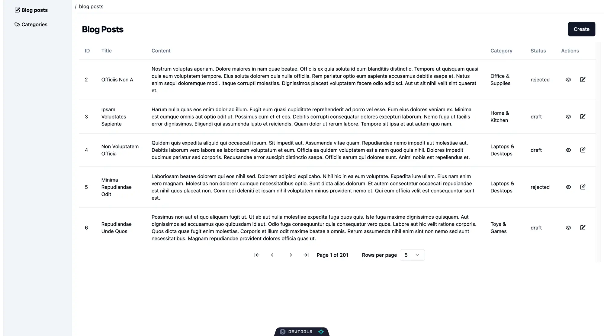 shadcn ui
Looking good.
Refine & Shadcn: Building a Reusable <DataTable /> Component with Shadcn
We can refactor the table related logic and components to build a Shadcn based reusable <DataTable /> component.
Show DataTable component
import React from "react";
import { flexRender } from "@tanstack/react-table";
import {
  Table,
  TableBody,
  TableCell,
  TableHead,
  TableHeader,
  TableRow,
} from "../ui/table";

import {
  Pagination,
  PaginationContent,
  PaginationItem,
  PaginationLink,
  PaginationNext,
  PaginationPrevious,
} from "../ui/pagination";

import {
  ArrowLeftToLine,
  ArrowRightToLine,
  ChevronLeftIcon,
  ChevronRightIcon,
} from "lucide-react";

import {
  Select,
  SelectContent,
  SelectItem,
  SelectTrigger,
  SelectValue,
} from "../ui/select";

export function DataTable({ ...tableProps }: any) {
  const {
    reactTable: { getHeaderGroups, getRowModel },
    refineCore: { result },
    getState,
    setPageIndex,
    getCanPreviousPage,
    getPageCount,
    getCanNextPage,
    nextPage,
    previousPage,
    setPageSize,
    getColumn,
  } = tableProps;

  return (
    <div style={{ maxWidth: "100%", overflowY: "scroll" }}>
      <Table>
        <TableHeader>
          {getHeaderGroups().map((headerGroup: any) => (
            <TableRow key={headerGroup.id}>
              {headerGroup.headers.map((header: any) => (
                <TableHead key={header.id}>
                  {!header.isPlaceholder &&
                    flexRender(
                      header.column.columnDef.header,
                      header.getContext(),
                    )}
                </TableHead>
              ))}
            </TableRow>
          ))}
        </TableHeader>
        <TableBody>
          {getRowModel().rows.map((row: any) => (
            <TableRow key={row.id}>
              {row.getVisibleCells().map((cell: any) => (
                <TableCell key={cell.id}>
                  {flexRender(cell.column.columnDef.cell, cell.getContext())}
                </TableCell>
              ))}
            </TableRow>
          ))}
        </TableBody>
      </Table>
      <Pagination>
        <PaginationContent>
          <PaginationItem>
            <PaginationLink onClick={() => setPageIndex(0)}>
              <ArrowLeftToLine className="h-4 w-4" />
            </PaginationLink>
          </PaginationItem>
          <PaginationItem>
            <PaginationPrevious onClick={() => previousPage()}>
              <ChevronLeftIcon className="h-4 w-4" />
            </PaginationPrevious>
          </PaginationItem>
          <PaginationItem>
            <PaginationNext onClick={() => nextPage()}>
              <ChevronRightIcon className="h-4 w-4" />
            </PaginationNext>
          </PaginationItem>
          <PaginationItem>
            <PaginationLink onClick={() => setPageIndex(getPageCount() - 1)}>
              <ArrowRightToLine className="h-4 w-4" />
            </PaginationLink>
          </PaginationItem>
          <div className="flex items-center space-x-6 lg:space-x-8">
            <div className="flex w-[100px] items-center justify-center text-sm font-medium">
              Page {getState().pagination.pageIndex + 1} of {getPageCount()}
            </div>
            <div className="flex items-center space-x-2">
              <p className="text-sm font-medium">Rows per page</p>
              <Select
                value={`${getState().pagination.pageSize}`}
                onValueChange={(value: any) => {
                  setPageSize(Number(value));
                }}
              >
                <SelectTrigger className="h-8 w-[70px]">
                  <SelectValue placeholder={getState().pagination.pageSize} />
                </SelectTrigger>
                <SelectContent side="top">
                  {[5, 10, 20, 30, 40, 50].map((pageSize) => (
                    <SelectItem key={pageSize} value={`${pageSize}`}>
                      {pageSize}
                    </SelectItem>
                  ))}
                </SelectContent>
              </Select>
            </div>
          </div>
        </PaginationContent>
      </Pagination>
    </div>
  );
}
We are passing all the table related props to <DataTable /> for it to present with Shadcn components internally. This way, we have a Refine data table tailored with Shadcn components.
With this, we can update the <BlogPostList /> component to the following and we should see the same paginated table:
Show final BlogPostList component code
import React from "react";

import {
  GetManyResponse,
  IResourceComponentsProps,
  useNavigation,
  useMany,
} from "@refinedev/core";

import { useTable } from "@refinedev/react-table";
import { ColumnDef } from "@tanstack/react-table";

import { LucideEdit, LucideEye } from "lucide-react";
import { Button } from "@/components/ui/button";
import { DataTable } from "@/components/table/data-table";

export const BlogPostList: React.FC<IResourceComponentsProps> = () => {
  // Omitted columns array
  // ...
  const { edit, show, create } = useNavigation();

  const tableProps = useTable({
    columns,
    refineCoreProps: {
      meta: {
        populate: ["category"],
      },
    },
  });

  tableProps?.setOptions((prev) => ({
    ...prev,
    meta: {
      ...prev.meta,
      categoryData,
    },
  }));

  return (
    <div className="p-2">
      <div className="mx-2 my-2 flex items-center justify-between">
        <h1 className="scroll-m-20 text-2xl font-extrabold tracking-tight">
          Blog Posts
        </h1>
        <div className="p-2">
          <Button onClick={() => create("blog_posts")}>Create</Button>
        </div>
      </div>
      <DataTable {...tableProps} />
    </div>
  );
};
Other Pages
For the remainder of the pages in blog_posts and categories resources, you can use appropriate Shadcn components. For example, you can use the Shadcn <Form /> and related boilerplace components with React Hook Form to implement complex form logic inside the create and edit pages.
Summary
In this post, we demonstrated with a blog posts list page example how Shadcn can be integrated seamlessly with Refine thanks to bundling and build tools like Vite.
We learned how Refin'es headless architecture offers easy integration of Shadcn within a Refine app. We covered Shadcn relies on TailwindCSS and its dependencies and elaborated how Shadcn is configured to operate with TypeScript within a Vite based React app like Refine.
Later on, we generated necessary Shadcn components we needed to rebuild a data grid for a list page in our Refine app. While rebuiling the data table and pagination with Shadcn components, we saw how Shadcn components complement and play well with the sophisticated data fetching, state management and React Table integrations typical of Refine apps. We also examined how Shadcn utilizes Class Variance Authority to produce style maps for component variants that are difficult to implement with plain TailwindCSS.
Towards the end, we refactored the Shadcn based paginated data table into a reusable component that we can use to present any data we want.
An update after a year
Refine and Shadcn UI continue to evolve rapidly. Shadcn UI's "code ownership" model, where you integrate component source directly, offers unmatched customization and transparency, especially with Tailwind CSS. This unique approach also positions it perfectly for AI-assisted development.
At Refine, we've fully embraced this synergy; our Refine initiatives are now in advanced stages of integrating Shadcn UI, leveraging its architecture to build smarter and more efficient development workflows. You can experience this firsthand by trying it out live at refine.dev!